Prompt Lab
Use this when you want an agent to design a page with the same proof-desk logic: editorial review surfaces, visible markup, and a clear approval path.
Design a web page using an Editorial Proof Desk art direction.

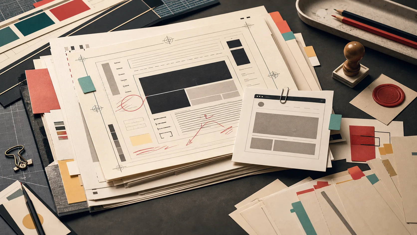
The page should feel like generated work has been placed on a print proofing table for human review. Use galley-proof sheets, crop marks, correction flags, revision slips, markup rails, signoff stamps, and stacked paper as the core visual language.

Translate those references into real web components:
- A hero that behaves like a proof sheet with metadata cells and a signoff row.
- Section headers styled as proof labels or revision slips, with enough padding around large type.
- Content cards that feel like marked-up galleys, not generic dashboard panels.
- A restrained palette of warm ivory paper, aubergine ink, proof red, teal correction tabs, muted mustard, and graphite desk tones.
- Typography that pairs a high-character editorial serif for display with a precise sans or mono for labels.

Keep the page readable first: body text at least 18px, generous line height, no justified prose, strong contrast, and no text pressed against borders.

Avoid fake readable text in images, AI-glow aesthetics, neon gradients, robots, code walls, and decorative proofing marks that make the content harder to scan.

Type: Fraunces for display, Inter for body, Literata italic for synthesis, Azeret Mono for proof labels and revision slips.
Color: warm proof paper #EAE1D2, aubergine ink #24172F, teal correction #147D78, red-clay proof marks #C95B43.
The pattern works because it starts with a specific page archetype, then translates the visual references into components, spacing rules, type choices, and accessibility constraints an agent can actually build.