Your generated site has a tell, and clients are learning to spot it
A React library of design tropes hit the top of Hacker News by naming the clichés that AI builders keep reaching for. The fix for the generated look is not a better model. It is feeding agents your own components.
Kanban Board / Project Tracker
A project-tracker board: three labeled lanes of stacked cards, color-coded label chips, and count badges on a cool slate ground.
A Kanban board is the layout product teams use to make a pile of work scannable: vertical lanes, a stack of cards in each, a small label taxonomy, and a count on every column. The reusable move is the card-in-a-lane: a tight unit with a label, a linked title, a line of context, and a meta footer, repeated across columns so the eye can scan down or across. Today the news is the backlog, so each item becomes a card and the sections become the lanes.
Tooling
2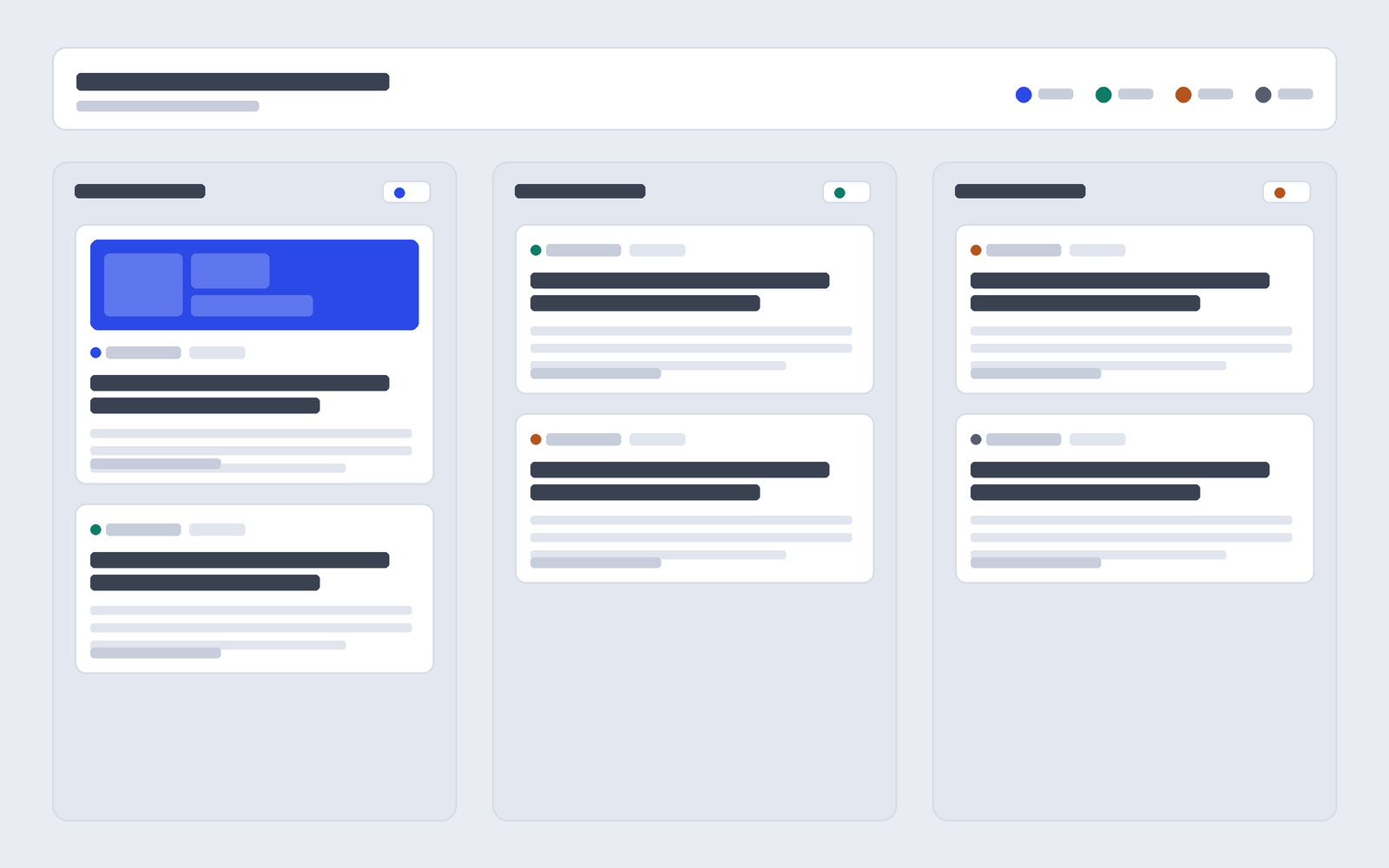
Performative-UI packages the AI design clichés as components
A React library billed as “AI-native components” collects the visual tropes that generated sites keep producing, turning the look into something you can install and point at. It topped Hacker News by making the genre legible.
Intuned writes and repairs its own browser automations
The code-first automation platform now ships an agent, built on the Claude Agent SDK, that explores a site, writes the scraper, validates it against the live page, and re-fixes itself when the site changes.
Technique
2Interop 2026 picks twenty things every browser should agree on
The annual cross-browser push targets anchor positioning, advanced attr(), container style queries, and scroll-driven animations, the layout primitives that let you drop a JavaScript or fallback crutch.
Feed v0 your Figma file and your own tokens
Vercel’s walkthrough imports a Figma design and a custom Tailwind config so generations start from your system, not the default shadcn shell. Teams report the design-to-build trip shrinking by up to three times.
Workflow
2Break the design into small framed components first
The practice under this week’s releases: split a page into named, separate component frames and register a real design system before you generate, so the agent fills in your shells instead of inventing generic ones.
Watch the config files that quietly run code
A write-up flags a supply-chain blind spot worth knowing as agents read and execute project configs: a config file that runs code on load is an execution path most reviews skip. Treat agent setup files as code.
Recreate this board
Paste this into your AI design or build tool to reproduce today’s visual system.
Design a single self-contained HTML page styled as a Kanban project
board, the kind Linear, Trello, or Jira uses to track work.

PAGE ARCHETYPE: a project tracker. Top app bar with a wordmark and two
nav links. Below it a board header: a small monospace breadcrumb line
(number, date, read time), a large board-title headline, a one-line
description, and a label legend of small color dots. Under the header,
the board itself: three equal vertical lanes side by side.

COMPONENTS: each lane has a header (an uppercase monospace title and a
count badge with a colored dot) over a stack of cards. A card is a tight
unit: a row of small label chips (each a colored dot plus a monospace
word), a linked headline, one or two lines of context, and a meta footer
with a source domain, a date, and a right-aligned arrow. One lead card
carries a flat-color cover image at the top. Below the board, full-width
panels for a prompt block, a short field note, and a numbered sources
list. Lanes stack to one column under about 920px.

PALETTE: cool slate board #E9ECF2, faint lane panels #E2E7F0, white cards
#FFFFFF, ink #171A21, secondary #565E6E, one flat cobalt accent #2B49E6
for links and the lead label, with teal #0E7C66 and clay #B4541E only as
label dots. No purple-blue gradient, no neon, no glow, no green-on-black.

TYPE: Bricolage Grotesque for the board title and card headings; Hanken
Grotesk for body and UI; DM Mono for labels, counts, dates, and source
domains; Literata italic for one editorial line only.

GUARDRAILS: body text at least 18px with about 1.6 line height and WCAG
AA contrast. Cap card radius near 13px, lane radius near 18px, chips near
7px, and vary radius with purpose. Label dots are the only circles; do
not pill-shape chips or buttons. The count badge and legend are
informational, not buttons, and there is no fake search field. Use one
tight card shadow on hover, not a shadow on every surface, and no colored
left-border stripe. Give cards and links honest hover and focus states
with ~160ms easing, and disable transforms under prefers-reduced-motion.
No readable text inside the generated cover image.

Type: Bricolage Grotesque for the board title and card headings, Hanken Grotesk for body and UI, DM Mono for labels, counts, dates, and source domains, Literata italic for one editorial line.
Color: cool slate ground #E9ECF2, ink #171A21, one flat cobalt accent #2B49E6, with teal, clay, and slate label chips as honest category colors. No gradients, no glow.
The bottom line
When the generated look gets consistent enough to package as a component library, the tell is not the model. It is the defaults nobody replaced.
“The way out of the AI look is to hand the agent your system before it reaches for its own.”
Field desk, Art Direction Daily
Linked this issue
- Performative-UI: a React component library of design tropesvorpus.github.io
- Show HN discussion of Performative-UInews.ycombinator.com
- Intuned: code-first browser automation, built and maintained by AIycombinator.com
- Interop 2026: continuing to improve the web for developersweb.dev
- Working with Figma and custom design systems in v0vercel.com
- Design systems in v0v0.app/docs
- Config files that run code: a supply-chain blind spotsafedep.io
A field experiment from the team behind Beaver Builder AI.