Config 2026 turned the design surface into a place where you keyframe by hand or ask the agent to animate for you, and the result leaves as real code. The mockup stopped being the end of the line.
The bill. This week's releases, set as one night's poster.
Today's Art Direction
Poster credits
Psychedelic Concert Poster
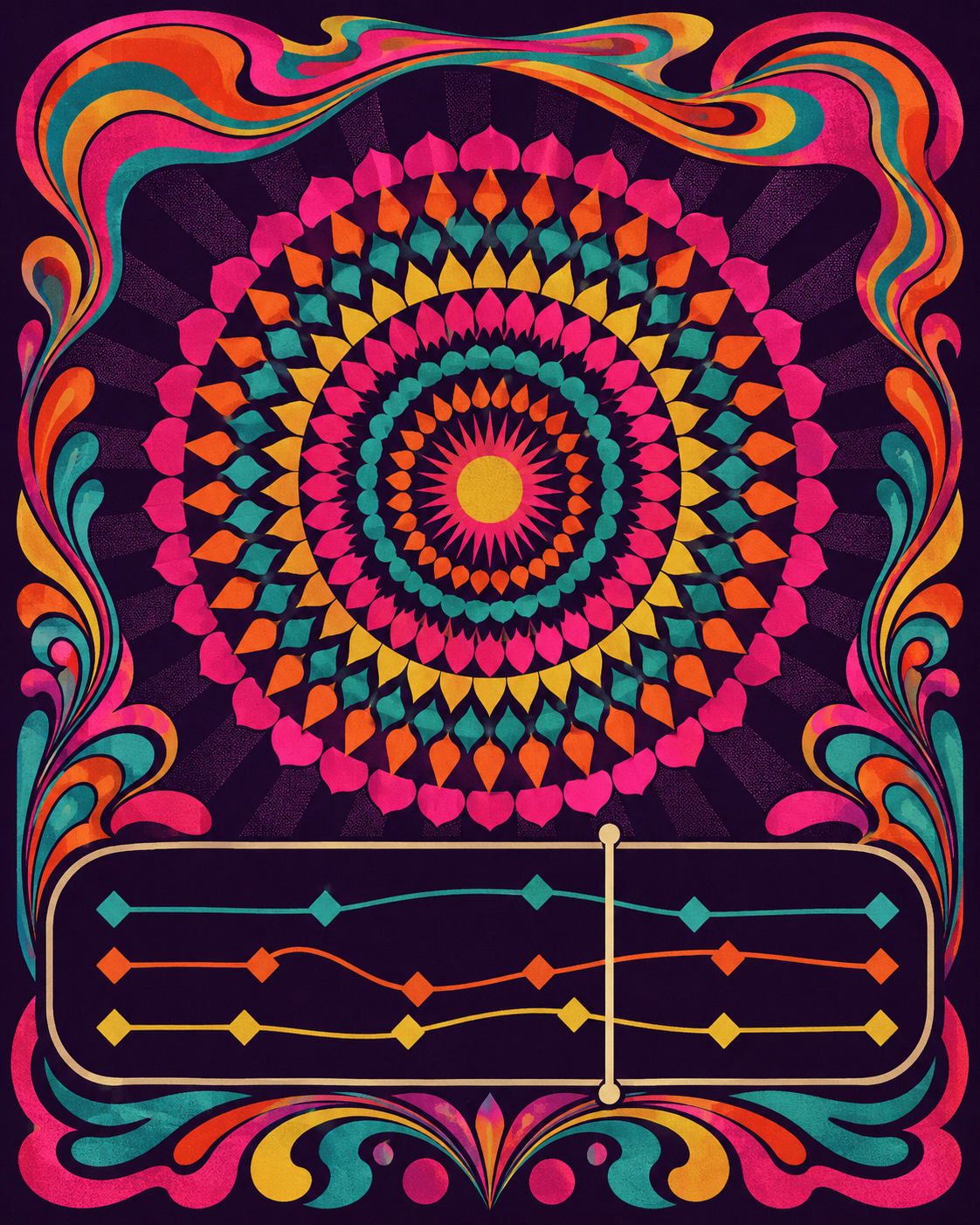
The briefing billed as a one-night gig poster, all concentric color, warped lockup, and a running order down the page.
The psychedelic concert poster is a print idiom of vibrating complementary color, liquid display lettering, and concentric ornament, the look of late-sixties dance-hall bills. Translated to the web it becomes an event landing page: a promoter line and a ticket-stub meta strip, a headliner hero framed by concentric color borders, and the stories billed as a lineup with running-order numbers and set-time labels instead of stacked cards. On a real page, the discipline is penning the loud color and warped type inside the masthead, frame, and act markers, so the reading column stays a calm dark field that still meets contrast. Each act is color-zoned through its order number and stage label, never a stripe down the edge.
At Config 2026, Figma added Motion, a native animation timeline that sits beside Design, Draw, and Dev modes. Switch a frame to Motion and you keyframe position, scale, rotation, and opacity directly on the canvas, or ask the Figma design agent to build a starting animation grounded in your own components and tokens.
What matters downstream is the handoff. Open Dev Mode and the full timeline is inspectable, every timing value and easing curve readable, and you copy the animation out as CSS, JSON, or framework-ready React. It is also MCP-compatible, so an animated frame can pass straight to a coding agent for implementation. Motion is rolling out in open beta.
Config also brought shader fills and effects to the canvas. Describe the look you want, or hand the agent a reference image, and it writes a small program that renders as a new material or transforms an existing layer. Because the agent builds it, every shader is parameterized by default, so you get real controls on the canvas instead of a texture baked flat into the file.
The same move shows up in generative plugins: tell the agent what tool you need and it builds a reusable plugin with no plugin-development setup. Treat a material or a tool as something you prompt and then tune, not something you hunt down or hand-code.
Lovable spent the week turning vibe-built apps into ones with a working backend. A new Calendly connector lets an app read scheduled events and event types and create single-use booking links, while a new Jobs tab in Lovable Cloud surfaces every scheduled background job, its status, schedule, and run history in one place.
The builder also reaches your editor now. The Lovable MCP server connects natively to Cursor and is listed in the GitHub MCP directory, so you can create, edit, and deploy a Lovable project from the coding agent you already keep open. The gap between a clickable prototype and a connected app keeps closing.
Now what you draw leaves as code.
Prompt Lab
Recreate tonight's poster
A copy-and-paste recipe that rebuilds the Psychedelic Concert Poster with an AI design tool. It describes the visual system, not the news.
The recipe
Design a single web page as a one-night psychedelic concert poster, an event or release landing page in the idiom of a late-1960s dance-hall bill: vibrating complementary color, concentric ornament, and a liquid display lockup. Not a dashboard, blog, or card grid.

Ground: deep saturated grape (#1B0E24) everywhere, with warm cream (#F4E7D4) body text at 19 to 20px and line-height about 1.7. Keep the loud color penned inside the masthead, the frame, and the act markers so the reading column stays a calm dark field. Accents are vibrating complementaries used as marks only: magenta (#FF3D9A), teal (#34E0CE), orange (#FF7A1A), gold-lime (#E8D44D). Links use the teal; never put body text in magenta or orange. Every word must hold WCAG AA on grape. No gradients behind text, no glow, no neon haze.

Type: a liquid retro display (Shrikhand) for the headliner, the art-direction name, act titles, and one marquee pullquote; a clean grotesque (Hanken Grotesk) for body and the italic one-liner; a monospace (Space Mono) for the promoter line, ticket-stub meta, set-time labels, source venues, and this recipe. One display size for the hero; never italicize body paragraphs.

Layout: center the whole page as a poster inside a concentric ornamental frame built from stacked colored outlines (magenta, teal, orange, lime), with a small ornament dot in each corner. A mono promoter line ("...presents") sits above a dashed ticket-stub strip carrying edition number, date, and running time. The headliner hero is centered: a mono kicker, a big two-line liquid headline with a hard offset shadow in magenta and teal, a short deck, and a framed psychedelic plate (concentric rings, a central disc, a warped marquee band of blank type blocks, an abstract animation timeline with keyframe diamonds and a playhead, no readable text). Today's art direction is a credits panel with a name, an italic one-line summary, a glossary paragraph, and bordered vocabulary chips. The stories are a running order, not cards: each act is a two-column row with a big outlined order number and a set-time label on the left, and on the right a mono stage label (Headliner, Main support, Closer), a liquid act title that links out, a mono venue credit, and one or two short paragraphs at about a 64ch measure. A single liquid marquee line sits on a faint complementary band. Close with a credits-style source list.

Components: concentric poster frame, promoter line, dashed ticket stub, offset-shadow headliner lockup, framed psychedelic plate, credits panel, bordered vocab chips, running-order act rows with outlined numerals and rotated-square set-time dots, marquee pullquote, mono venue credits, a magenta copy button on the recipe. Card and panel radii 11 to 12px, chips 7px, no pill-shaping and no accent left-border stripes. One restrained micro-interaction: act-title links grow a 2px teal underline on hover at about 160ms, behind a prefers-reduced-motion guard. No fake search fields, toggles, or filters; no dot-separator metadata chains; no emoji. Keep all body text on grape at WCAG AA.
Works in: Beaver Builder AI, v0, Lovable, Cursor, Figma Make.
Encore
Two launches this week pointed the same way. The design tool and the app builder both stopped ending at the mockup: Motion leaves Figma as code, a Lovable prototype ships with a backend, and the handoff that used to be a wall now has a door cut into it.