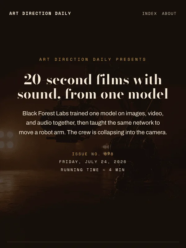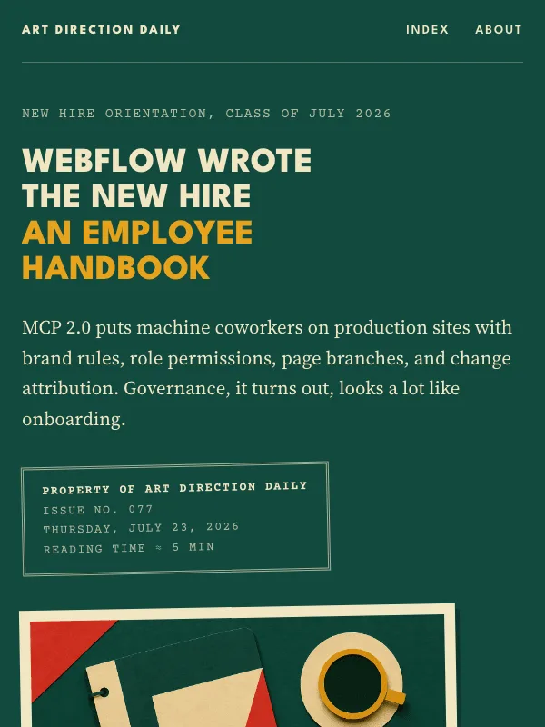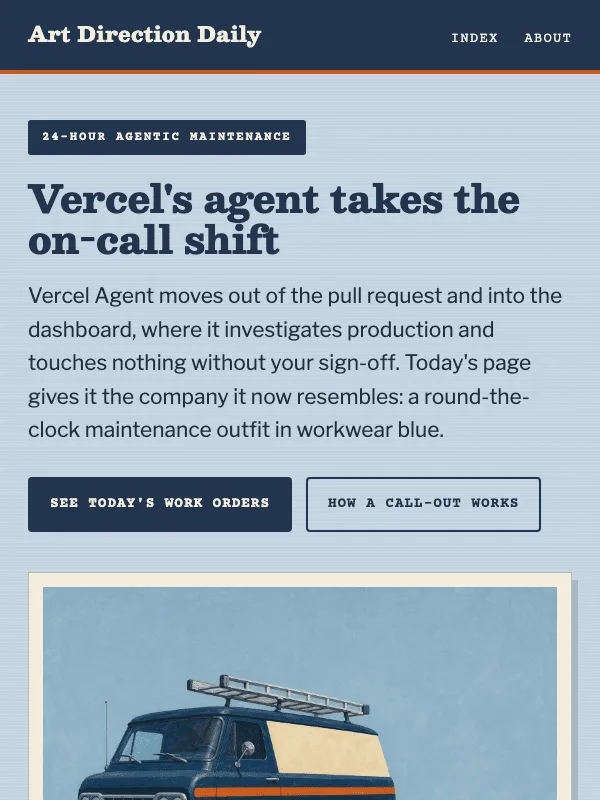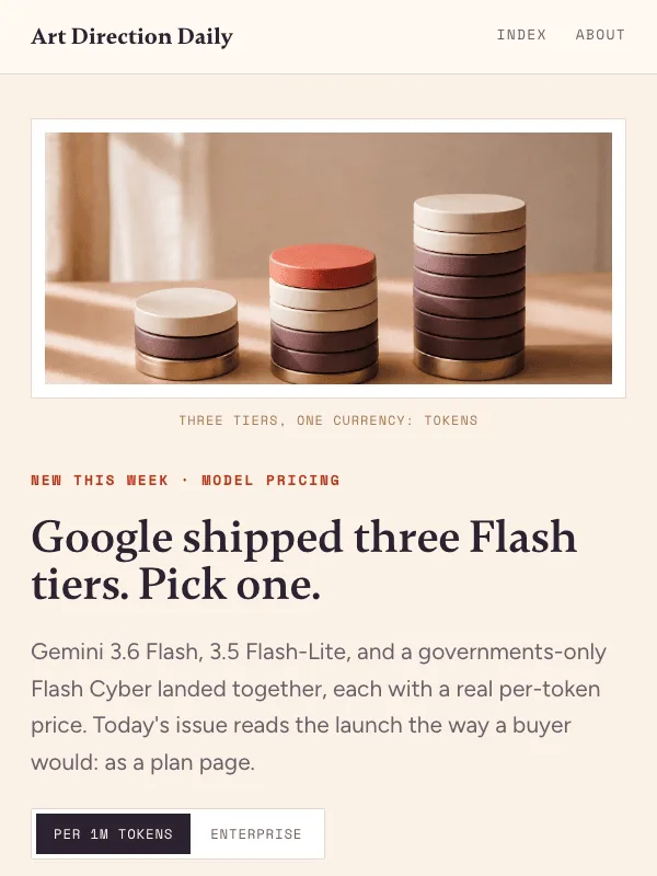
Prompt Lab

AI Web DesignPrompt Library

A growing library of copy-paste prompts for generating distinctive websites, visual systems, landing pages, editorial pages, product surfaces, and agentic web interfaces. Each entry pairs the prompt with the visual outcome it produced.

Copy the structure, then replace the story

Paste a prompt into an AI design or build tool, keep the art direction, layout structure, palette, typography, imagery role, and guardrails, then swap in your own product, article, interface, or client brief.

The prompts are written for working designers who want a reusable visual system, not another generic landing page. Use the thumbnail and linked issue to compare the prompt with the final visual result.

v0Figma MakeClaudeCursorLovableBeaver Builder AI

Prompt specimens

64 prompts · updated 2026-07-10

64 matching prompts

No prompts match that search and filter. Try a broader visual pattern.

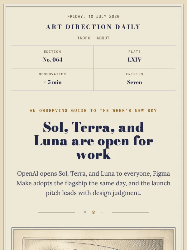
Visual result for the The Celestial Atlas prompt

NO. 064 · 2026-07-10

The Celestial Atlas

A nineteenth century star atlas plate rebuilt as an observing guide for a three body model release.

Create a one-page planetarium exhibition page styled as a nineteenth century celestial atlas plate. Structure: wrap the whole page in a double-rule engraved plate frame on aged cream paper;...

Bodoni Moda + Lora

ExpressiveLightProduct

Read the full prompt and reusable template
Create a one-page planetarium exhibition page styled as a nineteenth century celestial atlas plate. Structure: wrap the whole page in a double-rule engraved plate frame on aged cream paper; a running head with the venue name centered in letterspaced Didone capitals, the date on the left, and two small mono nav links on the right; below it a four-cell ephemeris strip of labeled metadata (edition, plate number, duration, entries) separated by hairline column rules; a centered hero with a small mono kicker, a large high-contrast Didone headline, and a two-line serif deck; then a full-width framed engraving-style illustration with a numbered figure caption beneath it; a bordered legend box explaining the exhibition in two short paragraphs; a data table styled like an astronomical elements table with a dark indigo header row and mono numerals; a diagram of three circles whose areas are proportional to real numbers from the table, each labeled beneath in small mono capitals, with a caption stating the scale rule; then an observing log of entries in a two-column grid, a mono entry number in a left rail with a hairline divider and a serif headline plus two sentences on the right; close with a centered italic field note, a numbered source list, and a colophon. Palette: aged cream #EFE8D5, indigo ink #2B3054, slate blue #46708A, solar ochre #C0761B, moonstone #8E8570. Type: Bodoni Moda for display, Lora for body, Fragment Mono for labels and numerals. Keep body text at 19px or larger with line height at least 1.65, ink on cream at WCAG AA contrast, no pill radii, no accent left-border stripes, no glow shadows, no gradient text, no neon, real hover and focus states with easing near 150ms, and no readable text inside the illustration.
Design a single web page for [your topic] using the The Celestial Atlas art direction.

Purpose: adapt this visual system to [your product, article, interface, or client brief]. Keep the layout grammar and visual lesson, but replace all story-specific references with your own content.

Visual system: A nineteenth century star atlas plate rebuilt as an observing guide for a three body model release.

Starting point: Create a one-page planetarium exhibition page styled as a nineteenth century celestial atlas plate. Structure: wrap the whole page in a double-rule engraved plate frame on aged cream paper;...

Palette: paper: #EFE8D5, primary: #2B3054, secondary: #46708A, accent: #C0761B, muted: #8E8570.

Type: Bodoni Moda + Lora. Keep running text readable, with clear hierarchy between display type, body copy, labels, and source or metadata marks.

Layout: preserve the original archetype's structural idea, then map it to your content. Define the hero, metadata, primary content sections, supporting image or artifact, prompt or CTA area, and source/reference area before styling individual cards.

Imagery: create or choose one integral visual artifact that teaches the pattern. It should be visible near the top of the page and work in both a wide social crop and a portrait cover crop. Avoid logos, watermarks, and fake readable text inside images.

Guardrails: avoid generic SaaS sections, purple-blue gradients, glass cards, fake controls, stock people, emoji decoration, pill-shaped everything, and identical feature cards. Build visible focus states, real links/buttons, responsive crop behavior, and a reduced-motion fallback.
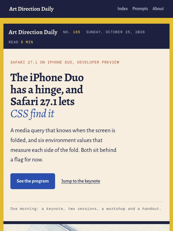
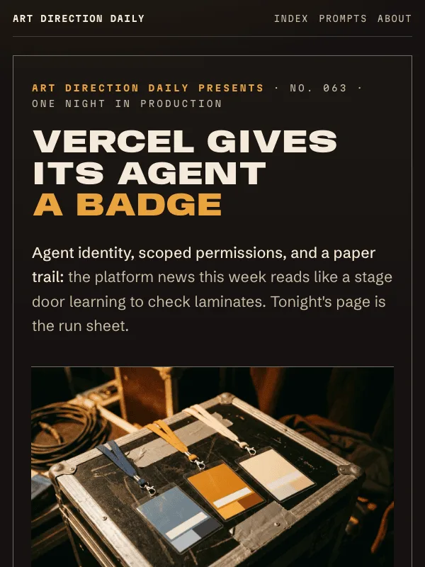
Visual result for the Show-Day Run Sheet prompt

NO. 063 · 2026-07-09

Show-Day Run Sheet

A gig page for the one night the agent plays production, laminates checked at the door.

Create a one-page show-day event page for a music venue, styled as a backstage run sheet under tungsten light. Structure: a full-width poster hero on a warm black ground with a small mono...

Anybody + Schibsted Grotesk

ExpressiveDarkProduct

Read the full prompt and reusable template
Create a one-page show-day event page for a music venue, styled as a backstage run sheet under tungsten light. Structure: a full-width poster hero on a warm black ground with a small mono stage-door kicker, a giant expanded ultra-black uppercase headline, a one-line support-act deck, a wide photographic art band of blank backstage laminates on a road case, and a perforated ticket-stub meta strip with punched notches at each end; then a vertical run-of-show timeline where a thin rail connects mono time chips labeled DOORS, SUPPORT SET, CHANGEOVER, HEADLINE SET, and ENCORE, each stop holding one act with a heading and two sentences; inside the first stop, a row of three laminate credential cards, each with a colored header band, a punched hole, a short mono list of what the pass allows, and one dashed-rule line stating what it cannot do; close with a cream production memo taped at the corners, a setlist-style numbered link list, and a stage-crew colophon. Palette: warm black #161210, warm cream #F4EADA, tungsten amber #E8A33C as the only loud accent, follow-spot steel blue #7C93A8 and gaff rust #A0472B reserved for the laminates. Type: Anybody Expanded Black for display, Schibsted Grotesk for body, Martian Mono for times, scopes, and labels. Keep body text at 19px or larger with line height at least 1.65, cream on warm black at WCAG AA contrast, laminate corners at 10px and everything else nearly square, real hover and focus states with easing near 150ms, no glow shadows, no neon, no gradient text, and no readable text inside the photograph.
Design a single web page for [your topic] using the Show-Day Run Sheet art direction.

Purpose: adapt this visual system to [your product, article, interface, or client brief]. Keep the layout grammar and visual lesson, but replace all story-specific references with your own content.

Visual system: A gig page for the one night the agent plays production, laminates checked at the door.

Starting point: Create a one-page show-day event page for a music venue, styled as a backstage run sheet under tungsten light. Structure: a full-width poster hero on a warm black ground with a small mono...

Palette: paper: #161210, primary: #F4EADA, secondary: #7C93A8, accent: #E8A33C, muted: #A0472B.

Type: Anybody + Schibsted Grotesk. Keep running text readable, with clear hierarchy between display type, body copy, labels, and source or metadata marks.

Layout: preserve the original archetype's structural idea, then map it to your content. Define the hero, metadata, primary content sections, supporting image or artifact, prompt or CTA area, and source/reference area before styling individual cards.

Imagery: create or choose one integral visual artifact that teaches the pattern. It should be visible near the top of the page and work in both a wide social crop and a portrait cover crop. Avoid logos, watermarks, and fake readable text inside images.

Guardrails: avoid generic SaaS sections, purple-blue gradients, glass cards, fake controls, stock people, emoji decoration, pill-shaped everything, and identical feature cards. Build visible focus states, real links/buttons, responsive crop behavior, and a reduced-motion fallback.
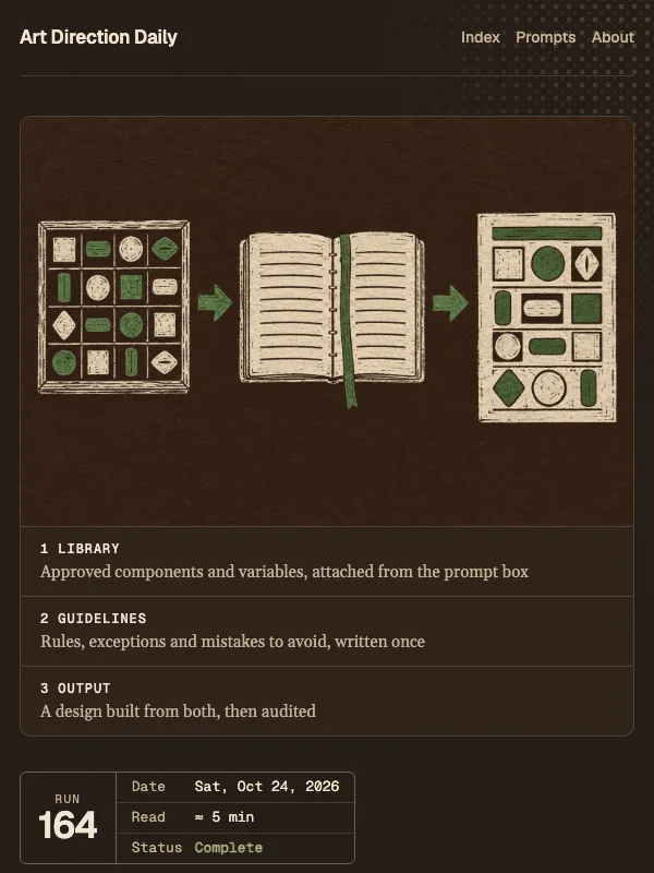
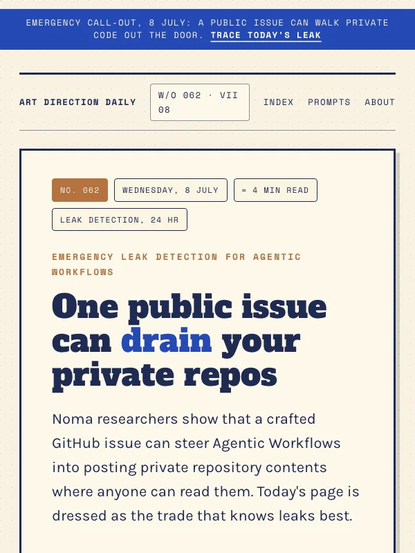
Visual result for the Emergency Leak Detection Service prompt

NO. 062 · 2026-07-08

Emergency Leak Detection Service

A vintage trade-services page for an emergency leak detection company, printed in indigo, cobalt, and copper on cream.

Create a responsive landing page for a neighborhood emergency leak detection and pipe repair service, styled as a vintage mid-century trade advertisement. Structure: a full width emergency...

Alfa Slab One + Karla

ExpressiveLight

Read the full prompt and reusable template
Create a responsive landing page for a neighborhood emergency leak detection and pipe repair service, styled as a vintage mid-century trade advertisement. Structure: a full width emergency strip at the very top with one promise and one anchor link; a two column signboard hero framed by a thick ink border, with a heavy slab headline and a badge cluster of small bordered permit chips on the left and a halftone lithograph illustration of copper pipes with one blue drip on the right; a featured work order panel for the lead service; stacked call-out ticket rows for the remaining services, each opening with a stamped work order label rotated one degree; a single rate card panel of labeled rows; a plain contact ledger. Include a horizontal pipe route diagram built from labeled station chips joined by a thick cobalt line with round copper valve joints, ending at a station with a small drip. Palette: cream paper #F6EFDC, deep indigo ink #1F2A50, cobalt #2449B4 for loud marks and the strip, water teal #3E7C96 for quiet emphasis, copper #B4713E for valves and stamps. Type: Alfa Slab One for the signboard display, Karla for body and paperwork, Space Mono for stamped uppercase labels. Keep body text at 19px or larger with line height at least 1.6, square corners with at most a 4px radius on chips, real hover and focus states, offset solid shadows instead of soft glows, no fake phone numbers or dead controls, no neon or gradient defaults, and keep the illustration free of readable text.
Design a single web page for [your topic] using the Emergency Leak Detection Service art direction.

Purpose: adapt this visual system to [your product, article, interface, or client brief]. Keep the layout grammar and visual lesson, but replace all story-specific references with your own content.

Visual system: A vintage trade-services page for an emergency leak detection company, printed in indigo, cobalt, and copper on cream.

Starting point: Create a responsive landing page for a neighborhood emergency leak detection and pipe repair service, styled as a vintage mid-century trade advertisement. Structure: a full width emergency...

Palette: paper: #F6EFDC, primary: #1F2A50, secondary: #3E7C96, accent: #2449B4, muted: #B4713E.

Type: Alfa Slab One + Karla. Keep running text readable, with clear hierarchy between display type, body copy, labels, and source or metadata marks.

Layout: preserve the original archetype's structural idea, then map it to your content. Define the hero, metadata, primary content sections, supporting image or artifact, prompt or CTA area, and source/reference area before styling individual cards.

Imagery: create or choose one integral visual artifact that teaches the pattern. It should be visible near the top of the page and work in both a wide social crop and a portrait cover crop. Avoid logos, watermarks, and fake readable text inside images.

Guardrails: avoid generic SaaS sections, purple-blue gradients, glass cards, fake controls, stock people, emoji decoration, pill-shaped everything, and identical feature cards. Build visible focus states, real links/buttons, responsive crop behavior, and a reduced-motion fallback.
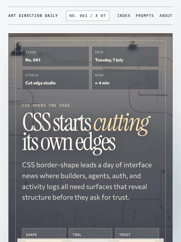
Visual result for the Cut Edge Drafting Studio prompt

NO. 061 · 2026-07-07

Cut Edge Drafting Studio

A cool drafting studio that turns CSS shape work and agent workflow news into cut-paper surfaces, proof strips, and routed edges.

Create a responsive editorial web page using a Cut Edge Drafting Studio archetype for an AI web design briefing about CSS shape work and agent workflow surfaces. Build the first viewport as...

Instrument Serif + Commissioner

ExpressiveLightIllustration

Read the full prompt and reusable template
Create a responsive editorial web page using a Cut Edge Drafting Studio archetype for an AI web design briefing about CSS shape work and agent workflow surfaces. Build the first viewport as an image-backed cutting-table hero: a blue-gray drafting image sits behind the headline under a translucent graphite and oxblood color layer, with torn tracing-paper interface pieces, colored border paths, crop marks, ruler shadows, and pinned proof notes. Use mist blue paper (#E9EEF4), graphite ink (#263141), teal route blue (#2C6E7F), oxblood red (#B84632), ochre pin color (#C49A44), and quiet sage (#7F8B6D). Pair Instrument Serif for loose display type, Commissioner for readable body text, and IBM Plex Mono for proof labels. Mark story sections as cut-paper proof strips in a loose atelier field rather than identical cards. Include a Design Move section that teaches the proof-strip pattern: let edges, routes, or masks reveal permission, dependency, review state, and history before the user trusts a generated surface. Keep body text at 19px or larger with line-height above 1.6, keep real hover and focus states, avoid fake controls, avoid purple-blue neon or glass defaults, and keep all image text abstract or blank so the readable copy stays in HTML.
Design a single web page for [your topic] using the Cut Edge Drafting Studio art direction.

Purpose: adapt this visual system to [your product, article, interface, or client brief]. Keep the layout grammar and visual lesson, but replace all story-specific references with your own content.

Visual system: A cool drafting studio that turns CSS shape work and agent workflow news into cut-paper surfaces, proof strips, and routed edges.

Starting point: Create a responsive editorial web page using a Cut Edge Drafting Studio archetype for an AI web design briefing about CSS shape work and agent workflow surfaces. Build the first viewport as...

Palette: paper: #E9EEF4, primary: #263141, secondary: #2C6E7F, accent: #B84632, muted: #C49A44.

Type: Instrument Serif + Commissioner + IBM Plex Mono. Keep running text readable, with clear hierarchy between display type, body copy, labels, and source or metadata marks.

Layout: preserve the original archetype's structural idea, then map it to your content. Define the hero, metadata, primary content sections, supporting image or artifact, prompt or CTA area, and source/reference area before styling individual cards.

Imagery: create or choose one integral visual artifact that teaches the pattern. It should be visible near the top of the page and work in both a wide social crop and a portrait cover crop. Avoid logos, watermarks, and fake readable text inside images.

Guardrails: avoid generic SaaS sections, purple-blue gradients, glass cards, fake controls, stock people, emoji decoration, pill-shaped everything, and identical feature cards. Build visible focus states, real links/buttons, responsive crop behavior, and a reduced-motion fallback.
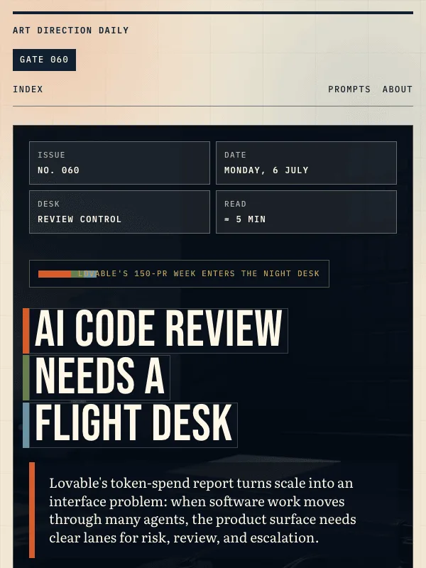
Visual result for the Airport Night Operations Desk prompt

NO. 060 · 2026-07-06

Airport Night Operations Desk

A dark terminal control desk for sending AI-coded work through risk lanes instead of a single review queue.

Create a responsive editorial web page using an Airport Night Operations Desk archetype for an AI web design briefing about agentic coding scale and review risk. Build the first viewport as...

Bebas Neue + Literata

ExpressiveDarkConsole

Read the full prompt and reusable template
Create a responsive editorial web page using an Airport Night Operations Desk archetype for an AI web design briefing about agentic coding scale and review risk. Build the first viewport as a dark terminal control desk: a full-bleed generated operations-desk image sits behind the layout, the headline appears as oversized split-flap tile strips, and review-lane strips sit at the bottom of the hero. Use deep airport ink (#07101B), warm ticket paper (#F2E7D4), safety orange (#D85C2A), gate green (#5F7F52), muted sky blue (#6A94A8), and amber status light (#D6A23F). Pair Bebas Neue for display, Literata for readable body text and italic notes, and IBM Plex Mono for gate labels. Mark story sections as departure board rows with gate labels, linked primary-source headlines, verified dates, and one or two plain paragraphs. Include a Design Move section that teaches the risk runway pattern: classify AI work first, show the lane, owner, evidence, and stop condition prior to acceptance. Keep body text at 19px or larger with line-height above 1.6, use real hover and focus states, avoid fake controls, avoid neon or glow defaults, and keep all image text abstract or blank so it never relies on generated copy.
Design a single web page for [your topic] using the Airport Night Operations Desk art direction.

Purpose: adapt this visual system to [your product, article, interface, or client brief]. Keep the layout grammar and visual lesson, but replace all story-specific references with your own content.

Visual system: A dark terminal control desk for sending AI-coded work through risk lanes instead of a single review queue.

Starting point: Create a responsive editorial web page using an Airport Night Operations Desk archetype for an AI web design briefing about agentic coding scale and review risk. Build the first viewport as...

Palette: paper: #F2E7D4, primary: #102032, secondary: #6A94A8, accent: #D85C2A, muted: #5F7F52, night: #07101B, status: #D6A23F.

Type: Bebas Neue + Literata + IBM Plex Mono. Keep running text readable, with clear hierarchy between display type, body copy, labels, and source or metadata marks.

Layout: preserve the original archetype's structural idea, then map it to your content. Define the hero, metadata, primary content sections, supporting image or artifact, prompt or CTA area, and source/reference area before styling individual cards.

Imagery: create or choose one integral visual artifact that teaches the pattern. It should be visible near the top of the page and work in both a wide social crop and a portrait cover crop. Avoid logos, watermarks, and fake readable text inside images.

Guardrails: avoid generic SaaS sections, purple-blue gradients, glass cards, fake controls, stock people, emoji decoration, pill-shaped everything, and identical feature cards. Build visible focus states, real links/buttons, responsive crop behavior, and a reduced-motion fallback.
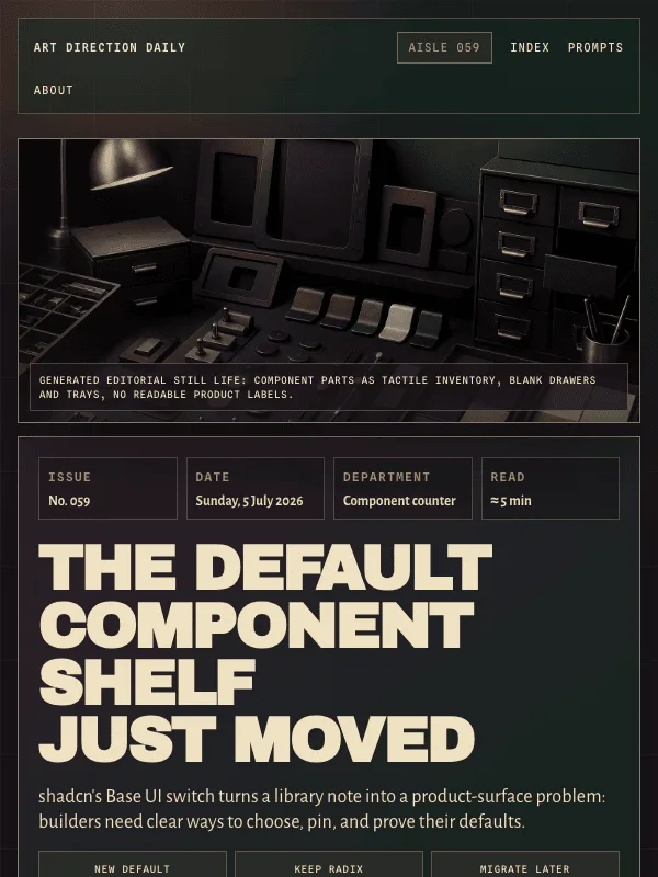
Visual result for the Component Hardware Store prompt

NO. 059 · 2026-07-05

Component Hardware Store

A dark specialty parts counter for making component library defaults inspectable before migration work ships.

Create a responsive editorial web page using a Component Hardware Store archetype for an AI web design briefing about component library defaults and migration paths. Build the first...

Archivo Black + Alegreya Sans

ExpressiveDark

Read the full prompt and reusable template
Create a responsive editorial web page using a Component Hardware Store archetype for an AI web design briefing about component library defaults and migration paths. Build the first viewport as a specialty hardware counter: left-side product spec panel with issue metadata and a large condensed headline, right-side editorial bitmap of tactile UI component parts, drawer bins, switches, sample trays, and brass task lighting. Use a dark aubergine and deep green ground (#1B151B, #13251F), warm bone text (#EFE1C2), brass accent (#C59A55), muted rose (#B46657), and smoke gray labels (#8F8779). Pair Archivo Black for display, Alegreya Sans for body and italic moments, and Spline Sans Mono for drawer labels. Mark news items as inventory bins with a bin number, linked headline, verified source date, and one or two readable paragraphs. Include a Design Move section that teaches the default chooser pattern: recommended path, compatible opt-out, current project pin, and review proof before migration. Keep body text at 19px or larger with line-height above 1.6, avoid fake readable text inside images, avoid neon or glow defaults, avoid fake controls, and include real hover and focus states with a reduced-motion guard.
Design a single web page for [your topic] using the Component Hardware Store art direction.

Purpose: adapt this visual system to [your product, article, interface, or client brief]. Keep the layout grammar and visual lesson, but replace all story-specific references with your own content.

Visual system: A dark specialty parts counter for making component library defaults inspectable before migration work ships.

Starting point: Create a responsive editorial web page using a Component Hardware Store archetype for an AI web design briefing about component library defaults and migration paths. Build the first...

Palette: paper: #1B151B, primary: #EFE1C2, secondary: #13251F, accent: #C59A55, muted: #B46657.

Type: Archivo Black + Alegreya Sans + Spline Sans Mono. Keep running text readable, with clear hierarchy between display type, body copy, labels, and source or metadata marks.

Layout: preserve the original archetype's structural idea, then map it to your content. Define the hero, metadata, primary content sections, supporting image or artifact, prompt or CTA area, and source/reference area before styling individual cards.

Imagery: create or choose one integral visual artifact that teaches the pattern. It should be visible near the top of the page and work in both a wide social crop and a portrait cover crop. Avoid logos, watermarks, and fake readable text inside images.

Guardrails: avoid generic SaaS sections, purple-blue gradients, glass cards, fake controls, stock people, emoji decoration, pill-shaped everything, and identical feature cards. Build visible focus states, real links/buttons, responsive crop behavior, and a reduced-motion fallback.
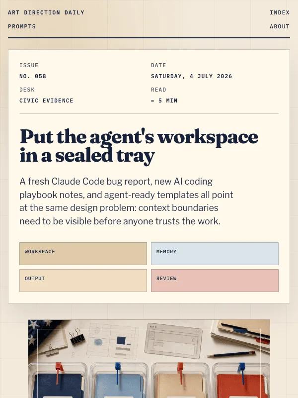
Visual result for the Civic Evidence Desk prompt

NO. 058 · 2026-07-04

Civic Evidence Desk

A public-records inspection desk for making AI workspace boundaries visible and reviewable.

Create a responsive editorial web page using a Civic Evidence Desk archetype for an AI web design briefing about workspace boundaries. Build the first viewport as a public-records...

Fraunces + Libre Franklin

ExpressiveLightConsole

Read the full prompt and reusable template
Create a responsive editorial web page using a Civic Evidence Desk archetype for an AI web design briefing about workspace boundaries. Build the first viewport as a public-records inspection desk: a docket-strip masthead beside a generated or composed bitmap of separated project folders in clear quarantine trays, with red and blue boundary seals, blank evidence cards, rulers, pencils, and warm paper texture. Use warm record paper (#F4EADB), navy ink (#17213A), federal blue (#4F78A6), inspection red (#B83A2E), brass folder tabs (#C8AA6A), and manila surfaces (#DFCAA8). Pair Fraunces for display and italic moments with Libre Franklin for body copy and IBM Plex Mono for docket labels. Mark news items as case pockets with a case number, linked headline, source date, and one or two readable paragraphs. Include a Design Move section that teaches the boundary tray pattern: scope, allowed memory, proof, and handoff all live in the same visible component. Keep body text at 19px or larger with line-height above 1.6, avoid fake readable text inside images, avoid neon or glow defaults, avoid fake controls, and include real hover and focus states with a reduced-motion guard.
Design a single web page for [your topic] using the Civic Evidence Desk art direction.

Purpose: adapt this visual system to [your product, article, interface, or client brief]. Keep the layout grammar and visual lesson, but replace all story-specific references with your own content.

Visual system: A public-records inspection desk for making AI workspace boundaries visible and reviewable.

Starting point: Create a responsive editorial web page using a Civic Evidence Desk archetype for an AI web design briefing about workspace boundaries. Build the first viewport as a public-records...

Palette: paper: #F4EADB, primary: #17213A, secondary: #4F78A6, accent: #B83A2E, muted: #C8AA6A.

Type: Fraunces + Libre Franklin + IBM Plex Mono. Keep running text readable, with clear hierarchy between display type, body copy, labels, and source or metadata marks.

Layout: preserve the original archetype's structural idea, then map it to your content. Define the hero, metadata, primary content sections, supporting image or artifact, prompt or CTA area, and source/reference area before styling individual cards.

Imagery: create or choose one integral visual artifact that teaches the pattern. It should be visible near the top of the page and work in both a wide social crop and a portrait cover crop. Avoid logos, watermarks, and fake readable text inside images.

Guardrails: avoid generic SaaS sections, purple-blue gradients, glass cards, fake controls, stock people, emoji decoration, pill-shaped everything, and identical feature cards. Build visible focus states, real links/buttons, responsive crop behavior, and a reduced-motion fallback.
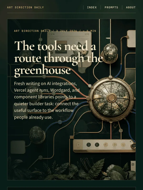
Visual result for the Conservatory Route Map prompt

NO. 057 · 2026-07-03

Conservatory Route Map

A botanical transit map for routing AI features into existing product workflows.

Create a responsive editorial web page using a Conservatory Route Map archetype for an AI web design briefing. Build the first viewport as a dark emerald glasshouse map: a wide generated or...

Cormorant Garamond + Source Sans 3

ExpressiveDarkProduct

Read the full prompt and reusable template
Create a responsive editorial web page using a Conservatory Route Map archetype for an AI web design briefing. Build the first viewport as a dark emerald glasshouse map: a wide generated or composed bitmap plate with brass route rails, coral and lapis transfer lines, blank interface panes, and botanical canopy crops, paired with a narrow itinerary rail that lists the issue number, date, and route stops. Use deep emerald (#081d17), warm ivory (#f2e6c8), fern green (#2c6e5d), coral (#ef6a52), brass (#c7a867), and lapis (#315fa8). Pair Cormorant Garamond for display and italic moments with Source Sans 3 for body copy and IBM Plex Mono for small route labels. Mark stories as plant-label cards attached to route nodes: each card needs a route code, linked headline, source label, and one or two readable paragraphs. Include a Design Move section that teaches the transfer-node pattern: every AI affordance needs an origin, destination, checkpoint, and return path. Keep body text at 19px or larger with line-height above 1.6, avoid fake readable text inside images, avoid neon/glow defaults, avoid fake controls, and include real hover and focus states with a reduced-motion guard.
Design a single web page for [your topic] using the Conservatory Route Map art direction.

Purpose: adapt this visual system to [your product, article, interface, or client brief]. Keep the layout grammar and visual lesson, but replace all story-specific references with your own content.

Visual system: A botanical transit map for routing AI features into existing product workflows.

Starting point: Create a responsive editorial web page using a Conservatory Route Map archetype for an AI web design briefing. Build the first viewport as a dark emerald glasshouse map: a wide generated or...

Palette: paper: #081D17, primary: #F2E6C8, secondary: #2C6E5D, accent: #EF6A52, muted: #C7A867.

Type: Cormorant Garamond + Source Sans 3 + IBM Plex Mono. Keep running text readable, with clear hierarchy between display type, body copy, labels, and source or metadata marks.

Layout: preserve the original archetype's structural idea, then map it to your content. Define the hero, metadata, primary content sections, supporting image or artifact, prompt or CTA area, and source/reference area before styling individual cards.

Imagery: create or choose one integral visual artifact that teaches the pattern. It should be visible near the top of the page and work in both a wide social crop and a portrait cover crop. Avoid logos, watermarks, and fake readable text inside images.

Guardrails: avoid generic SaaS sections, purple-blue gradients, glass cards, fake controls, stock people, emoji decoration, pill-shaped everything, and identical feature cards. Build visible focus states, real links/buttons, responsive crop behavior, and a reduced-motion fallback.
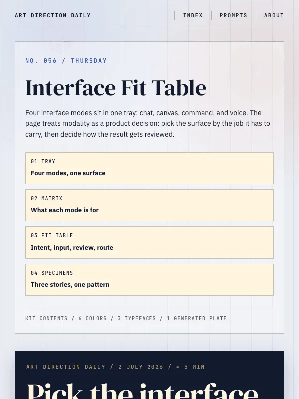
Visual result for the Interface Fit Table prompt

NO. 056 · 2026-07-02

Interface Fit Table

A fit table for choosing the correct AI surface before a feature goes live.

Create a responsive editorial web page using an Interface Fit Table archetype. The above-fold layout has a narrow left inventory rail with issue or product metadata, then a deep indigo...

DM Serif Display + IBM Plex Sans

ExpressiveLightProduct

Read the full prompt and reusable template
Create a responsive editorial web page using an Interface Fit Table archetype. The above-fold layout has a narrow left inventory rail with issue or product metadata, then a deep indigo product tray hero holding four abstract interface samples: chat card, canvas tile, command strip, and voice token. Use a cool light-gray page ground (#e9edf2), dark indigo tray (#111a2d), ivory specimen cards (#fff5df), cobalt (#284fd6), tomato red (#d8442f), and brushed brass (#bd9652). Pair DM Serif Display for the hero and section heads with IBM Plex Sans for body copy and JetBrains Mono for specimen labels. Add a four-part fit matrix immediately under the hero, then a compact decision table that compares intent, input shape, review state, and route. Fill every table row with real, specific content (a concrete job, a real input shape, a named checkpoint), never placeholder labels, and end the table with one worked example. Mark content sections as specimen cards with a colored marker block, large sample number, source label, linked headline, and one or two readable paragraphs. Keep body text at 19px or larger with line-height above 1.6, avoid fake readable text inside images, avoid neon/glow defaults, avoid dead UI controls, and include real hover/focus states plus a reduced-motion guard.
Design a single web page for [your topic] using the Interface Fit Table art direction.

Purpose: adapt this visual system to [your product, article, interface, or client brief]. Keep the layout grammar and visual lesson, but replace all story-specific references with your own content.

Visual system: A fit table for choosing the correct AI surface before a feature goes live.

Starting point: Create a responsive editorial web page using an Interface Fit Table archetype. The above-fold layout has a narrow left inventory rail with issue or product metadata, then a deep indigo...

Palette: paper: #E9EDF2, primary: #172033, secondary: #284FD6, accent: #D8442F, muted: #BD9652.

Type: DM Serif Display + IBM Plex Sans + JetBrains Mono. Keep running text readable, with clear hierarchy between display type, body copy, labels, and source or metadata marks.

Layout: preserve the original archetype's structural idea, then map it to your content. Define the hero, metadata, primary content sections, supporting image or artifact, prompt or CTA area, and source/reference area before styling individual cards.

Imagery: create or choose one integral visual artifact that teaches the pattern. It should be visible near the top of the page and work in both a wide social crop and a portrait cover crop. Avoid logos, watermarks, and fake readable text inside images.

Guardrails: avoid generic SaaS sections, purple-blue gradients, glass cards, fake controls, stock people, emoji decoration, pill-shaped everything, and identical feature cards. Build visible focus states, real links/buttons, responsive crop behavior, and a reduced-motion fallback.
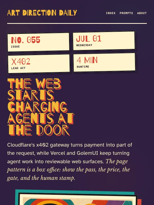
Visual result for the Concert Ticket Box Office prompt

NO. 055 · 2026-07-01

Concert Ticket Box Office

A saturated ticket-booth issue with stacked stubs, perforated review cards, cartoon handoff imagery, and model-name gig billing.

Design a single editorial web page as a 1970s concert ticket box office for agentic web design news. The visual lesson is how to turn checkout, permission, and review states into playful...

Barrio + Atkinson Hyperlegible

ExpressiveDarkPosterConsole

Read the full prompt and reusable template
Design a single editorial web page as a 1970s concert ticket box office for agentic web design news. The visual lesson is how to turn checkout, permission, and review states into playful but legible ticket components.

Palette: deep plum stage wall (#2F1F40) as the page ground, aged ticket ivory (#FFF4CD) for reading surfaces, saturated teal (#1B9A91), tomato red (#DA4636), sunflower yellow (#F1B737), and dusty purple accents. Avoid beige minimalism, generic dashboards, purple-blue gradients, glass, glow, stock people, and fake readable text inside images.

Type: use a hand-painted or carnival display face such as Barrio for the hero and box-office labels; Atkinson Hyperlegible or a similarly readable sans for 19px body text at 1.68 line-height; Libre Baskerville Italic for one editorial note; and Roboto Mono for ticket numbers, source stamps, and the prompt block.

Layout: above the fold is a ticket booth, not a split SaaS hero. Use a dark stage background, one large irregular headline, a stack of overlapping vintage ticket stubs for the issue metadata, and a large bitmap illustration of a human box-office clerk handing an oversized blank ticket to a browser-shaped agent. Below, make Today's Art Direction a wide perforated stub. Run Tooling, Workflow, and Technique as stacked concert tickets with torn edges, source stamps, and one short caption each. Do not use a wide left margin with giant numbered section markers.

Imagery: create one integral bitmap in the first viewport. It should feel hand-inked and cartoony: a ticket booth, a human handoff, a friendly computer or browser agent, stacked old concert tickets, abstract band-name bars, admission stamps, and payment tokens. No readable text, logos, or watermarks. It must still compose well in a 1200x630 crop and a 600x800 cover crop.

Components and guardrails: box-office nav, metadata ticket stack, perforated stubs, source stamps, gig-bill labels, a real copy button, numbered source ledger, visible focus and hover states, and a prefers-reduced-motion guard. No dot-chip legends, fake toggles, fake search boxes, emoji, pill-shaped everything, accent left-border stripes, 3D blobs, or identical feature cards.
Design a single web page for [your topic] using the Concert Ticket Box Office art direction.

Purpose: adapt this visual system to [your product, article, interface, or client brief]. Keep the layout grammar and visual lesson, but replace all story-specific references with your own content.

Visual system: A saturated ticket-booth issue with stacked stubs, perforated review cards, cartoon handoff imagery, and model-name gig billing.

Starting point: Design a editorial web page as a 1970s concert ticket box office for agentic web design news. The visual lesson is how to turn checkout, permission, and review states into playful...

Palette: paper: #2F1F40, primary: #FFF4CD, secondary: #1B9A91, accent: #DA4636, muted: #F1B737.

Type: Barrio + Atkinson Hyperlegible + Roboto Mono. Keep running text readable, with clear hierarchy between display type, body copy, labels, and source or metadata marks.

Layout: preserve the original archetype's structural idea, then map it to your content. Define the hero, metadata, primary content sections, supporting image or artifact, prompt or CTA area, and source/reference area before styling individual cards.

Imagery: create or choose one integral visual artifact that teaches the pattern. It should be visible near the top of the page and work in both a wide social crop and a portrait cover crop. Avoid logos, watermarks, and fake readable text inside images.

Guardrails: avoid generic SaaS sections, purple-blue gradients, glass cards, fake controls, stock people, emoji decoration, pill-shaped everything, and identical feature cards. Build visible focus states, real links/buttons, responsive crop behavior, and a reduced-motion fallback.
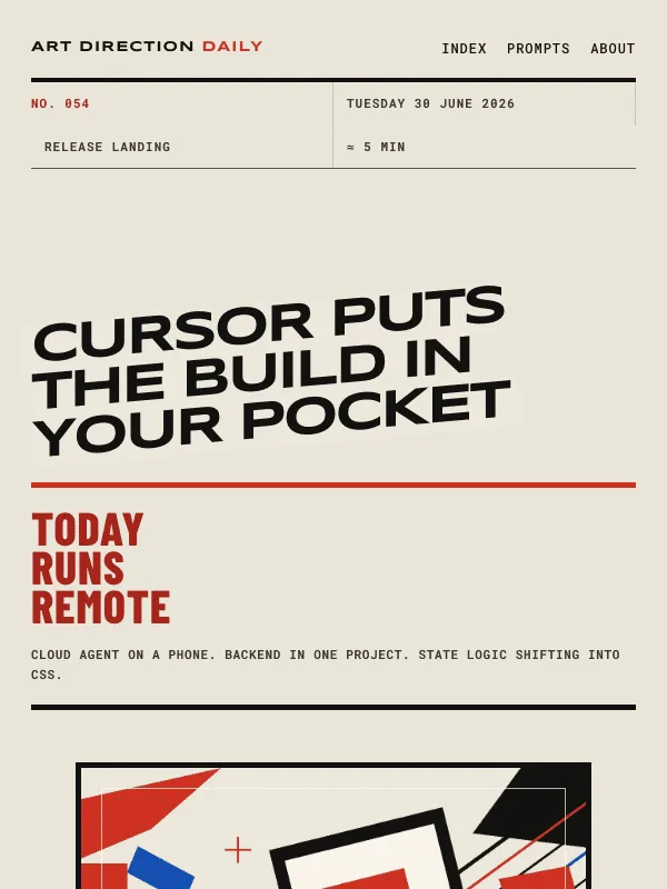
Visual result for the Italian Futurist Poster prompt

NO. 054 · 2026-06-30

Italian Futurist Poster

A release landing page built from mechanical diagonals, flat vermilion planes, and a phone-as-velocity hero plate.

Design a single web page as an Italian Futurist poster translated into a product release landing page. The page should teach type-as-shape over a hero product plate, with a structure that...

Syncopate + Barlow

ExpressiveLightProductPoster

Read the full prompt and reusable template
Design a single web page as an Italian Futurist poster translated into a product release landing page. The page should teach type-as-shape over a hero product plate, with a structure that avoids the generic startup landing pattern.

Palette: warm bone paper (#EDE8DC) as the dominant ground, near-black ink (#121210) for body text, vermilion (#CF3123) as the loud graphic accent, and electric blue (#144EB2) used sparingly for rules and one accent plane. Use flat planes only. No gradients, neon, glow, glass, or violet defaults. Keep all running text on bone or warm cream at WCAG AA.

Type: a mechanical extended geometric display face such as Syncopate for the hero headline and art-direction name; a clean grotesque such as Barlow for 19px body text at about 1.68 line-height; Barlow Condensed for big program numbers; a monospace such as Roboto Mono for issue metadata, source labels, and the prompt block. Tilt only the display headline and large slot numbers. Keep paragraphs, links, and metadata level and easy to read.

Layout: create an event or release landing page. Top: a compact nav and a ticket-style metadata strip with issue number, date, archetype, and reading time. Above the fold: one giant diagonal headline spanning the page, a narrow left ticket column with the day's thesis, and a large hero plate on the right showing an abstract product surface or phone with force lines and flat color planes. The headline may overlap the plate slightly. Below: a Today's Art Direction panel with a large decorative Futurismo mark and vocabulary tags. Then program slots for Tooling, Technique, Workflow, and Prompt Lab. Each slot uses a huge diagonal number as the marker, a level section label, a headline link, source credit, and one or two readable paragraphs.

Imagery: create one integral bitmap or SVG hero plate in the first viewport. It should be a flat poster-style product surface, like a tilted phone or web canvas, with blank bars and blocks instead of readable text. Use force lines and flat red, black, and blue planes to show velocity. The image must work in a 1200x630 crop and a 600x800 cover crop.

Components and guardrails: ticket metadata strip, product hero plate, art-direction vocabulary tags, program slot rows, one bold pull line, numbered sources, and a real copy button for the prompt. No fake countdown timers, fake search fields, toggles, dot-chip legends, emoji, 3D blobs, stock people, accent left-border stripes, or identical feature cards. Provide hover and focus states for real links and buttons with 120 to 180ms easing, plus a prefers-reduced-motion guard.
Design a single web page for [your topic] using the Italian Futurist Poster art direction.

Purpose: adapt this visual system to [your product, article, interface, or client brief]. Keep the layout grammar and visual lesson, but replace all story-specific references with your own content.

Visual system: A release landing page built from mechanical diagonals, flat vermilion planes, and a phone-as-velocity hero plate.

Starting point: Design a web page as an Italian Futurist poster translated into a product release landing page. The page should teach type-as-shape over a hero product plate, with a structure that...

Palette: paper: #EDE8DC, primary: #121210, secondary: #144EB2, accent: #CF3123, muted: #F8F3E8.

Type: Syncopate + Barlow + Roboto Mono. Keep running text readable, with clear hierarchy between display type, body copy, labels, and source or metadata marks.

Layout: preserve the original archetype's structural idea, then map it to your content. Define the hero, metadata, primary content sections, supporting image or artifact, prompt or CTA area, and source/reference area before styling individual cards.

Imagery: create or choose one integral visual artifact that teaches the pattern. It should be visible near the top of the page and work in both a wide social crop and a portrait cover crop. Avoid logos, watermarks, and fake readable text inside images.

Guardrails: avoid generic SaaS sections, purple-blue gradients, glass cards, fake controls, stock people, emoji decoration, pill-shaped everything, and identical feature cards. Build visible focus states, real links/buttons, responsive crop behavior, and a reduced-motion fallback.
Visual result for the Scandinavian Folk Textile prompt

NO. 053 · 2026-06-29

Scandinavian Folk Textile

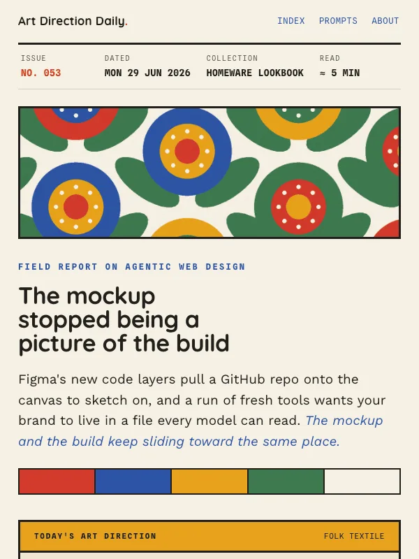
A homeware lookbook in printed cloth: oversized folk flowers in flat poppy, cobalt, and marigold on warm off-white.

Design a single web page as a Scandinavian folk textile, a homeware lookbook or ecommerce collection page in the Marimekko register: oversized folk flowers cut into flat unbroken color,...

Quicksand + Work Sans

ExpressiveLightIllustration

Read the full prompt and reusable template
Design a single web page as a Scandinavian folk textile, a homeware lookbook or ecommerce collection page in the Marimekko register: oversized folk flowers cut into flat unbroken color, printed on warm cloth. Not a dashboard, blog, or ranked list.

Ground: warm off-white (#F6F0E4) everywhere, with near-black ink body text (#21201C) at 19px and line-height about 1.68. Build from a small set of flat folk colors: poppy red (#D33A2C), cobalt (#2D54A6), marigold (#E8A21C), leaf green (#3E7A4F). Use large unbroken color fields, never gradients or neon. Links and the one italic line are cobalt; poppy is the loud accent for marks and one panel. Every word holds WCAG AA: white text only on the darker fields (cobalt, deep poppy, deep leaf), ink text on marigold and off-white.

Type: a warm geometric sans (Quicksand, 600 to 700) for the collection headline, the art-direction name, and entry titles; a humanist sans (Work Sans) for body and the single italic line; a monospace (Spline Sans Mono) for the edition cells, catalog numbers, source credits, and this recipe. One display size for the headline; never italicize body paragraphs.

Layout: build a homeware lookbook. A row of edition cells runs across the top (issue number in poppy, date, collection, reading time, mono uppercase). A full-width printed-cloth banner shows the folk-floral repeat (flat oversized flowers, half-drop tiled, no readable text). Below it, a collection intro: an oversized headline, a short deck, and a row of color swatches. Then The Collection: each story is a catalog entry, a two-column row pairing a solid color swatch panel (family name in white, a catalog number, a small folk-flower motif) with a copy column holding the title, a mono source credit, and one or two short paragraphs at about a 62ch measure. Color-zone the families: cobalt, deep poppy, deep leaf. Alternate which side the swatch panel sits on, like a lookbook spread. Set one centered sampler pullquote on a marigold field. Close with a numbered source index.

Components: edition cell row, printed-cloth banner, color swatch row, color-zoned catalog entries with solid swatch panels, small folk-flower motifs, centered sampler on a color field, mono source credits, a poppy copy button on the recipe. Borders are heavy 3px rules, square corners, no pills and no accent left-border stripes; shadows are absent. One restrained micro-interaction: entry-title links grow a poppy underline on hover at about 150ms, behind a prefers-reduced-motion guard. No fake search fields, toggles, or filters; no dot-separator metadata chains; no emoji; no readable text inside the textile image. Keep the pattern in banners and panels so all running text stays ink on off-white at WCAG AA.
Design a single web page for [your topic] using the Scandinavian Folk Textile art direction.

Purpose: adapt this visual system to [your product, article, interface, or client brief]. Keep the layout grammar and visual lesson, but replace all story-specific references with your own content.

Visual system: A homeware lookbook in printed cloth: oversized folk flowers in flat poppy, cobalt, and marigold on warm off-white.

Starting point: Design a web page as a Scandinavian folk textile, a homeware lookbook or ecommerce collection page in the Marimekko register: oversized folk flowers cut into flat unbroken color,...

Palette: paper: #F6F0E4, primary: #21201C, secondary: #2D54A6, accent: #D33A2C, muted: #E8A21C.

Type: Quicksand + Work Sans + Spline Sans Mono. Keep running text readable, with clear hierarchy between display type, body copy, labels, and source or metadata marks.

Layout: preserve the original archetype's structural idea, then map it to your content. Define the hero, metadata, primary content sections, supporting image or artifact, prompt or CTA area, and source/reference area before styling individual cards.

Imagery: create or choose one integral visual artifact that teaches the pattern. It should be visible near the top of the page and work in both a wide social crop and a portrait cover crop. Avoid logos, watermarks, and fake readable text inside images.

Guardrails: avoid generic SaaS sections, purple-blue gradients, glass cards, fake controls, stock people, emoji decoration, pill-shaped everything, and identical feature cards. Build visible focus states, real links/buttons, responsive crop behavior, and a reduced-motion fallback.
Visual result for the Mid-Century Jazz Record Sleeve prompt

NO. 052 · 2026-06-28

Mid-Century Jazz Record Sleeve

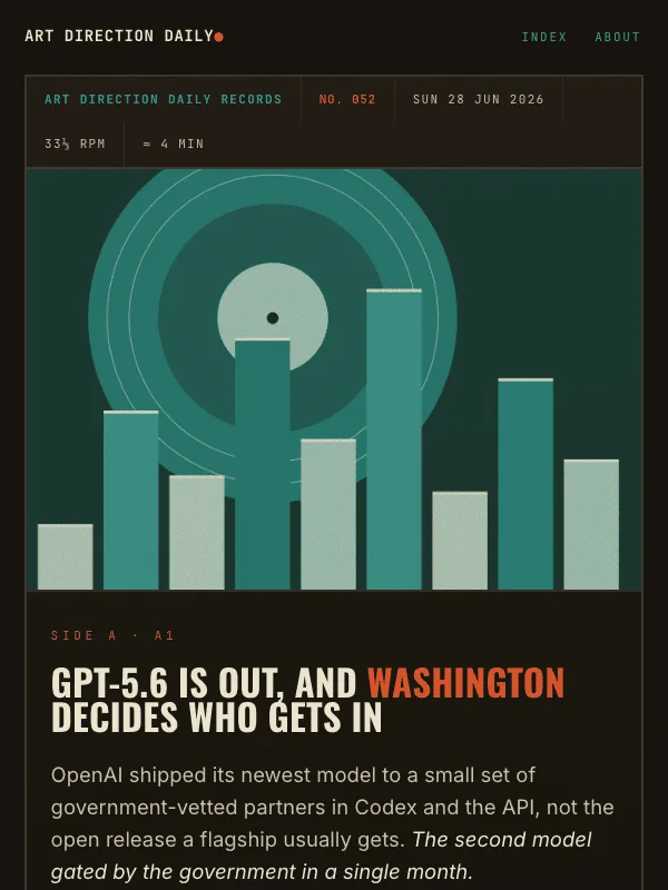
A Blue Note album cover: a cropped duotone plate, a tight condensed lockup, and the stories pressed as a track listing.

Design a single web page as a mid-century jazz record sleeve, an album or release landing page in the Blue Note / Reid Miles register: a cropped duotone cover, tightly tracked condensed...

Oswald + Inter

ExpressiveDark

Read the full prompt and reusable template
Design a single web page as a mid-century jazz record sleeve, an album or release landing page in the Blue Note / Reid Miles register: a cropped duotone cover, tightly tracked condensed type, and the content pressed as a track listing. Not a dashboard, blog, or card grid.

Ground: warm charcoal (#17140E) everywhere, with cream body text (#ECE3CE) at 19 to 20px and line-height about 1.7. Build the palette from one duotone color, teal (#37A496), plus cream and a single hot accent, rust-orange (#D9542B), used only for the catalog number, side labels, and one mark. Lean on negative space, not extra color. Links are cream with a teal underline; never set body text in rust or teal. Every word holds WCAG AA on charcoal. No gradients behind text, no glow, no neon.

Type: a tightly tracked condensed gothic (Oswald, uppercase) for the cover headline, the art-direction name, track titles, and one liner-note highlight; a clean grotesque (Inter) for body and the italic one-liner; a monospace (JetBrains Mono) for the catalog strip, side labels, track durations, source credits, and this recipe. One display size for the cover; never italicize body paragraphs.

Layout: build an album cover. A catalog meta strip runs across the top (label name, issue number in rust, date, RPM, running time, mono uppercase). The cover is a two-column lockup: an oversized condensed headline and short deck on the left, a hard-cropped duotone plate on the right (abstract still life in two inks, cream on charcoal, heavy film grain, no readable text). Below the cover, a liner-notes panel holds today's art direction. Then the stories are a track listing split into Side A and Side B, each side introduced by a side label and a thin rule. Each track is a row with a big condensed track number (A1, A2, B1) on the left, a mono duration on the right, and in the middle a mono kick label, a condensed title that links out, a mono source credit, and one or two short paragraphs at about a 66ch measure. Add a centered liner-note highlight between two rules. Close with a credits-style source list.

Components: catalog meta strip, two-column cover lockup, cropped duotone plate, liner-notes panel, side labels with rules, track rows with condensed numerals and mono durations, centered liner highlight, mono source credits, a rust copy button on the recipe. Borders are thin 1 to 2px rules, square corners, no pills and no accent left-border stripes; shadows are absent or minimal, never a diffuse glow. One restrained micro-interaction: track-title links grow a 2px teal underline on hover at about 160ms, behind a prefers-reduced-motion guard. No fake search fields, toggles, or filters; no dot-separator metadata chains; no emoji. Keep all body text cream on charcoal at WCAG AA.
Design a single web page for [your topic] using the Mid-Century Jazz Record Sleeve art direction.

Purpose: adapt this visual system to [your product, article, interface, or client brief]. Keep the layout grammar and visual lesson, but replace all story-specific references with your own content.

Visual system: A Blue Note album cover: a cropped duotone plate, a tight condensed lockup, and the stories pressed as a track listing.

Starting point: Design a web page as a mid-century jazz record sleeve, an album or release landing page in the Blue Note / Reid Miles register: a cropped duotone cover, tightly tracked condensed...

Palette: paper: #17140E, primary: #ECE3CE, secondary: #37A496, accent: #D9542B, muted: #C9BFA6.

Type: Oswald + Inter. Keep running text readable, with clear hierarchy between display type, body copy, labels, and source or metadata marks.

Layout: preserve the original archetype's structural idea, then map it to your content. Define the hero, metadata, primary content sections, supporting image or artifact, prompt or CTA area, and source/reference area before styling individual cards.

Imagery: create or choose one integral visual artifact that teaches the pattern. It should be visible near the top of the page and work in both a wide social crop and a portrait cover crop. Avoid logos, watermarks, and fake readable text inside images.

Guardrails: avoid generic SaaS sections, purple-blue gradients, glass cards, fake controls, stock people, emoji decoration, pill-shaped everything, and identical feature cards. Build visible focus states, real links/buttons, responsive crop behavior, and a reduced-motion fallback.
Visual result for the Psychedelic Concert Poster prompt

NO. 051 · 2026-06-27

Psychedelic Concert Poster

The briefing billed as a one-night gig poster, all concentric color, warped lockup, and a running order down the page.

Design a single web page as a one-night psychedelic concert poster, an event or release landing page in the idiom of a late-1960s dance-hall bill: vibrating complementary color, concentric...

Shrikhand + Hanken Grotesk

ExpressiveDarkPoster

Read the full prompt and reusable template
Design a single web page as a one-night psychedelic concert poster, an event or release landing page in the idiom of a late-1960s dance-hall bill: vibrating complementary color, concentric ornament, and a liquid display lockup. Not a dashboard, blog, or card grid.

Ground: deep saturated grape (#1B0E24) everywhere, with warm cream (#F4E7D4) body text at 19 to 20px and line-height about 1.7. Keep the loud color penned inside the masthead, the frame, and the act markers so the reading column stays a calm dark field. Accents are vibrating complementaries used as marks only: magenta (#FF3D9A), teal (#34E0CE), orange (#FF7A1A), gold-lime (#E8D44D). Links use the teal; never put body text in magenta or orange. Every word must hold WCAG AA on grape. No gradients behind text, no glow, no neon haze.

Type: a liquid retro display (Shrikhand) for the headliner, the art-direction name, act titles, and one marquee pullquote; a clean grotesque (Hanken Grotesk) for body and the italic one-liner; a monospace (Space Mono) for the promoter line, ticket-stub meta, set-time labels, source venues, and this recipe. One display size for the hero; never italicize body paragraphs.

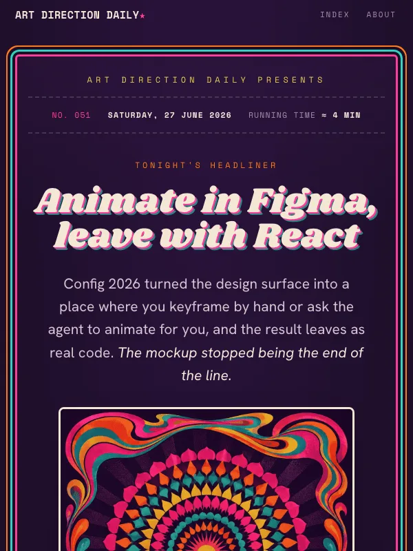
Layout: center the whole page as a poster inside a concentric ornamental frame built from stacked colored outlines (magenta, teal, orange, lime), with a small ornament dot in each corner. A mono promoter line ("...presents") sits above a dashed ticket-stub strip carrying edition number, date, and running time. The headliner hero is centered: a mono kicker, a big two-line liquid headline with a hard offset shadow in magenta and teal, a short deck, and a framed psychedelic plate (concentric rings, a central disc, a warped marquee band of blank type blocks, an abstract animation timeline with keyframe diamonds and a playhead, no readable text). Today's art direction is a credits panel with a name, an italic one-line summary, a glossary paragraph, and bordered vocabulary chips. The stories are a running order, not cards: each act is a two-column row with a big outlined order number and a set-time label on the left, and on the right a mono stage label (Headliner, Main support, Closer), a liquid act title that links out, a mono venue credit, and one or two short paragraphs at about a 64ch measure. A single liquid marquee line sits on a faint complementary band. Close with a credits-style source list.

Components: concentric poster frame, promoter line, dashed ticket stub, offset-shadow headliner lockup, framed psychedelic plate, credits panel, bordered vocab chips, running-order act rows with outlined numerals and rotated-square set-time dots, marquee pullquote, mono venue credits, a magenta copy button on the recipe. Card and panel radii 11 to 12px, chips 7px, no pill-shaping and no accent left-border stripes. One restrained micro-interaction: act-title links grow a 2px teal underline on hover at about 160ms, behind a prefers-reduced-motion guard. No fake search fields, toggles, or filters; no dot-separator metadata chains; no emoji. Keep all body text on grape at WCAG AA.
Design a single web page for [your topic] using the Psychedelic Concert Poster art direction.

Purpose: adapt this visual system to [your product, article, interface, or client brief]. Keep the layout grammar and visual lesson, but replace all story-specific references with your own content.

Visual system: The briefing billed as a one-night gig poster, all concentric color, warped lockup, and a running order down the page.

Starting point: Design a web page as a one-night psychedelic concert poster, an event or release landing page in the idiom of a late-1960s dance-hall bill: vibrating complementary color, concentric...

Palette: paper: #1B0E24, primary: #F4E7D4, secondary: #34E0CE, accent: #FF3D9A, muted: #FF7A1A.

Type: Shrikhand + Hanken Grotesk. Keep running text readable, with clear hierarchy between display type, body copy, labels, and source or metadata marks.

Layout: preserve the original archetype's structural idea, then map it to your content. Define the hero, metadata, primary content sections, supporting image or artifact, prompt or CTA area, and source/reference area before styling individual cards.

Imagery: create or choose one integral visual artifact that teaches the pattern. It should be visible near the top of the page and work in both a wide social crop and a portrait cover crop. Avoid logos, watermarks, and fake readable text inside images.

Guardrails: avoid generic SaaS sections, purple-blue gradients, glass cards, fake controls, stock people, emoji decoration, pill-shaped everything, and identical feature cards. Build visible focus states, real links/buttons, responsive crop behavior, and a reduced-motion fallback.
Visual result for the Matisse Cut-Paper Collage prompt

NO. 050 · 2026-06-26

Matisse Cut-Paper Collage

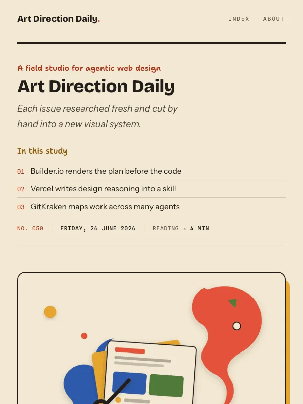
The briefing arranged as a design studio's portfolio, built from torn and cut paper shapes the way Matisse made his late gouaches.

Design a single web page as a design studio's portfolio of case studies, built in the idiom of Matisse cut-paper collage: flat organic shapes, bold unmixed color, layered paper with a soft...

Bricolage Grotesque + Instrument Sans

ExpressiveLightIllustration

Read the full prompt and reusable template
Design a single web page as a design studio's portfolio of case studies, built in the idiom of Matisse cut-paper collage: flat organic shapes, bold unmixed color, layered paper with a soft offset shadow. Page archetype is a portfolio or case-study page, not a dashboard, blog, or card grid.

Ground: warm cream paper (#F3E8D2) everywhere, with warm near-black ink (#211E1A) for body text at 20px and line-height about 1.66. Color lives in cut-paper shapes and labels, not behind the reading text. Three zone colors carry the three cases: coral (#E5533B), cobalt (#2E5AAB), leaf green (#4F7A3A), with marigold (#E5A52E) for the hero shadow and one pull-quote shape. Links and any colored text use darkened versions (coral #A8331A, cobalt #234887, leaf #3C5E2C) so every word holds WCAG AA on cream. No gradients, no glow, no neon.

Type: a warm characterful grotesque (Bricolage Grotesque) for the nameplate, hero, case headlines, and one pull-quote; a clean humanist sans (Instrument Sans) for body and the italic art-direction one-liner; an informal hand face (Shantell Sans) only for kickers, section labels, and small studio captions; a monospace (Spline Sans Mono) only for edition meta, source domains, and this recipe block. Keep one display size for the hero, never italicize body paragraphs.

Layout: a studio header pairs a large nameplate on one side with a selected-work index on the other, a short numbered list that links to each case, plus an edition meta row in mono cells separated by rules, not dots. The hero is two columns: a hand kicker, headline, and deck on one side, a framed cut-paper collage plate on the other (organic fronds, a layered stack of pages standing in for screens, abstract blocks and bars instead of readable text, paper scissors), the frame a cream card with a 2px ink keyline and a flat marigold offset shadow. Today's art direction is a spec card on a marigold-tinted panel with a style name, an italic one-line summary, a glossary paragraph, and bordered vocabulary chips. The three stories are numbered cases: each opens with an organic cut-paper shape in its zone color holding the case number, then a cream case card with a 2px ink keyline, a hand kicker, a linked headline, a mono maker credit and source domain, and one or two paragraphs at a 66ch measure; the first opens with a coral drop cap. One Bricolage pull-quote sits on a cut-paper marigold shape. A numbered reference list closes the issue.

Components: studio nameplate, selected-work index, framed collage plate, marigold spec card, organic shape section markers, cream case cards, drop cap, shape-backed pull-quote, mono maker credits, bordered vocabulary chips, a coral copy button on the recipe. Card and panel radii 14 to 18px, chips 7px, no pill-shaping. One restrained micro-interaction: headline links grow a 2px underline on hover at about 160ms and the hero plate shifts a few pixels, both behind a prefers-reduced-motion guard. No accent left-border stripes, no fake search fields or toggles, no dot-separator metadata chains, no emoji. Keep all body text on cream at WCAG AA.
Design a single web page for [your topic] using the Matisse Cut-Paper Collage art direction.

Purpose: adapt this visual system to [your product, article, interface, or client brief]. Keep the layout grammar and visual lesson, but replace all story-specific references with your own content.

Visual system: The briefing arranged as a design studio's portfolio, built from torn and cut paper shapes the way Matisse made his late gouaches.

Starting point: Design a web page as a design studio's portfolio of case studies, built in the idiom of Matisse cut-paper collage: flat organic shapes, bold unmixed color, layered paper with a soft...

Palette: paper: #F3E8D2, primary: #211E1A, secondary: #2E5AAB, accent: #E5533B, muted: #4F7A3A.

Type: Bricolage Grotesque + Instrument Sans. Keep running text readable, with clear hierarchy between display type, body copy, labels, and source or metadata marks.

Layout: preserve the original archetype's structural idea, then map it to your content. Define the hero, metadata, primary content sections, supporting image or artifact, prompt or CTA area, and source/reference area before styling individual cards.

Imagery: create or choose one integral visual artifact that teaches the pattern. It should be visible near the top of the page and work in both a wide social crop and a portrait cover crop. Avoid logos, watermarks, and fake readable text inside images.

Guardrails: avoid generic SaaS sections, purple-blue gradients, glass cards, fake controls, stock people, emoji decoration, pill-shaped everything, and identical feature cards. Build visible focus states, real links/buttons, responsive crop behavior, and a reduced-motion fallback.
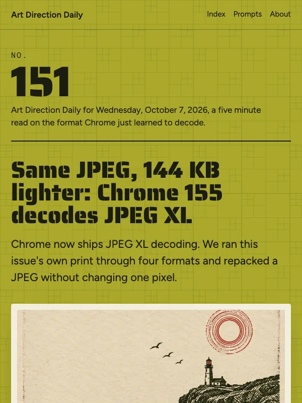
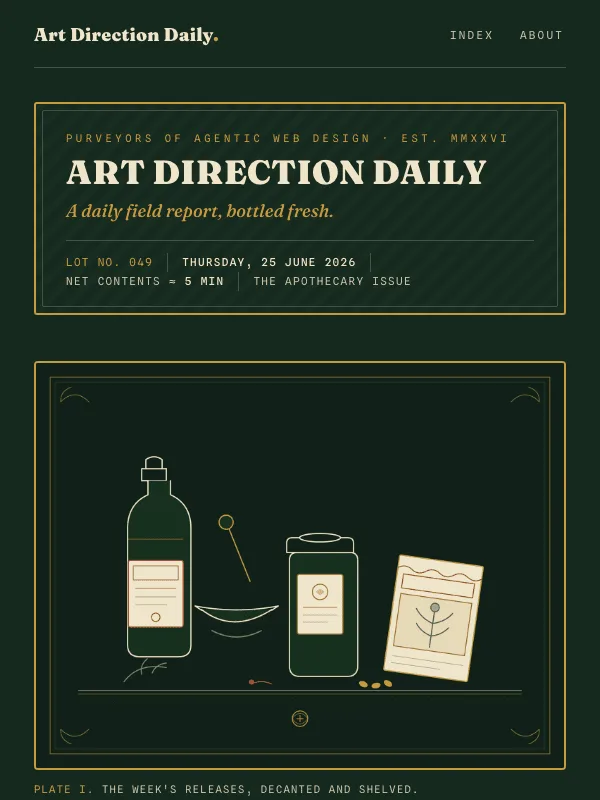
Visual result for the Vintage Apothecary Label prompt

NO. 049 · 2026-06-25

Vintage Apothecary Label

The briefing bottled as an apothecary storefront: framed label cartouches, engraved botanicals, and a metadata block read like the back of a remedy label.

Design a single web page as a vintage apothecary and seed-packet label that opens into a product-detail shelf: a briefing of three linked stories. Page archetype is an apothecary...

Fraunces + Newsreader

ExpressiveDark

Read the full prompt and reusable template
Design a single web page as a vintage apothecary and seed-packet label that opens into a product-detail shelf: a briefing of three linked stories. Page archetype is an apothecary product-detail page, not a dashboard, blog, or card grid.

Ground: deep botanical bottle green (#15291E) as the surrounding glass, with a warm parchment label field (#EFE5CC) for every reading surface and dark sepia ink (#241E15) for body text on it. Antique brass (#C79A3E) for keylines and ornament, deep rust (#9A3E22) for links and marks on parchment, a sage (#4E5C3C) and a darker brass as the two other zone colors. No gradients, no glow, no neon.

Type: a characterful high-contrast old-style serif (Fraunces) for the house name, hero, headlines, and one italic banner pull-quote; a readable book serif (Newsreader) for body at 20px with line-height about 1.7; a monospace (Spline Sans Mono) only for lot numbers, the facts labels, kickers, and this formula block. Keep one display size for the hero, never italicize body.

Layout: a double-keyline brass cartouche masthead on the green carries the house name and a lot line of edition, date, and net contents in mono cells separated by rules, not dots. The hero is two columns: an engraved apothecary plate on one side (bottles, mortar and pestle, seed packet, botanical sprigs, cream line work, no readable text), a kicker, headline, and deck on the other, set in cream on the green. Today's art direction is a facts panel dressed as the back of a label: a parchment card with a header row, a style name, an italic one-line summary, a glossary paragraph, and an active-ingredients list of bordered vocab chips. The three stories are numbered preparations: each opens with a filled label band carrying a botanical mark, a number, a section name, and a lot tag, then a parchment label field with a linked headline, a maker credit with the source domain, and one or two paragraphs at a 66ch measure; the first opens with a rust drop cap. One italic pull-quote sits between two brass rules as an engraved banner. A numbered provenance list closes the issue.

Components: brass cartouche, lot line, engraved plate, facts panel, filled section bands with botanical marks, parchment label fields, drop cap, banner pull-quote, mono maker credits, bordered vocab chips, a brass copy tag on the formula. Rectangular labels at 3 to 5px radius, chips at 3px, no pill-shaping. One restrained micro-interaction: headline links grow a rust underline on hover at about 160ms and the plate lifts a few pixels, both behind a prefers-reduced-motion guard. No accent left-border stripes, no fake search fields or toggles, no dot-separator metadata chains, no emoji. Keep body text on the parchment fields at WCAG AA, never sepia ink on the green.
Design a single web page for [your topic] using the Vintage Apothecary Label art direction.

Purpose: adapt this visual system to [your product, article, interface, or client brief]. Keep the layout grammar and visual lesson, but replace all story-specific references with your own content.

Visual system: The briefing bottled as an apothecary storefront: framed label cartouches, engraved botanicals, and a metadata block read like the back of a remedy label.

Starting point: Design a web page as a vintage apothecary and seed-packet label that opens into a product-detail shelf: a briefing of three linked stories. Page archetype is an apothecary...

Palette: paper: #15291E, primary: #EFE5CC, secondary: #C79A3E, accent: #9A3E22, muted: #7C8A5E.

Type: Fraunces + Newsreader. Keep running text readable, with clear hierarchy between display type, body copy, labels, and source or metadata marks.

Layout: preserve the original archetype's structural idea, then map it to your content. Define the hero, metadata, primary content sections, supporting image or artifact, prompt or CTA area, and source/reference area before styling individual cards.

Imagery: create or choose one integral visual artifact that teaches the pattern. It should be visible near the top of the page and work in both a wide social crop and a portrait cover crop. Avoid logos, watermarks, and fake readable text inside images.

Guardrails: avoid generic SaaS sections, purple-blue gradients, glass cards, fake controls, stock people, emoji decoration, pill-shaped everything, and identical feature cards. Build visible focus states, real links/buttons, responsive crop behavior, and a reduced-motion fallback.
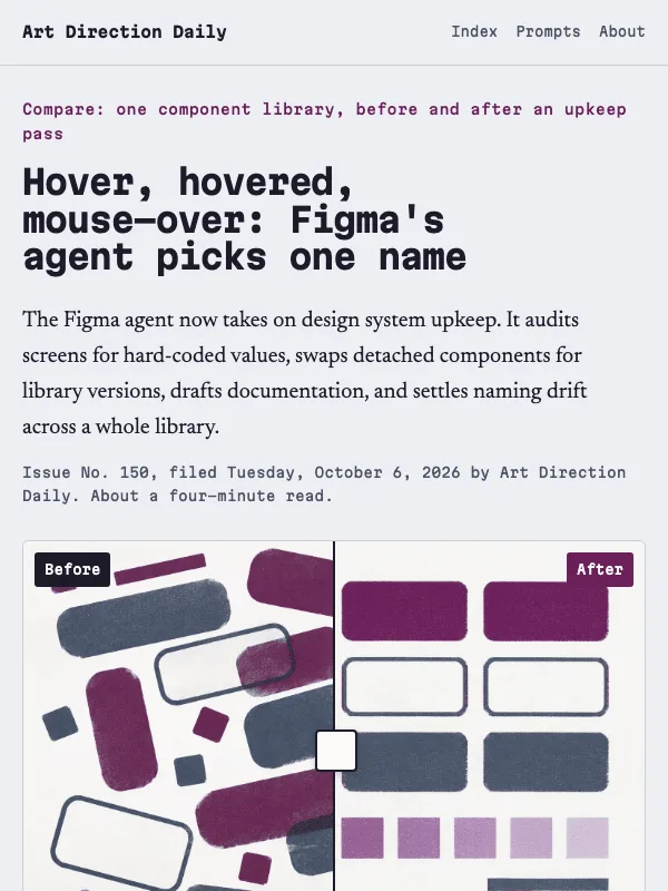
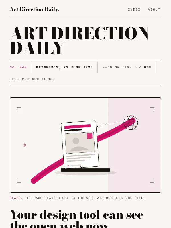
Visual result for the Fashion Magazine Editorial prompt

NO. 048 · 2026-06-24

Fashion Magazine Editorial

The briefing as a high-fashion cover and feature spread: a Didone nameplate, oversized cover lines that double as navigation, one image set as art, and wide white margins.

Design a single web page as a high-fashion magazine cover that opens into a short feature spread: a briefing of three linked stories. Page archetype is a fashion cover plus editorial...

Bodoni Moda + Hanken Grotesk

ExpressiveLightEditorialProduct

Read the full prompt and reusable template
Design a single web page as a high-fashion magazine cover that opens into a short feature spread: a briefing of three linked stories. Page archetype is a fashion cover plus editorial spread, not a dashboard, blog, or card grid.

Ground: stark warm white (#F8F6F2), near-black ink (#15110E) for text, one couture accent in hot magenta (#D8126B) for marks, with a deep magenta (#A8124F) for links so they hold WCAG AA, and a quiet blush field (#F4E7EC) to color-zone one panel. No gradients, no glow, no neon.

Type: a Didone display (Bodoni Moda) for the nameplate, hero line, cover blurbs, and one large italic pull-quote; a tight modern grotesque (Hanken Grotesk) for body at 19px with line-height about 1.65; a monospace (Space Mono) only for the dateline cells, kickers, and this prompt block. Keep one display size for the hero, never italicize body.

Layout: a giant uppercase Didone nameplate spans the top, with a dateline rule below carrying edition, date, reading time, and an issue tag in mono cells separated by space, not dots. The cover is two columns: an oversized hero headline and deck on the left over a list of cover lines, each cover line a tracked-caps label plus a Didone teaser that links to its section; and one framed editorial image on the right, set as art, no readable text inside it. Stories run as feature openers: a mono kicker, a Didone headline link, a credit line in tracked caps with the source domain, then one or two plain paragraphs at a 66ch measure; the first opens with a magenta drop cap. One huge italic pull-quote sits on the white as art. A numbered Sources list closes the issue.

Components: nameplate, dateline rule, cover lines that double as navigation, framed image plate, drop cap, pull-quote as art, tracked-caps credits, bordered vocab chips. Cards and panels at 12 to 14px radius, chips at 6px, the image frame near-square, full circles only for genuine dots. One restrained micro-interaction: cover lines and headline links grow an underline on hover with about 160ms easing, behind a prefers-reduced-motion guard. No pill-shaping everything, no accent left-border stripes, no fake search fields or toggles, no dot-separator metadata chains, no emoji.
Design a single web page for [your topic] using the Fashion Magazine Editorial art direction.

Purpose: adapt this visual system to [your product, article, interface, or client brief]. Keep the layout grammar and visual lesson, but replace all story-specific references with your own content.

Visual system: The briefing as a high-fashion cover and feature spread: a Didone nameplate, oversized cover lines that double as navigation, one image set as art, and wide white margins.

Starting point: Design a web page as a high-fashion magazine cover that opens into a short feature spread: a briefing of three linked stories. Page archetype is a fashion cover plus editorial...

Palette: paper: #f8f6f2, primary: #15110e, secondary: #5f574c, accent: #d8126b, muted: #f4e7ec.

Type: Bodoni Moda + Hanken Grotesk. Keep running text readable, with clear hierarchy between display type, body copy, labels, and source or metadata marks.

Layout: preserve the original archetype's structural idea, then map it to your content. Define the hero, metadata, primary content sections, supporting image or artifact, prompt or CTA area, and source/reference area before styling individual cards.

Imagery: create or choose one integral visual artifact that teaches the pattern. It should be visible near the top of the page and work in both a wide social crop and a portrait cover crop. Avoid logos, watermarks, and fake readable text inside images.

Guardrails: avoid generic SaaS sections, purple-blue gradients, glass cards, fake controls, stock people, emoji decoration, pill-shaped everything, and identical feature cards. Build visible focus states, real links/buttons, responsive crop behavior, and a reduced-motion fallback.
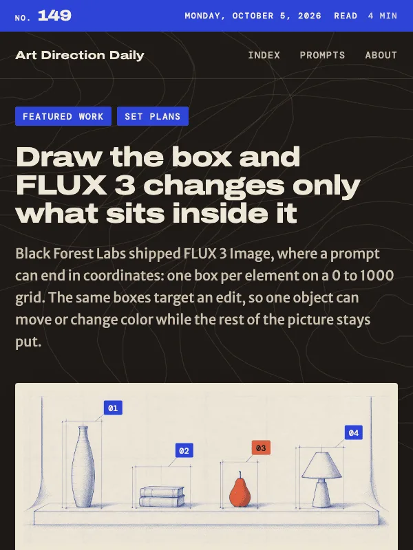
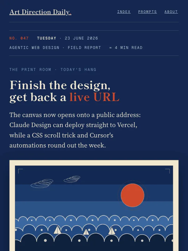
Visual result for the Aizuri-e Woodblock Print prompt

NO. 047 · 2026-06-23

Aizuri-e Woodblock Print

The briefing hung as an indigo print exhibition: cream plates matted on a deep blue wall, vermilion seals, scalloped wave crests, and museum labels carrying the metadata.

Design a single web page as a museum print room hanging an aizuri-e (indigo woodblock) exhibition: a short briefing of linked stories shown as framed prints on a gallery wall. Page...

Shippori Mincho B1 + Source Serif 4

Illustration

Read the full prompt and reusable template
Design a single web page as a museum print room hanging an aizuri-e (indigo woodblock) exhibition: a short briefing of linked stories shown as framed prints on a gallery wall. Page archetype is an exhibition microsite, not a dashboard, blog, or card grid.

Ground: a deep indigo gallery wall (#14274F) is the page. Each story is a cream washi print panel (#F0E7D0) matted and hung on the wall, with sumi ink text (#211D16) at 20px, line-height 1.7, measure 66 to 68 characters, never justified. Accents: a low vermilion (#CF4A2C) for plate numbers and seals, a sky indigo (#6F9BC4) for labels on the dark wall, a quiet ochre (#BD8420) used sparingly. Links on cream use a deep indigo ink (#1F4A82) so they stay WCAG AA; never set body text in vermilion or on the dark wall.

Layout: a wall placard masthead reads like a museum object label (edition number, weekday and date, collection, reading time) in mono small caps. The hero hangs one large framed woodblock plate beside the title. Stories run as numbered plates (Plate II, III, IV): a plaque with a vermilion roman numeral and a mono section kicker, a serif headline link, one or two plain paragraphs, and a museum caption line (source, kind, date). One large display pull-quote sits directly on the indigo wall. An exhibition-checklist Sources list closes the show.

Type: Shippori Mincho B1 for the display headline, plate headlines, and section heads; Source Serif 4 for body and the single italic art-direction summary; Geist Mono for labels, the wall placard, captions, and the prompt block.

Components: framed and matted print panels with a tight drop shadow on the dark wall, mono wall labels, a vermilion seal mark, scalloped key-line wave motifs confined to one generated plate. Generate one woodblock image only: flat indigo tonal bands, a vermilion sun, scalloped foam wave crests outlined in cream, a few abstract sails, corner registration marks, and a seal, with no readable text inside the image. Add one restrained micro-interaction, a hung print that lifts slightly on hover with a tight shadow, behind a prefers-reduced-motion guard. No gradients, no glow, no neon, no pill-shaping everything, no accent left-border stripes, no fake search fields or toggles, no emoji.
Design a single web page for [your topic] using the Aizuri-e Woodblock Print art direction.

Purpose: adapt this visual system to [your product, article, interface, or client brief]. Keep the layout grammar and visual lesson, but replace all story-specific references with your own content.

Visual system: The briefing hung as an indigo print exhibition: cream plates matted on a deep blue wall, vermilion seals, scalloped wave crests, and museum labels carrying the metadata.

Starting point: Design a web page as a museum print room hanging an aizuri-e (indigo woodblock) exhibition: a short briefing of linked stories shown as framed prints on a gallery wall. Page...

Palette: paper: #14274f, primary: #f0e7d0, secondary: #6f9bc4, accent: #cf4a2c, muted: #bd8420.

Type: Shippori Mincho B1 + Source Serif 4. Keep running text readable, with clear hierarchy between display type, body copy, labels, and source or metadata marks.

Layout: preserve the original archetype's structural idea, then map it to your content. Define the hero, metadata, primary content sections, supporting image or artifact, prompt or CTA area, and source/reference area before styling individual cards.

Imagery: create or choose one integral visual artifact that teaches the pattern. It should be visible near the top of the page and work in both a wide social crop and a portrait cover crop. Avoid logos, watermarks, and fake readable text inside images.

Guardrails: avoid generic SaaS sections, purple-blue gradients, glass cards, fake controls, stock people, emoji decoration, pill-shaped everything, and identical feature cards. Build visible focus states, real links/buttons, responsive crop behavior, and a reduced-motion fallback.
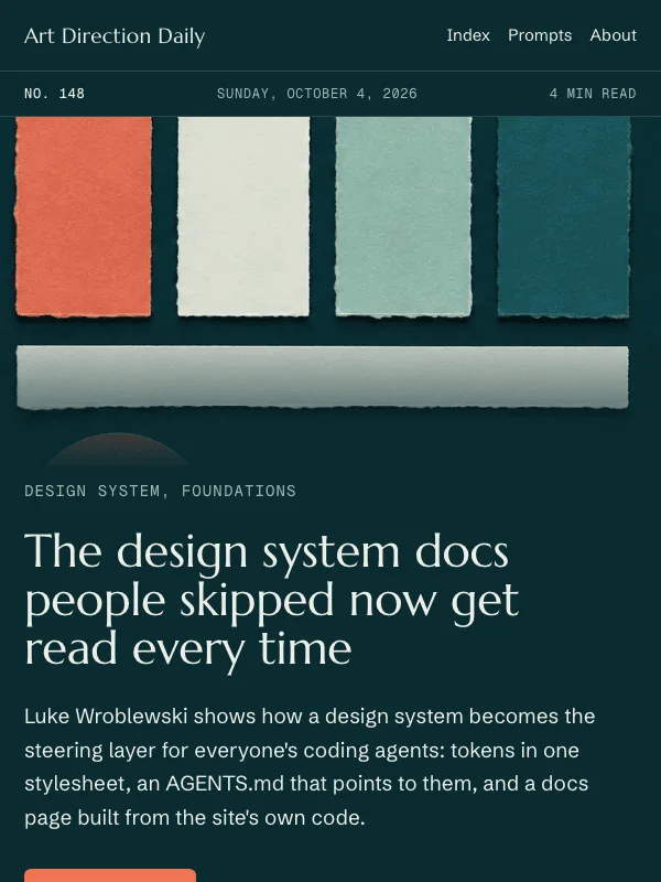
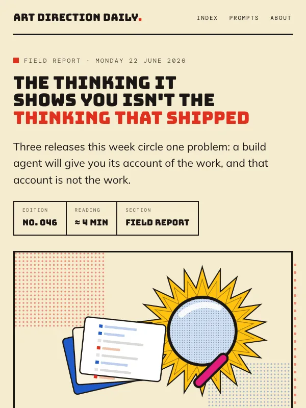
Visual result for the Pop Art Screenprint Product Page prompt

NO. 046 · 2026-06-22

Pop Art Screenprint Product Page

The briefing as a comic-panel product page: flat primaries, thick black keylines, Ben-Day halftone fields, and speech bubbles doing real label work.

Design a single web page as a Pop Art screenprint product feature page presenting a short briefing of linked stories. Page archetype: a comic-panel landing page that showcases one hero...

Bungee + Mulish

ExpressiveProductPosterForms

Read the full prompt and reusable template
Design a single web page as a Pop Art screenprint product feature page presenting a short briefing of linked stories. Page archetype: a comic-panel landing page that showcases one hero plate and then lists the news as product features, not a dashboard, blog, or card grid.

Ground: a bright warm screenprint cream (#F5ECCF) with a lifted panel (#FBF5E2). Text is ink (#1A1714) at 19px, line-height 1.68, measure near 64 characters, never justified. Use flat pop primaries: pop red (#E0301F) for marks and the Tooling zone, cobalt (#1E5AC8) for the Technique zone, pop yellow (#FFC20E) for the Workflow zone, hot pink (#E11C7C) used once as accent. Inline links use a deeper red (#B5180B) so they stay WCAG AA on cream; never set body text in yellow or bright red. Keep all color in marks, fills, and dot fields, not under the words.

Layout: a product showcase. A hero splits into a Bungee headline, deck, and a spec strip of metadata cells with thick keylines on the left, and a framed hero plate on the right backed by a red Ben-Day halftone field. The news runs as three numbered feature blocks (01, 02, 03), each opened by a zone-colored top bar, a halftone number bubble, a solid-filled speech-bubble kicker, a linked Bungee headline, one or two plain paragraphs, and a dashed source stamp. One giant display pull-quote sits on a yellow halftone field. A product-info card carries the art-direction note.

Type: Bungee for the hero headline, feature headlines, numbers, and the one pull-quote; Mulish for body and the single italic art-direction summary; DM Mono for labels, the spec strip, stamps, and the prompt block.

Components: speech bubbles and stamps as real labels (not dead chrome), Ben-Day dot fields for texture, thick 2.5 to 3.5px black keylines, flat color zoning by section. Include one generated plate: a comic magnifying glass over a fanned stack of file cards marked with abstract red and blue diff bars, a yellow starburst behind it, and a halftone field, all flat fills with heavy outlines and no readable text inside the image. Add one restrained micro-interaction, a link underline that flips from yellow to red on hover, behind a prefers-reduced-motion guard. No gradients, no glow, no neon, no pill-shaping everything, no accent left-border stripes, no fake search fields or toggles, no emoji.
Design a single web page for [your topic] using the Pop Art Screenprint Product Page art direction.

Purpose: adapt this visual system to [your product, article, interface, or client brief]. Keep the layout grammar and visual lesson, but replace all story-specific references with your own content.

Visual system: The briefing as a comic-panel product page: flat primaries, thick black keylines, Ben-Day halftone fields, and speech bubbles doing real label work.

Starting point: Design a web page as a Pop Art screenprint product feature page presenting a short briefing of linked stories. Page archetype: a comic-panel landing page that showcases one hero...

Palette: paper: #F5ECCF, primary: #1A1714, secondary: #1E5AC8, accent: #E0301F, muted: #FFC20E.

Type: Bungee + Mulish. Keep running text readable, with clear hierarchy between display type, body copy, labels, and source or metadata marks.

Layout: preserve the original archetype's structural idea, then map it to your content. Define the hero, metadata, primary content sections, supporting image or artifact, prompt or CTA area, and source/reference area before styling individual cards.

Imagery: create or choose one integral visual artifact that teaches the pattern. It should be visible near the top of the page and work in both a wide social crop and a portrait cover crop. Avoid logos, watermarks, and fake readable text inside images.

Guardrails: avoid generic SaaS sections, purple-blue gradients, glass cards, fake controls, stock people, emoji decoration, pill-shaped everything, and identical feature cards. Build visible focus states, real links/buttons, responsive crop behavior, and a reduced-motion fallback.
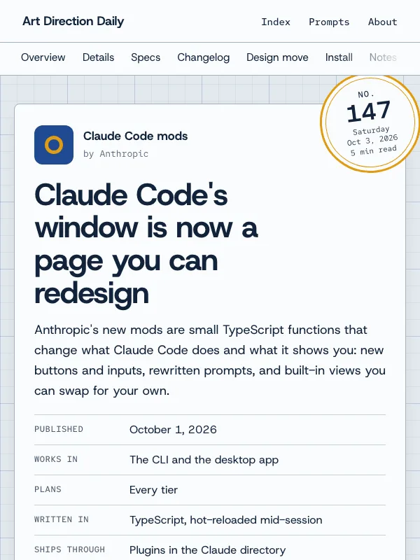
Visual result for the Art Nouveau Editorial prompt

NO. 045 · 2026-06-21

Art Nouveau Editorial

The briefing as an illustrated Art Nouveau feature: a decorated margin, a gold drop-cap, and whiplash ornament framing one calm reading column on deep aubergine.

Design a single web page as an illustrated Art Nouveau editorial feature presenting a short briefing of linked stories. Page archetype: a long-form magazine feature with a decorated margin,...

Yeseva One + Lora

EditorialProduct

Read the full prompt and reusable template
Design a single web page as an illustrated Art Nouveau editorial feature presenting a short briefing of linked stories. Page archetype: a long-form magazine feature with a decorated margin, not a dashboard, blog, or card grid.

Ground: deep aubergine jewel (#271629) with a lifted plum surface (#32203A). Text is warm parchment (#F2E7D2) at 20px, line-height 1.72, measure near 64 characters, never justified. Use a Mucha-register palette: antique gold (#C8A24C) for links, rules, drop cap, and all ornament; olive-sage (#9FA977) and muted mauve (#C2A6BD) to color-zone the chapters. Keep every text color WCAG AA on aubergine; let color live in the ornament, not under the words.

Layout: an asymmetric two-part page. A decorated left rail (sticky on desktop, stacked on mobile) holds an ornamental nameplate, edition metadata as label-value rows, and a contents index. The story runs as one framed reading column: a thin gold keyline border with whiplash corner flourishes, a Yeseva One headline, a deck, a single illustrated plate, then a lead paragraph opened by one gold drop-cap. Sections are numbered chapter heads (I, II, III) with a spaced-caps label and a whiplash hairline divider in the chapter's zone color; each story is a kicker, a linked headline, one or two plain paragraphs, and the source domain. Exactly one italic display pull-quote.

Type: Yeseva One for the display headline, chapter numerals, and drop cap; Lora for body; Cormorant Garamond italic for the one pull-quote and the art-direction summary; IBM Plex Mono for labels, metadata, and the prompt block.

Include one generated plate: a symmetrical Art Nouveau panel with a gold sunburst halo, a stylized iris, mirrored whiplash scrollwork, sage leaves, and small gold-keyline cartouches of abstract page layouts, all flat color fields with gold keylines and no readable text inside the image. Add one restrained micro-interaction, a link underline that warms to gold on hover, behind a prefers-reduced-motion guard. No gradients, no glow, no neon, no pill-shaping everything, no accent left-border stripes, no fake search fields or toggles, no emoji.
Design a single web page for [your topic] using the Art Nouveau Editorial art direction.

Purpose: adapt this visual system to [your product, article, interface, or client brief]. Keep the layout grammar and visual lesson, but replace all story-specific references with your own content.

Visual system: The briefing as an illustrated Art Nouveau feature: a decorated margin, a gold drop-cap, and whiplash ornament framing one calm reading column on deep aubergine.

Starting point: Design a web page as an illustrated Art Nouveau editorial feature presenting a short briefing of linked stories. Page archetype: a long-form magazine feature with a decorated margin,...

Palette: paper: #271629, primary: #F2E7D2, secondary: #9FA977, accent: #C8A24C, muted: #C2A6BD.

Type: Yeseva One + Lora. Keep running text readable, with clear hierarchy between display type, body copy, labels, and source or metadata marks.

Layout: preserve the original archetype's structural idea, then map it to your content. Define the hero, metadata, primary content sections, supporting image or artifact, prompt or CTA area, and source/reference area before styling individual cards.

Imagery: create or choose one integral visual artifact that teaches the pattern. It should be visible near the top of the page and work in both a wide social crop and a portrait cover crop. Avoid logos, watermarks, and fake readable text inside images.

Guardrails: avoid generic SaaS sections, purple-blue gradients, glass cards, fake controls, stock people, emoji decoration, pill-shaped everything, and identical feature cards. Build visible focus states, real links/buttons, responsive crop behavior, and a reduced-motion fallback.
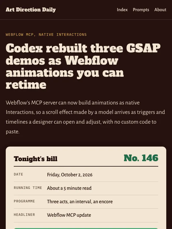
Visual result for the Mid-Century Modern Lifestyle Brand prompt

NO. 044 · 2026-06-20

Mid-Century Modern Lifestyle Brand

The briefing as a warm homeware catalog: color-zoned departments, atomic-era marks, flat Girard color on cream.

Design a single web page as a mid-century-modern lifestyle brand's product catalog presenting a short briefing of linked stories. Page archetype: an ecommerce category or lookbook page, not...

Familjen Grotesk + Figtree

ProductReference

Read the full prompt and reusable template
Design a single web page as a mid-century-modern lifestyle brand's product catalog presenting a short briefing of linked stories. Page archetype: an ecommerce category or lookbook page, not a dashboard, blog, or card-grid template.

Ground: warm cream (#F4E9D4) with a lighter card paper (#FBF4E6). Body ink is warm near-black (#2B2622). Use a warm multi-hue mid-century palette in the Alexander Girard register: burnt orange (#C8501E, links and brand marks), teal (#2C7A6B), marigold (#D9A328), and avocado (#6B7D3A). Links in a darker rust (#A8410F) so small text stays WCAG AA on cream.

Layout: a catalog masthead with a brand wordmark and a row of issue metadata cells; a campaign hero with one large headline and a deck; then one full-width flat still-life plate; then a product grid color-zoned by department. Do not use three identical feature cards. Color-zone the structure instead: each department (Tooling, Technique, Workflow) is a panel tinted in its hue with a solid filled department band on top, carrying a small atomic motif mark (starburst, boomerang, or concentric circle) in the zone color, a slab-or-sans department name in spaced caps, and a department number.

Each story is a product card: a mono kicker, a product-name headline that links out, one or two plain caption sentences, and the source domain named like a maker. Type: a warm humanist or geometric sans for display and product names (Familjen Grotesk), a friendly sans for body (Figtree) at 19px with line-height 1.7 and a measure near 66 characters, and a mono (DM Mono) only for tiny labels, metadata, and swatch hex codes. Exactly one italic display pullquote.

Include one generated plate: a flat, mid-century still life (a starburst clock, a tripod sputnik lamp, a boomerang table with a ceramic vase and a spiky plant, a low lounge chair) in flat color fields with a clean keyline and no readable text inside the image. Add one restrained micro-interaction, an underline that shifts to orange on link hover, behind a prefers-reduced-motion guard. Keep WCAG AA on every text color against its real background. No gradients, no glow, no neon, no pill-shaping everything, no accent left-border stripes, no fake search fields or toggles, no emoji.
Design a single web page for [your topic] using the Mid-Century Modern Lifestyle Brand art direction.

Purpose: adapt this visual system to [your product, article, interface, or client brief]. Keep the layout grammar and visual lesson, but replace all story-specific references with your own content.

Visual system: The briefing as a warm homeware catalog: color-zoned departments, atomic-era marks, flat Girard color on cream.

Starting point: Design a web page as a mid-century-modern lifestyle brand's product catalog presenting a short briefing of linked stories. Page archetype: an ecommerce category or lookbook page, not...

Palette: paper: #F4E9D4, primary: #2B2622, secondary: #2C7A6B, accent: #C8501E, muted: #6B6253.

Type: Familjen Grotesk + Figtree. Keep running text readable, with clear hierarchy between display type, body copy, labels, and source or metadata marks.

Layout: preserve the original archetype's structural idea, then map it to your content. Define the hero, metadata, primary content sections, supporting image or artifact, prompt or CTA area, and source/reference area before styling individual cards.

Imagery: create or choose one integral visual artifact that teaches the pattern. It should be visible near the top of the page and work in both a wide social crop and a portrait cover crop. Avoid logos, watermarks, and fake readable text inside images.

Guardrails: avoid generic SaaS sections, purple-blue gradients, glass cards, fake controls, stock people, emoji decoration, pill-shaped everything, and identical feature cards. Build visible focus states, real links/buttons, responsive crop behavior, and a reduced-motion fallback.
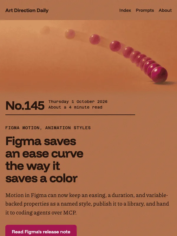
Visual result for the Art Deco Travel Poster prompt

NO. 043 · 2026-06-19

Art Deco Travel Poster

The briefing as a grand-voyage travel poster: a symmetrical gold-hairline crest, stepped cartouche frames, and a sunburst over deep teal.

Design a single web page as an Art Deco travel poster presenting a short briefing of linked stories. Page archetype: a grand-voyage destination poster, symmetrical and centered, not a card...

Cinzel + Spectral

Poster

Read the full prompt and reusable template
Design a single web page as an Art Deco travel poster presenting a short briefing of linked stories. Page archetype: a grand-voyage destination poster, symmetrical and centered, not a card grid or dashboard.

Ground: deep teal (#0C2B2E) with slightly lighter teal panels (#0F373A). Text is warm cream (#F3E8CE). Gold (#D6B25E) is the only metallic and is reserved for hairline rules, frame corners, section numerals, and link underlines. Emerald (#2C8C70) is a decorative field and mark color only, never a surface behind small text.

Layout: one centered reading column about 680px wide, no left-right split. Open with a small mono crest line, a thin gold rule with a tiny diamond, then the headline inside a stepped cartouche, a rectangular frame with an inset gold hairline and small bracket corners. Under the deck, place a ticket-stub metadata strip: three perforated cells (departure date, issue number, reading time) divided by dashed gold rules. Mark each section as a numbered port of call: a gold square holding a Roman numeral, flanked by thin gold wings, with the section name in spaced small caps.

Type: display in a monumental engraved serif (Cinzel) for the headline, section numerals, and item titles; body in a transitional serif (Spectral) at 19px, line-height 1.7, measure near 68 characters, cream on teal, never colored body text; tiny labels in a mono (Space Mono) in uppercase with wide tracking. Use exactly one italic display pullquote.

Include one generated plate as the poster image: a streamlined Deco scene (an ocean liner or stepped gateway under a radiating sunburst) in emerald, gold, and cream on teal, with no readable text inside the image. Add one restrained micro-interaction, a gold underline that brightens on link hover, behind a prefers-reduced-motion guard. Keep WCAG AA on every text color against its real background. No gradients, no glow, no neon, no pill-shaped everything, no fake search fields or toggles.
Design a single web page for [your topic] using the Art Deco Travel Poster art direction.

Purpose: adapt this visual system to [your product, article, interface, or client brief]. Keep the layout grammar and visual lesson, but replace all story-specific references with your own content.

Visual system: The briefing as a grand-voyage travel poster: a symmetrical gold-hairline crest, stepped cartouche frames, and a sunburst over deep teal.

Starting point: Design a web page as an Art Deco travel poster presenting a short briefing of linked stories. Page archetype: a grand-voyage destination poster, symmetrical and centered, not a card...

Palette: paper: #0C2B2E, primary: #F3E8CE, secondary: #2C8C70, accent: #D6B25E, muted: #A9BDB4.

Type: Cinzel + Spectral. Keep running text readable, with clear hierarchy between display type, body copy, labels, and source or metadata marks.

Layout: preserve the original archetype's structural idea, then map it to your content. Define the hero, metadata, primary content sections, supporting image or artifact, prompt or CTA area, and source/reference area before styling individual cards.

Imagery: create or choose one integral visual artifact that teaches the pattern. It should be visible near the top of the page and work in both a wide social crop and a portrait cover crop. Avoid logos, watermarks, and fake readable text inside images.

Guardrails: avoid generic SaaS sections, purple-blue gradients, glass cards, fake controls, stock people, emoji decoration, pill-shaped everything, and identical feature cards. Build visible focus states, real links/buttons, responsive crop behavior, and a reduced-motion fallback.
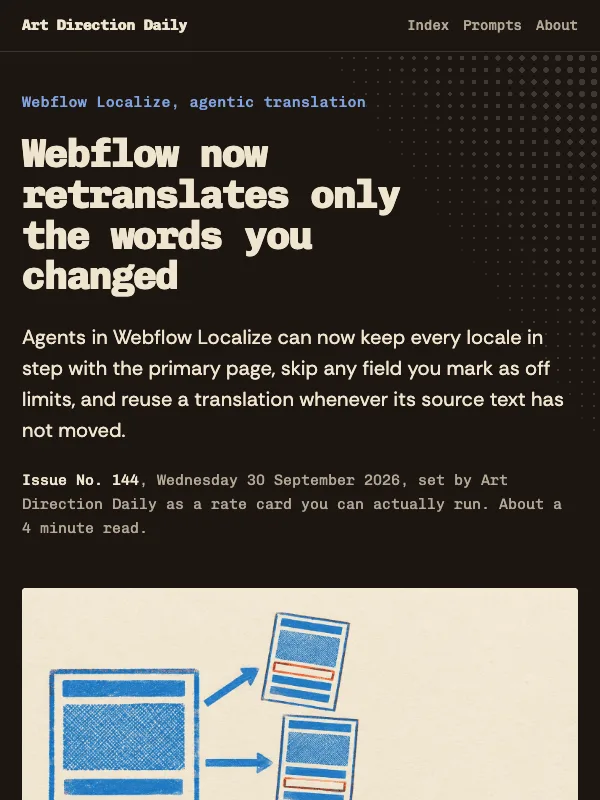
Visual result for the Bauhaus Primary Poster prompt

NO. 042 · 2026-06-18

Bauhaus Primary Poster

The news set as a Bauhaus exhibition poster: primary blocks on an asymmetric grid, with circle, triangle, and square coding the sections.

Design a single web page as a Bauhaus exhibition poster presenting a short briefing of four linked stories. Ground: warm bone (#F2EBDB). Use three primary colors as structural zones rather...

Jost + Archivo

ExpressivePoster

Read the full prompt and reusable template
Design a single web page as a Bauhaus exhibition poster presenting a short briefing of four linked stories. Ground: warm bone (#F2EBDB). Use three primary colors as structural zones rather than decoration: Bauhaus red (#D1321F), cobalt (#1C46A6), and a warm yellow (#F2B705), with near-black ink (#16130F) for text.

Build an asymmetric modular grid: a large bone hero cell carries the headline; a cobalt metadata tile holds the issue number, date, and reading time as small mono rows; hard-edged primitives float in the grid, a yellow circle, a red triangle, a cobalt square. Cut one black diagonal rule across the upper grid for tension.

Code the sections by shape, not icons: a filled circle marks Tooling, a triangle marks Technique, a square marks Workflow, each drawn in its zone color, with a small real legend mapping shape to section. Each item is a grid cell with a mono source line, a linked headline, and one or two short paragraphs.

Type: display in a geometric sans (Jost, or a Futura-like face), body in a clean grotesque (Archivo), tiny labels in a mono (DM Mono). Keep body at 19px, line-height 1.7, measure near 68 characters, ink on bone, never colored body text. Reserve white text for the cobalt and red blocks and verify WCAG AA on every block. Square corners everywhere except the genuine circle. No gradients, no glow, no neon, and no fake screenshots or garbled text inside any generated image.
Design a single web page for [your topic] using the Bauhaus Primary Poster art direction.

Purpose: adapt this visual system to [your product, article, interface, or client brief]. Keep the layout grammar and visual lesson, but replace all story-specific references with your own content.

Visual system: The news set as a Bauhaus exhibition poster: primary blocks on an asymmetric grid, with circle, triangle, and square coding the sections.

Starting point: Design a web page as a Bauhaus exhibition poster presenting a short briefing of four linked stories. Ground: warm bone (#F2EBDB). Use three primary colors as structural zones rather...

Palette: paper: #F2EBDB, primary: #16130F, secondary: #1C46A6, accent: #D1321F, muted: #F2B705.

Type: Jost + Archivo. Keep running text readable, with clear hierarchy between display type, body copy, labels, and source or metadata marks.

Layout: preserve the original archetype's structural idea, then map it to your content. Define the hero, metadata, primary content sections, supporting image or artifact, prompt or CTA area, and source/reference area before styling individual cards.

Imagery: create or choose one integral visual artifact that teaches the pattern. It should be visible near the top of the page and work in both a wide social crop and a portrait cover crop. Avoid logos, watermarks, and fake readable text inside images.

Guardrails: avoid generic SaaS sections, purple-blue gradients, glass cards, fake controls, stock people, emoji decoration, pill-shaped everything, and identical feature cards. Build visible focus states, real links/buttons, responsive crop behavior, and a reduced-motion fallback.
Visual result for the Branch Review Console (dark version-control client) prompt

NO. 041 · 2026-06-17

Branch Review Console (dark version-control client)

The day's news set in a dark version-control client: a branch graph rail, commit cards, one live diff, and a merge.

Design a single dark web page styled as a version-control review tool, used to present a short briefing of four linked stories as commits on a branch.

Bricolage Grotesque + IBM Plex Sans

DarkConsole

Read the full prompt and reusable template
Design a single dark web page styled as a version-control review tool, used to present a short briefing of four linked stories as commits on a branch.

Layout: a monospace top bar showing a repo path, nav, a branch pill, and an edition number. A two-column shell: a left branch-graph rail and a wider review column. The rail is a list of commits on a vertical line with small round nodes, each linking to a section, with a short hash under each label; a steel main line runs through them and a coral side branch diverges for the agent commits and merges back at a green node near the end. The review column opens with a status row of monospace cells (edition, date, section, reading time, an Open status), a short kicker, one large headline, and a one or two sentence deck. Then a lead well: a framed diff plate image on the left, and a change-request box of label-and-value rows on the right. Then an art-direction note. Then the commits, each opened by a file-path kicker (like tooling/ or technique/), a short hash, the source domain on the right, a headline that links out, and one or two body paragraphs. The lead commit also shows a real diff hunk with removed lines in red and added lines in green. Close with a field note styled as a merge, a prompt block, and a numbered sources list.

Palette: deep ink ground #15171C, panels #1B1E25, parchment text #E7E5DE, secondary #9AA0AB, a steel-blue main branch and link color #6FA0C0, a coral agent branch #D9774A, and green #74B083 with red #C75B4E reserved only for the diff and the merge. No gradients, no glow, no neon.

Type: Bricolage Grotesque for the headline and section headlines; IBM Plex Sans for body at 19px with line height 1.68; JetBrains Mono for branch names, hashes, file-path kickers, the diff, the meta cells, and the prompt block; IBM Plex Serif italic for one pullquote.

Components: branch-graph rail with nodes, status row, diff hunk with a line-number gutter, change-request box, commit cards with file-path kickers, merge node, numbered sources. Card radius 12px, code blocks 10px, nodes are the only full circles. Keep the reading measure near 67 characters.

Guardrails: every text color meets WCAG AA on its real dark surface, small mono labels included. Hover and focus states with 140ms easing and a prefers-reduced-motion guard. No fake search field, no dead toggles, no active filter pills; the branch pill and status row carry real metadata only. Any plate stays abstract, with no garbled text baked into the image.
Design a single web page for [your topic] using the Branch Review Console (dark version-control client) art direction.

Purpose: adapt this visual system to [your product, article, interface, or client brief]. Keep the layout grammar and visual lesson, but replace all story-specific references with your own content.

Visual system: The day's news set in a dark version-control client: a branch graph rail, commit cards, one live diff, and a merge.

Starting point: Design a dark web page styled as a version-control review tool, used to present a short briefing of four linked stories as commits on a branch.

Palette: paper: #15171C, primary: #E7E5DE, secondary: #9AA0AB, accent: #6FA0C0, muted: #838995.

Type: Bricolage Grotesque + IBM Plex Sans. Keep running text readable, with clear hierarchy between display type, body copy, labels, and source or metadata marks.

Layout: preserve the original archetype's structural idea, then map it to your content. Define the hero, metadata, primary content sections, supporting image or artifact, prompt or CTA area, and source/reference area before styling individual cards.

Imagery: create or choose one integral visual artifact that teaches the pattern. It should be visible near the top of the page and work in both a wide social crop and a portrait cover crop. Avoid logos, watermarks, and fake readable text inside images.

Guardrails: avoid generic SaaS sections, purple-blue gradients, glass cards, fake controls, stock people, emoji decoration, pill-shaped everything, and identical feature cards. Build visible focus states, real links/buttons, responsive crop behavior, and a reduced-motion fallback.
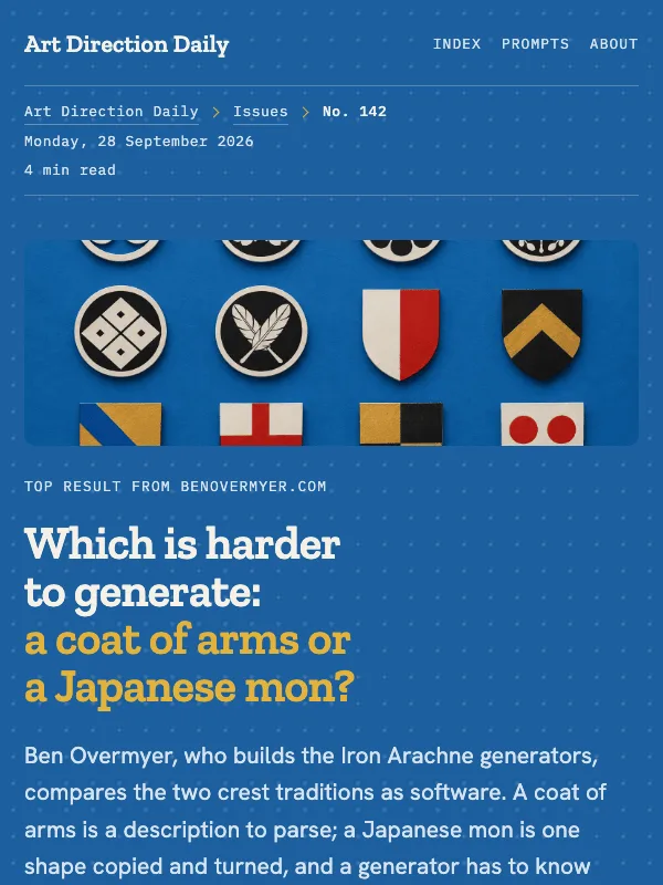
Visual result for the Broadsheet Front Page (newspaper edition) prompt

NO. 040 · 2026-06-16

Broadsheet Front Page (newspaper edition)

The day's news set as a newspaper front page: a dateline strip, a halftone lead plate, kicker-led stories, and a references footer.

Design a single web page styled as the front page of a broadsheet newspaper, used to present a short briefing of three linked stories.

Libre Caslon Display + Libre Franklin

LightEditorialReference

Read the full prompt and reusable template
Design a single web page styled as the front page of a broadsheet newspaper, used to present a short briefing of three linked stories.

Layout: a small monospace top bar with the publication name and nav. Below it a dateline strip, a thick top rule with a row of monospace cells (edition number, weekday and date, section, reading time). Then a masthead: a short red kicker, one large serif headline (this is the only display-size element), and a one or two sentence deck. Then a lead well: a two-column row with a framed halftone plate and its caption on the left, and a bordered fact box of label-and-value rows on the right. Then an art-direction note. Then the stories, each opened by a kicker line (a small red square, a role label like Tooling, and the source domain on the right), a serif headline that links out, and one or two body paragraphs. Close with a field note carrying one italic pull line, a prompt block, and a numbered references list.

Palette: cool newsprint ground #EDEEE9, deeper panel #E5E7E0, near-black ink #16181A, secondary #494C50, and one editorial red #C32A20 for rules, kickers, and links. Spot color only, near-monochrome otherwise. No gradients, no glow, no second accent.

Type: Libre Caslon Display for the headline and section headlines; Libre Caslon Text italic for the one pull line; Libre Franklin for body at 19px with line height 1.65; Spline Sans Mono for the dateline, kickers, labels, and the prompt block.

Components: dateline strip, halftone lead plate with caption, label-value fact box, kicker-led stories, hairline column rules between items, numbered references. Square corners; rely on rules and weight, not boxes, to separate. Keep the reading measure near 66 characters.

Guardrails: every text color meets WCAG AA on its real surface, small mono labels included. Hover and focus states with 140ms easing and a prefers-reduced-motion guard. No fake search field, toggles, or active filter pills. Any plate stays abstract, with no garbled text baked into the image.
Design a single web page for [your topic] using the Broadsheet Front Page (newspaper edition) art direction.

Purpose: adapt this visual system to [your product, article, interface, or client brief]. Keep the layout grammar and visual lesson, but replace all story-specific references with your own content.

Visual system: The day's news set as a newspaper front page: a dateline strip, a halftone lead plate, kicker-led stories, and a references footer.

Starting point: Design a web page styled as the front page of a broadsheet newspaper, used to present a short briefing of three linked stories.

Palette: paper: #EDEEE9, primary: #16181A, secondary: #494C50, accent: #C32A20, muted: #6C6F73.

Type: Libre Caslon Display + Libre Franklin. Keep running text readable, with clear hierarchy between display type, body copy, labels, and source or metadata marks.

Layout: preserve the original archetype's structural idea, then map it to your content. Define the hero, metadata, primary content sections, supporting image or artifact, prompt or CTA area, and source/reference area before styling individual cards.

Imagery: create or choose one integral visual artifact that teaches the pattern. It should be visible near the top of the page and work in both a wide social crop and a portrait cover crop. Avoid logos, watermarks, and fake readable text inside images.

Guardrails: avoid generic SaaS sections, purple-blue gradients, glass cards, fake controls, stock people, emoji decoration, pill-shaped everything, and identical feature cards. Build visible focus states, real links/buttons, responsive crop behavior, and a reduced-motion fallback.
Visual result for the Design System Reference (DESIGN.md spec sheet) prompt

NO. 039 · 2026-06-15

Design System Reference (DESIGN.md spec sheet)

The issue laid out as a DESIGN.md spec sheet: token tables, type specimens, and the news as numbered guideline entries.

Design a single web page styled as a design-system reference, the spec sheet for a small visual identity.

Fraunces + Hanken Grotesk

DarkReference

Read the full prompt and reusable template
Design a single web page styled as a design-system reference, the spec sheet for a small visual identity.

Layout: a monospace top bar with the project name, nav, and a spec tag. A masthead title block: an eyebrow, a serif headline, one deck sentence, and a row of spec metadata (issue, date, read time, section) as labeled mono cells. Below it, a framed figure showing the design system as a file. Then a tokens-and-type panel: a color token table (swatch, role name, hex) beside three type specimens (display, body, mono). Then numbered spec sections, each opened by a section number, a serif title, and a quiet role label; inside each, one guideline entry with a small clay marker, a linked headline, two sentences of context, and a source domain. Close with a field note, a prompt block, and a numbered sources list.

Palette: warm espresso ground #1B1714, panel #241F1B, warm bone text #F3ECE1, one clay accent #D9764C for links and markers, a sage #8FA86B reserved for genuine approval marks, and a brick #C25A47 reserved for refusal marks. Dark, but warm and deliberate. No neon, no glow, no gradient.

Type: Fraunces for the headline, section titles, and one italic pullquote; Hanken Grotesk for body at 19px with line height 1.65; Space Mono for tokens, labels, metadata, and the prompt block.

Components: token tables with swatch chips, type specimens, numbered spec sections, guideline entries, a do-and-do-not list, a sources table. Card radius 14 to 16px, chip radius 5 to 6px; vary radius and padding with intent.

Guardrails: every text color meets WCAG AA on its real surface, small mono labels included. Hover and focus states with 140ms easing and a prefers-reduced-motion guard. No fake search fields, toggles, or active filter pills. Any embedded specimen uses short honest text, never garbled labels.
Design a single web page for [your topic] using the Design System Reference (DESIGN.md spec sheet) art direction.

Purpose: adapt this visual system to [your product, article, interface, or client brief]. Keep the layout grammar and visual lesson, but replace all story-specific references with your own content.

Visual system: The issue laid out as a DESIGN.md spec sheet: token tables, type specimens, and the news as numbered guideline entries.

Starting point: Design a web page styled as a design-system reference, the spec sheet for a small visual identity.

Palette: paper: #1B1714, primary: #241F1B, secondary: #F3ECE1, accent: #D9764C, muted: #8FA86B.

Type: Fraunces + Hanken Grotesk. Keep running text readable, with clear hierarchy between display type, body copy, labels, and source or metadata marks.

Layout: preserve the original archetype's structural idea, then map it to your content. Define the hero, metadata, primary content sections, supporting image or artifact, prompt or CTA area, and source/reference area before styling individual cards.

Imagery: create or choose one integral visual artifact that teaches the pattern. It should be visible near the top of the page and work in both a wide social crop and a portrait cover crop. Avoid logos, watermarks, and fake readable text inside images.

Guardrails: avoid generic SaaS sections, purple-blue gradients, glass cards, fake controls, stock people, emoji decoration, pill-shaped everything, and identical feature cards. Build visible focus states, real links/buttons, responsive crop behavior, and a reduced-motion fallback.
Visual result for the Vector Design-Tool Workspace prompt

NO. 038 · 2026-06-14

Vector Design-Tool Workspace

A layers panel, a dot-grid canvas of named frames, and a properties inspector reading the selection.

# Vector Design-Tool Workspace - editorial layout

Space Grotesk + Newsreader

Read the full prompt and reusable template
# Vector Design-Tool Workspace - editorial layout
Design a single web page that looks like a vector design app (Figma,
Sketch) holding a long read. Three columns on desktop, stacking on mobile:

LEFT: a sticky "Layers" panel. A monospace tree of the page's sections,
some indented, each row a real anchor link to that section. One row shows
a filled "selected" state. This is the table of contents.

CENTER: a canvas with a faint dot-grid background. Each content section is
a white "frame" (artboard): 12px radius, 1px hairline border, and a small
name tab in the top-left corner reading its label (Hero, 01 Tooling,
Field Note). The active/first frame carries a 1.5px selection outline just
outside its edge with four small square corner handles. On hover, other
frames show the same outline. Guard it behind prefers-reduced-motion.

RIGHT: a sticky "Properties" inspector, monospace label/value rows holding
REAL metadata only (issue number, date, reading time, color tokens as
swatches, typeface names). No fake toggles, sliders, or search fields.

Palette: canvas #E9E9EC, frames #FFFFFF, ink #1A1A1F, one violet selection
accent #4A2BD9 (used only for selection, links, the active tab), and a
reserved red #D8413F for dimension/measure marks. No gradients, no glow.
Type: Space Grotesk for the display headline, section titles, and name
tabs; a readable serif (Newsreader) for body at 19px and line-height 1.7;
Spline Sans Mono for the panels, tabs, and metadata. Body stays serif and
left-aligned, never justified, 60-75 characters per line. Keep all small
labels at WCAG AA on their actual surface. No fake readable UI text inside
any generated image; use plain bars and blank labels instead.
Design a single web page for [your topic] using the Vector Design-Tool Workspace art direction.

Purpose: adapt this visual system to [your product, article, interface, or client brief]. Keep the layout grammar and visual lesson, but replace all story-specific references with your own content.

Visual system: A layers panel, a dot-grid canvas of named frames, and a properties inspector reading the selection.

Starting point: # Vector Design-Tool Workspace - editorial layout

Palette: paper: #E9E9EC, primary: #1A1A1F, secondary: #54565E, accent: #4A2BD9, muted: #83858D.

Type: Space Grotesk + Newsreader. Keep running text readable, with clear hierarchy between display type, body copy, labels, and source or metadata marks.

Layout: preserve the original archetype's structural idea, then map it to your content. Define the hero, metadata, primary content sections, supporting image or artifact, prompt or CTA area, and source/reference area before styling individual cards.

Imagery: create or choose one integral visual artifact that teaches the pattern. It should be visible near the top of the page and work in both a wide social crop and a portrait cover crop. Avoid logos, watermarks, and fake readable text inside images.

Guardrails: avoid generic SaaS sections, purple-blue gradients, glass cards, fake controls, stock people, emoji decoration, pill-shaped everything, and identical feature cards. Build visible focus states, real links/buttons, responsive crop behavior, and a reduced-motion fallback.
Visual result for the Model Hub Listing prompt

NO. 037 · 2026-06-13

Model Hub Listing

A model marketplace page for a product that just went off sale.

Build a software marketplace listing page for a product that is currently unavailable, in the style of a model hub or extension marketplace.

Geist + Onest

LightProduct

Read the full prompt and reusable template
Build a software marketplace listing page for a product that is currently unavailable, in the style of a model hub or extension marketplace.

Layout: a slim dark top bar with a wordmark on the left and small mono nav links on the right. Below it a dark header band holding a breadcrumb, a large product title, a one paragraph description, a right aligned metadata column, and a withdrawn status note. Under the band, a product top row: a media gallery card on the left and a sticky spec and install panel on the right with label and value rows, a status pill, and a short list of available alternatives. Below that, a single reading column about 760px wide for the long form sections.

Components: category kicker labels in monospace above each section title, section titles with a bottom hairline, a bordered idiom card with no colored edge stripe, solid filled status pills for withdrawn, available, and new, a spec register of mono labels and plain values, and one serif italic pullquote.

Palette: page #DCDFE2, listing cards #F4F5F6, dark band #21262B, ink #1A1E22, hairlines #C7CCD1, green accent #2F7A55 for marks and available state, clay #B23A2E for withdrawn. No gradients, no glow, no neon.

Type: Geist for the title and section heads, Onest for body at 19px with 1.7 line height and a 72 character measure, Geist Mono only for labels and metadata, Spectral italic for the single pullquote.

Guardrails: WCAG AA contrast on every text and surface pair, underline on link hover, visible focus rings, card radius 12 to 14px and pill radius 6px rather than uniform pills everywhere, no card shadows, no fake search or filter chrome, real hover states under 180ms, and honor prefers-reduced-motion.
Design a single web page for [your topic] using the Model Hub Listing art direction.

Purpose: adapt this visual system to [your product, article, interface, or client brief]. Keep the layout grammar and visual lesson, but replace all story-specific references with your own content.

Visual system: A model marketplace page for a product that just went off sale.

Starting point: Build a software marketplace listing page for a product that is currently unavailable, in the style of a model hub or extension marketplace.

Palette: paper: #DCDFE2, primary: #1A1E22, secondary: #566069, accent: #2F7A55, muted: #76808A.

Type: Geist + Onest. Keep running text readable, with clear hierarchy between display type, body copy, labels, and source or metadata marks.

Layout: preserve the original archetype's structural idea, then map it to your content. Define the hero, metadata, primary content sections, supporting image or artifact, prompt or CTA area, and source/reference area before styling individual cards.

Imagery: create or choose one integral visual artifact that teaches the pattern. It should be visible near the top of the page and work in both a wide social crop and a portrait cover crop. Avoid logos, watermarks, and fake readable text inside images.

Guardrails: avoid generic SaaS sections, purple-blue gradients, glass cards, fake controls, stock people, emoji decoration, pill-shaped everything, and identical feature cards. Build visible focus states, real links/buttons, responsive crop behavior, and a reduced-motion fallback.
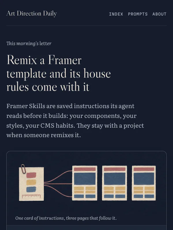
Visual result for the Encyclopedia Article, Dark Reading Mode prompt

NO. 036 · 2026-06-12

Encyclopedia Article, Dark Reading Mode

A wiki article read at night: infobox masthead, contents rail, numbered references.

Build a long form article page styled like an encyclopedia entry in dark reading mode.

Source Serif 4 + Arimo

EditorialReference

Read the full prompt and reusable template
Build a long form article page styled like an encyclopedia entry in dark reading mode.

Layout: a slim top site bar with a wordmark on the left and two tab style links on the right. Below it, a single reading column about 720px wide with a sticky contents rail on the left listing the numbered sections. At the top right of the article, place a 320px infobox: cover image first, then label and value rows for the page metadata, then a row of five color swatches.

Components: an italic hatnote under the H1, hairline rules above each numbered H2, a bordered notice box for editorial asides with no colored edge stripe, one large serif italic pullquote, superscript reference numbers in the prose, a numbered references list with small backlinks, and a category strip of tag links across the footer.

Palette: page #101418, panels #1B2126, hairlines #3A434D, body text #E6E9EC, secondary text #A8B0B9, links #87A6F8. No gradients, no glow, no neon.

Type: a text serif such as Source Serif 4 for the H1, section heads, and the pullquote. A neutral sans such as Arimo for body at 19px with 1.7 line height and a 72 character measure. Monospace only inside code blocks.

Guardrails: WCAG AA contrast on every text and background pair, underlines on link hover, visible focus outlines, square corners except 8px on the infobox and notice box, no card shadows, no fake search or toggle chrome, and honor prefers-reduced-motion.
Design a single web page for [your topic] using the Encyclopedia Article, Dark Reading Mode art direction.

Purpose: adapt this visual system to [your product, article, interface, or client brief]. Keep the layout grammar and visual lesson, but replace all story-specific references with your own content.

Visual system: A wiki article read at night: infobox masthead, contents rail, numbered references.

Starting point: Build a long form article page styled like an encyclopedia entry in dark reading mode.

Palette: paper: #101418, primary: #E6E9EC, secondary: #A8B0B9, accent: #87A6F8, muted: #5E6873.

Type: Source Serif 4 + Arimo. Keep running text readable, with clear hierarchy between display type, body copy, labels, and source or metadata marks.

Layout: preserve the original archetype's structural idea, then map it to your content. Define the hero, metadata, primary content sections, supporting image or artifact, prompt or CTA area, and source/reference area before styling individual cards.

Imagery: create or choose one integral visual artifact that teaches the pattern. It should be visible near the top of the page and work in both a wide social crop and a portrait cover crop. Avoid logos, watermarks, and fake readable text inside images.

Guardrails: avoid generic SaaS sections, purple-blue gradients, glass cards, fake controls, stock people, emoji decoration, pill-shaped everything, and identical feature cards. Build visible focus states, real links/buttons, responsive crop behavior, and a reduced-motion fallback.
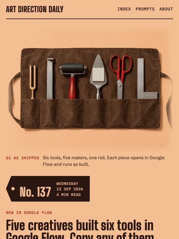
Visual result for the Security Advisory / CERT Daily Bulletin prompt

NO. 035 · 2026-06-11

Security Advisory / CERT Daily Bulletin

The issue filed as a security advisory: field registers, one orange classification strip, an affected-versions table.

Design a single self-contained HTML page styled as a security advisory or

Inter Tight + Source Sans 3

Read the full prompt and reusable template
Design a single self-contained HTML page styled as a security advisory or
CERT daily bulletin, the kind a national vulnerability database or a
distro security team publishes.

Structure: a near-black agency band across the top with the site name and
nav; directly under it a thin classification strip in the accent color
with small uppercase monospace text; then a bulletin header holding a
monospace advisory ID line, the headline as the advisory title, a short
deck, a four-cell field register (label over value, hairline-divided),
and a row of numbered section links. Body sections open with a thick
3px ink rule, a monospace section number, and a title. News entries are
numbered notes: a monospace note ID in a narrow left column, then a
linked title, one or two sentences of prose, and a source-domain line.
Give the lead story an affected-versions table with status labels, and a
disclosure timeline of dated rows. Close with a boxed analyst note and a
numbered reference list.

Type: Inter Tight bold for the headline and section titles, Source Sans 3
for prose, IBM Plex Mono for IDs, field labels, tables, and timestamps.
At most one serif italic line (Crimson Pro italic) as a pullquote.

Color: warm paper #FAFAF7, field-register gray #F1F1EC, near-black ink
#1C1E20, and one safety-orange accent #BC4A07 for the classification
strip, IDs, and links. Status green #256D38 and the orange appear in
table status labels only, as honest states, never as decoration.

Guardrails: body text at least 19px with line height 1.65 or more, never
monospace for prose; square corners throughout, no border radius; all
text meets WCAG AA on its actual background; no gradients, no glow, no
neon, no fake search fields or buttons; hover states only on real links;
the bureaucratic grammar must organize real content, not decorate it.
Design a single web page for [your topic] using the Security Advisory / CERT Daily Bulletin art direction.

Purpose: adapt this visual system to [your product, article, interface, or client brief]. Keep the layout grammar and visual lesson, but replace all story-specific references with your own content.

Visual system: The issue filed as a security advisory: field registers, one orange classification strip, an affected-versions table.

Starting point: Design a self-contained HTML page styled as a security advisory or

Palette: paper: #FAFAF7, primary: #1C1E20, secondary: #52565B, accent: #BC4A07, muted: #7C8187.

Type: Inter Tight + Source Sans 3. Keep running text readable, with clear hierarchy between display type, body copy, labels, and source or metadata marks.

Layout: preserve the original archetype's structural idea, then map it to your content. Define the hero, metadata, primary content sections, supporting image or artifact, prompt or CTA area, and source/reference area before styling individual cards.

Imagery: create or choose one integral visual artifact that teaches the pattern. It should be visible near the top of the page and work in both a wide social crop and a portrait cover crop. Avoid logos, watermarks, and fake readable text inside images.

Guardrails: avoid generic SaaS sections, purple-blue gradients, glass cards, fake controls, stock people, emoji decoration, pill-shaped everything, and identical feature cards. Build visible focus states, real links/buttons, responsive crop behavior, and a reduced-motion fallback.
Visual result for the Market Data Terminal / Phosphor Quote Board prompt

NO. 034 · 2026-06-10

Market Data Terminal / Phosphor Quote Board

A market data terminal: amber phosphor quotes on warm black, news as wire rows, one spread chart.

Design a dark market-data terminal page for a daily design-news briefing.

Saira Condensed + Public Sans

Console

Read the full prompt and reusable template
Design a dark market-data terminal page for a daily design-news briefing.
Archetype: a financial trading console rendered as a web page. Ground: warm
near-black (#131009), panels in #1B1710 with 1px #3A3220 borders and sharp
2-3px corners. One signal color: amber #FFB000, reserved for live numbers,
panel codes, prices, and link underlines; body prose is warm parchment
(#F2E9D8) and secondary text is #B5A78D. Type: a condensed engineering
display face (Saira Condensed 700, uppercase) for the headline and panel
titles, a neutral sans (Public Sans, 19px minimum, line-height 1.65 or more)
for prose, and a monospace (Fragment Mono) only for tickers, timestamps,
stat readouts, and source domains. Build: a top status bar holding the brand
and session metadata as bordered mono cells; a thin ticker strip of real
data points from the page itself; a two-column quote board with the lead
story on the left and an instrument tile on the right showing genuine
numbers as label-value rows; below, a grid of panels titled like terminal
functions (WIRE, TECH, FLOW), each news item a wire row with a mono date
cell, a linked headline, and one or two sentences of context. Add one
abstract phosphor depth-chart plate with no readable text in it. Guardrails:
WCAG AA contrast for every label on its actual surface, no neon glow, no
gradients, no cyan-on-black, no fake buttons or fake search fields, hover
states with about 150ms easing, and a prefers-reduced-motion fallback that
stops the ticker animation.
Design a single web page for [your topic] using the Market Data Terminal / Phosphor Quote Board art direction.

Purpose: adapt this visual system to [your product, article, interface, or client brief]. Keep the layout grammar and visual lesson, but replace all story-specific references with your own content.

Visual system: A market data terminal: amber phosphor quotes on warm black, news as wire rows, one spread chart.

Starting point: Design a dark market-data terminal page for a daily design-news briefing.

Palette: paper: #131009, primary: #F2E9D8, secondary: #B5A78D, accent: #FFB000, muted: #97896D.

Type: Saira Condensed + Public Sans. Keep running text readable, with clear hierarchy between display type, body copy, labels, and source or metadata marks.

Layout: preserve the original archetype's structural idea, then map it to your content. Define the hero, metadata, primary content sections, supporting image or artifact, prompt or CTA area, and source/reference area before styling individual cards.

Imagery: create or choose one integral visual artifact that teaches the pattern. It should be visible near the top of the page and work in both a wide social crop and a portrait cover crop. Avoid logos, watermarks, and fake readable text inside images.

Guardrails: avoid generic SaaS sections, purple-blue gradients, glass cards, fake controls, stock people, emoji decoration, pill-shaped everything, and identical feature cards. Build visible focus states, real links/buttons, responsive crop behavior, and a reduced-motion fallback.
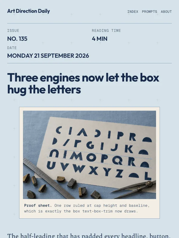
Visual result for the Settings / Preferences Console prompt

NO. 033 · 2026-06-09

Settings / Preferences Console

A system settings page: a sticky section rail beside grouped preference rows, each a label, a description, and a control on the right.

Design a single self-contained HTML page styled as a system settings or

Schibsted Grotesk + Hanken Grotesk

ConsoleReference

Read the full prompt and reusable template
Design a single self-contained HTML page styled as a system settings or
account preferences page, the kind macOS System Settings or a SaaS
account screen uses.

PAGE ARCHETYPE: a settings console. Top app bar with a wordmark and two
nav links. Below it a thin settings bar: a small monospace breadcrumb
and a quiet saved indicator. Then a two-pane layout: a sticky left
section rail and a wide main column.

COMPONENTS: the rail is a vertical list of section links, one marked as
the current section with a filled background, bold weight, and a short
inset edge marker. The main column opens with a settings header: a small
kicker chip, a large headline, a one-line description, and a four-cell
meta strip (issue, date, reading time, section). Under quiet uppercase
group labels, each item is a preference ROW on a card: a bold row title
and one line of description on the left, and a right control column that
is a bordered Open link plus the source domain beneath it. A couple of
rows carry small honest state badges. Include one framed figure, then
full-width panels for a prompt block, a field note, and a numbered
sources list. Panes stack to one column under about 900px.

PALETTE: warm porcelain ground #EFEDE7, sunken panel #EAE7DF, card
surface #FBFAF6, ink #1C1B19, secondary #5F5A51, one flat teal accent
#117C6F for links, the active section, and on-states. No purple-blue
gradient, no neon, no glow, no green-on-black.

TYPE: Schibsted Grotesk for the headline and row titles; Hanken Grotesk
for body and UI; Spline Sans Mono for labels, meta, and source domains;
Newsreader italic for the art-direction line and one pullquote only.

GUARDRAILS: body text at least 18px with about 1.6 line height and WCAG
AA contrast. Cap card radius near 16px, controls near 9px; do not
pill-shape every element. Toggles and the saved indicator are
informational state, marked aria-hidden, never fake buttons, and there
is no fake search field. Use no colored left-border stripe on cards;
distinguish the active rail item with background and weight. Real hover
and focus on links and the rail with ~150ms easing, and disable
transforms under prefers-reduced-motion. No readable text in the figure.

Type: Schibsted Grotesk for the headline, Hanken Grotesk for rows and body, Spline Sans Mono for labels and source domains, Newsreader italic for one editorial line.
Color: warm porcelain ground #EFEDE7, ink #1C1B19, one flat teal accent #117C6F on hairline-divided cream surfaces. No gradients, no glow.
Design a single web page for [your topic] using the Settings / Preferences Console art direction.

Purpose: adapt this visual system to [your product, article, interface, or client brief]. Keep the layout grammar and visual lesson, but replace all story-specific references with your own content.

Visual system: A system settings page: a sticky section rail beside grouped preference rows, each a label, a description, and a control on the right.

Starting point: Design a self-contained HTML page styled as a system settings or

Palette: paper: #EFEDE7, primary: #1C1B19, secondary: #5F5A51, accent: #117C6F, muted: #8F897D.

Type: Schibsted Grotesk + Hanken Grotesk. Keep running text readable, with clear hierarchy between display type, body copy, labels, and source or metadata marks.

Layout: preserve the original archetype's structural idea, then map it to your content. Define the hero, metadata, primary content sections, supporting image or artifact, prompt or CTA area, and source/reference area before styling individual cards.

Imagery: create or choose one integral visual artifact that teaches the pattern. It should be visible near the top of the page and work in both a wide social crop and a portrait cover crop. Avoid logos, watermarks, and fake readable text inside images.

Guardrails: avoid generic SaaS sections, purple-blue gradients, glass cards, fake controls, stock people, emoji decoration, pill-shaped everything, and identical feature cards. Build visible focus states, real links/buttons, responsive crop behavior, and a reduced-motion fallback.
Visual result for the Kanban Board / Project Tracker prompt

NO. 032 · 2026-06-08

Kanban Board / Project Tracker

A project-tracker board: three labeled lanes of stacked cards, color-coded label chips, and count badges on a cool slate ground.

Design a single self-contained HTML page styled as a Kanban project

Bricolage Grotesque + Hanken Grotesk

Read the full prompt and reusable template
Design a single self-contained HTML page styled as a Kanban project
board, the kind Linear, Trello, or Jira uses to track work.

PAGE ARCHETYPE: a project tracker. Top app bar with a wordmark and two
nav links. Below it a board header: a small monospace breadcrumb line
(number, date, read time), a large board-title headline, a one-line
description, and a label legend of small color dots. Under the header,
the board itself: three equal vertical lanes side by side.

COMPONENTS: each lane has a header (an uppercase monospace title and a
count badge with a colored dot) over a stack of cards. A card is a tight
unit: a row of small label chips (each a colored dot plus a monospace
word), a linked headline, one or two lines of context, and a meta footer
with a source domain, a date, and a right-aligned arrow. One lead card
carries a flat-color cover image at the top. Below the board, full-width
panels for a prompt block, a short field note, and a numbered sources
list. Lanes stack to one column under about 920px.

PALETTE: cool slate board #E9ECF2, faint lane panels #E2E7F0, white cards
#FFFFFF, ink #171A21, secondary #565E6E, one flat cobalt accent #2B49E6
for links and the lead label, with teal #0E7C66 and clay #B4541E only as
label dots. No purple-blue gradient, no neon, no glow, no green-on-black.

TYPE: Bricolage Grotesque for the board title and card headings; Hanken
Grotesk for body and UI; DM Mono for labels, counts, dates, and source
domains; Literata italic for one editorial line only.

GUARDRAILS: body text at least 18px with about 1.6 line height and WCAG
AA contrast. Cap card radius near 13px, lane radius near 18px, chips near
7px, and vary radius with purpose. Label dots are the only circles; do
not pill-shape chips or buttons. The count badge and legend are
informational, not buttons, and there is no fake search field. Use one
tight card shadow on hover, not a shadow on every surface, and no colored
left-border stripe. Give cards and links honest hover and focus states
with ~160ms easing, and disable transforms under prefers-reduced-motion.
No readable text inside the generated cover image.

Type: Bricolage Grotesque for the board title and card headings, Hanken Grotesk for body and UI, DM Mono for labels, counts, dates, and source domains, Literata italic for one editorial line.
Color: cool slate ground #E9ECF2, ink #171A21, one flat cobalt accent #2B49E6, with teal, clay, and slate label chips as honest category colors. No gradients, no glow.
Design a single web page for [your topic] using the Kanban Board / Project Tracker art direction.

Purpose: adapt this visual system to [your product, article, interface, or client brief]. Keep the layout grammar and visual lesson, but replace all story-specific references with your own content.

Visual system: A project-tracker board: three labeled lanes of stacked cards, color-coded label chips, and count badges on a cool slate ground.

Starting point: Design a self-contained HTML page styled as a Kanban project

Palette: paper: #E9ECF2, primary: #171A21, secondary: #565E6E, accent: #2B49E6, muted: #8A92A2.

Type: Bricolage Grotesque + Hanken Grotesk. Keep running text readable, with clear hierarchy between display type, body copy, labels, and source or metadata marks.

Layout: preserve the original archetype's structural idea, then map it to your content. Define the hero, metadata, primary content sections, supporting image or artifact, prompt or CTA area, and source/reference area before styling individual cards.

Imagery: create or choose one integral visual artifact that teaches the pattern. It should be visible near the top of the page and work in both a wide social crop and a portrait cover crop. Avoid logos, watermarks, and fake readable text inside images.

Guardrails: avoid generic SaaS sections, purple-blue gradients, glass cards, fake controls, stock people, emoji decoration, pill-shaped everything, and identical feature cards. Build visible focus states, real links/buttons, responsive crop behavior, and a reduced-motion fallback.
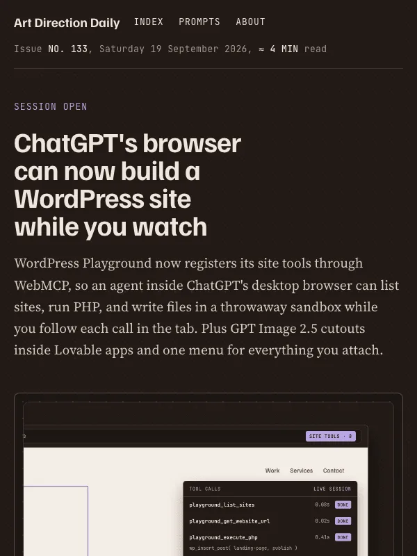
Visual result for the Q&A / Community Discussion Thread prompt

NO. 031 · 2026-06-07

Q&A / Community Discussion Thread

The whole issue filed as a Stack-Overflow-style question with voted answers and one accepted reply.

Design a single self-contained HTML page styled as a community Q&A

Space Grotesk + IBM Plex Sans

Read the full prompt and reusable template
Design a single self-contained HTML page styled as a community Q&A
discussion thread, the kind Stack Overflow or a developer forum uses.

PAGE ARCHETYPE: a question-and-answers thread. At the top, a question
block: a small monospace meta line (number, asked date, read time), a
large question headline, a one-paragraph question body, a left gutter
showing a score and an answer count, and a row of tag chips. Below it, a
short pinned info card, then a "3 Answers" heading and a stack of answer
cards.

COMPONENTS: each answer is a two-column row, a narrow left vote gutter
(an up caret, a score, a down caret) beside the answer content. The
strongest answer is marked Accepted with a filled raspberry check and a
full raspberry border, never a colored left stripe. Each answer ends with
an author byline: a small rounded avatar, a handle, and a reputation
figure. A sticky right sidebar holds one image card, an asked/viewed/
active stat row, a tag list, and a short Linked list of primary sources.

PALETTE: warm paper #F2EFE6, card surface #FBFAF5, ink #1A1C22, secondary
#5C5F66, one raspberry accent #A8244E for links, the accepted state, and
marks. No purple-blue gradient, no neon, no glow, no green-on-black.

TYPE: Space Grotesk for the question and answer headings; IBM Plex Sans
for body prose; JetBrains Mono for scores, tags, meta, and source
domains; Newsreader italic for one editorial line only.

GUARDRAILS: body text at least 18px with about 1.65 line height and WCAG
AA contrast; answer prose capped near 62 to 66 characters per line. Cap
card radius around 14px and chips around 8px; vary radius with purpose.
The vote gutter is informational, not a button: mark it aria-hidden and
do not style it as tappable. Give links and the issue nav honest hover
and focus states with ~160ms easing, and disable transforms under
prefers-reduced-motion. No fake search field, no readable text inside
the generated image.
Design a single web page for [your topic] using the Q&A / Community Discussion Thread art direction.

Purpose: adapt this visual system to [your product, article, interface, or client brief]. Keep the layout grammar and visual lesson, but replace all story-specific references with your own content.

Visual system: The whole issue filed as a Stack-Overflow-style question with voted answers and one accepted reply.

Starting point: Design a self-contained HTML page styled as a community Q&A

Palette: paper: #F2EFE6, primary: #1A1C22, secondary: #5C5F66, accent: #A8244E, muted: #8C8A82.

Type: Space Grotesk + IBM Plex Sans. Keep running text readable, with clear hierarchy between display type, body copy, labels, and source or metadata marks.

Layout: preserve the original archetype's structural idea, then map it to your content. Define the hero, metadata, primary content sections, supporting image or artifact, prompt or CTA area, and source/reference area before styling individual cards.

Imagery: create or choose one integral visual artifact that teaches the pattern. It should be visible near the top of the page and work in both a wide social crop and a portrait cover crop. Avoid logos, watermarks, and fake readable text inside images.

Guardrails: avoid generic SaaS sections, purple-blue gradients, glass cards, fake controls, stock people, emoji decoration, pill-shaped everything, and identical feature cards. Build visible focus states, real links/buttons, responsive crop behavior, and a reduced-motion fallback.
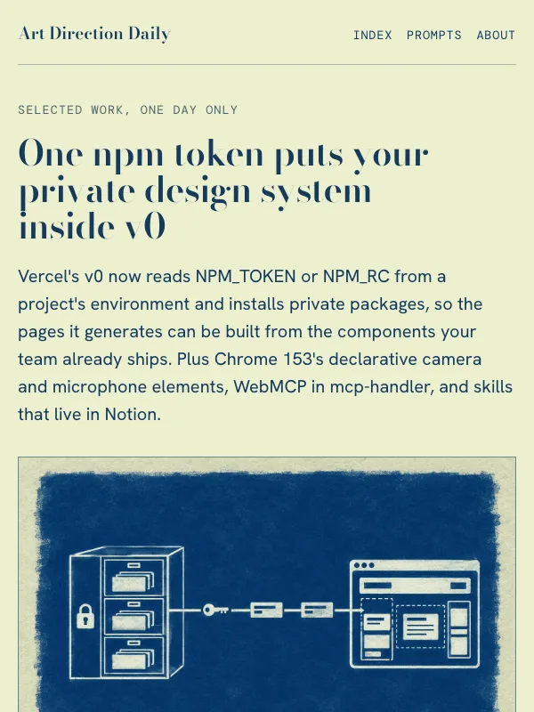
Visual result for the Pricing & Packaging Page / Tiered Plan Comparison prompt

NO. 030 · 2026-06-06

Pricing & Packaging Page / Tiered Plan Comparison

A SaaS pricing page: a dark plan band, three tier columns bridging into ivory, one plan recommended.

Design a single self-contained HTML page styled as a SaaS pricing and

Fraunces + Instrument Sans

Product

Read the full prompt and reusable template
Design a single self-contained HTML page styled as a SaaS pricing and
packaging page, the kind a product site ships to compare plans.

PAGE ARCHETYPE: a tiered pricing page. Above the fold, a dark slate plan
band holds the top nav, a small masthead line, a large headline, a short
deck, and an abstract plan-stack image on the right. Three pricing-tier
columns sit centered and overlap the seam where the dark band meets the
lighter page below.

COMPONENTS: three tier cards, the middle one "recommended" and set apart
by a darker surface, heavier type, and a small ribbon, never a colored
left stripe. Each card has a small-caps plan label, a tier name, a
monospace price chip, one short sentence, and a text link styled as the
plan's call to action. Below, build the article sections with a
comparison matrix table (real text cells, not check marks), numbered
workflow steps, one pullquote, and a numbered sources list.

PALETTE: ivory paper #FBF8F1, deep slate band #1B2435, amber accent
#C07E1E for prices, ribbon, and marks, slate #5A6377 for secondary text,
hairline #E4DECF. No purple-blue gradient, no neon, no glow.

TYPE: Fraunces for the headline, tier names, and section headings;
Instrument Sans for body prose; Spline Sans Mono for price chips, labels,
and metadata.

GUARDRAILS: body text at least 18px with 1.6 line height and WCAG AA
contrast. Never set long prose on the dark band. Cap card radius around
14px and chips around 7px; vary radius with purpose. Give cards and links
honest hover and focus states with ~160ms easing, and disable transforms
under prefers-reduced-motion. No fake toggles or dead search fields, and
no readable text inside the generated image.
Design a single web page for [your topic] using the Pricing & Packaging Page / Tiered Plan Comparison art direction.

Purpose: adapt this visual system to [your product, article, interface, or client brief]. Keep the layout grammar and visual lesson, but replace all story-specific references with your own content.

Visual system: A SaaS pricing page: a dark plan band, three tier columns bridging into ivory, one plan recommended.

Starting point: Design a self-contained HTML page styled as a SaaS pricing and

Palette: paper: #FBF8F1, primary: #1B2435, secondary: #5A6377, accent: #C07E1E, muted: #8C8576.

Type: Fraunces + Instrument Sans. Keep running text readable, with clear hierarchy between display type, body copy, labels, and source or metadata marks.

Layout: preserve the original archetype's structural idea, then map it to your content. Define the hero, metadata, primary content sections, supporting image or artifact, prompt or CTA area, and source/reference area before styling individual cards.

Imagery: create or choose one integral visual artifact that teaches the pattern. It should be visible near the top of the page and work in both a wide social crop and a portrait cover crop. Avoid logos, watermarks, and fake readable text inside images.

Guardrails: avoid generic SaaS sections, purple-blue gradients, glass cards, fake controls, stock people, emoji decoration, pill-shaped everything, and identical feature cards. Build visible focus states, real links/buttons, responsive crop behavior, and a reduced-motion fallback.
Visual result for the Help Viewer / Three-Pane Manual Docs prompt

NO. 029 · 2026-06-05

Help Viewer / Three-Pane Manual Docs

A 1998 help viewer on a teal desktop: chrome bevels outside, book typography inside.

Design a single self-contained HTML page styled as a late-1990s software

Istok Web + Gelasio

Reference

Read the full prompt and reusable template
Design a single self-contained HTML page styled as a late-1990s software
help viewer, the kind that shipped as a compiled manual with Windows 98
software.

PAGE ARCHETYPE: a help-viewer docs topic page. The entire page lives
inside one beveled application window centered on a dithered teal
desktop. Window chrome, top to bottom: a navy-to-blue gradient title
bar with the site name, a menu bar of plain text links, then a two-pane
body: a left Contents tree and a right topic pane.

COMPONENTS: build the Contents tree from real anchor links with
closed-book and page icons drawn in CSS, plus/minus expander squares,
and a navy selection bar on the hovered row. In the topic pane use
breadcrumbs (Contents > Topic), bold headings over a thin gray rule,
figures with sunken borders and numbered captions, a pale yellow Note
box with a 1px tan border, a Courier-style code block, prev and next
topic links, and a sunken status bar at the window's foot.

PALETTE: dithered teal desktop #0F7268, warm chrome gray #C8C4BA with
#FFFFFF and #7A766A bevel edges, white content panes, navy #1A2E8C
title bar and headings, hyperlink blue #0B3FBF, note yellow #FFF7CC.

TYPE: Istok Web bold for chrome, headings, and labels (hosted Verdana
stand-in); Gelasio for body prose (hosted Georgia stand-in); Cousine
for code (hosted Courier stand-in).

GUARDRAILS: body text at least 19px with 1.7 line height and WCAG AA
contrast on white. Never set body prose on the teal desktop or gray
chrome. Bevels come from two inset box-shadow colors, not drop
shadows. No readable text inside generated images, no pill radii, no
glow, no gradient text. Give links and tree rows honest hover and
focus states, and disable transitions under prefers-reduced-motion.
Design a single web page for [your topic] using the Help Viewer / Three-Pane Manual Docs art direction.

Purpose: adapt this visual system to [your product, article, interface, or client brief]. Keep the layout grammar and visual lesson, but replace all story-specific references with your own content.

Visual system: A 1998 help viewer on a teal desktop: chrome bevels outside, book typography inside.

Starting point: Design a self-contained HTML page styled as a late-1990s software

Palette: paper: #0F7268, primary: #14181D, secondary: #1A2E8C, accent: #0B3FBF, muted: #C8C4BA.

Type: Istok Web + Gelasio. Keep running text readable, with clear hierarchy between display type, body copy, labels, and source or metadata marks.

Layout: preserve the original archetype's structural idea, then map it to your content. Define the hero, metadata, primary content sections, supporting image or artifact, prompt or CTA area, and source/reference area before styling individual cards.

Imagery: create or choose one integral visual artifact that teaches the pattern. It should be visible near the top of the page and work in both a wide social crop and a portrait cover crop. Avoid logos, watermarks, and fake readable text inside images.

Guardrails: avoid generic SaaS sections, purple-blue gradients, glass cards, fake controls, stock people, emoji decoration, pill-shaped everything, and identical feature cards. Build visible focus states, real links/buttons, responsive crop behavior, and a reduced-motion fallback.
Visual result for the Release Notes / Semver Ledger prompt

NO. 028 · 2026-06-04

Release Notes / Semver Ledger

A dark product changelog: one dated timeline rail, tagged entries, and Keep-a-Changelog badges on a near-black ink ground.

Design a product changelog page for [project]. Archetype: a release-notes

Archivo + Schibsted Grotesk

Product

Read the full prompt and reusable template
Design a product changelog page for [project]. Archetype: a release-notes
feed like Linear's, not a blog. Structure: a slim top nav; a release header
band with a version chip, date, and build metadata set in a monospace face;
one bold display headline; then a single vertical timeline rail down the
left with a node per entry. Each entry gets a date column, a small uppercase
tag chip (MAJOR, SECURITY, POLICY, PROMPT, NOTE), a section heading, and
short change rows that lead with Keep-a-Changelog badges: Added, Changed,
Security, Removed. Palette: near-black ink ground #15171B, warm paper-white
text #F2F0E9, slate #9AA3B2 metadata, and one flat chartreuse accent #C3E940
for nodes, tags, and links. No gradients, no glow, no neon-on-black, no
purple. Type: Archivo 900 for display, Schibsted Grotesk at 19px/1.7 for
body, Spline Sans Mono for tags and metadata. Guardrails: body text at least
18px with AA contrast on the dark ground; 6px chip radius instead of pills;
no colored left-border stripes; no fake search fields or toggles; real hover
and focus states on rows and links; respect prefers-reduced-motion.
Design a single web page for [your topic] using the Release Notes / Semver Ledger art direction.

Purpose: adapt this visual system to [your product, article, interface, or client brief]. Keep the layout grammar and visual lesson, but replace all story-specific references with your own content.

Visual system: A dark product changelog: one dated timeline rail, tagged entries, and Keep-a-Changelog badges on a near-black ink ground.

Starting point: Design a product changelog page for [project]. Archetype: a release-notes

Palette: paper: #15171B, primary: #F2F0E9, secondary: #9AA3B2, accent: #C3E940, muted: #5F6673.

Type: Archivo + Schibsted Grotesk. Keep running text readable, with clear hierarchy between display type, body copy, labels, and source or metadata marks.

Layout: preserve the original archetype's structural idea, then map it to your content. Define the hero, metadata, primary content sections, supporting image or artifact, prompt or CTA area, and source/reference area before styling individual cards.

Imagery: create or choose one integral visual artifact that teaches the pattern. It should be visible near the top of the page and work in both a wide social crop and a portrait cover crop. Avoid logos, watermarks, and fake readable text inside images.

Guardrails: avoid generic SaaS sections, purple-blue gradients, glass cards, fake controls, stock people, emoji decoration, pill-shaped everything, and identical feature cards. Build visible focus states, real links/buttons, responsive crop behavior, and a reduced-motion fallback.
Visual result for the Real-Estate Search / Listings & Market Map prompt

NO. 027 · 2026-06-03

Real-Estate Search / Listings & Market Map

A list-and-map property search: a scrollable listings rail beside a sticky cartographic market map, with filter chips, pins, a legend, and spec strips.

Design a real-estate style search results page, the list-and-map

Overpass + Mulish

Read the full prompt and reusable template
Design a real-estate style search results page, the list-and-map
layout behind Zillow and Airbnb, not a marketing landing page.

Layout:
- A top wayfinding bar: left wordmark, a rounded faux search field
  with a location pin reading "search the market", and a small nav.
- A row of filter chips below it, one chip active.
- A market-report header: an eyebrow label, a large headline, a
  one or two sentence deck, and a results summary line.
- The body is a two-column split: a scrollable LISTINGS RAIL on the
  left and a STICKY MAP PANEL on the right. On narrow screens the
  map moves above the rail and stops being sticky.
- The map panel holds a printed-map image, a small legend of pin
  colors, and three readout stats. No big photo hero.
- Content sections are listing groups with a pin-number marker.
  Each item is a listing card: a left marker column, a linked title,
  one or two sentences, a mono "spec strip" of small chips, and a
  footer with a "view listing" link and the source domain. One
  featured listing carries an accent left border and a "just listed"
  flag.

Palette: warm map vellum (#E9E4D2), card paper (#F5F1E5), deep ink
(#20251F), sage land and pale-teal water, one brick-red accent
(#C8482E) for pins, rules, and the active chip; a deeper red
(#A2381F) for small accent text. No gradients on type, no glow,
no neon.

Type: a highway-signage grotesque (Overpass) for headings and pins,
a humanist sans (Mulish) for body and UI, a reading serif italic
(Source Serif 4) for one editorial line, and a monospace (Overpass
Mono) for chips, labels, and the legend.

Readability: body at least 18px, line height 1.6 or more, no
justified text, WCAG AA contrast, text never sitting on a border.
In the map image use shapes, contours, roads, and colored pins only;
no fake readable text.
Design a single web page for [your topic] using the Real-Estate Search / Listings & Market Map art direction.

Purpose: adapt this visual system to [your product, article, interface, or client brief]. Keep the layout grammar and visual lesson, but replace all story-specific references with your own content.

Visual system: A list-and-map property search: a scrollable listings rail beside a sticky cartographic market map, with filter chips, pins, a legend, and spec strips.

Starting point: Design a real-estate style search results page, the list-and-map

Palette: paper: #E4DBC2, primary: #20251F, secondary: #55604F, accent: #C8482E, muted: #6E6F5E.

Type: Overpass + Mulish. Keep running text readable, with clear hierarchy between display type, body copy, labels, and source or metadata marks.

Layout: preserve the original archetype's structural idea, then map it to your content. Define the hero, metadata, primary content sections, supporting image or artifact, prompt or CTA area, and source/reference area before styling individual cards.

Imagery: create or choose one integral visual artifact that teaches the pattern. It should be visible near the top of the page and work in both a wide social crop and a portrait cover crop. Avoid logos, watermarks, and fake readable text inside images.

Guardrails: avoid generic SaaS sections, purple-blue gradients, glass cards, fake controls, stock people, emoji decoration, pill-shaped everything, and identical feature cards. Build visible focus states, real links/buttons, responsive crop behavior, and a reduced-motion fallback.
Visual result for the Feature Support Matrix / Baseline Status Board prompt

NO. 026 · 2026-06-02

Feature Support Matrix / Baseline Status Board

A caniuse-style Baseline board: status cells, browser columns, usage-share bars, filter chips, and feature rows.

Design a browser feature-support board, in the spirit of caniuse and

Sora + Public Sans

Product

Read the full prompt and reusable template
Design a browser feature-support board, in the spirit of caniuse and
the web.dev Baseline widget, not a marketing landing page.

Layout:
- A top toolbar: left wordmark, a faux search field reading
  "search features", and a small right nav.
- A row of filter chips under the toolbar, with one active chip.
- A full-width feature-header band: an eyebrow label, a large
  headline, a one or two sentence deck, and a status row of pills
  (Baseline, Newly available) plus a horizontal usage-share bar.
- A full-width support-matrix card as the hero: a grid of status
  cells (supported, partial, missing) under neutral browser column
  headers, with a legend. No big photo hero.
- Content sections as table rows, not stacked hero cards: each row is
  a left status column (a pill plus a "since" tag), a middle column
  with a short heading and one or two sentences, and a right support
  strip of five small status squares, a usage bar, and a source
  domain.

Palette: cool spec paper (#EEF2F0), deep green-slate ink (#16211C),
one green accent (#1F8A5B) for links and the supported state, amber
(#B7791A) for partial, red (#BE3A34) for missing. Status colors are
functional only; no gradients on type, no glow, no neon.

Type: a clean grotesk (Sora) for headings, a highly readable
humanist sans (Public Sans) for body and UI, a reading italic (Lora)
for one editorial line, and a monospace (IBM Plex Mono) for labels,
status pills, and the legend.

Readability: body at least 18px, line height 1.6 or more, no
justified text, WCAG AA contrast, text never on a border. In the
matrix image use colored cells, checks, and bars only; no fake
readable text.
Design a single web page for [your topic] using the Feature Support Matrix / Baseline Status Board art direction.

Purpose: adapt this visual system to [your product, article, interface, or client brief]. Keep the layout grammar and visual lesson, but replace all story-specific references with your own content.

Visual system: A caniuse-style Baseline board: status cells, browser columns, usage-share bars, filter chips, and feature rows.

Starting point: Design a browser feature-support board, in the spirit of caniuse and

Palette: paper: #EEF2F0, primary: #16211C, secondary: #51605A, accent: #1F8A5B, muted: #7E8C86.

Type: Sora + Public Sans. Keep running text readable, with clear hierarchy between display type, body copy, labels, and source or metadata marks.

Layout: preserve the original archetype's structural idea, then map it to your content. Define the hero, metadata, primary content sections, supporting image or artifact, prompt or CTA area, and source/reference area before styling individual cards.

Imagery: create or choose one integral visual artifact that teaches the pattern. It should be visible near the top of the page and work in both a wide social crop and a portrait cover crop. Avoid logos, watermarks, and fake readable text inside images.

Guardrails: avoid generic SaaS sections, purple-blue gradients, glass cards, fake controls, stock people, emoji decoration, pill-shaped everything, and identical feature cards. Build visible focus states, real links/buttons, responsive crop behavior, and a reduced-motion fallback.
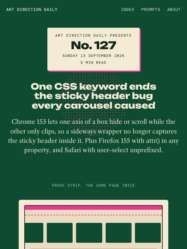
Visual result for the Boutique Product Page / Ecommerce PDP prompt

NO. 025 · 2026-06-01

Boutique Product Page / Ecommerce PDP

A premium ecommerce product detail layout: left gallery with a thumbnail rail, a sticky buy box, variant chips, and scannable spec rows on warm catalog paper.

Design a premium ecommerce product detail page (PDP) for a single

Instrument Serif + Figtree

ProductReference

Read the full prompt and reusable template
Design a premium ecommerce product detail page (PDP) for a single
catalog item, not a marketing landing page.

Layout:
- Above the fold, a two-column split: a left product gallery with a
  vertical thumbnail rail and one large product photo on a warm
  seamless studio backdrop, and a right sticky buy box.
- The buy box holds: an "in stock" status line, a serif product
  title, a one-line subtitle, a price-and-SKU strip, variant chips,
  a primary add-to-cart button, and a small assurance row.
- Below the fold, stack product sections: Specifications as
  label/value spec rows, a "Pairs well with" shelf of three cards,
  a "Recreate this look" panel, and an Editor's review with stars.
- Section markers come from the store, not symbols: numbered section
  headers with an eyebrow tab on the right.

Palette: warm oat paper (#F1EADD), espresso ink (#221C18), one
garnet accent (#8E2A39) for the buy button, links, and price, and a
muted olive (#4C5740) for one italic editorial line. No gradients on
type, no glow, no neon.

Type: an elegant high-contrast serif (Instrument Serif) for the
product title and section heads, a clean humanist sans (Figtree) for
body and UI, a reading italic (Newsreader) for one editorial line,
and a monospace (Spline Sans Mono) for SKU codes, price labels, and
spec metadata.

Readability: body at least 18px, line height 1.6 or more, no
justified text, WCAG AA contrast, text never sitting on a border.
Do not render fake readable text inside the product photo; use blank
labels and soft shapes only.
Design a single web page for [your topic] using the Boutique Product Page / Ecommerce PDP art direction.

Purpose: adapt this visual system to [your product, article, interface, or client brief]. Keep the layout grammar and visual lesson, but replace all story-specific references with your own content.

Visual system: A premium ecommerce product detail layout: left gallery with a thumbnail rail, a sticky buy box, variant chips, and scannable spec rows on warm catalog paper.

Starting point: Design a premium ecommerce product detail page (PDP) for a single

Palette: paper: #F1EADD, primary: #221C18, secondary: #6B6356, accent: #8E2A39, muted: #4C5740.

Type: Instrument Serif + Figtree. Keep running text readable, with clear hierarchy between display type, body copy, labels, and source or metadata marks.

Layout: preserve the original archetype's structural idea, then map it to your content. Define the hero, metadata, primary content sections, supporting image or artifact, prompt or CTA area, and source/reference area before styling individual cards.

Imagery: create or choose one integral visual artifact that teaches the pattern. It should be visible near the top of the page and work in both a wide social crop and a portrait cover crop. Avoid logos, watermarks, and fake readable text inside images.

Guardrails: avoid generic SaaS sections, purple-blue gradients, glass cards, fake controls, stock people, emoji decoration, pill-shaped everything, and identical feature cards. Build visible focus states, real links/buttons, responsive crop behavior, and a reduced-motion fallback.
Visual result for the Command Palette / ⌘K Launcher prompt

NO. 024 · 2026-05-31

Command Palette / ⌘K Launcher

The whole page as a light command launcher floating over a dimmed app.

Design a web page using a Command Palette art direction.

Bricolage Grotesque + Hanken Grotesk

Read the full prompt and reusable template
Design a web page using a Command Palette art direction.

Lay it out as a single light "launcher" window floating over a softly
blurred application screenshot. No big hero image inside the window.

Translate the references into real web components:
- A search bar header: a magnifier, a typed query with a blinking caret,
  and right-aligned kbd chips for issue and date metadata.
- Content as grouped command rows: a small-caps group header with a count,
  then rows of leading icon + title + one-line subtitle + a return key.
- One highlighted active row in a pale blue tint for the pinned item.
- An expandable command that opens a dark code panel for a prompt.
- A fixed action bar at the foot with kbd hints (Open, Actions, Close).

Palette: a cool lavender-gray field, white window, near-black ink, slate
gray secondary text, one electric blue for selection and links, and a warm
amber only for the return key. Avoid purple-blue gradients and any glow.

Type: a characterful grotesque for command titles, a humanist sans for
body, a serif italic for one editorial line, and a monospace for keys,
shortcuts, and source domains.

Keep it readable: body at least 18px, line height 1.6 or more, no justified
text, strong contrast, no text sitting on borders. Do not render fake
readable UI text inside the blurred backdrop image; use soft shapes only.

Type: Bricolage Grotesque for command titles, Hanken Grotesk for body, Newsreader italic for one editorial line, a monospace for shortcuts and metadata.
Color: lavender-gray field #E9EAF2, ink #15161D, action blue #3355FF, one amber #E8870B highlight as an honest active state.
Design a single web page for [your topic] using the Command Palette / ⌘K Launcher art direction.

Purpose: adapt this visual system to [your product, article, interface, or client brief]. Keep the layout grammar and visual lesson, but replace all story-specific references with your own content.

Visual system: The whole page as a light command launcher floating over a dimmed app.

Starting point: Design a web page using a Command Palette art direction.

Palette: paper: #E9EAF2, primary: #15161D, secondary: #5B6472, accent: #3355FF, muted: #E8870B.

Type: Bricolage Grotesque + Hanken Grotesk. Keep running text readable, with clear hierarchy between display type, body copy, labels, and source or metadata marks.

Layout: preserve the original archetype's structural idea, then map it to your content. Define the hero, metadata, primary content sections, supporting image or artifact, prompt or CTA area, and source/reference area before styling individual cards.

Imagery: create or choose one integral visual artifact that teaches the pattern. It should be visible near the top of the page and work in both a wide social crop and a portrait cover crop. Avoid logos, watermarks, and fake readable text inside images.

Guardrails: avoid generic SaaS sections, purple-blue gradients, glass cards, fake controls, stock people, emoji decoration, pill-shaped everything, and identical feature cards. Build visible focus states, real links/buttons, responsive crop behavior, and a reduced-motion fallback.
Visual result for the Pull Request Review / Diff Merge System prompt

NO. 023 · 2026-05-30

Pull Request Review / Diff Merge System

A GitHub-style files-changed view — a sticky left files-changed index rail beside a right feed of changed-file cards, with green addition rows, diff stats, status checks, and a merge box.

Design a web page using a Pull Request Review art direction.

Geist + Spectral

Console

Read the full prompt and reusable template
Design a web page using a Pull Request Review art direction.

Lay it out like a code-review "files changed" view: a full-width PR header, then a sticky left "files changed" index rail beside a right-hand feed of entries. Do not use a big hero image.

Translate the references into real web components:
- A masthead styled as a PR header, with an Open status pill and a branch ref (canvas to main).
- A left rail listing each section as a file row with a monospace path and a +N stat, anchored to the feed.
- Each feed section as a changed-file card: a file path, a kind tag, and a +N -N diff stat.
- News items shown as green addition rows: a linked headline, one sentence, a source link.
- A green merge box for the closing takeaway, with a visible Merge button.

Use a cool light review-paper background, near-black ink, merge green, deletion red, and a quiet plum for the merged state. Pair a clean product sans for display with a readable serif for body, and a monospace for paths, line numbers, and labels.

Keep it readable: body text at least 18px, generous line height, no justified prose, strong contrast, no text against borders. Avoid fake readable code in images (use abstract bars), AI-glow, neon gradients, and decorative marks that hurt scanning.

Type: Geist for display and UI, Spectral for body and italic synthesis, Geist Mono for diffs, counts, and metadata.
Color: cool review gray #F4F6F8, ink #11181C, diff green #1F883D and alert red #CF222E as honest review states only, merge violet #6639A6 for the merge moment.
Design a single web page for [your topic] using the Pull Request Review / Diff Merge System art direction.

Purpose: adapt this visual system to [your product, article, interface, or client brief]. Keep the layout grammar and visual lesson, but replace all story-specific references with your own content.

Visual system: A GitHub-style files-changed view — a sticky left files-changed index rail beside a right feed of changed-file cards, with green addition rows, diff stats, status checks, and a merge box.

Starting point: Design a web page using a Pull Request Review art direction.

Palette: paper: #F4F6F8, primary: #11181C, secondary: #1F883D, accent: #CF222E, muted: #6639A6.

Type: Geist + Spectral. Keep running text readable, with clear hierarchy between display type, body copy, labels, and source or metadata marks.

Layout: preserve the original archetype's structural idea, then map it to your content. Define the hero, metadata, primary content sections, supporting image or artifact, prompt or CTA area, and source/reference area before styling individual cards.

Imagery: create or choose one integral visual artifact that teaches the pattern. It should be visible near the top of the page and work in both a wide social crop and a portrait cover crop. Avoid logos, watermarks, and fake readable text inside images.

Guardrails: avoid generic SaaS sections, purple-blue gradients, glass cards, fake controls, stock people, emoji decoration, pill-shaped everything, and identical feature cards. Build visible focus states, real links/buttons, responsive crop behavior, and a reduced-motion fallback.
Visual result for the Editorial Proof Desk / Agent Galley System prompt

NO. 022 · 2026-05-29

Editorial Proof Desk / Agent Galley System

Galley proofs, crop marks, correction flags, revision slips, and signoff stamps turn long-running agent work into reviewable publishing material.

Design a web page using an Editorial Proof Desk art direction.

Fraunces + Inter

EditorialConsole

Read the full prompt and reusable template
Design a web page using an Editorial Proof Desk art direction.

The page should feel like generated work has been placed on a print proofing table for human review. Use galley-proof sheets, crop marks, correction flags, revision slips, markup rails, signoff stamps, and stacked paper as the core visual language.

Translate those references into real web components:
- A hero that behaves like a proof sheet with metadata cells and a signoff row.
- Section headers styled as proof labels or revision slips, with enough padding around large type.
- Content cards that feel like marked-up galleys, not generic dashboard panels.
- A restrained palette of warm ivory paper, aubergine ink, proof red, teal correction tabs, muted mustard, and graphite desk tones.
- Typography that pairs a high-character editorial serif for display with a precise sans or mono for labels.

Keep the page readable first: body text at least 18px, generous line height, no justified prose, strong contrast, and no text pressed against borders.

Avoid fake readable text in images, AI-glow aesthetics, neon gradients, robots, code walls, and decorative proofing marks that make the content harder to scan.

Type: Fraunces for display, Inter for body, Literata italic for synthesis, Azeret Mono for proof labels and revision slips.
Color: warm proof paper #EAE1D2, aubergine ink #24172F, teal correction #147D78, red-clay proof marks #C95B43.
Design a single web page for [your topic] using the Editorial Proof Desk / Agent Galley System art direction.

Purpose: adapt this visual system to [your product, article, interface, or client brief]. Keep the layout grammar and visual lesson, but replace all story-specific references with your own content.

Visual system: Galley proofs, crop marks, correction flags, revision slips, and signoff stamps turn long-running agent work into reviewable publishing material.

Starting point: Design a web page using an Editorial Proof Desk art direction.

Palette: paper: #EAE1D2, primary: #24172F, secondary: #147D78, accent: #C95B43, muted: #685D67.

Type: Fraunces + Inter. Keep running text readable, with clear hierarchy between display type, body copy, labels, and source or metadata marks.

Layout: preserve the original archetype's structural idea, then map it to your content. Define the hero, metadata, primary content sections, supporting image or artifact, prompt or CTA area, and source/reference area before styling individual cards.

Imagery: create or choose one integral visual artifact that teaches the pattern. It should be visible near the top of the page and work in both a wide social crop and a portrait cover crop. Avoid logos, watermarks, and fake readable text inside images.

Guardrails: avoid generic SaaS sections, purple-blue gradients, glass cards, fake controls, stock people, emoji decoration, pill-shaped everything, and identical feature cards. Build visible focus states, real links/buttons, responsive crop behavior, and a reduced-motion fallback.
Visual result for the Connector Catalog / MCP Switchboard prompt

NO. 021 · 2026-05-28

Connector Catalog / MCP Switchboard

Light documentation-catalog surfaces, endpoint cards, socket ports, route tags, and trust labels turn MCP connectors into inspectable product grammar.

Design a single self-contained HTML page as a connector catalog and MCP switchboard, integration documentation as product grammar. The content is a daily design-news briefing: a top nav, an...

Space Grotesk + IBM Plex Sans

ProductReference

Read the full prompt and reusable template
Design a single self-contained HTML page as a connector catalog and MCP switchboard, integration documentation as product grammar. The content is a daily design-news briefing: a top nav, an issue masthead with number, date, and read time, a hero headline with a one-line deck, a boxed art-direction note, numbered sections of linked news items with one or two sentences of context each, one pullquote, a monospace prompt block, a sources list, and a colophon.

Treatment: cream documentation ground #F6F3EC; a dark graphite issue sheet #17212B anchoring the hero; items as modular endpoint cards with small socket-port motifs along one edge; section markers named like catalog routes (Route, Socket, Return, Recipe, Trust, Index); muted teal #0B7D76 route labels and signal-orange #E75D2A trust marks as honest states; sources arranged like a switchboard index.

Type: Space Grotesk for product-doc display, IBM Plex Sans for body, IBM Plex Serif italic for emphasis, Space Mono for endpoint labels.

Guardrails: body text at least 18px with line height 1.6 or more, prose in the body face and never in monospace, line length 60-75 characters, WCAG AA contrast on every surface, hover and focus states on real links, decoration in the margins and panels rather than under running prose, no fake readable text in images, and no default AI styling (no purple-blue gradients, no glow, no pill-shaped everything). Socket motifs are small flat geometry on card edges, never a background pattern.
Design a single web page for [your topic] using the Connector Catalog / MCP Switchboard art direction.

Purpose: adapt this visual system to [your product, article, interface, or client brief]. Keep the layout grammar and visual lesson, but replace all story-specific references with your own content.

Visual system: Light documentation-catalog surfaces, endpoint cards, socket ports, route tags, and trust labels turn MCP connectors into inspectable product grammar.

Starting point: Design a self-contained HTML page as a connector catalog and MCP switchboard, integration documentation as product grammar. The content is a daily design-news briefing: a top nav, an...

Palette: paper: #F6F3EC, primary: #17212B, secondary: #0B7D76, accent: #E75D2A, muted: #52606B.

Type: Space Grotesk + IBM Plex Sans. Keep running text readable, with clear hierarchy between display type, body copy, labels, and source or metadata marks.

Layout: preserve the original archetype's structural idea, then map it to your content. Define the hero, metadata, primary content sections, supporting image or artifact, prompt or CTA area, and source/reference area before styling individual cards.

Imagery: create or choose one integral visual artifact that teaches the pattern. It should be visible near the top of the page and work in both a wide social crop and a portrait cover crop. Avoid logos, watermarks, and fake readable text inside images.

Guardrails: avoid generic SaaS sections, purple-blue gradients, glass cards, fake controls, stock people, emoji decoration, pill-shaped everything, and identical feature cards. Build visible focus states, real links/buttons, responsive crop behavior, and a reduced-motion fallback.
Visual result for the Agent Ops Console / Attention State System prompt

NO. 020 · 2026-05-27

Agent Ops Console / Attention State System

Graphite-green command-console chrome, split browser and terminal panes, attention rings, permission lanes, alert rows, and status lights.

Design a single self-contained HTML page as an agent operations console, a supervised run queue with attention states. The content is a daily design-news briefing: a top nav, an issue...

DM Sans + DM Sans

Console

Read the full prompt and reusable template
Design a single self-contained HTML page as an agent operations console, a supervised run queue with attention states. The content is a daily design-news briefing: a top nav, an issue masthead with number, date, and read time, a hero headline with a one-line deck, a boxed art-direction note, numbered sections of linked news items with one or two sentences of context each, one pullquote, a monospace prompt block, a sources list, and a colophon.

Treatment: a flat graphite-green ground #101816; content on mineral-white #E8EFE8 review surfaces; split-pane rhythm pairing prose with console chrome; cyan #2EA7B8 and amber #F3B23C used only as honest state marks (rings, status lights, lane labels); sections arranged like a run queue with status rows; ink #E8EFE8 on dark, #101816 on light.

Type: DM Sans for display and body, Fraunces italic for one editorial synthesis line, JetBrains Mono for terminal labels and states.

Guardrails: body text at least 18px with line height 1.6 or more, prose in the body face and never in monospace, line length 60-75 characters, WCAG AA contrast on every surface, hover and focus states on real links, decoration in the margins and panels rather than under running prose, no fake readable text in images, and no default AI styling (no purple-blue gradients, no glow, no pill-shaped everything). Dark ground without dark-mode cliches: no neon, no glow, no cyan-on-black prose; body text sits on the light surfaces.
Design a single web page for [your topic] using the Agent Ops Console / Attention State System art direction.

Purpose: adapt this visual system to [your product, article, interface, or client brief]. Keep the layout grammar and visual lesson, but replace all story-specific references with your own content.

Visual system: Graphite-green command-console chrome, split browser and terminal panes, attention rings, permission lanes, alert rows, and status lights.

Starting point: Design a self-contained HTML page as an agent operations console, a supervised run queue with attention states. The content is a daily design-news briefing: a top nav, an issue...

Palette: paper: #101816, primary: #E8EFE8, secondary: #2EA7B8, accent: #F3B23C, muted: #7F9A84.

Type: DM Sans + DM Sans. Keep running text readable, with clear hierarchy between display type, body copy, labels, and source or metadata marks.

Layout: preserve the original archetype's structural idea, then map it to your content. Define the hero, metadata, primary content sections, supporting image or artifact, prompt or CTA area, and source/reference area before styling individual cards.

Imagery: create or choose one integral visual artifact that teaches the pattern. It should be visible near the top of the page and work in both a wide social crop and a portrait cover crop. Avoid logos, watermarks, and fake readable text inside images.

Guardrails: avoid generic SaaS sections, purple-blue gradients, glass cards, fake controls, stock people, emoji decoration, pill-shaped everything, and identical feature cards. Build visible focus states, real links/buttons, responsive crop behavior, and a reduced-motion fallback.
Visual result for the Metro Transfer Map / Ticket Kiosk System prompt

NO. 019 · 2026-05-26

Metro Transfer Map / Ticket Kiosk System

Mint fare-ticket stock, blunt route lines, transfer dots, kiosk cards, and punched edges turn agent handoffs into visible transit signage.

Design a single self-contained HTML page as a metro transfer map and ticket kiosk, transit signage for a daily briefing. The content is a daily design-news briefing: a top nav, an issue...

Archivo Black + Atkinson Hyperlegible

Read the full prompt and reusable template
Design a single self-contained HTML page as a metro transfer map and ticket kiosk, transit signage for a daily briefing. The content is a daily design-news briefing: a top nav, an issue masthead with number, date, and read time, a hero headline with a one-line deck, a boxed art-direction note, numbered sections of linked news items with one or two sentences of context each, one pullquote, a monospace prompt block, a sources list, and a colophon.

Treatment: mint fare-ticket stock #E6FFF5 with punched-edge perforations on cards; section numbers as transfer stops connected by a blunt route line running down the page; a kiosk-style nav; a three-cell route metadata strip in the masthead; the art-direction note as a yellow fare card; transit teal #006B5F lines and signal orange #FF5A1F transfer dots; ink #14201C.

Type: Archivo Black caps for display, Atkinson Hyperlegible for body, Fraunces italic for one editorial signal, IBM Plex Mono for route labels.

Guardrails: body text at least 18px with line height 1.6 or more, prose in the body face and never in monospace, line length 60-75 characters, WCAG AA contrast on every surface, hover and focus states on real links, decoration in the margins and panels rather than under running prose, no fake readable text in images, and no default AI styling (no purple-blue gradients, no glow, no pill-shaped everything). The route line is structural, drawn once, connecting real sections.
Design a single web page for [your topic] using the Metro Transfer Map / Ticket Kiosk System art direction.

Purpose: adapt this visual system to [your product, article, interface, or client brief]. Keep the layout grammar and visual lesson, but replace all story-specific references with your own content.

Visual system: Mint fare-ticket stock, blunt route lines, transfer dots, kiosk cards, and punched edges turn agent handoffs into visible transit signage.

Starting point: Design a self-contained HTML page as a metro transfer map and ticket kiosk, transit signage for a daily briefing. The content is a daily design-news briefing: a top nav, an issue...

Palette: paper: #E6FFF5, primary: #14201C, secondary: #006B5F, accent: #FF5A1F, muted: #3F635B.

Type: Archivo Black + Atkinson Hyperlegible. Keep running text readable, with clear hierarchy between display type, body copy, labels, and source or metadata marks.

Layout: preserve the original archetype's structural idea, then map it to your content. Define the hero, metadata, primary content sections, supporting image or artifact, prompt or CTA area, and source/reference area before styling individual cards.

Imagery: create or choose one integral visual artifact that teaches the pattern. It should be visible near the top of the page and work in both a wide social crop and a portrait cover crop. Avoid logos, watermarks, and fake readable text inside images.

Guardrails: avoid generic SaaS sections, purple-blue gradients, glass cards, fake controls, stock people, emoji decoration, pill-shaped everything, and identical feature cards. Build visible focus states, real links/buttons, responsive crop behavior, and a reduced-motion fallback.
Visual result for the Service Banner Modernism / Memorial Textile System prompt

NO. 018 · 2026-05-25

Service Banner Modernism / Memorial Textile System

Deep service navy cloth, aged ivory panels, oxblood ribbon bars, muted gold markers, and sewn-edge permission labels.

Design a single self-contained HTML page as a service-banner textile system, memorial modernism in cloth and ribbon. The content is a daily design-news briefing: a top nav, an issue...

Barlow Condensed + Source Serif 4

Illustration

Read the full prompt and reusable template
Design a single self-contained HTML page as a service-banner textile system, memorial modernism in cloth and ribbon. The content is a daily design-news briefing: a top nav, an issue masthead with number, date, and read time, a hero headline with a one-line deck, a boxed art-direction note, numbered sections of linked news items with one or two sentences of context each, one pullquote, a monospace prompt block, a sources list, and a colophon.

Treatment: a deep service-navy cloth ground #101C32; content on aged ivory #E9E0CA panels with sewn-edge stitched borders; oxblood #76302E ribbon bars marking sections; muted marigold #C4972E status markers; gray-green #687467 stitched rules; sections arranged like procession markers down the page. The register is solemn and restrained.

Type: Barlow Condensed for procession-signage display, Source Serif 4 for body, Literata italic for one quiet line, IBM Plex Mono for stitched labels.

Guardrails: body text at least 18px with line height 1.6 or more, prose in the body face and never in monospace, line length 60-75 characters, WCAG AA contrast on every surface, hover and focus states on real links, decoration in the margins and panels rather than under running prose, no fake readable text in images, and no default AI styling (no purple-blue gradients, no glow, no pill-shaped everything). Ivory text on navy meets WCAG AA; no glow, no gradients, cloth implied by flat color and stitch rules only.
Design a single web page for [your topic] using the Service Banner Modernism / Memorial Textile System art direction.

Purpose: adapt this visual system to [your product, article, interface, or client brief]. Keep the layout grammar and visual lesson, but replace all story-specific references with your own content.

Visual system: Deep service navy cloth, aged ivory panels, oxblood ribbon bars, muted gold markers, and sewn-edge permission labels.

Starting point: Design a self-contained HTML page as a service-banner textile system, memorial modernism in cloth and ribbon. The content is a daily design-news briefing: a top nav, an issue...

Palette: paper: #101C32, primary: #E9E0CA, secondary: #687467, accent: #C4972E, muted: #76302E.

Type: Barlow Condensed + Source Serif 4. Keep running text readable, with clear hierarchy between display type, body copy, labels, and source or metadata marks.

Layout: preserve the original archetype's structural idea, then map it to your content. Define the hero, metadata, primary content sections, supporting image or artifact, prompt or CTA area, and source/reference area before styling individual cards.

Imagery: create or choose one integral visual artifact that teaches the pattern. It should be visible near the top of the page and work in both a wide social crop and a portrait cover crop. Avoid logos, watermarks, and fake readable text inside images.

Guardrails: avoid generic SaaS sections, purple-blue gradients, glass cards, fake controls, stock people, emoji decoration, pill-shaped everything, and identical feature cards. Build visible focus states, real links/buttons, responsive crop behavior, and a reduced-motion fallback.
Visual result for the Victory Garden Risograph / Civic Seed Packet prompt

NO. 017 · 2026-05-24

Victory Garden Risograph / Civic Seed Packet

Overprinted crop rows, seed packets, tomato-red app panels, blue browser frames, and one remembrance flower.

Design a single self-contained HTML page as a victory-garden risograph poster crossed with a civic seed packet. The content is a daily design-news briefing: a top nav, an issue masthead...

Bagel Fat One + Newsreader

Read the full prompt and reusable template
Design a single self-contained HTML page as a victory-garden risograph poster crossed with a civic seed packet. The content is a daily design-news briefing: a top nav, an issue masthead with number, date, and read time, a hero headline with a one-line deck, a boxed art-direction note, numbered sections of linked news items with one or two sentences of context each, one pullquote, a monospace prompt block, a sources list, and a colophon.

Treatment: sun-gold paper #F4E2B8 with a faint crop-row line pattern in the ground; overprinted riso inks in navy #132A4A, garden green #236E44, and tomato red #E34B2D with visible print grain; the art-direction note as a seed packet with a labeled front panel; blue stamped section labels; tomato-red offset shadows on cards; one poster-style hero plate above the fold.

Type: Bagel Fat One for chunky seed-packet display lettering, Newsreader for body, Work Sans for poster labels, a monospace for registration captions.

Guardrails: body text at least 18px with line height 1.6 or more, prose in the body face and never in monospace, line length 60-75 characters, WCAG AA contrast on every surface, hover and focus states on real links, decoration in the margins and panels rather than under running prose, no fake readable text in images, and no default AI styling (no purple-blue gradients, no glow, no pill-shaped everything). Overprint texture stays under display and panels, never under body text.
Design a single web page for [your topic] using the Victory Garden Risograph / Civic Seed Packet art direction.

Purpose: adapt this visual system to [your product, article, interface, or client brief]. Keep the layout grammar and visual lesson, but replace all story-specific references with your own content.

Visual system: Overprinted crop rows, seed packets, tomato-red app panels, blue browser frames, and one remembrance flower.

Starting point: Design a self-contained HTML page as a victory-garden risograph poster crossed with a civic seed packet. The content is a daily design-news briefing: a top nav, an issue masthead...

Palette: paper: #F4E2B8, primary: #132A4A, secondary: #236E44, accent: #E34B2D, muted: #5C5133.

Type: Bagel Fat One + Newsreader. Keep running text readable, with clear hierarchy between display type, body copy, labels, and source or metadata marks.

Layout: preserve the original archetype's structural idea, then map it to your content. Define the hero, metadata, primary content sections, supporting image or artifact, prompt or CTA area, and source/reference area before styling individual cards.

Imagery: create or choose one integral visual artifact that teaches the pattern. It should be visible near the top of the page and work in both a wide social crop and a portrait cover crop. Avoid logos, watermarks, and fake readable text inside images.

Guardrails: avoid generic SaaS sections, purple-blue gradients, glass cards, fake controls, stock people, emoji decoration, pill-shaped everything, and identical feature cards. Build visible focus states, real links/buttons, responsive crop behavior, and a reduced-motion fallback.
Visual result for the Memorial Archive Ledger / Civic Record Table prompt

NO. 016 · 2026-05-23

Memorial Archive Ledger / Civic Record Table

Folded service paper, stone rubbing, vellum workflow, and quiet filing marks.

Design a single self-contained HTML page as a memorial archive ledger, a civic record table handled quietly. The content is a daily design-news briefing: a top nav, an issue masthead with...

Cormorant Garamond + Source Serif 4

Read the full prompt and reusable template
Design a single self-contained HTML page as a memorial archive ledger, a civic record table handled quietly. The content is a daily design-news briefing: a top nav, an issue masthead with number, date, and read time, a hero headline with a one-line deck, a boxed art-direction note, numbered sections of linked news items with one or two sentences of context each, one pullquote, a monospace prompt block, a sources list, and a colophon.

Treatment: cool gray record-table ground #DDE1DE; cream service-paper panels carrying the content; typed ledger metadata rows; one red #B94A36 inspection stamp used once; a double-rule frame on the pullquote; sections filed like conservation notes with small accession marks; slate #5D7279 secondary, ink #1B2022. The register is solemn and restrained throughout.

Type: Cormorant Garamond for display, Source Serif 4 for body, a condensed sans for small labels, a monospace for accession marks.

Guardrails: body text at least 18px with line height 1.6 or more, prose in the body face and never in monospace, line length 60-75 characters, WCAG AA contrast on every surface, hover and focus states on real links, decoration in the margins and panels rather than under running prose, no fake readable text in images, and no default AI styling (no purple-blue gradients, no glow, no pill-shaped everything). No bright color beyond the single stamp; quiet is the idiom.
Design a single web page for [your topic] using the Memorial Archive Ledger / Civic Record Table art direction.

Purpose: adapt this visual system to [your product, article, interface, or client brief]. Keep the layout grammar and visual lesson, but replace all story-specific references with your own content.

Visual system: Folded service paper, stone rubbing, vellum workflow, and quiet filing marks.

Starting point: Design a self-contained HTML page as a memorial archive ledger, a civic record table handled quietly. The content is a daily design-news briefing: a top nav, an issue masthead with...

Palette: paper: #DDE1DE, primary: #1B2022, secondary: #5D7279, accent: #B94A36, muted: #566266.

Type: Cormorant Garamond + Source Serif 4. Keep running text readable, with clear hierarchy between display type, body copy, labels, and source or metadata marks.

Layout: preserve the original archetype's structural idea, then map it to your content. Define the hero, metadata, primary content sections, supporting image or artifact, prompt or CTA area, and source/reference area before styling individual cards.

Imagery: create or choose one integral visual artifact that teaches the pattern. It should be visible near the top of the page and work in both a wide social crop and a portrait cover crop. Avoid logos, watermarks, and fake readable text inside images.

Guardrails: avoid generic SaaS sections, purple-blue gradients, glass cards, fake controls, stock people, emoji decoration, pill-shaped everything, and identical feature cards. Build visible focus states, real links/buttons, responsive crop behavior, and a reduced-motion fallback.
Visual result for the Exploded Office Manual / Technical Workbench prompt

NO. 015 · 2026-05-22

Exploded Office Manual / Technical Workbench

A cool drafting-table page built from leader lines, spot colors, and exploded-view context diagrams.

Design a single self-contained HTML page as an exploded technical office manual, a 1980s drafting-table workbench. The content is a daily design-news briefing: a top nav, an issue masthead...

Barlow Condensed + Source Sans 3

Reference

Read the full prompt and reusable template
Design a single self-contained HTML page as an exploded technical office manual, a 1980s drafting-table workbench. The content is a daily design-news briefing: a top nav, an issue masthead with number, date, and read time, a hero headline with a one-line deck, a boxed art-direction note, numbered sections of linked news items with one or two sentences of context each, one pullquote, a monospace prompt block, a sources list, and a colophon.

Treatment: cool drafting paper #EAF3F4 over a faint blue grid; one exploded-view diagram with thin leader lines and numbered yellow figure tags above the fold; section headers as technical manual plates with figure numbers; oxide-red #C43B2F inspection marks as the single accent; engineering blue #1D56A5 secondary; ink #111820.

Type: Barlow Condensed for plate display, Source Sans 3 for body, a monospace for part numbers, figure tags, and metadata.

Guardrails: body text at least 18px with line height 1.6 or more, prose in the body face and never in monospace, line length 60-75 characters, WCAG AA contrast on every surface, hover and focus states on real links, decoration in the margins and panels rather than under running prose, no fake readable text in images, and no default AI styling (no purple-blue gradients, no glow, no pill-shaped everything). Leader lines connect labels to real content, never decorate empty space.
Design a single web page for [your topic] using the Exploded Office Manual / Technical Workbench art direction.

Purpose: adapt this visual system to [your product, article, interface, or client brief]. Keep the layout grammar and visual lesson, but replace all story-specific references with your own content.

Visual system: A cool drafting-table page built from leader lines, spot colors, and exploded-view context diagrams.

Starting point: Design a self-contained HTML page as an exploded technical office manual, a 1980s drafting-table workbench. The content is a daily design-news briefing: a top nav, an issue masthead...

Palette: paper: #EAF3F4, primary: #111820, secondary: #1D56A5, accent: #C43B2F, muted: #52616B.

Type: Barlow Condensed + Source Sans 3. Keep running text readable, with clear hierarchy between display type, body copy, labels, and source or metadata marks.

Layout: preserve the original archetype's structural idea, then map it to your content. Define the hero, metadata, primary content sections, supporting image or artifact, prompt or CTA area, and source/reference area before styling individual cards.

Imagery: create or choose one integral visual artifact that teaches the pattern. It should be visible near the top of the page and work in both a wide social crop and a portrait cover crop. Avoid logos, watermarks, and fake readable text inside images.

Guardrails: avoid generic SaaS sections, purple-blue gradients, glass cards, fake controls, stock people, emoji decoration, pill-shaped everything, and identical feature cards. Build visible focus states, real links/buttons, responsive crop behavior, and a reduced-motion fallback.
Visual result for the White Cube Installation / Gallery Wall Label prompt

NO. 014 · 2026-05-21

White Cube Installation / Gallery Wall Label

White gallery walls, mint floor plane, graphite wall labels, cobalt review tape, and a generated installation plate turn the agent canvas into an inspectable exhibition.

Design a single self-contained HTML page as a white-cube gallery installation, museum wall labels for a daily briefing. The content is a daily design-news briefing: a top nav, an issue...

Instrument Serif + Libre Franklin

Console

Read the full prompt and reusable template
Design a single self-contained HTML page as a white-cube gallery installation, museum wall labels for a daily briefing. The content is a daily design-news briefing: a top nav, an issue masthead with number, date, and read time, a hero headline with a one-line deck, a boxed art-direction note, numbered sections of linked news items with one or two sentences of context each, one pullquote, a monospace prompt block, a sources list, and a colophon.

Treatment: pure gallery white #F8FAF7 walls over a pale mint floor plane; the hero pairs a large serif exhibition title with one framed plate image; section numbers set like accession labels; items as graphite wall-label cards #42494F on white with generous margins; strips of cobalt #0B63CE painter's tape as the only marking accent; ink #121416.

Type: Instrument Serif for exhibition display, Libre Franklin for body, IBM Plex Mono for accession-style metadata.

Guardrails: body text at least 18px with line height 1.6 or more, prose in the body face and never in monospace, line length 60-75 characters, WCAG AA contrast on every surface, hover and focus states on real links, decoration in the margins and panels rather than under running prose, no fake readable text in images, and no default AI styling (no purple-blue gradients, no glow, no pill-shaped everything). Whitespace is the medium: wide margins, few rules, tape used at most four times.
Design a single web page for [your topic] using the White Cube Installation / Gallery Wall Label art direction.

Purpose: adapt this visual system to [your product, article, interface, or client brief]. Keep the layout grammar and visual lesson, but replace all story-specific references with your own content.

Visual system: White gallery walls, mint floor plane, graphite wall labels, cobalt review tape, and a generated installation plate turn the agent canvas into an inspectable exhibition.

Starting point: Design a self-contained HTML page as a white-cube gallery installation, museum wall labels for a daily briefing. The content is a daily design-news briefing: a top nav, an issue...

Palette: paper: #F8FAF7, primary: #121416, secondary: #42494F, accent: #0B63CE, muted: #667076.

Type: Instrument Serif + Libre Franklin. Keep running text readable, with clear hierarchy between display type, body copy, labels, and source or metadata marks.

Layout: preserve the original archetype's structural idea, then map it to your content. Define the hero, metadata, primary content sections, supporting image or artifact, prompt or CTA area, and source/reference area before styling individual cards.

Imagery: create or choose one integral visual artifact that teaches the pattern. It should be visible near the top of the page and work in both a wide social crop and a portrait cover crop. Avoid logos, watermarks, and fake readable text inside images.

Guardrails: avoid generic SaaS sections, purple-blue gradients, glass cards, fake controls, stock people, emoji decoration, pill-shaped everything, and identical feature cards. Build visible focus states, real links/buttons, responsive crop behavior, and a reduced-motion fallback.
Visual result for the Race Control / Pit Wall Telemetry prompt

NO. 013 · 2026-05-20

Race Control / Pit Wall Telemetry

Carbon panels, sector timing blocks, curb stripes, lap boards, and telemetry traces turn agent speed into an operations surface.

Design a single self-contained HTML page as a race-control pit wall, motorsport telemetry as an operations surface. The content is a daily design-news briefing: a top nav, an issue masthead...

Bebas Neue + IBM Plex Sans

Console

Read the full prompt and reusable template
Design a single self-contained HTML page as a race-control pit wall, motorsport telemetry as an operations surface. The content is a daily design-news briefing: a top nav, an issue masthead with number, date, and read time, a hero headline with a one-line deck, a boxed art-direction note, numbered sections of linked news items with one or two sentences of context each, one pullquote, a monospace prompt block, a sources list, and a colophon.

Treatment: cool gray paper #E9ECE7 with carbon panels #111417 and #2A3238; the hero as a pit-wall control board; sections as sector reports with curb-stripe edge marks; takeaways styled as radio calls; lap-board tiles for metadata; telemetry lime #C9FF2E reserved for timing data, traces, and live marks, never prose; thin timing rules between rows.

Type: Bebas Neue for condensed display, IBM Plex Sans for body, Fraunces italic for one editorial aside, IBM Plex Mono for timing labels and sector numbers.

Guardrails: body text at least 18px with line height 1.6 or more, prose in the body face and never in monospace, line length 60-75 characters, WCAG AA contrast on every surface, hover and focus states on real links, decoration in the margins and panels rather than under running prose, no fake readable text in images, and no default AI styling (no purple-blue gradients, no glow, no pill-shaped everything). Lime on carbon only, never lime on light gray.
Design a single web page for [your topic] using the Race Control / Pit Wall Telemetry art direction.

Purpose: adapt this visual system to [your product, article, interface, or client brief]. Keep the layout grammar and visual lesson, but replace all story-specific references with your own content.

Visual system: Carbon panels, sector timing blocks, curb stripes, lap boards, and telemetry traces turn agent speed into an operations surface.

Starting point: Design a self-contained HTML page as a race-control pit wall, motorsport telemetry as an operations surface. The content is a daily design-news briefing: a top nav, an issue masthead...

Palette: paper: #E9ECE7, primary: #111417, secondary: #2A3238, accent: #C9FF2E, muted: #56636D.

Type: Bebas Neue + IBM Plex Sans. Keep running text readable, with clear hierarchy between display type, body copy, labels, and source or metadata marks.

Layout: preserve the original archetype's structural idea, then map it to your content. Define the hero, metadata, primary content sections, supporting image or artifact, prompt or CTA area, and source/reference area before styling individual cards.

Imagery: create or choose one integral visual artifact that teaches the pattern. It should be visible near the top of the page and work in both a wide social crop and a portrait cover crop. Avoid logos, watermarks, and fake readable text inside images.

Guardrails: avoid generic SaaS sections, purple-blue gradients, glass cards, fake controls, stock people, emoji decoration, pill-shaped everything, and identical feature cards. Build visible focus states, real links/buttons, responsive crop behavior, and a reduced-motion fallback.
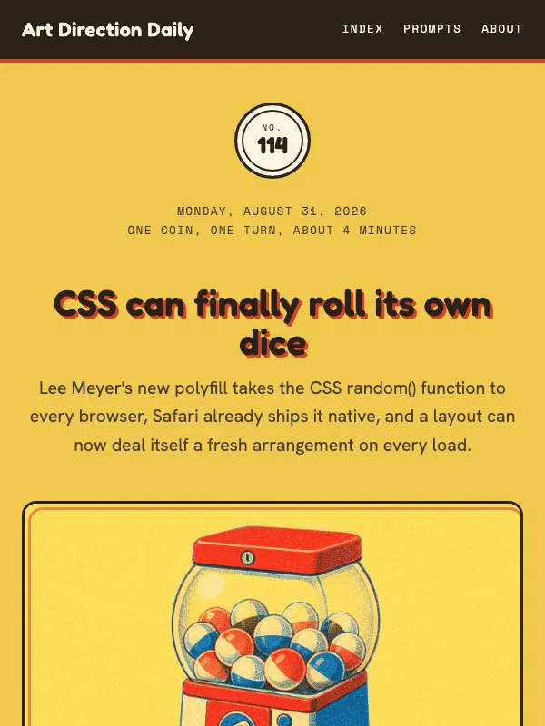
Visual result for the Public Library Card Catalog / Reference Desk Drawer prompt

NO. 012 · 2026-05-19

Public Library Card Catalog / Reference Desk Drawer

Celadon filing cards, brass label pulls, due-date stamps, serif reference headings, and tabbed dividers turn today’s issue into a pre-digital search system for browser-agent memory.

Design a single self-contained HTML page as a public-library card catalog, a reference-desk drawer rendered as a webpage. The content is a daily design-news briefing: a top nav, an issue...

DM Serif Display + Source Serif 4

Reference

Read the full prompt and reusable template
Design a single self-contained HTML page as a public-library card catalog, a reference-desk drawer rendered as a webpage. The content is a daily design-news briefing: a top nav, an issue masthead with number, date, and read time, a hero headline with a one-line deck, a boxed art-direction note, numbered sections of linked news items with one or two sentences of context each, one pullquote, a monospace prompt block, a sources list, and a colophon.

Treatment: cool celadon card stock #DCE4D8 deepening to #CBD6C8, with brighter filing cards #EEF2E7; the hero as one oversized library card with a top filing tab; the art-direction note as a stamped reference slip; section markers as drawer labels with small brass #AE8D48 pulls; due-date-style stamps on metadata; the issue nav as a stack of catalog drawers in deep green #526156 and #39463C; oxblood #7B3033 as the single marking accent.

Type: DM Serif Display for headings and its italic for quiet accents, Source Serif 4 for body, IBM Plex Mono for filing marks and source records.

Guardrails: body text at least 18px with line height 1.6 or more, prose in the body face and never in monospace, line length 60-75 characters, WCAG AA contrast on every surface, hover and focus states on real links, decoration in the margins and panels rather than under running prose, no fake readable text in images, and no default AI styling (no purple-blue gradients, no glow, no pill-shaped everything). Stamps tilt no more than two degrees and never touch prose.
Design a single web page for [your topic] using the Public Library Card Catalog / Reference Desk Drawer art direction.

Purpose: adapt this visual system to [your product, article, interface, or client brief]. Keep the layout grammar and visual lesson, but replace all story-specific references with your own content.

Visual system: Celadon filing cards, brass label pulls, due-date stamps, serif reference headings, and tabbed dividers turn today’s issue into a pre-digital search system for browser-agent memory.

Starting point: Design a self-contained HTML page as a public-library card catalog, a reference-desk drawer rendered as a webpage. The content is a daily design-news briefing: a top nav, an issue...

Palette: paper: #DCE4D8, paperDeep: #CBD6C8, paperCard: #EEF2E7, drawer: #526156, drawerDeep: #39463C, accent: #7B3033, accentItalic: #4C5D52, brass: #AE8D48, muted: #5C675D.

Type: DM Serif Display + Source Serif 4 + IBM Plex Mono. Keep running text readable, with clear hierarchy between display type, body copy, labels, and source or metadata marks.

Layout: preserve the original archetype's structural idea, then map it to your content. Define the hero, metadata, primary content sections, supporting image or artifact, prompt or CTA area, and source/reference area before styling individual cards.

Imagery: create or choose one integral visual artifact that teaches the pattern. It should be visible near the top of the page and work in both a wide social crop and a portrait cover crop. Avoid logos, watermarks, and fake readable text inside images.

Guardrails: avoid generic SaaS sections, purple-blue gradients, glass cards, fake controls, stock people, emoji decoration, pill-shaped everything, and identical feature cards. Build visible focus states, real links/buttons, responsive crop behavior, and a reduced-motion fallback.
Visual result for the Airport Wayfinding / Terminal Operations Board prompt

NO. 011 · 2026-05-18

Airport Wayfinding / Terminal Operations Board

Black enamel terminal boards, high-contrast yellow arrows, gate codes, route logic, and public-infrastructure typography applied to the problem of making website actions visible to agents.

Design a single self-contained HTML page as an airport terminal operations board, public wayfinding infrastructure. The content is a daily design-news briefing: a top nav, an issue masthead...

Archivo Black + Atkinson Hyperlegible

Console

Read the full prompt and reusable template
Design a single self-contained HTML page as an airport terminal operations board, public wayfinding infrastructure. The content is a daily design-news briefing: a top nav, an issue masthead with number, date, and read time, a hero headline with a one-line deck, a boxed art-direction note, numbered sections of linked news items with one or two sentences of context each, one pullquote, a monospace prompt block, a sources list, and a colophon.

Treatment: warm concourse paper #F7F1E3; a black enamel #151915 departure-board hero with high-contrast signal-yellow #F5C400 route accents and arrows; gate-number tiles as section headers; a three-stop route board for the lead story; public-signage arrows guiding flow between sections; sources styled as terminal records; wayfinding blue #0057B8, service green #008C72, and alert red #D3381C used only as honest signage states.

Type: Archivo Black for terminal signage display, Atkinson Hyperlegible for body, Literata italic for one editorial card, IBM Plex Mono for gates, routes, and metadata.

Guardrails: body text at least 18px with line height 1.6 or more, prose in the body face and never in monospace, line length 60-75 characters, WCAG AA contrast on every surface, hover and focus states on real links, decoration in the margins and panels rather than under running prose, no fake readable text in images, and no default AI styling (no purple-blue gradients, no glow, no pill-shaped everything). Yellow stays on dark enamel for contrast, never as small text on light paper.
Design a single web page for [your topic] using the Airport Wayfinding / Terminal Operations Board art direction.

Purpose: adapt this visual system to [your product, article, interface, or client brief]. Keep the layout grammar and visual lesson, but replace all story-specific references with your own content.

Visual system: Black enamel terminal boards, high-contrast yellow arrows, gate codes, route logic, and public-infrastructure typography applied to the problem of making website actions visible to agents.

Starting point: Design a self-contained HTML page as an airport terminal operations board, public wayfinding infrastructure. The content is a daily design-news briefing: a top nav, an issue masthead...

Palette: paper: #F7F1E3, asphalt: #151915, yellow: #F5C400, blue: #0057B8, green: #008C72, red: #D3381C, mute: #4B554E.

Type: Archivo Black + Atkinson Hyperlegible + IBM Plex Mono. Keep running text readable, with clear hierarchy between display type, body copy, labels, and source or metadata marks.

Layout: preserve the original archetype's structural idea, then map it to your content. Define the hero, metadata, primary content sections, supporting image or artifact, prompt or CTA area, and source/reference area before styling individual cards.

Imagery: create or choose one integral visual artifact that teaches the pattern. It should be visible near the top of the page and work in both a wide social crop and a portrait cover crop. Avoid logos, watermarks, and fake readable text inside images.

Guardrails: avoid generic SaaS sections, purple-blue gradients, glass cards, fake controls, stock people, emoji decoration, pill-shaped everything, and identical feature cards. Build visible focus states, real links/buttons, responsive crop behavior, and a reduced-motion fallback.
Visual result for the Vaporwave / VHS Broadcast prompt

NO. 010 · 2026-05-17

Vaporwave / VHS Broadcast

Sunset-magenta gradient over a cyan wireframe horizon, lined-CRT display type, burnt-in subtitle pullquotes, scanline overlay, and lower-third broadcast chrome — the lapsed-1990s cable-channel aesthetic applied to a story about design systems learning a new audience.

Design a single self-contained HTML page as a vaporwave VHS broadcast, a lapsed cable channel rendered as a webpage. The content is a daily design-news briefing: a top nav, an issue...

Monoton + Space Grotesk

Read the full prompt and reusable template
Design a single self-contained HTML page as a vaporwave VHS broadcast, a lapsed cable channel rendered as a webpage. The content is a daily design-news briefing: a top nav, an issue masthead with number, date, and read time, a hero headline with a one-line deck, a boxed art-direction note, numbered sections of linked news items with one or two sentences of context each, one pullquote, a monospace prompt block, a sources list, and a colophon.

Treatment: a deep-navy field from #0D0732 to #1E0D5B; the masthead as a VHS chrome bar with a blinking REC dot, channel number, and timecode; a full-width hero of a sunset-to-magenta gradient over a perspective cyan wireframe horizon with polygon palm silhouettes and a sun cut by three navy bands; magenta #FF2EC8 plus cyan #5BFCFC color-bleed text shadows on the display headline only; sections badged TRACK 01 through 06 with transport-control glyphs; the pullquote as a burnt-in TV subtitle with closed-caption corner marks; takeaways as on-screen alerts with a magenta side bar; pearl #ECE6FF prose, coral #FF7AB3 and sunset #FFE873 accents; a faint scanline overlay.

Type: Monoton for monumental display, Space Grotesk for body, VT323 for all chrome, timecodes, and the sources list.

Guardrails: body text at least 18px with line height 1.6 or more, prose in the body face and never in monospace, line length 60-75 characters, WCAG AA contrast on every surface, hover and focus states on real links, decoration in the margins and panels rather than under running prose, no fake readable text in images, and no default AI styling (no purple-blue gradients, no glow, no pill-shaped everything). Gradients belong to the hero sky and chrome only; body prose is flat pearl on flat navy at 19px or larger.
Design a single web page for [your topic] using the Vaporwave / VHS Broadcast art direction.

Purpose: adapt this visual system to [your product, article, interface, or client brief]. Keep the layout grammar and visual lesson, but replace all story-specific references with your own content.

Visual system: Sunset-magenta gradient over a cyan wireframe horizon, lined-CRT display type, burnt-in subtitle pullquotes, scanline overlay, and lower-third broadcast chrome — the lapsed-1990s cable-channel aesthetic applied to a story about design systems learning a new audience.

Starting point: Design a self-contained HTML page as a vaporwave VHS broadcast, a lapsed cable channel rendered as a webpage. The content is a daily design-news briefing: a top nav, an issue...

Palette: bgDeep: #0D0732, bgMid: #1E0D5B, magenta: #FF2EC8, cyan: #5BFCFC, coral: #FF7AB3, sunset: #FFE873, pearl: #ECE6FF, italicMute: #D4C9F0.

Type: Monoton + Space Grotesk + VT323. Keep running text readable, with clear hierarchy between display type, body copy, labels, and source or metadata marks.

Layout: preserve the original archetype's structural idea, then map it to your content. Define the hero, metadata, primary content sections, supporting image or artifact, prompt or CTA area, and source/reference area before styling individual cards.

Imagery: create or choose one integral visual artifact that teaches the pattern. It should be visible near the top of the page and work in both a wide social crop and a portrait cover crop. Avoid logos, watermarks, and fake readable text inside images.

Guardrails: avoid generic SaaS sections, purple-blue gradients, glass cards, fake controls, stock people, emoji decoration, pill-shaped everything, and identical feature cards. Build visible focus states, real links/buttons, responsive crop behavior, and a reduced-motion fallback.
Visual result for the Saul Bass / Mid-Century Cinema Poster prompt

NO. 009 · 2026-05-16

Saul Bass / Mid-Century Cinema Poster

Cut-paper silhouettes, asymmetric Spartan caps, tomato-red punctuation, cobalt secondary, mid-century cinema-program paper.

Design a single self-contained HTML page as a mid-century cinema poster program, Saul Bass cut-paper modernism. The content is a daily design-news briefing: a top nav, an issue masthead...

League Spartan + PT Serif

PosterIllustration

Read the full prompt and reusable template
Design a single self-contained HTML page as a mid-century cinema poster program, Saul Bass cut-paper modernism. The content is a daily design-news briefing: a top nav, an issue masthead with number, date, and read time, a hero headline with a one-line deck, a boxed art-direction note, numbered sections of linked news items with one or two sentences of context each, one pullquote, a monospace prompt block, a sources list, and a colophon.

Treatment: program paper #EFE7D1 with deeper #E2D8BC panels; a cut-paper composition anchored to one hero corner built from simple geometry (a cobalt lozenge, a tomato circle, an ink bar); a vertical monospace strip in the margin carrying the issue number; section markers as spelled-out numerals ONE, TWO, THREE in Spartan caps, each prefixed by a tomato bar; the pullquote framed by thick black bookend bars above and below; takeaway cards reversed out in ink #171615 with a tomato pin; tomato #D8401C punctuation accents and cobalt #26456E secondary.

Type: League Spartan caps for display with a tomato period on the headline, PT Serif for body, Fraunces italic for asides, DM Mono for credit-block captions.

Guardrails: body text at least 18px with line height 1.6 or more, prose in the body face and never in monospace, line length 60-75 characters, WCAG AA contrast on every surface, hover and focus states on real links, decoration in the margins and panels rather than under running prose, no fake readable text in images, and no default AI styling (no purple-blue gradients, no glow, no pill-shaped everything). Cut-paper shapes are flat fills, no gradients or bevels.
Design a single web page for [your topic] using the Saul Bass / Mid-Century Cinema Poster art direction.

Purpose: adapt this visual system to [your product, article, interface, or client brief]. Keep the layout grammar and visual lesson, but replace all story-specific references with your own content.

Visual system: Cut-paper silhouettes, asymmetric Spartan caps, tomato-red punctuation, cobalt secondary, mid-century cinema-program paper.

Starting point: Design a self-contained HTML page as a mid-century cinema poster program, Saul Bass cut-paper modernism. The content is a daily design-news briefing: a top nav, an issue masthead...

Palette: paper: #EFE7D1, paperWarm: #E8DFC2, paperDeep: #E2D8BC, primary: #171615, secondary: #26456E, accent: #D8401C, accentItalic: #3C5273, muted: #5F5544.

Type: League Spartan + PT Serif + DM Mono. Keep running text readable, with clear hierarchy between display type, body copy, labels, and source or metadata marks.

Layout: preserve the original archetype's structural idea, then map it to your content. Define the hero, metadata, primary content sections, supporting image or artifact, prompt or CTA area, and source/reference area before styling individual cards.

Imagery: create or choose one integral visual artifact that teaches the pattern. It should be visible near the top of the page and work in both a wide social crop and a portrait cover crop. Avoid logos, watermarks, and fake readable text inside images.

Guardrails: avoid generic SaaS sections, purple-blue gradients, glass cards, fake controls, stock people, emoji decoration, pill-shaped everything, and identical feature cards. Build visible focus states, real links/buttons, responsive crop behavior, and a reduced-motion fallback.
Visual result for the Sumi-e Manga Spread prompt

NO. 008 · 2026-05-15

Sumi-e Manga Spread

Ink-wash editorial with vertical tategaki kanji, hanko seals, and manga panel cuts on washi paper.

Design a single self-contained HTML page as a sumi-e manga spread, ink-wash editorial on washi paper. The content is a daily design-news briefing: a top nav, an issue masthead with number,...

Shippori Mincho B1 + EB Garamond

Editorial

Read the full prompt and reusable template
Design a single self-contained HTML page as a sumi-e manga spread, ink-wash editorial on washi paper. The content is a daily design-news briefing: a top nav, an issue masthead with number, date, and read time, a hero headline with a one-line deck, a boxed art-direction note, numbered sections of linked news items with one or two sentences of context each, one pullquote, a monospace prompt block, a sources list, and a colophon.

Treatment: washi #F4EFE3 with deeper #DCD0B4 panels; a soft bokashi ink-wash gradient across the top of the hero; a vertical tategaki kanji column beside the headline; a vermillion #C72A1E hanko seal rotated about -7 degrees in the hero corner; a brushstroke panel-cut divider before every section; a small kanji numeral prefixing each section marker; indigo #234763 for italic asides; sakura #D89BAE petals drifting in the hero top corner; ink #1A1816.

Type: Shippori Mincho B1 for display, EB Garamond for body and italic, Noto Serif JP for kanji, JetBrains Mono for marks and tags.

Guardrails: body text at least 18px with line height 1.6 or more, prose in the body face and never in monospace, line length 60-75 characters, WCAG AA contrast on every surface, hover and focus states on real links, decoration in the margins and panels rather than under running prose, no fake readable text in images, and no default AI styling (no purple-blue gradients, no glow, no pill-shaped everything). Ink wash stays in the hero and dividers; prose sits on clean washi.
Design a single web page for [your topic] using the Sumi-e Manga Spread art direction.

Purpose: adapt this visual system to [your product, article, interface, or client brief]. Keep the layout grammar and visual lesson, but replace all story-specific references with your own content.

Visual system: Ink-wash editorial with vertical tategaki kanji, hanko seals, and manga panel cuts on washi paper.

Starting point: Design a self-contained HTML page as a sumi-e manga spread, ink-wash editorial on washi paper. The content is a daily design-news briefing: a top nav, an issue masthead with number,...

Palette: paper: #F4EFE3, paperDeep: #DCD0B4, primary: #1A1816, secondary: #2C2723, accent: #C72A1E, accentItalic: #234763, sakura: #D89BAE, muted: #6E6256.

Type: Shippori Mincho B1 + EB Garamond + JetBrains Mono. Keep running text readable, with clear hierarchy between display type, body copy, labels, and source or metadata marks.

Layout: preserve the original archetype's structural idea, then map it to your content. Define the hero, metadata, primary content sections, supporting image or artifact, prompt or CTA area, and source/reference area before styling individual cards.

Imagery: create or choose one integral visual artifact that teaches the pattern. It should be visible near the top of the page and work in both a wide social crop and a portrait cover crop. Avoid logos, watermarks, and fake readable text inside images.

Guardrails: avoid generic SaaS sections, purple-blue gradients, glass cards, fake controls, stock people, emoji decoration, pill-shaped everything, and identical feature cards. Build visible focus states, real links/buttons, responsive crop behavior, and a reduced-motion fallback.
Visual result for the Maritime Signal Flags / Naval Code Book prompt

NO. 007 · 2026-05-14

Maritime Signal Flags / Naval Code Book

Chart-paper cream, navy chart ink, signal-red flags, signal-yellow pennants, stenciled hoist, ICS flag-strip banner.

Design a single self-contained HTML page as a naval code book, maritime signal flags over chart paper. The content is a daily design-news briefing: a top nav, an issue masthead with number,...

Oswald + Source Serif 4

Read the full prompt and reusable template
Design a single self-contained HTML page as a naval code book, maritime signal flags over chart paper. The content is a daily design-news briefing: a top nav, an issue masthead with number, date, and read time, a hero headline with a one-line deck, a boxed art-direction note, numbered sections of linked news items with one or two sentences of context each, one pullquote, a monospace prompt block, a sources list, and a colophon.

Treatment: chart cream #F1E7CB with deeper #DACB9D panels and a navy double-rule chart border around the page; a banner of international-code signal flags running across the header; the art-direction note framed as a code-book leaf with two small pennants hanging from its top edge; a stenciled mono masthead with ship's-log lines; a signal-yellow #E8A60E rope-banner pullquote with vermilion end caps; a compass-rose ornament between sections; chart navy #082042 ink, sea blue #1F4D78 secondary, signal red #C8102E accents.

Type: Oswald for compressed signage display, Source Serif 4 for body and its italic for asides, JetBrains Mono for callsigns and tags.

Guardrails: body text at least 18px with line height 1.6 or more, prose in the body face and never in monospace, line length 60-75 characters, WCAG AA contrast on every surface, hover and focus states on real links, decoration in the margins and panels rather than under running prose, no fake readable text in images, and no default AI styling (no purple-blue gradients, no glow, no pill-shaped everything). Flags are flat geometric color, no skeuomorphic cloth.
Design a single web page for [your topic] using the Maritime Signal Flags / Naval Code Book art direction.

Purpose: adapt this visual system to [your product, article, interface, or client brief]. Keep the layout grammar and visual lesson, but replace all story-specific references with your own content.

Visual system: Chart-paper cream, navy chart ink, signal-red flags, signal-yellow pennants, stenciled hoist, ICS flag-strip banner.

Starting point: Design a self-contained HTML page as a naval code book, maritime signal flags over chart paper. The content is a daily design-news briefing: a top nav, an issue masthead with number,...

Palette: paper: #F1E7CB, paperDeep: #DACB9D, primary: #082042, secondary: #1F4D78, accent: #C8102E, accentItalic: #1F4D78, gold: #E8A60E, hull: #0D1218, muted: #544328.

Type: Oswald + Source Serif 4 + JetBrains Mono. Keep running text readable, with clear hierarchy between display type, body copy, labels, and source or metadata marks.

Layout: preserve the original archetype's structural idea, then map it to your content. Define the hero, metadata, primary content sections, supporting image or artifact, prompt or CTA area, and source/reference area before styling individual cards.

Imagery: create or choose one integral visual artifact that teaches the pattern. It should be visible near the top of the page and work in both a wide social crop and a portrait cover crop. Avoid logos, watermarks, and fake readable text inside images.

Guardrails: avoid generic SaaS sections, purple-blue gradients, glass cards, fake controls, stock people, emoji decoration, pill-shaped everything, and identical feature cards. Build visible focus states, real links/buttons, responsive crop behavior, and a reduced-motion fallback.
Visual result for the Pressed Specimen Folio / Botanical Herbarium Plate prompt

NO. 006 · 2026-05-13

Pressed Specimen Folio / Botanical Herbarium Plate

Aged manila herbarium card, copperplate title plates, italic Latin binomials, ink-stamped accession marks, pressed-leaf olive hairlines.

Design a single self-contained HTML page as a pressed-specimen herbarium folio, a botanical archive plate. The content is a daily design-news briefing: a top nav, an issue masthead with...

Cormorant Garamond + Lora

Read the full prompt and reusable template
Design a single self-contained HTML page as a pressed-specimen herbarium folio, a botanical archive plate. The content is a daily design-news briefing: a top nav, an issue masthead with number, date, and read time, a hero headline with a one-line deck, a boxed art-direction note, numbered sections of linked news items with one or two sentences of context each, one pullquote, a monospace prompt block, a sources list, and a colophon.

Treatment: aged manila card #EDE3D0 with deeper #D7C9AE panels and a double-rule folio frame around the whole page; a copperplate-engraved title plate as the masthead with a small pressed-leaf ornament between two hairline rules; an italic Latin-style binomial line under the art-direction heading; rose-madder #893B30 ink stamps reading FILED and OBSERVED, rotated about 1.5 degrees, on the takeaway boxes; a mono accession tag on the hero; faint foxing spots; pressed-leaf olive #4F5A2A hairlines and tags; ink #1F1A12.

Type: Cormorant Garamond for display and italic binomials, Lora for body, IBM Plex Mono for accession numbers and field tags.

Guardrails: body text at least 18px with line height 1.6 or more, prose in the body face and never in monospace, line length 60-75 characters, WCAG AA contrast on every surface, hover and focus states on real links, decoration in the margins and panels rather than under running prose, no fake readable text in images, and no default AI styling (no purple-blue gradients, no glow, no pill-shaped everything). Stamps and foxing are sparse, never over prose.
Design a single web page for [your topic] using the Pressed Specimen Folio / Botanical Herbarium Plate art direction.

Purpose: adapt this visual system to [your product, article, interface, or client brief]. Keep the layout grammar and visual lesson, but replace all story-specific references with your own content.

Visual system: Aged manila herbarium card, copperplate title plates, italic Latin binomials, ink-stamped accession marks, pressed-leaf olive hairlines.

Starting point: Design a self-contained HTML page as a pressed-specimen herbarium folio, a botanical archive plate. The content is a daily design-news briefing: a top nav, an issue masthead with...

Palette: paper: #EDE3D0, paperDeep: #D7C9AE, primary: #1F1A12, secondary: #4F5A2A, accent: #893B30, accentItalic: #4A3724, muted: #615541.

Type: Cormorant Garamond + Lora + IBM Plex Mono. Keep running text readable, with clear hierarchy between display type, body copy, labels, and source or metadata marks.

Layout: preserve the original archetype's structural idea, then map it to your content. Define the hero, metadata, primary content sections, supporting image or artifact, prompt or CTA area, and source/reference area before styling individual cards.

Imagery: create or choose one integral visual artifact that teaches the pattern. It should be visible near the top of the page and work in both a wide social crop and a portrait cover crop. Avoid logos, watermarks, and fake readable text inside images.

Guardrails: avoid generic SaaS sections, purple-blue gradients, glass cards, fake controls, stock people, emoji decoration, pill-shaped everything, and identical feature cards. Build visible focus states, real links/buttons, responsive crop behavior, and a reduced-motion fallback.
Visual result for the Architectural Blueprint / Drafting Plate prompt

NO. 005 · 2026-05-12

Architectural Blueprint / Drafting Plate

Trace paper, drafting hairlines, dimension callouts, and a single drafting-pencil red on warm vellum.

Design a single self-contained HTML page as an architectural drafting plate, blueprint discipline on warm vellum. The content is a daily design-news briefing: a top nav, an issue masthead...

Big Shoulders Display + Inter

Read the full prompt and reusable template
Design a single self-contained HTML page as an architectural drafting plate, blueprint discipline on warm vellum. The content is a daily design-news briefing: a top nav, an issue masthead with number, date, and read time, a hero headline with a one-line deck, a boxed art-direction note, numbered sections of linked news items with one or two sentences of context each, one pullquote, a monospace prompt block, a sources list, and a colophon.

Treatment: vellum #ECE3CB with deeper #D6C9A4 panels and a faint hairline drafting grid; a drafting title block as the masthead, labelled like Sheet A-005 with issue metadata in its cells; numbered drafting bubbles with thin leader lines as section markers; surveyor corner brackets framing the art-direction note, captioned Detail A; a faint cyan double-rule sheet border around the page; drafting-pencil red #A8240F reserved for rev marks, dimension callouts, and the period of the hero headline; navy ink #112E5A with secondary #1B5E8C.

Type: Big Shoulders Display for the plate display face, Inter for body, Source Serif 4 italic for asides, JetBrains Mono for dimension annotations.

Guardrails: body text at least 18px with line height 1.6 or more, prose in the body face and never in monospace, line length 60-75 characters, WCAG AA contrast on every surface, hover and focus states on real links, decoration in the margins and panels rather than under running prose, no fake readable text in images, and no default AI styling (no purple-blue gradients, no glow, no pill-shaped everything). The grid stays faint enough to read over.
Design a single web page for [your topic] using the Architectural Blueprint / Drafting Plate art direction.

Purpose: adapt this visual system to [your product, article, interface, or client brief]. Keep the layout grammar and visual lesson, but replace all story-specific references with your own content.

Visual system: Trace paper, drafting hairlines, dimension callouts, and a single drafting-pencil red on warm vellum.

Starting point: Design a self-contained HTML page as an architectural drafting plate, blueprint discipline on warm vellum. The content is a daily design-news briefing: a top nav, an issue masthead...

Palette: paper: #ECE3CB, paperDeep: #D6C9A4, primary: #112E5A, secondary: #1B5E8C, accent: #A8240F, accentItalic: #5A3E22, muted: #8C7E62.

Type: Big Shoulders Display + Inter + JetBrains Mono. Keep running text readable, with clear hierarchy between display type, body copy, labels, and source or metadata marks.

Layout: preserve the original archetype's structural idea, then map it to your content. Define the hero, metadata, primary content sections, supporting image or artifact, prompt or CTA area, and source/reference area before styling individual cards.

Imagery: create or choose one integral visual artifact that teaches the pattern. It should be visible near the top of the page and work in both a wide social crop and a portrait cover crop. Avoid logos, watermarks, and fake readable text inside images.

Guardrails: avoid generic SaaS sections, purple-blue gradients, glass cards, fake controls, stock people, emoji decoration, pill-shaped everything, and identical feature cards. Build visible focus states, real links/buttons, responsive crop behavior, and a reduced-motion fallback.
Visual result for the Memphis Milano / Postmodern Sottsass prompt

NO. 004 · 2026-05-11

Memphis Milano / Postmodern Sottsass

Confetti terrazzo, squiggles, geometric blocks and offset drop shadows in salon pink, electric teal, sunshine yellow, and cobalt.

Design a single self-contained HTML page in a Memphis Milano idiom, postmodern Sottsass exuberance disciplined for reading. The content is a daily design-news briefing: a top nav, an issue...

Bungee + Sora

Read the full prompt and reusable template
Design a single self-contained HTML page in a Memphis Milano idiom, postmodern Sottsass exuberance disciplined for reading. The content is a daily design-news briefing: a top nav, an issue masthead with number, date, and read time, a hero headline with a one-line deck, a boxed art-direction note, numbered sections of linked news items with one or two sentences of context each, one pullquote, a monospace prompt block, a sources list, and a colophon.

Treatment: warm paper #FAF6E8 scattered with confetti-terrazzo dots; chunky geometric blocks; hot-pink #FF3E8A and cobalt #2E5BFF offset drop shadows on cards and callouts; accents in electric teal #00BFB3, sunshine yellow #FFD23F, and terracotta #E96A4A; a yellow half-circle bookend on the art-direction card and one small triangle pin in its corner; ink #1A1A1A for all prose.

Type: Bungee for chunky display headlines with a layered pink-plus-cobalt text shadow, Sora for body, Fraunces italic for one editorial flourish, Space Mono for captions and labels.

Guardrails: body text at least 18px with line height 1.6 or more, prose in the body face and never in monospace, line length 60-75 characters, WCAG AA contrast on every surface, hover and focus states on real links, decoration in the margins and panels rather than under running prose, no fake readable text in images, and no default AI styling (no purple-blue gradients, no glow, no pill-shaped everything). Shapes and shadows decorate cards and margins; body paragraphs sit on plain paper with no pattern behind them.
Design a single web page for [your topic] using the Memphis Milano / Postmodern Sottsass art direction.

Purpose: adapt this visual system to [your product, article, interface, or client brief]. Keep the layout grammar and visual lesson, but replace all story-specific references with your own content.

Visual system: Confetti terrazzo, squiggles, geometric blocks and offset drop shadows in salon pink, electric teal, sunshine yellow, and cobalt.

Starting point: Design a self-contained HTML page in a Memphis Milano idiom, postmodern Sottsass exuberance disciplined for reading. The content is a daily design-news briefing: a top nav, an issue...

Palette: paper: #FAF6E8, paperDeep: #F2EDDA, primary: #1A1A1A, secondary: #FF3E8A, accent: #00BFB3, accentItalic: #3A1F4D, yellow: #FFD23F, cobalt: #2E5BFF, terracotta: #E96A4A, muted: #8A857A.

Type: Bungee + Sora + Space Mono. Keep running text readable, with clear hierarchy between display type, body copy, labels, and source or metadata marks.

Layout: preserve the original archetype's structural idea, then map it to your content. Define the hero, metadata, primary content sections, supporting image or artifact, prompt or CTA area, and source/reference area before styling individual cards.

Imagery: create or choose one integral visual artifact that teaches the pattern. It should be visible near the top of the page and work in both a wide social crop and a portrait cover crop. Avoid logos, watermarks, and fake readable text inside images.

Guardrails: avoid generic SaaS sections, purple-blue gradients, glass cards, fake controls, stock people, emoji decoration, pill-shaped everything, and identical feature cards. Build visible focus states, real links/buttons, responsive crop behavior, and a reduced-motion fallback.
Visual result for the Editorial Brutalism + Spec Sheet prompt

NO. 003 · 2026-05-10

Editorial Brutalism + Spec Sheet

Stamped block-caps, hairline rules, mono caption ticks, vermilion section flags, cream spec paper.

Design a single self-contained HTML page as an editorial-brutalism spec sheet, stamped block-caps over engineering paper. The content is a daily design-news briefing: a top nav, an issue...

Anton + Newsreader

Editorial

Read the full prompt and reusable template
Design a single self-contained HTML page as an editorial-brutalism spec sheet, stamped block-caps over engineering paper. The content is a daily design-news briefing: a top nav, an issue masthead with number, date, and read time, a hero headline with a one-line deck, a boxed art-direction note, numbered sections of linked news items with one or two sentences of context each, one pullquote, a monospace prompt block, a sources list, and a colophon.

Treatment: cream spec paper #F2EEE6 with deeper cream #E8E2D2 panels, ink #111111, secondary ink #3A3A3A, vermilion #FF3A1F reserved for section flags, oversize section numerals, and small markers; hairline horizontal rules dividing every section; the art-direction note framed as a labelled title block with a vermilion bookend; mono caption ticks on metadata.

Type: Anton for stamped block-cap headlines, Newsreader for body and its italic for asides, IBM Plex Mono for spec captions and section numbers.

Guardrails: body text at least 18px with line height 1.6 or more, prose in the body face and never in monospace, line length 60-75 characters, WCAG AA contrast on every surface, hover and focus states on real links, decoration in the margins and panels rather than under running prose, no fake readable text in images, and no default AI styling (no purple-blue gradients, no glow, no pill-shaped everything). Vermilion is a marking ink, never a background field.
Design a single web page for [your topic] using the Editorial Brutalism + Spec Sheet art direction.

Purpose: adapt this visual system to [your product, article, interface, or client brief]. Keep the layout grammar and visual lesson, but replace all story-specific references with your own content.

Visual system: Stamped block-caps, hairline rules, mono caption ticks, vermilion section flags, cream spec paper.

Starting point: Design a self-contained HTML page as an editorial-brutalism spec sheet, stamped block-caps over engineering paper. The content is a daily design-news briefing: a top nav, an issue...

Palette: paper: #F2EEE6, paperDeep: #E8E2D2, primary: #111111, secondary: #3A3A3A, accent: #FF3A1F, accentItalic: #4A2418, muted: #8A867E.

Type: Anton + Newsreader + IBM Plex Mono. Keep running text readable, with clear hierarchy between display type, body copy, labels, and source or metadata marks.

Layout: preserve the original archetype's structural idea, then map it to your content. Define the hero, metadata, primary content sections, supporting image or artifact, prompt or CTA area, and source/reference area before styling individual cards.

Imagery: create or choose one integral visual artifact that teaches the pattern. It should be visible near the top of the page and work in both a wide social crop and a portrait cover crop. Avoid logos, watermarks, and fake readable text inside images.

Guardrails: avoid generic SaaS sections, purple-blue gradients, glass cards, fake controls, stock people, emoji decoration, pill-shaped everything, and identical feature cards. Build visible focus states, real links/buttons, responsive crop behavior, and a reduced-motion fallback.
Visual result for the Frutiger Aero / Aqua-Era Web prompt

NO. 002 · 2026-05-09

Frutiger Aero / Aqua-Era Web

Glossy aqua gradients, cumulus clouds, lens flares, beveled tabs, royal-blue links.

Design a single self-contained HTML page in a Frutiger Aero idiom, the glossy aqua-era web of 2004-2008. The content is a daily design-news briefing: a top nav, an issue masthead with...

Tahoma / Verdana, ultra-bold with chrome gradient fill + Verdana, Tahoma

Read the full prompt and reusable template
Design a single self-contained HTML page in a Frutiger Aero idiom, the glossy aqua-era web of 2004-2008. The content is a daily design-news briefing: a top nav, an issue masthead with number, date, and read time, a hero headline with a one-line deck, a boxed art-direction note, numbered sections of linked news items with one or two sentences of context each, one pullquote, a monospace prompt block, a sources list, and a colophon.

Treatment: a sky ground from #DCEEFF down to #B7DEF5 with drifting cumulus clouds and exactly one lens flare; glossy aqua panels with white inner highlights and soft bevels; beveled tabs for the nav; capsule buttons; a peach horizon glow with one sunset-orange accent #FF6B00; royal-blue links #0066CC and teal secondary accents #00A99D.

Type: Tahoma or Verdana ultra-bold for display with a chrome gradient fill on the hero headline only, Verdana or Tahoma body, Times-style italic kickers, Courier-style monospace captions.

Guardrails: body text at least 18px with line height 1.6 or more, prose in the body face and never in monospace, line length 60-75 characters, WCAG AA contrast on every surface, hover and focus states on real links, decoration in the margins and panels rather than under running prose, no fake readable text in images, and no default AI styling (no purple-blue gradients, no glow, no pill-shaped everything). Gloss and gradients live on panels, chrome, and the hero sky, never under body text, which sits on a plain light surface.
Design a single web page for [your topic] using the Frutiger Aero / Aqua-Era Web art direction.

Purpose: adapt this visual system to [your product, article, interface, or client brief]. Keep the layout grammar and visual lesson, but replace all story-specific references with your own content.

Visual system: Glossy aqua gradients, cumulus clouds, lens flares, beveled tabs, royal-blue links.

Starting point: Design a self-contained HTML page in a Frutiger Aero idiom, the glossy aqua-era web of 2004-2008. The content is a daily design-news briefing: a top nav, an issue masthead with...

Palette: paper: #DCEEFF, paperDeep: #B7DEF5, primary: #0066CC, secondary: #00A99D, accent: #FF6B00, muted: #6E8AA8.

Type: Tahoma / Verdana, ultra-bold with chrome gradient fill + Verdana, Tahoma + Courier New. Keep running text readable, with clear hierarchy between display type, body copy, labels, and source or metadata marks.

Layout: preserve the original archetype's structural idea, then map it to your content. Define the hero, metadata, primary content sections, supporting image or artifact, prompt or CTA area, and source/reference area before styling individual cards.

Imagery: create or choose one integral visual artifact that teaches the pattern. It should be visible near the top of the page and work in both a wide social crop and a portrait cover crop. Avoid logos, watermarks, and fake readable text inside images.

Guardrails: avoid generic SaaS sections, purple-blue gradients, glass cards, fake controls, stock people, emoji decoration, pill-shaped everything, and identical feature cards. Build visible focus states, real links/buttons, responsive crop behavior, and a reduced-motion fallback.
Visual result for the Risograph Print / Indie Studio prompt

NO. 001 · 2026-05-08
Risograph Print / Indie Studio

Two-color overprint, halftone, cream paper, deliberate misregistration.

Design a single self-contained HTML page in a risograph print idiom, the look of a two-color indie-studio zine. The content is a daily design-news briefing: a top nav, an issue masthead...

Helvetica Neue / Arial Black, ultra-bold condensed

Read the full prompt and reusable template
Design a single self-contained HTML page in a risograph print idiom, the look of a two-color indie-studio zine. The content is a daily design-news briefing: a top nav, an issue masthead with number, date, and read time, a hero headline with a one-line deck, a boxed art-direction note, numbered sections of linked news items with one or two sentences of context each, one pullquote, a monospace prompt block, a sources list, and a colophon.

Treatment: cream paper #F4EBD3 with deeper cream #E9DCB8 panels; fluorescent pink #FF3E9C and riso blue #1F35C4 as the two ink passes, overprinting to violet #4A1170 where they overlap; halftone dot fields behind display moments; deliberate 2-3px misregistration offsets on headlines, rules, and section numbers, as if the pink and blue passes slipped; visible paper grain.

Type: an ultra-bold condensed grotesque for display (Anton or Archivo Black), a Times-style italic serif for editorial asides, Courier-style monospace for captions and section numbers (set as "Section 01" markers).

Guardrails: body text at least 18px with line height 1.6 or more, prose in the body face and never in monospace, line length 60-75 characters, WCAG AA contrast on every surface, hover and focus states on real links, decoration in the margins and panels rather than under running prose, no fake readable text in images, and no default AI styling (no purple-blue gradients, no glow, no pill-shaped everything). Misregistration belongs to display elements only, never body text.
Design a single web page for [your topic] using the Risograph Print / Indie Studio art direction.

Purpose: adapt this visual system to [your product, article, interface, or client brief]. Keep the layout grammar and visual lesson, but replace all story-specific references with your own content.

Visual system: Two-color overprint, halftone, cream paper, deliberate misregistration.

Starting point: Design a self-contained HTML page in a risograph print idiom, the look of a two-color indie-studio zine. The content is a daily design-news briefing: a top nav, an issue masthead...

Palette: paper: #F4EBD3, paperDeep: #E9DCB8, primary: #FF3E9C, secondary: #1F35C4, accent: #4A1170, muted: #8C7A4E.

Type: Helvetica Neue / Arial Black, ultra-bold condensed + Courier New. Keep running text readable, with clear hierarchy between display type, body copy, labels, and source or metadata marks.

Layout: preserve the original archetype's structural idea, then map it to your content. Define the hero, metadata, primary content sections, supporting image or artifact, prompt or CTA area, and source/reference area before styling individual cards.

Imagery: create or choose one integral visual artifact that teaches the pattern. It should be visible near the top of the page and work in both a wide social crop and a portrait cover crop. Avoid logos, watermarks, and fake readable text inside images.

Guardrails: avoid generic SaaS sections, purple-blue gradients, glass cards, fake controls, stock people, emoji decoration, pill-shaped everything, and identical feature cards. Build visible focus states, real links/buttons, responsive crop behavior, and a reduced-motion fallback.