Studio project: a shared floor for a marketing team and its agents

What happens when Webflow stops requiring Webflow?

Webflow opened Conf 2026 with Source: one environment where marketers, designers, developers, and their agents work on the site's real code, including codebases that never ran on Webflow. Plus Figma's Code Connect numbers from Coinbase, Gemini 3.8 Flash, and who Perplexity actually cites.

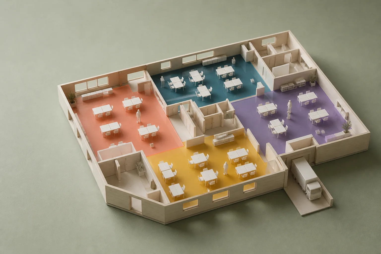
Photograph of a handmade architectural model of an open-plan office floor on sage matboard, with four floor zones inlaid in coral, teal, violet, and mustard acrylic, tiny white desks and figures, and a small delivery truck at a loading dock
Presentation model of the shared floor. Zones by role: coral marketing, teal design, violet engineering, mustard agency.Fig. 01
Sheet
NO. 116
Issued
Wednesday, 2 September 2026
Reading time
≈ 5 MIN
Client
Marketing teams and their agents
Status
Limited research preview
Announced
Webflow Conf 2026, Boston, opening keynote
View as Dims the rest. Hides nothing.

The Presentation Model

Today's art direction

An architecture studio's project page: one photographed model on sage matboard, zones inlaid in colored acrylic, and a view switch that lights one zone without turning off the others.

Architecture studios present a building the way a client can read it: one photographed model, a facts block, a set of drawings keyed to the column grid, and a credits list of who did what. This page borrows that presentation for a studio project called a shared floor, which is what Webflow described this morning. The section markers are grid bubbles, the circled letters a drawing set uses to label its column lines, strung on a dashed gridline down the left margin. The color code is Source's own idea of Views: coral for marketers, teal for designers, violet for developers, mustard for agencies, and a switch at the top that brings one audience forward while the others recede to a readable forty percent.

  • Grid bubbles
  • Museum-board sheets
  • Acrylic zone inlays
  • View switch
  • Facts block
  • Presentation model
  • Drawing register

Webflow Conf 2026

Tooling

  • Marketer
  • Designer
  • Developer
  • Agency

Source: one floor for the team and its agents

Webflow used the opening keynote in Boston to introduce Source, a platform now in limited research preview where marketers, designers, developers, and agents share one environment built on the site's actual code. Every visual edit writes to that code, agents get direct access to it, and the codebase can be one you already have: Webflow says an agency can bring Source to a client's existing stack and martech tools without a migration, and one launch partner names its Next.js and Astro clients as the first candidates.

Each role gets a Views workspace scoped to its job, with brand systems, role-based access, approval paths, and audit trails set by the developer who connects the stack. Agents are scoped the same way: one that flags pages slipping on conversion and drafts variants, another that checks brand voice before a page goes live. Nine days after Webflow parked itself inside ChatGPT, it has moved the other direction and parked itself on your repository.

  • Marketer
  • Agency

Campaigns reads your brand off a URL

Two products for marketers shipped from the same keynote, per the announcement roundup. Campaigns starts from a live URL, has an agent pull colors, fonts, and UI elements into a brand system whether or not the site runs on Webflow, then takes a brief to a landing page, per-audience variants, and matched ad creative. It is in beta and goes on sale next month. Assets, built on the Vidoso acquisition, adapts approved creative across channels and enters beta in October.

  • Designer
  • Developer
  • Agency

Releases branches the whole site; Agent Presence shows who is on it

Releases lets a team branch an entire site, pages, CMS content, components, assets, and locales together, so a launch stages as one unit. Agent Presence puts agents on the canvas as live collaborators, Agent Instructions can now be generated from the context already on the site, and the MCP server picked up GSAP Interactions, deeper CMS queries, and help managing deploys to Webflow Cloud. The one to watch as a designer is Presence: an agent moving a hero on the canvas next to your cursor is a different working relationship from an agent posting a pull request.

Mappings the machine reads

Technique

  • Designer
  • Developer

Code Connect cut Coinbase's agent bill by 22.5 percent

Figma published a case study on Coinbase's design system team benchmarking design-to-code runs with and without Code Connect mappings: same Figma frame, same prompt, same model, a blank codebase reset between runs. With mappings in place the agent spent 22.5 percent fewer tokens on average, finished about 22 percent faster, and produced code the team rated noticeably closer to the system. Bringing hundreds of components up to the current mapping format took roughly four hours, with Claude Code working through the list in parallel.

The mapping file is design-system documentation an agent actually consumes. If your components in Figma and in code have never been introduced to each other, that is the highest-yield afternoon on this page.

  • Developer

shadcn 4.20 swaps out your class helper

This morning's shadcn 4.20.0 adds a migrate command that replaces clsx and tailwind-merge with a faster class-merging helper across a Tailwind CSS v4 project in one pass. Small, but it is the kind of codemod that used to be a Friday chore.

Cheap loops and manufactured sources

Workflow

  • Developer
  • Agency

Gemini 3.8 Flash lands at 75 cents a million

Google shipped Gemini 3.8 Flash today at $0.75 per million input tokens and $3.75 per million output, introductory pricing through the end of the year, available in AI Studio, the Gemini API, the Gemini app, and Search's AI Mode, with a restricted Flash Cyber sibling for security teams. The pitch is software engineering and agentic tasks, and the model card thread was the top story on Hacker News by mid-morning. For a studio, this is the tier for the loops that never needed a frontier model: alt text, lint explanations, variant copy, the first pass of a component audit.

  • Marketer
  • Agency

Who Perplexity actually cites

A Trellner Research report traced three sister sites that published 215,128 generated software buying guides between them, then ran 380 buyer-intent category queries through Perplexity's sonar models. Of 7,534 citations, 59.8 percent went to domains ranked worse than 100,000 on Tranco. The three sites share templates, nameservers, and page titles written for machines, a "Facts and Grounding Page" per brand.

Read it next to Webflow's keynote number: the median company appears in 16 percent of the AI answers it would want to be in and is cited in 6 percent. The answer-engine page is turning into a manufactured format, and the clients asking you for one are competing with a content farm that already knows what the retriever likes.

Views that dim, never hide

Design move

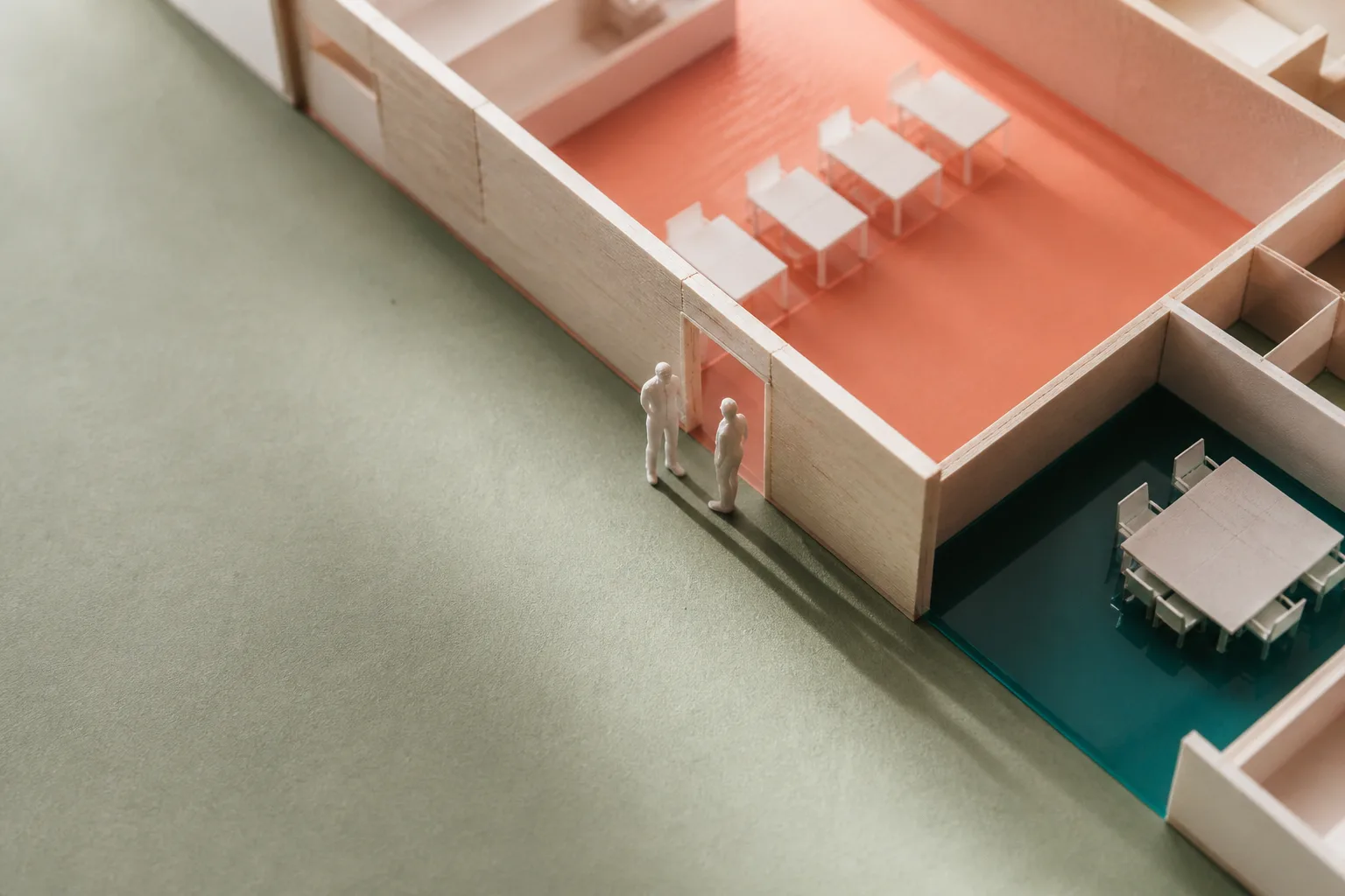
Close photograph of the architectural model: two tiny white figures stand in a doorway cut through a basswood partition between a coral zone with a row of desks and a teal zone with a meeting table
Detail. The partition has a doorway; the zones are lit, not walled off.Fig. 02
Borrow this pattern

A view switch for any page that serves more than one audience. Put a row of radio buttons near the top, tag every item with the audiences it is for, and let a CSS parent selector do the rest: when a view is chosen, untagged items recede to about forty percent opacity and tagged items get a colored top rule. Nothing is removed from the page. Every item stays readable, stays in the tab order, and stays indexed, so the first paint is the complete page and the switch only changes emphasis.

Use it on agency and SaaS pages that speak to a marketer, a founder, and an engineer at once, on pricing pages with plan-specific footnotes, and on documentation hubs. The rules that keep it honest: a real "Everyone" default, no reordering that breaks the reading sequence, a dimmed state that still passes contrast, and no script. Browsers without the parent selector simply show the full page.

.views input { /* visually hidden, still focusable */ }

body:has(#view-designer:checked)
  .item:not([data-for~="designer"]) { opacity: .42; }

body:has(#view-designer:checked)
  .item[data-for~="designer"] { border-top-color: var(--teal); }

Specification sheet

Prompt Lab · specification for your build tool

Build a one-page project landing page for an architecture and interiors studio, presenting a single project (an open-plan shared floor for a marketing team) the way a studio presents work to a client.

Ground: a flat sage matboard (#C9CFB9) with a faint dashed column grid running vertically behind the content. Content sits on white museum-board sheets (#F4F3EB) with a thin ink rule (1px, ink at 28% opacity), square corners, no drop shadows.

Type: Barlow Semi Condensed 600 to 700 for the headline, section titles, labels, and the view switch, set in caps with wide tracking for labels; Literata for all body text at 19px, line-height 1.7, never justified, 60 to 75 characters per line; Sometype Mono only for figure captions and the code sample.

Palette: ink #1F2622 for text, coral #B5482A, teal #22606F, violet #5F4BA8, and mustard #E3B341 as the four audience colors, white text on coral, teal, and violet, ink text on mustard. Links in a deep coral (#8F3418) with a 1px underline. Italic emphasis in a quiet brick tone (#8A4A34), never the loud coral.

Structure, top to bottom:
1. Top nav: studio name left, three text links right.
2. A breadcrumb masthead (Studio index, Projects, Shared floors, then the sheet number in a small bordered tag) instead of a boxed metadata table.
3. Hero in two columns: left, a caps kicker, a large condensed headline (max 13 characters wide), and a 22px deck; right, one photographed presentation model of the floor inside a 1px-ruled plate with a mono figure caption (Fig. 01).
4. A facts block: a six-cell definition list on a white sheet (sheet number, issue date, reading time, client, status, announced at), caps labels over serif values, cells divided by thin rules.
5. A sticky ink-black view switch: "View as" followed by five radio buttons styled as bordered caps tabs (Everyone, Marketer, Designer, Developer, Agency). The checked tab fills with that audience's color. Inputs are visually hidden but keyboard focusable, with a mustard focus ring.
6. Sections as white sheets, each keyed by a circled letter (A, B, C...) in a 46px grid bubble on a left rail with a dashed vertical gridline; on mobile the bubble sits inline above the sheet. Each sheet has a 34px section title and a small caps role line.
7. Inside sections, items separated by a 3px top rule in mid-gray, each opening with a row of solid audience tags (small caps, 3px radius), then a 26px condensed title and one or two serif paragraphs with at most two inline links.
8. The view switch logic in CSS only: body:has(#view-designer:checked) .item:not([data-for~="designer"]) sets opacity to .42; tagged items get their top rule recolored. Nothing is hidden or reordered.
9. A design-move sheet in two columns: prose plus a small mono code block on the left, a second photographed model detail with a Fig. 02 caption on the right.
10. A sources sheet as a numbered register (mono numbers in a narrow column), then a prev/index/next line and a small colophon.

Interaction: 140 to 160ms ease transitions on link underline weight, tab fills, and item opacity; hover on nav links shows a coral bottom rule; respect prefers-reduced-motion by removing transitions.

Guardrails: no gradients, no glow, no drop shadows, no pill buttons beyond the small tags, no accent left-border stripes, no fake search fields or toggles, no emoji, no readable text inside the photographs, all small labels at WCAG AA on their actual fill, images inside plates never taller than the text beside them.

Works in v0, Lovable, Bolt, Cursor, Claude Code, and Beaver Builder AI. Swap the model photographs for your own project imagery and keep the four audience colors on solid fills.
Field Note

Site notes

Webflow's own nav greets you with a switch: I'm a Marketer, Designer, Developer, Agency.

Source turns that navigation toggle into the product, one workspace per role on one codebase. This page borrowed the toggle back and left the walls out.