The Identity Manual
Today's art direction
Light standard sheets on a graphite table, and one orange chip that is the only color allowed to mean anything.
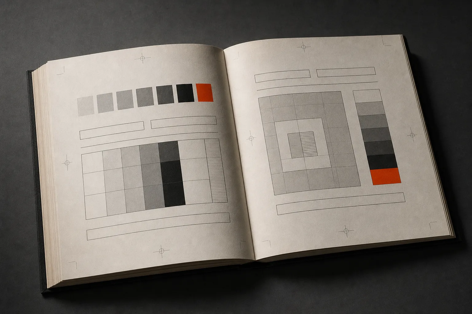
The corporate identity manual was the original design system: a numbered book of rules, chip ladders, and reproduction sheets that let strangers apply a brand without the designer in the room. The 1976 NASA graphics standards manual by Danne and Blackburn is the touchstone. Today that genre returns as a page type, because the stranger applying the brand is now a model reading markdown, and as of this morning that model has a new version number. This issue sets each section as a standard sheet photographed on the studio table, with decimal numbers doing the navigation.
- standard sheet
- decimal numbering
- chip ladder
- do and don't plates
- registration marks
- edge-tab rail
- reproduction sheet
The reader of the standard shipped a new version this morning
The standard · lead story
Anthropic released Claude Fable 5.1 and Claude Mythos 5.1 today, one model at two safeguard levels, with Fable 5.1 generally available in Claude Code, the Claude apps, the API, Bedrock, Google Cloud, and Microsoft Foundry. Input and output prices hold at 10 and 50 dollars per million tokens. Cache reads fall from a dollar to 25 cents, which Anthropic estimates at about 25 percent off a typical workload and up to 45 percent off agentic work.
The announcement says nothing about visual output. The benchmarks are terminal coding (55.8 percent on Terminal-Bench 4.0, up from 42.0), computer use (77.9 percent on OSWorld 2.0), and science. What changes for a studio is the shape of the bill. A guidance file loaded at the top of every run, a four-pass generation workflow, a blind review loop: all of that is cached input, and re-reading it is now a quarter of the price. The platform overview adds per-message effort, so a layout can be roughed at low and finished at high without dropping the cache, and notes the default is high in Claude Code and medium in Cowork and claude.ai.
One line for anyone who writes rules for a model: in the Hacker News thread, an Anthropic engineer says 5.1 follows style instructions more reliably and drops the stock phrases, and the system card says the same of its prose. That is the whole premise of a brand manual for machines, tested against a new reader.
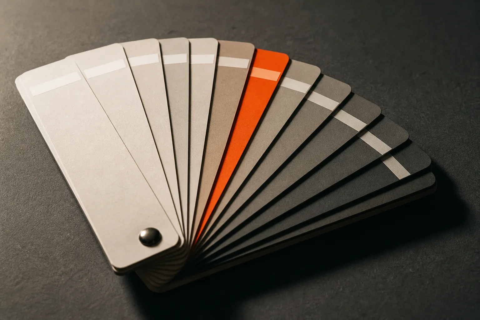
Sheet 2.1 The gray ladder. One chip is reserved for meaning.
Ambient CSS wants to light your page like a 3D scene
Tooling
Ambient CSS shipped its third major version this morning under the tagline Blender meets CSS. The project bills itself as a physics-based lighting system for the browser: instead of hand-picking shadows and highlights per element, you describe light sources and let surfaces pick up shading the way materials do in a render.
It first appeared in February as a set of physically based CSS and React components, and the v3 thread landed on Hacker News today. Worth a look for any interface that leans on depth, from product shots to the kind of raking-light tableaux this issue fakes with box shadows.
Vercel wrote a brand manual for its agents
Technique
Vercel published how its agents build on-brand pages with design.md, a guidance file served from a public URL that any agent loads before it generates a report, a proposal, or a landing page: prose rules for framing, composition, and copy; a public stylesheet that bounds the CSS vocabulary; and an evaluation loop of human review plus deterministic checks. In blind comparisons across fixed scenarios, pages built with the file showed 57 percent fewer documented failures.
The method transfers to any studio. Seven fixed scenarios, generated with and without the guidance, blind reviews, and every correction encoded as a rule, a CSS class, or a test. Read the live file for the register; it orders competing priorities and mandates a four-pass workflow. Two rules are reproduced below as the manual's verdict plates.
Design in monochrome. Color signals state, action, or data meaning only. Equivalent peers share role, size, weight, and line height.
Never color a favorable finding green merely because it is favorable. Decoration that poses as data is the first failure reviewers flag.
Sheet 4.3 Verdict plates, reproduced from the standard
Thank u, Next.js
Workflow
Max Leiter replaced Next.js on his personal site with a bespoke framework he had Claude Code architect on Fable 5, as of this morning the previous release, with Opus subagents doing the implementation. The bill: about eight and a half hours of API time and 669 dollars. The result: content pages that ship 99 percent less JavaScript and builds that run 79 percent faster warm.
His conclusion is the interesting part for working designers. A framework's real value is the knowledge it encodes, and an agent can now vendor exactly the slice of that knowledge one site needs.
Publish the standard
Design move
Borrow this patternGive every brand system you deliver a standards page that humans and agents both read from the same URL. Number the rules like a manual (2.1 Color, 3.2 Type), pair each rule with a do plate and a don't plate instead of paragraphs, bound the vocabulary to documented CSS classes, and keep the ground monochrome so color only ever signals state, data, or a verdict.
Use it wherever a client's site will be extended by people or models you never meet: brand portals, design-system docs, agency handoffs. What keeps it honest is the manual's own discipline. If a rule cannot be checked by eye or by script, rewrite the rule until it can.
Prompt Lab
Reproduction sheet · paste into your build tool
Build a one-page brand-portal landing page styled as a 1970s corporate
identity standards manual, for a design studio delivering a brand system
to a client.

Ground: a near-black graphite studio table (#17191C) with faint
photographic grain. All content sits on light standard sheets: squared
warm-white paper panels (#EDEAE2), zero border radius, hairline #C9C4B6
edges, and a single tight offset shadow falling down-right, as if every
sheet were lit from the left.

Cover: dark, with a small uppercase mono kicker, an oversized grotesque
headline (Switzer 800 or a Helvetica-grade equivalent), a one-sentence
deck, and an inline edition line in mono. Beside the title, one
photographic plate framed by thin registration-mark corners. On wide
screens, a fixed contents rail on the right edge lists decimal-numbered
sections (1.0, 2.0, 3.0) as working anchor links in 11px mono.

Sections are standard sheets. Each opens with a small international-
orange tab (#E8481D) carrying its decimal number in mono, a bold title,
and a thin ruled role line. Component vocabulary: a gray chip ladder
with hex labels where exactly one chip is orange; paired DO and DON'T
verdict plates with squared label chips; mono spec captions under every
figure (Sheet 2.1, Fig. 0.1).

Type: Switzer everywhere, weights 400 to 800 doing all hierarchy work;
IBM Plex Mono 400 and 500 for tabs, captions, and labels. Body 19px
minimum, line height 1.7, 60 to 72 characters per line, never justified.

Color rule, enforced: the page is monochrome except the orange. Orange
appears only on section tabs, the reserved chip, DO labels, and link
underlines. Never tint a panel for decoration.

Guardrails: WCAG AA contrast on both the graphite ground and the paper
sheets; no purple gradients, no glow, no pill radii; hover states on
links and the rail at about 150ms ease; a prefers-reduced-motion guard;
no fake toggles or search fields; imagery is blank-label printed matter
with no readable text.
Runs in Bolt, Lovable, v0, Cursor, and Claude Code; Beaver Builder AI takes the same sheet.
Field Note
Closing
This issue was drafted on Fable 5 at nine in the morning and re-led on Fable 5.1 at half past twelve. The manual on the table did not change; the reader did.
Sources
Full trail
- 9.1Introducing Claude Fable 5.1 and Claude Mythos 5.1, Anthropic
- 9.2Claude Fable 5.1 model overview, Claude Platform docs
- 9.3Claude Fable 5.1 and Claude Mythos 5.1 on Hacker News
- 9.4How our agents build on-brand pages with design.md, Vercel Blog
- 9.5design.md, the live guidance file, Vercel
- 9.6Ambient CSS, a physics-based lighting system for CSS
- 9.7Ambient CSS v3 on Hacker News
- 9.8Thank u, next: replacing Next.js, Max Leiter