℞NO. 092Friday, August 7, 2026≈ 5 min readSecond opinions daily
Comprehensive exams for machine readers
A browser no human will ever see
Cloudflare shipped Kitesurf, a browser engine with no human audience: V8 isolates instead of Chromium, no WebGL, no video, a fraction of the footprint. Today's practice is open for the newest kind of patient.
Exam chart 092. Read down to the smallest line you can. On the strip, red is what this patient never asks for and green is what it lives on.
Today's Art Direction
The Optician
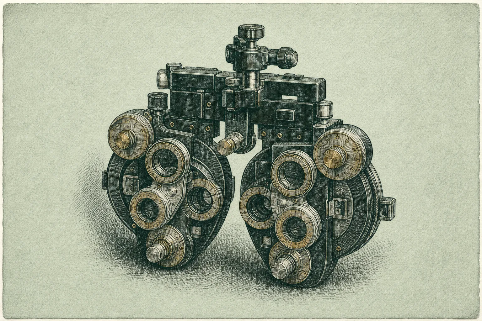
An optician's landing page on celadon paper: etched instrument plates, a live-text Snellen chart, and specs dispensed on a prescription card.
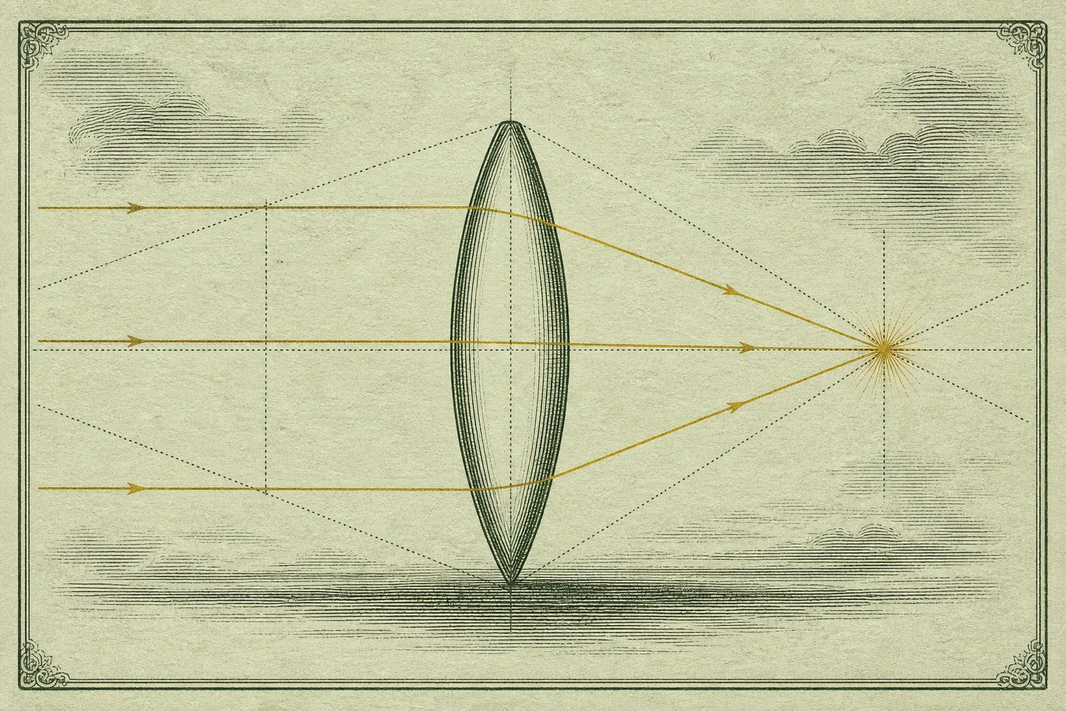
The lead story is a browser that changes what it means for software to see, so the page borrows the room where seeing gets measured. The archetype is a local practice site, the kind a freelancer ships for a clinic or dispensary: split hero with a booking call to action, exam-step sections, and a spec sheet dressed as the practice's own prescription pad. The plates are copperplate etchings in one green-black ink with brass picked out on the metal, and the only loud color is the red and green pair every optician uses for the duochrome test.
celadon paper
etched plates
Snellen hierarchy
Rx card
exam-step markers
brass accents
duochrome strip
Step 01
Refraction
The lead exam
Kitesurf renders the web for readers without eyes
Kitesurf is Cloudflare's browser engine built for agents rather than people. It skips Chromium entirely: pages load inside V8 isolates on Workers, Rust libraries parse the HTML and CSS, and the engine passes more than 215,000 Web Platform Tests while using three to seven times less memory and CPU than the browser on your desk.
The trade is honest and deliberate. An agent doing a one-shot job does not need WebGL, video, or a perfect paint; it needs the DOM, a screenshot, and a place to run scripts, and Kitesurf gives up the first list to get the second one cheap. The free beta is live through Browser Run behind a single browser=kitesurf flag for Puppeteer, Playwright, and MCP clients.
Two days after Cloudflare turned its intranet into an agent-run operating system, this reads as the other half of one bet: the company already fronts the sites agents visit, and now it wants to supply the eyes they arrive with.
Step 02
Frames
Tooling
Mirafold paints an interface over your terminal agent
Mirafold is a free, MIT-licensed layer that gives Claude Code, Codex, or Gemini CLI a browser face: answers arrive as live cards, tables, charts, and red-green diffs instead of scrollback, and pinned views keep updating as the work moves on. The agent, keys, and permission rules all stay on your machine.
Vercel integrations now ship with their own skills
Installing a marketplace integration from the Vercel CLI now also installs that provider's agent skills from skills.sh. Add a database and the agent that will use it learns how at the same moment, which is a small change with a clear direction: infrastructure that arrives pre-explained.
Frames change how a prescription wearsFig. 092-B
Step 03
Lenses
Technique
Two models in a loop landed a 549-commit migration
One engineer pointed Codex at a long-shelved Ember upgrade with a plan file and an instruction to keep going, then patched the arrangement every time it broke down. The patches became neal, a local CLI that runs planner, coder, and reviewer roles around a plan document, giving the coder a fresh context per scope and putting a different model in the reviewer seat.
The migration landed: 549 commits, more than 3,000 files, around 13,000 new lines of test code. The write-up also names the failure that started it all, context rot, the slow loss of early instructions as a session grows, and treats a fresh context per scope as the corrective lens.
Different glass, one focal pointFig. 092-C
Step 04
Fitting
Workflow
One prompt walks a Figma file into Webflow
Webflow's MCP 2.0 exposes variables, styles, elements, components, and assets to any MCP client, and the launch walkthrough ports a full portfolio design out of Figma from a single loose prompt. The agent picks its own order of operations, design tokens before classes before structure before components, which is exactly the sequence a careful front-end developer would choose by hand.
Dispensary note · borrow this pattern
The domain-artifact spec card
When a page needs a spec list or a comparison, dress it as a paper artifact the client's business already prints. Here the browser specs sit on a prescription pad; for a travel client the same rows become a boarding pass, for a venue a ticket, for a restaurant a guest check. Underneath it stays a plain definition list; the ℞ header, ruled rows, and signature line do all the branding.
What keeps it honest: every row holds a real value, the labels come from the actual domain rather than invented flourish, and the type passes AA contrast on its rendered surface. The artifact is a costume for real data, never a home for fake data.
Step 05
Lab order
Prompt Lab
Build a one-page landing site for an independent optician's practice,
art directed like a 19th century optical catalog set in modern web type.

Ground and ink: pale celadon paper (#D6DFC9), deep green-black ink
(#1C2A20), cream card stock (#F4F1E1) for panels, brass (#A9791C) as the
only accent. Reserve one red (#A93325) and one green (#2F6B4A) for a
single duochrome test strip and use them nowhere else.

Type: Fraunces for display and italic flourishes, Schibsted Grotesk for
body at 19px with 1.7 line height, Spline Sans Mono for small uppercase
labels. The contrast logic: a soft high-contrast serif over a plainspoken
grotesque, brass italics for quiet emphasis.

Layout: split hero with the headline, a short deck, and one booking
button on the left, and a framed etched-instrument illustration on the
right, matted inside a thin double border like a printed plate. Directly
under the hero, a full-width cream band holding a Snellen eye chart
built from live text: six centered rows in steeply decreasing type
sizes, mono acuity fractions (20/200 down to 20/30) on the rails, and a
half-red half-green duochrome strip at the bottom.

Sections read as exam steps: a mono step number (STEP 01, STEP 02), a
serif section title, and a small role note on the right, divided by
solid ink rules. Somewhere in the page, present the key specs as a
prescription card: a cream panel with a large Rx glyph, mono labels,
dotted ruled rows, and an italic signature line at the bottom right.

Guardrails: body text at least 18px, line height 1.6 or more, AA
contrast for every label on its actual background, no text baked into
images, no neon, no glow, no gradient text, radii at 12px or below.
Hover states on links and buttons with about 150ms ease, one blur-to-
sharp entrance on the chart letters, and a prefers-reduced-motion guard
that disables all of it.
Works in v0, Lovable, Figma Make, Bolt, and Beaver Builder AI.
Aftercare
Field note
This page was art directed for human eyes; Kitesurf will only ever see its landmarks, headings, and alt text. Both readers are now permanent, and a page that flatters one while starving the other is half finished.