Compare: one component library, before and after an upkeep pass
Hover, hovered, mouse-over: Figma's agent picks one name
The Figma agent now takes on design system upkeep. It audits screens for hard-coded values, swaps detached components for library versions, drafts documentation, and settles naming drift across a whole library.
Today's art direction
The Audit Compare
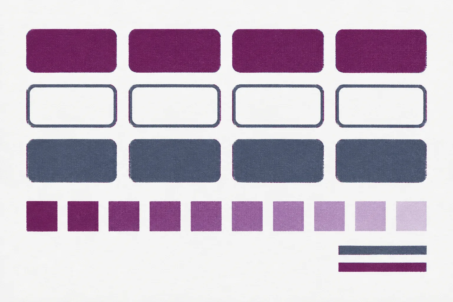
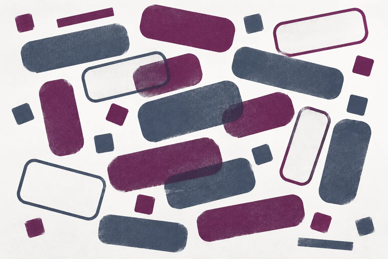
A before-and-after comparison page for a design system audit, printed in plum and slate on a cool mist ground.
A comparison page sells a change, so the change is the hero: one pair of prints under a draggable seam, then a table that puts the old state and the new state on the same row. Lettered criteria in outlined squares organize the page the way a buyer scans a spec sheet.
Full-width colour bands separate the evidence from the argument, and deep plum is saved for two jobs: the one line worth quoting and the offer at the end.
- before and after seam
- criteria table
- lettered rows
- colour bands
- two-colour screenprint
- mono display
- plum and slate
Tooling
Figma hands the upkeep shift to its agent
Figma product manager Wayne Lin laid out five design system jobs the Figma agent now handles inside a file. It inventories the components and tokens on a screen, maps each one to its library, and flags duplicates and hard-coded values that should have been tokens.
It also works at library scale: bulk swaps by @-mention, one naming convention applied everywhere, and a record of every rename so the code can follow. That is the maintenance half of the story issue 148 told about design system docs steering coding tools.
The five jobs, as Figma describes them
| Job | Before the pass | After the pass |
|---|---|---|
| 1Documentation | Usage rules live in someone's head, and variants go undocumented. | Drafted usage and behavior notes, do's and don'ts, visual examples of variants and properties, and a suggested component API for handoff. |
| 2Adherence | Drift between screens and the library is found by eye, if at all. | An inventory of every component and token on a screen, mapped to its library, with duplicates and hard-coded values flagged. |
| 3Matching | Imported buttons sit disconnected from the system they imitate. | Bulk replacement of a component or token by @-mention, and detached imports swapped for the system versions. |
| 4Naming | Hover, hovered, and mouse-over name one state; layers are called icon_1. | One convention across the library, descriptive names like linkedin_icon, and a log of renames for the code. |
| 5Tokens | Components carry raw values nobody can trace back to a decision. | Each value checked for token use, annotations showing which tokens a component uses, and the hard-coded ones listed. |
At Uber, designer Ian Guisard uses the /create-api and /create-color skills to document components across seven platforms. Granola designer Paavan Buddhdev uses the Chrome extension to replace imported buttons with the design system's own.
Full seats on Professional, Organization, Enterprise, and select Education plans get the agent, with limited access on Starter. Collab, Dev, and View seats can use it in drafts.
A library drifts one renamed hover state at a time, and now something reads all of it at once.
Technique
Name the token for its job, not its colour
In A Practical Guide To Naming Things, Vitaly Friedman writes that a good name "has a logical structure, is short, meaningful, known by everyone, and not related to visual properties." For tokens he builds a ladder from brand primitives through semantics to pages, so a name says what a token is for.
The guide landed the same day as Figma's naming pass, which is useful timing. An automated rename is only as good as the convention you hand it, so settle the ladder first and let the tool apply it.
- Primitiveplum-700
- Semanticcolor-action
- Pagecheckout-submit
Example ladder written for this issue, not taken from the guide.
Workflow
Describe the tool, export the plugin
Google Labs added plugin building to Flow Music: producers describe an instrument or effect in plain language and export it as a VST3 or AU plugin for their audio workstation. Producer Khris Riddick-Tynes built one called No Chaser to keep recordings consistent across different rooms.
It is a music tool, but the shape will be familiar to web builders. The description is the source file, and the export drops into software people already use.
- From
- Google Labs, Flow Music
- Input
- A plain-language description
- Exports
- VST3 and AU plugins
- Example
- No Chaser, by Khris Riddick-Tynes
Borrow this pattern
A before-and-after seam on a native range input
Stack two images of the same frame, clip the top one, and let a native range input move the clip. Use it on redesign case studies, retouching portfolios, renovation listings, and any page whose whole pitch is what changed.
Stack
Put both images in one grid cell at one aspect ratio, after first and before on top.
img{grid-area:1/1}Clip
Clip the before image from the right with a custom property, and draw the seam at the same position.
clip-path:inset(0 calc(100% - var(--pos)) 0 0)
Drive
Lay a transparent range input over the frame with a real label; one input listener sets --pos.
<input type="range" value="50">
Three rules make the comparison fair: pull both frames from the identical position so the seam lines up, start at 50 percent so neither state wins by default, and let the arrow keys work, which a native input gives you for free.
Prompt Lab
Build your own after
Paste this into an AI build tool to get a comparison page in today's system: the seam, the criteria table, the lettered sections, and the bands.
Works in Claude Code, Figma Make, Lovable, v0, and Beaver Builder AI.
Build a before-and-after comparison landing page for a design system audit service. The page sells one change, so the change is the hero.

Structure:
1. Top nav: brand on the left, three text links on the right, a 1px hairline under it.
2. Hero on a cool mist ground (#EDEFF4): a two-column row of a mono kicker plus a large monospace headline (max 19 characters per line) on the left, and a serif deck plus a one-sentence inline byline on the right, bottom-aligned.
3. Under it, full width, a 3:2 before/after image compare. Stack both images in one grid cell, after underneath, before on top clipped with clip-path: inset(0 calc(100% - var(--pos)) 0 0). Draw a 2px ink seam and a 34px square handle at var(--pos). Lay a transparent native input type=range (0 to 100, default 50) over the frame with a visible label in the caption; one input listener sets --pos. Small filled corner labels: Before (ink) and After (plum).
4. Sections are full-width horizontal colour bands, alternating cool mist #EDEFF4, pale lilac #E3DEEA, and near-white #FBFBFD. One deep plum band (#3E1233) holds a single italic pullquote; a second holds the closing offer.
5. Each section opens with an outlined 52px square index letter (A, B, C, D) in plum, a small mono label, then the h2. Body text sits in a 66ch column indented to the letter's right edge.
6. The proof is a three-column comparison table on white: Job, Before, After. 2px ink header rule, hairline rows, the After column tinted a pale plum (#F6F1F5), each row header carrying a small outlined number. On mobile each row becomes a stacked block with Before and After labels.
7. A three-step how-it-works strip under a 2px ink rule, each step with a short heading, two sentences, and an optional code line.
8. Closing plum band: offer text and one solid button.

Palette: ink #1D1B29, plum accent #6B1F57, slate #4A5266 for secondary text, lilac #D9C4D3 for text on plum.
Type: Martian Mono for headline, labels, table headers, and buttons; Newsreader for body at 19px, line-height 1.7.
Imagery: two two-colour screenprints (plum and slate ink on white stock) of the same component sheet, scattered then ordered, from the identical overhead framing so the seam lines up. No legible text in the images.

Guardrails: body at least 18px; WCAG AA contrast for every label on its actual band; radius 3 to 6px, no pills; no gradients, glow, or neon; no accent left-border stripes; no fake controls; visible focus states; hover transitions around 150ms; a prefers-reduced-motion guard.
Field Note
The ordered sheet is the easy print
Anyone can pull the tidy version once. Keeping it tidy through the next forty screens is the job Figma just put on the agent's list.
Credits
Sources
- How to Lighten Design System Upkeep With the Figma AgentFigma blog, Wayne Lin, October 6, 2026
- A Practical Guide To Naming ThingsSmashing Magazine, Vitaly Friedman, October 6, 2026
- Create music production plugins with Google FlowGoogle blog, Google Labs, October 6, 2026
- Issue 148: design system docs as steering for coding toolsArt Direction Daily, October 4, 2026