Open betaFigma, October 15
Figma's new system check finds the hover state nobody drew
Guidelines put a design system's rules inside the published library, where coding tools read them through Figma's MCP server. System checks scan the same library for the gaps.
Today's art direction
The State Specimen
A design-system docs page with a letterpress proof for a hero.
The page is a component library's documentation: a dark spine for the masthead, a sticky sidebar of anchor links, and one wide reading sheet on a blush drafting grid. Sections open with release-status labels, the same filled badges a docs site uses for beta and preview, so the markers carry information instead of ornament.
Open betaAll paid plans
The rules move into the library, next to the components
Figma's Build by design post, from Dylan Field on October 15, adds Guidelines to published libraries so coding agents follow the patterns a team already set. The written rules ship with the components instead of living in a wiki the coding tool never opens.
Code sources, in closed beta, import a component library from a GitHub repository or an npm package so agents build against the real code. A system map, in preview, gathers every library in a system in one view and tracks changes and dependencies between them.
Write the rule on the component it governs: one primary button per view, secondary actions as text links.
Keep that rule in a slide deck from the kickoff, where neither the next designer nor the coding tool will find it.
A state nobody drew is a state the coding tool will invent.
System checks read the library for what is missing
Checks scan a design system for gaps; Figma's examples are components with no description and components missing interactive states. The sample report in the post counts twelve component issues and ten token issues. Those are exactly the holes a coding tool fills by guessing.
The Figma MCP server also picked up new jobs: agents can generate code layers, work with Specs, create visual assets, and run published Weave workflows from tools like Junie and OpenCode. The Make and Specs side of the same week ran in yesterday's issue.
- Guidelines
- Open beta, all paid plans. Rules attached to published libraries.
- Code sources
- Closed beta. Import from GitHub or npm.
- System map
- Preview. Libraries, changes, and dependencies in one place.
- MCP partners
- Twenty new integrations, including Dia, Junie, Meta Muse, and OpenCode.
ChangelogTwo builder updates
Lovable apps hand page actions to the browser's agent
The Lovable changelog entry for October 13 says that with agent integrations on, Lovable generates WebMCP tools for the app, so an AI agent in the visitor's browser can act on the page they have open, like marking a task done. The tools become part of what the builder outputs, next to the markup and styles.
Figma's release notes for the same day add Gemini 4 Argon to the model picker in Figma Make on all plans. It is a model choice, not a new feature, but it sits inside the design tool rather than a separate coding app.
ReferenceImage formats
Jake Archibald ran the numbers: AVIF still wins most web images
A week after Chrome started decoding JPEG XL, Jake Archibald compared it with AVIF on photos, screenshots, illustrations, and transparent images. At default effort the best lossy JPEG XL photo came out 15 to 25 percent larger than AVIF, and screenshots and illustrations 30 to 90 percent larger.
JPEG XL keeps one clear job: lossless recompression of existing JPEGs, which shrank them 9 to 20 percent. His default for new work is AVIF at 4:4:4 and high effort. The measured case for JPEG XL ran in issue 151.
How-toBefore you turn Guidelines on
Make the library readable before a tool reads it
- Give every published component a one-line description that says when to use it, not what it looks like.
- Draw the full state set for anything clickable: default, hover, focus, pressed, disabled. Focus is the one most libraries skip.
- Write each guideline as a pair, one thing to do and one to avoid, so a model has a boundary rather than a mood.
- Run the check, fix what it flags, and only then point a coding tool at the library.
PatternBorrow this
Show every state in one row, and leave a slot for the one you skipped
On a component docs page, lay the states out side by side as live elements, then add an empty dashed slot labelled with the state that has not been designed yet. Reviewers see the gap at a glance, and so does any tool reading the page. Each slot is the real button, forced into its state with a class. Hover the first one: nothing changes, because that state was never drawn.
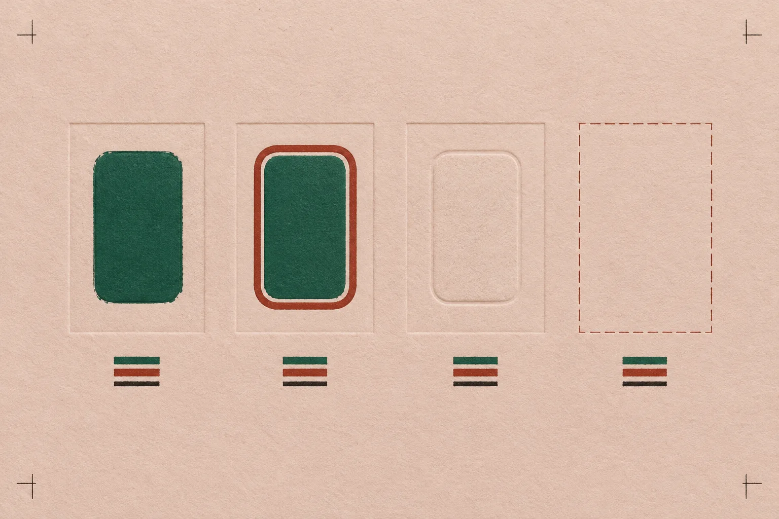
The fifth slot is deliberate: the hover state from the headline, left visibly empty until someone designs it.
- Where
- Component docs, design-system sites, and the handoff page for any client library.
- Keep it honest
- Use the real component for every slot, never a screenshot, and drive each state with a class that mirrors the pseudo-class so the docs cannot drift from the CSS.
.btn:active, .btn.is-press { background: #7FC2A0; }
.btn:focus-visible, .btn.is-focus {
  box-shadow: 0 0 0 3px #23191A, 0 0 0 6px #E9A08E;
}
.gap { border: 1.5px dashed #E9A08E; } /* the state not drawn yet */
PromptPrompt Lab
Build the docs page
Build a product launch page for a design-system feature, laid out as a component library documentation site (SaaS / product launch page, docs-site register).

Layout on desktop: three columns. (1) A 72px dark ink #23191A spine pinned to the left edge at full viewport height, holding the issue or release number set vertically in a heavy grotesk and, below it, the date and reading time in small uppercase mono, both rotated to read bottom to top. (2) A 248px sticky sidebar of anchor links grouped under small mono caps headings; each link is a bold grotesk label with a small filled status badge on the right (Open beta, Changelog, Reference, Pattern). The current section's link inverts to ink with a light badge. (3) One wide reading sheet in warm off-white #FBF4EF, with prose held to a 700px column. Under 900px the spine becomes a horizontal strip at the top and the sidebar becomes one horizontally scrolling row of link chips.

Hero: a filled green status badge and a plain source line, a heavy grotesk headline (Schibsted Grotesk 800, about 64px, tight tracking, max 16ch), a serif deck at 22px (Spectral). Below it a bordered specimen panel: on the left a 3:2 image of a letterpress specimen sheet showing one button in several states with one slot left empty, with an HTML caption row naming each slot (the last one, Missing, in brick red); on the right a 280px "System check" report with a definition list of two counts in large brick numerals and a short checklist of flags with empty square markers.

Sections: each opens with a filled status badge plus a small mono note, then a grotesk h2. Badge colours carry meaning: green #1E6B4A for open beta and patterns, brick #8A3B2A for changelog items, ink for reference, outlined ink for how-to. Use a Do and Don't pair (two white cards with 1.5px ink borders, green and brick header strips), one italic serif pullquote under a 2px green rule, a two-column dt/dd facts list, and a numbered how-to list with mono leading-zero numerals.

Design move block: an inverted ink panel holding a row of five live buttons, one per state (default, hover, focus, disabled), each forced into its state with a class that mirrors the pseudo-class, plus a fifth dashed empty slot labelled with the state not designed yet.

Ground: blush #F1DCD0 with a fine 24px drafting grid of 1px ink lines at 7 percent opacity, visible around the sheet and behind the sidebar. No gradients anywhere else.

Type: Schibsted Grotesk (700, 800) for headlines, links, and buttons; Spectral (400, 400 italic, 600) for reading text; IBM Plex Mono (500, 600) for badges, labels, and code.

Guardrails: body text at least 18px with line-height 1.65 or more and about 65 characters per line; WCAG AA contrast for every badge against its own fill; hover and focus states on every link and button with 150ms easing, visible focus rings, and a prefers-reduced-motion guard; radius 12px on panels, 8px on buttons, 4px on badges, no pills; no neon, glow, purple-blue gradients, emoji icons, logo bars, or fake readable text inside images; no fake search box in the sidebar.
Works in v0, Webflow, Bolt, Beaver Builder AI, and Claude Design. Paste it whole; the guardrails at the end matter most.
Field note
For years the style guide was a document people skimmed once. Figma is betting that a reader which follows every rule to the letter will finally make teams write the rules down properly.
Sources
- Build by design Figma blog, Dylan Field, October 15, 2026
- Design systems: guidelines and code sources Figma Help Center
- Let browser agents use your app Lovable changelog, October 13, 2026
- Gemini 4 Argon in Figma Make Figma release notes, October 13, 2026
- JPEG XL vs AVIF Jake Archibald, October 15, 2026
- Issue 156: Figma Make sites now ship with an admin panel the client can run Art Direction Daily, October 15, 2026
- Issue 151: Same JPEG, 144 KB lighter Art Direction Daily, October 7, 2026