Safari now places an anchored popover against an element as it is drawn, after a rotate, scale, or translate. Scattered cards can carry labels that stay upright and still find them.
No. 141 Sunday, 27 September 2026. A table for about five minutes of reading.
A wine bar's list page at night, where each release is poured with its producer and vintage.
A wine bar's site lives or dies on its list: producers as the headers, and every pour carrying the facts a guest checks before ordering. Here the producers are the companies that shipped, and each vintage is a verified release date. A painted table at night sets the room, and a faint contour map of the vineyard sits under the list.
producer header
pour row
vintage
dotted leader
tasting note
terroir contours
WebKit
Technique. Three pours from Safari 27.0, the full release post that followed the styleable select.
When an anchor carries a scale, a rotate, a translate, or any mix of them, the elements positioned against it now follow where it lands on screen. A tooltip on a tilted card, or a label on a card mid-animation, stays with it instead of pointing at the spot the card held before it moved.
The release also renames the state selectors to anchor-valid and anchor-visible, and changes the default of position-anchor from auto to normal, so check older experiments that leaned on the implicit anchor.
Width, height, their min and max, and flex-basis all accept stretch, which fills the space available without the familiar 100 percent plus margin overflow. The new alpha() function sets transparency on a token color, as in alpha(from var(--brand) / 80%), and color-mix() now takes more than two colors.
The :heading pseudo-class matches h1 through h6 in one go, and :heading(1, 2) narrows it to the levels you name. light-dark() now accepts images as well as colors, so a hero can swap its artwork along with the color scheme.
The same release shipped the customizable select this publication covered in issue 129.
Tasting note
Hang the label off the card with anchor positioning instead of nesting it inside. In Safari 27 the label lands beside the card as drawn, after the turn, and it keeps its own upright angle.
/* the card turns, the label follows */
.bottle {
  anchor-name: --bottle;
  rotate: -24deg;
}
.tag {
  position: absolute;
  position-anchor: --bottle;
  position-area: right span-bottom;
}
Vercel
Tooling. An unnamed model poured for layout work, and a registry that just passed a million entries.
Vercel lists Pixel Canary without naming its maker and describes it as strong at frontend work, from responsive layouts and app screens to navigation and interactive components. It passed 28 of 31 Next.js eval tasks, and 30 with documentation supplied.
It is free while in stealth, but prompts and responses may be used for training and zero data retention is not available, so keep client work out of it.
Vercel's report counts one million skills on skills.sh and nearly 280 million installs since launch. The top 375 skills take 62 percent of installs and nearly half of all skills were installed once, so the useful design skills are a short shelf worth curating by hand.
One minute bought a sketch. Twenty-eight bought the mockup.
Anthropic
Workflow. How much thinking to spend on a sketch versus a mockup.
Thariq Shihipar explains effort as how much compute the model spends, from low to max, with higher settings adding independent checks and edge-case testing. His redesign of the Claude Code config menu took one minute at low effort and returned an interactive sketch; at max it took 28 minutes and returned a close mockup with walkthroughs.
The post recommends low effort for brainstorming, sketching, and easy changes, which maps well onto the first pass of a layout.
Borrow this pattern
Tilt the card, anchor the label
Scatter a few cards at small angles for a menu, a moodboard, or a pinned-notes hero, and hang each label off its card with anchor positioning rather than nesting it inside. A nested label turns with the card and reads at an angle; an anchored label keeps its own upright line and still lands against the card.
Keep it honest: hold the tilt between two and eight degrees so hit areas stay predictable, keep reading text upright, and set a plain fallback that places the label under the card for engines that still measure the untransformed box.
Label
Nested. The label tilts with the card.
Label
Anchored. The label stays level beside it.
Prompt Lab
The house recipe
Build a landing page for a small natural wine bar, centered on its wine list, the page a bar owner would pay a freelancer to ship.

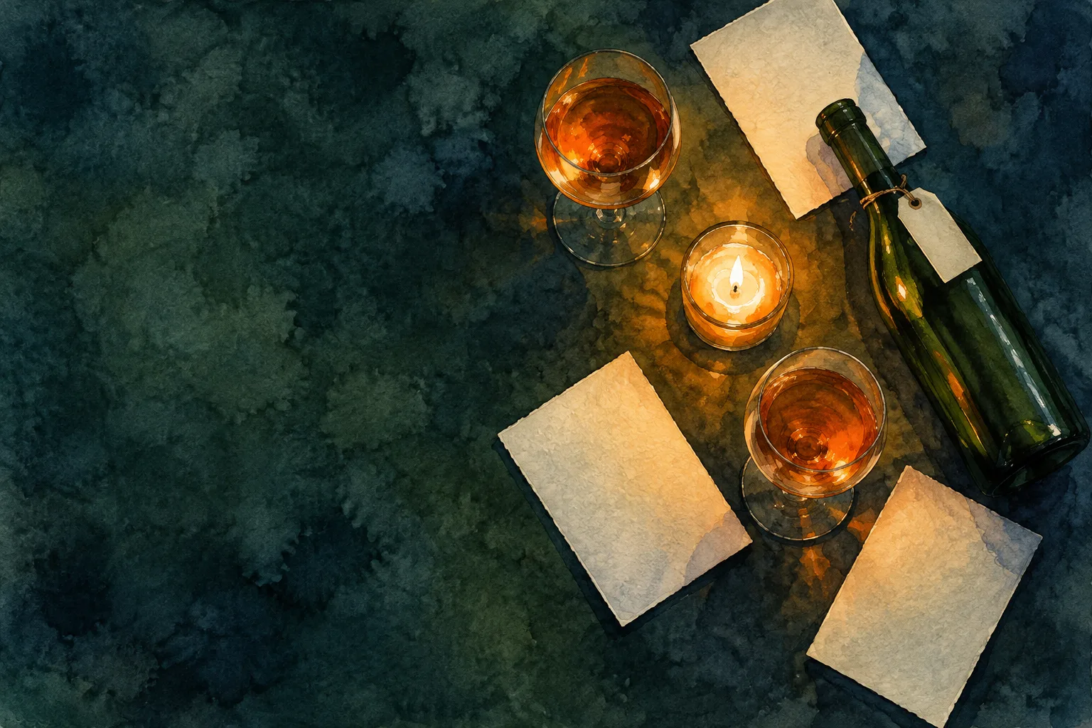
Hero: a full-bleed ink and watercolour painting of the bar's table from above at night (bottle-green cloth, one candle, glasses of orange wine, blank menu cards scattered at angles, a bottle with a blank tag). Keep the left 45 percent of the painting empty cloth and set the kicker, a 12ch Bodoni Moda headline, a two-sentence deck, and one apricot button there, over a left-to-right scrim from #0F1E1D at 94 percent to clear by 64 percent. The top nav floats on the painting. Under 900px, show the painting at 4:3 cropped on the still life and stack the text below on the ground.

Masthead: no boxed meta cells. One reservation line under the deck, separated by a hairline: a mono number, the date, and the reading time as a sentence.

Palette: bottle-green night ground #0F1E1D, raised panels #162927, cream text #EDE4D3, sage-grey #A9B7AF for labels, apricot #E8833A for buttons and link underlines only, a softer #F2B27C for italics.

Type: Bodoni Moda for display, Newsreader for body at 19px with line height 1.68, Martian Mono for labels, vintages, and code. The contrast logic: a high-contrast Didone against a calm reading serif, with a mono for the facts.

The list: each section is a producer header (a 72px Didone name on the left, a one-line section summary on the right, a 2px cream rule under both). Under it, pour rows that read like a real wine list: the linked item title in 30px Didone, a dotted leader running to a right-aligned vintage in tabular mono (17.09.26), a small mono label line under the title, then one or two short paragraphs set in two columns. Link underlines stay faint at rest and brighten on hover. Hairlines between rows. Put a faint SVG contour-line map in cream at 7 percent opacity behind the list, off to the right, never a repeating tile.

Also: one tasting-note row with a small CSS snippet in a dark pre, one centered italic pullquote between producers, a design-move block with a square painted detail and a two-card diagram, the prompt as a cream kitchen docket with scalloped top and bottom edges and a real copy button, a two-column sources list, and a colophon.

Guardrails: body at least 18px and line height at least 1.6, WCAG AA contrast for every label on its real background including text over the painting, no readable text inside the paintings, no neon or glow, no gradients except the hero scrim and its bottom fade, no pill shapes, no fake controls, hover and focus states on every link and button, and a reduced-motion guard.
Pour it into Claude, Framer, v0, Beaver Builder AI, Bolt, or Webflow.
Field note
Two free things arrived this week with different prices. Safari 27 asks only for a fallback; Pixel Canary asks for your prompts, so hand it the moodboard and keep the client brief.