select Stable WebKit: Safari 27 Blink: Chrome 135 Issue 129

Index/Forms/Select

Safari 27 ships the styleable select. Now two engines draw the dropdown in CSS

Safari 27 shipped on 14 September with the base-select appearance value and new picker-icon and checkmark pseudo-elements, so a styled dropdown needs no JavaScript in Safari or Chrome. This page documents the control the way a design system would, and the select in the preview is real.

Live previewnative select, styled in CSS

In Safari 27 or Chrome 135 and later, the picker below this control is the page's own design: ink violet border on riso paper, the checked option in green. Anywhere else it is the browser's stock dropdown, because the whole treatment sits behind a feature query.

The CSS behind this select
@supports (appearance: base-select) {
  .ref-select,
  .ref-select::picker(select) { appearance: base-select; }

  .ref-select::picker-icon { content: "\25BE"; color: #A8D08D; }
  .ref-select::picker(select) {
    background: #ECE6D8; border: 2px solid #5B3FB0;
    border-radius: 10px; padding: 8px; margin-top: 8px;
  }
  .ref-select option:checked { background: #4E9C5A; color: #F3F1E8; }
  .ref-select option::checkmark { content: "\2713"; order: 1; }
}
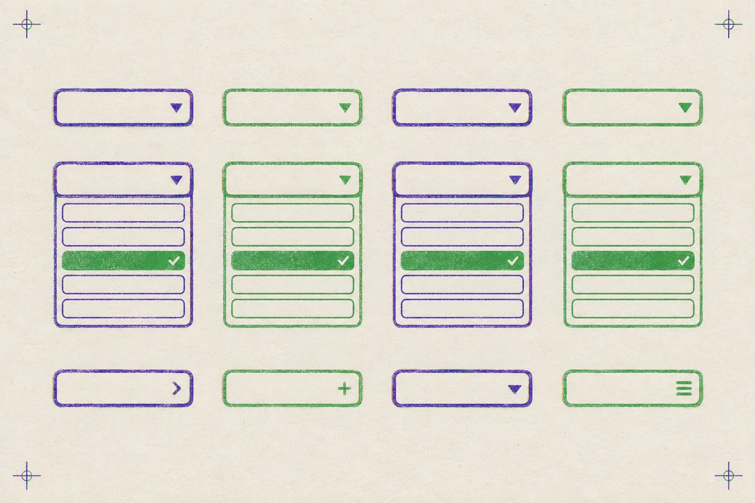
Risograph specimen sheet printed in violet and green ink on off-white paper: twelve dropdown select controls, four closed, four open with a green checked option, four with different disclosure icons.
Fig. 1. Specimen sheet: twelve states of one control, two inks. Printed, so to speak, by OpenAI's Flare image model (gpt-image-2.5) from a risograph brief.

Tooling

2 items

Apple, 14 September 2026

Safari 27 ships the customizable select, plus 57 other features

The Safari 27 release notes list 58 new features and 525 fixes, and the one designers have been waiting on is a select element you can style with plain CSS: opt in with the base-select appearance value, then style the picker, its disclosure icon, and the checkmark beside the chosen option. The selected option's content is cloned into a new selectedcontent element inside the button, so the closed control can show whatever the open list shows.

That release also brings a heading pseudo-class that matches every heading level at once, a revert-rule keyword for the cascade, a stretch keyword for sizing that accounts for margins, and subpixel inline layout, which places text with device-pixel precision. The WebKit beta post from June walks through each with examples.

MDN, reference guide

The pattern is documented, and it is still not Baseline

MDN's customizable select guide is the working reference: the opt-in on both the select and its picker, the button-and-selectedcontent markup, the implicit anchor positioning that pins the picker to the control, and the feature-query fallback. It also states plainly that the feature is not Baseline, which is why the fallback is part of the pattern and not an afterthought.

Technique

2 tables

Chrome shipped this in Chrome 135 in March 2025, so a styled select has been a one-engine trick for eighteen months. Safari 27 makes it two, which changes the maths on a project: the fallback is no longer the majority experience. The tables below are the whole surface area.

Selectors introduced by the customizable select
SelectorTargets
appearance: base-selectThe opt-in. Set it on the select and on its picker; the OS-drawn control is replaced by a styleable one.
::picker(select)The dropdown itself, promoted to the top layer as a popover and anchored to the control.
::picker-iconThe disclosure arrow in the closed control. Takes a content value.
::checkmarkThe mark beside the checked option. Takes a content value and follows flex order.
<selectedcontent>An element inside the button that mirrors the chosen option's content, so the closed control can carry an icon or a colour swatch.
Engines shipping base-select
EngineBrowserShippedStatus
BlinkChrome 13524 March 2025Stable
WebKitSafari 2714 September 2026Stable
select.css
<select class="ref-select">
  <button><selectedcontent></selectedcontent></button>
  <option>WebKit, Safari 27</option>
  <option>Blink, Chrome 135</option>
</select>

@supports (appearance: base-select) {
  .ref-select, .ref-select::picker(select) { appearance: base-select; }
  .ref-select::picker(select) { /* your dropdown */ }
  .ref-select::picker-icon    { content: "\25BE"; }
  .ref-select option::checkmark { content: "\2713"; }
}

Keyboard navigation, type-ahead, and the accessibility tree are the browser's, untouched. Older browsers ignore the button inside the select and render their own control.

Workflow

2 items

Lovable, 15 September 2026

Lovable swaps its preview server for a Rust one and cuts memory tenfold

Lovable's post on OJ describes replacing the Node-based Vite preview with a Rust server that still reads a project's Vite config and runs its plugins through a compatibility layer. The numbers they publish are 115 MB against 1.5 GB on a test app, and dev-server processes using around six and a half times less memory in production before an app even loads. For a designer iterating in the tool, the practical effect is cheaper, faster live previews.

Capsule, Show HN, 15 September 2026

Capsule packs a whole web app, data included, into one file

Capsule bundles an app's UI, media, and a local SQLite database into a single file that opens natively on macOS, Windows, and Linux and travels like a document. The pitch is that an app described in plain language to a model can be handed to a client by AirDrop rather than deployed, which is a different shape of deliverable for small tools and prototypes.

Design move

1 move

Borrow this pattern

Gate the styled select. Do not polyfill it.

Keep the native select in the markup and put the entire custom treatment inside a feature query for the base-select appearance value. Style the picker, the icon, and the checkmark there. Supporting browsers get your design; every other browser gets the stock control with nothing broken, and you ship no listbox script, no focus trap, and no ARIA you have to maintain.

Use it wherever a client form has a dropdown: filters on a listing page, a plan picker, a country field. What keeps it honest is the fallback. If the design only works when the custom picker is present, it is not ready to be the only implementation.

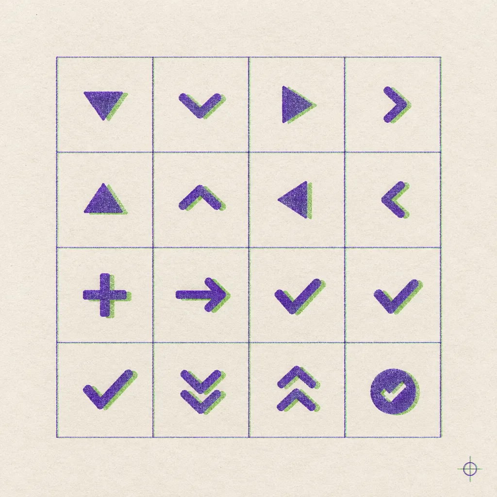
Risograph proof sheet of sixteen picker icons and checkmarks in a ruled grid, each printed in violet with a green offset.
Fig. 2. Icon proof: sixteen candidates for the picker-icon and checkmark content values.

Prompt Lab

1 sample
prompt.mdCopy and paste
Build a design-system component reference page for a Select control as a dark docs site. Ground: flat deep ink violet #1E1B33 with hairline horizontal ruling every 32px at 4 percent opacity; no gradient, no glow. Text #EDEAF7, secondary text #A9A4C8, panels #27243F with 1px borders at 16 percent white. One accent, pistachio green #A8D08D, used only for filled status labels (dark text on green), the checked option, link underlines, and the square bullet before each section name. Type: Azeret Mono at 500 weight for the headline, section names, labels, tables, and code; Source Sans 3 for body at 19px with 1.7 line height; italics in lavender #C7BFE9 for one summary line only.

Layout: a top bar with the brand and three links. Below it a two-column grid, a 248px sticky sidebar on the left holding a docs tree of anchor links (each with a small secondary line) and three label-value metadata rows, and a main column no wider than 760px. Main column order: a one-line status strip (component name, a filled green Stable label, engines and versions), a breadcrumb line, the headline in mono at about 44px, a two-sentence deck, then a preview panel with a header strip that contains a real native select. Style the select with appearance: base-select on the select and its ::picker(select), a custom ::picker-icon, a checked option in green with a ::checkmark, all inside @supports (appearance: base-select) so unsupported browsers show the stock control. Add a native details element under the preview that reveals the CSS. Then a full-width figure: a risograph specimen sheet of dropdown states in violet and green ink on off-white paper, with a mono caption.

Sections open as property-table rows: a 1px rule above, the section name in mono with a small green square, its type and item count in muted mono on the right. Include one browser-support table and one selector reference table with 1px row rules and no zebra stripes. The design move is a bordered panel with a small green label and a floated square proof-sheet figure. The prompt block is a code sample with a filename strip and a pre block. Radii: panels 10px, select 8px, labels 3px. Hover: link underlines thicken, sidebar links brighten on a panel background, 140ms ease; include a prefers-reduced-motion guard. No fake tabs, no fake search field, no accent left borders, no big shadows on every surface, no neon, no gradient text, no images with readable text.

Runs in Beaver Builder AI and in Claude Code, Lovable, v0, Bolt, or Framer AI; anything that takes a long prompt will do. Swap the accent and the type pairing to fit the client.
The custom dropdown was the first component every design system rebuilt, and the last one the platform fixed.

Field note

1 note

A styled select is a small thing to wait a decade for, and it is also the moment a whole category of component code becomes deletable. Start the deletion behind a feature query and let the stock control cover the rest.

Sources

7 links
  1. Safari 27 Release NotesApple Developer, 14 September 2026
  2. About the security content of Safari 27Apple Support, 14 September 2026
  3. News from WWDC26: WebKit in Safari 27 betaWebKit blog, 8 June 2026
  4. The select element can now be customized with CSSChrome for Developers, 24 March 2025
  5. Customizable select elementsMDN
  6. Faster previews with OJLovable, 15 September 2026
  7. CapsuleShow HN, 15 September 2026