
Component
The same card, three rooms
On a wide screen this card goes horizontal, even in a 300px slot.
Read the ruleMedia query vs container query
Container queries sit at roughly 94 percent browser support while the State of CSS survey counts 41 percent of developers using them. Victor Ayomipo's Smashing Magazine piece explains the confusion, so this page is built as the comparison it asks for. The demo card below is real: drag its container and watch it answer the space it has, not the screen.
Media query
How wide is the screen?
Looks outward. Right for the page shell, the header, and system preferences.
Container query
How much room do I have here?
Looks inward. Right for anything that lives in more than one place.
Asks the viewportthe bug
Component
On a wide screen this card goes horizontal, even in a 300px slot.
Read the ruleAsks its container28rem query
Component
Same markup. It stays stacked because the slot is narrow.
Read the ruleAsks its containerdrag the corner
Component
Drag the bottom-right corner past 28rem and back. The title is set in cqi, so it scales with the box.
Read the ruleResizable container, inline-size containment, no script.
On a desktop viewport the first card is the bug from the article: a 1024px media query fires because the window is wide, so a card in a narrow slot is forced into a row and cramps its own text. The second card asks the slot instead. On a phone all three stack, which is exactly the point: the container query is the only one that gets the answer right in both places.
The Versus Page
A comparison landing page on blush pink, a soft display serif over a grotesque, a vertical spine masthead, a verdict table, a live demo, and two-colour woodblock prints bleeding behind the hero and the interlude.
Glossary
The archetype is the comparison page, the "X vs Y" landing page agencies build for a product against its rival: a hero that names both sides, a verdict table with one row per concern, and a demo that lets the visitor test the claim. Here the two sides are the media query and the container query, the table is Ayomipo's when-to-reach-for-which, and the demo is a real container the reader can drag. The treatment is a two-colour woodblock print in forest green and blush, pulled across the hero as the ground and again as an interlude before the Prompt Lab, with the verdict colour reserved for whichever side wins a row.
Ayomipo opens with a confession most of us could sign: he skipped container queries because they looked like media queries with a different name. The difference is the question each one asks. A media query asks how wide the screen is. A container query asks how much room this component has in this spot, right now, and that is the question a reused component actually needs answered.
The failure case is the one every design system ships. A card styled with a 1024px media query is dropped into a 300px grid cell on a 1920px screen; the viewport says desktop, so the card goes horizontal and deforms. Wrap it in an element with inline-size containment and query that instead, and the same card answers the cell. He frames it as macro versus micro: media queries for page structure and system preferences, container queries for the cards, widgets, forms, and navigation that live inside it.
The cqi unit is the quiet win. A title set with clamp and a few cqi grows with its container, so one card sets its own size in a sidebar and in a full-width grid without a second rule. The demo card above uses exactly that line. He also shows a trick borrowed from Kevin Powell: make each flex item a container and it can detect its own wrap, because a wrapped item suddenly has more inline space, which is a layout event media queries are structurally blind to.
A container cannot query itself, so a component needs one extra wrapper. Querying block size collapses a container to zero height unless you give it one, so query inline-size. And a query cannot read a custom property, so breakpoints stay as literal lengths. None of these is a reason to wait; they are the three lines to put in the team's CSS guide.
| Concern | Media query | Container query |
|---|---|---|
| Page shell, header, main grid | Sized by the viewport it fills | No container to ask |
| A card that lives in a grid and a sidebar | Fires on the window, not the cell | Answers the cell it is in |
| Type inside a component | vw scales with the window | cqi scales with the box |
| Colour scheme, touch, reduced motion | Preference queries live here | Not a size |
| Detecting a flex wrap | Cannot see inside the page | Nested container on each item |
| Height-based layout | Viewport height is always known | Block-size containers collapse |
Figma's post today says community publishing is now live for Weave tools, the small prompt-built tools that run inside Figma Weave, and picks five to start with: render a room from an inspiration board, turn a building photo into a 3D visualization, extend an image to fit any format, sketch an architectural concept from text, and preview a nail set.
The list leans interiors and architecture, which says something about who is publishing first. The one a web designer will reach for is the reframer, which extends an image to a new aspect ratio while keeping its composition; that is the hero-to-OG-to-cover problem every issue of this publication has, solved as a shared tool rather than a private prompt.
Mozilla and Mistral announced that the Firefox Smart Window beta, the browser's built-in assistant, now runs on Mistral models in France and North America, with the UK and Germany to follow. Conversations are not saved to Mozilla's servers by default and Mistral has committed to zero data retention, which is the line to quote when a client asks what an in-browser assistant does with their pages.
Stack Overflow's update rounds up what is new on Stack Overflow for Agents, its API-first knowledge exchange for coding agents: a ChatGPT plugin, privacy changes, and access through the API, the web surface, or an installed skill. The pitch is that a solution an agent works out at 2am should survive the session that produced it.
Borrow this pattern
Any component that appears in more than one place gets a wrapper with inline-size containment. Its breakpoints become container rules and its display sizes use cqi, so the card is right in the sidebar and the main column with one stylesheet. Use it for cards, listing tiles, forms, widgets, and pricing panels.
What keeps it honest: media queries stay in charge of the page shell and of preferences like reduced motion and colour scheme. Query inline-size only, never size, and accept the one extra wrapper instead of trying to make a card query itself.
.slot { container-type: inline-size; }
.card { display: flex; flex-direction: column; }
.card h3 { font-size: clamp(1rem, .6rem + 2.4cqi, 1.6rem); }
@container (min-width: 28rem) {
  .card { flex-direction: row; }
}
The comparison page itself is the second move. When a story has two honest sides, a hero that names both questions, a table with one row per concern, and a demo the reader can test does more than a persuasive column ever will. Let the losing side win the rows it deserves; the table is only credible if the verdict colour sometimes lands on the left.
The structural trick to lift is the vertical spine: the issue number, date, and reading time turned ninety degrees down the left edge of the hero, so the masthead reads as a binding rather than a table of cells. On a phone it lays back down as a single ruled row above the headline.
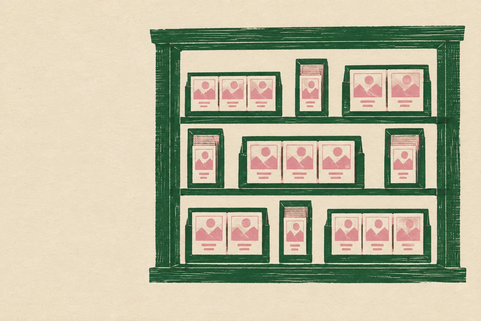
Paste this into an AI page builder to get the Versus Page: the blush comparison landing page with a spine masthead, a verdict table, a draggable container-query demo, and two-colour woodblock prints as the hero ground.
Build a comparison landing page ("X vs Y") for two CSS techniques, media queries versus container queries, as a light expressive page. Ground: pale blush pink #F3DCD6 with a very fine print grain at about 9 percent opacity, panels one step lighter at #FAEDE9. Ink: warm oxblood near-black #2B1A1E. Accent: forest green #1E5A3D, used only for the winning side of each comparison, section-row values, buttons and links; a deeper green #17402E for the prompt panel. Muted: dusty rose-brown #7E5A5E. Type: Fraunces (optical size 144 for the headline, 40 for subheads, italic for one pullquote) over Archivo for body at 19px with 1.7 line height, Fragment Mono for labels, the spine, table headers, and code. Never justify text; hold 60 to 75 characters per line.

Layout: a hairline top bar with the brand and three links. A hero whose whole ground is a full-bleed two-colour woodblock print (forest green and blush inks on cream paper, wood grain in the flat ink, no readable text) under a left-to-right blush scrim from 97 percent opacity on the left to 30 percent on the right, so the print shows at the right edge only. Inside the hero a two-column grid: a 64px vertical spine on the left holding the issue number, date, and reading time as three ruled cells rotated to read bottom to top, and the copy on the right: a mono kicker, a 74px Fraunces headline at most 12 characters wide per line, a 22px deck, then a two-cell versus box with a hairline border: each cell holds a mono side label, the question that side asks in 24px Fraunces, and a one-line answer, with the winning side's label in green.

Below the hero a live demo section: a three-column grid of 300px, 300px, and the remainder. Each column is a bordered slot with a mono label row. Slot one holds a card styled with a 1024px media query so it goes horizontal on a wide screen even in the narrow slot. Slot two holds the same card inside a wrapper with container-type inline-size and a 28rem container query, so it stays stacked. Slot three is a resizable container (resize: horizontal, overflow: auto, dashed green border) holding the container card, with its title set in clamp(1.05rem, .6rem + 2.4cqi, 1.6rem). The card is a bordered cream panel with an image area that shows a crop of the woodblock print, a mono kicker, a Fraunces title, one line of muted body, and a mono link.

Every section opens with a spec-table row: a top rule in ink, a three-column baseline grid holding the section name in 30px Fraunces, then two mono value cells that summarise the section's two sides or its item count, then a soft rule. Sections are two equal columns. The technique section carries a verdict table: mono column headers, one row per concern, and the winning cell in each row tinted 9 percent green with a small mono "reach for this" label above its text. The art direction and design move sections are bordered lighter panels; the design move includes a small dark green code block. Between the design move and the prompt, a full-width 340px interlude figure showing a second woodblock print (a window frame full of boxes) with a soft blush fade at top and bottom and an ink caption tag in the bottom-left. The Prompt Lab is an inverted forest green panel with a two-cell mono header (Prompt, Works in) and the prompt in cream mono. End with a centred italic Fraunces pullquote, a field note, a numbered sources list, prev and next links, and a colophon.

Radii: 0 on panels and cards, 3px on tags, 4px on code blocks. Hover: link underlines thicken and nav links gain a green underline over 140ms; include a prefers-reduced-motion guard. No accent left borders, no pill shapes, no big shadows, no gradient text, no neon, no images with readable text, no fake search fields or toggles.
Works with Beaver Builder AI, and with Framer AI, Bolt, v0, Lovable, or Claude Code. Swap the two techniques for any two products and the comparison page still holds.
A component should switch layout when it has the room, not when the screen crosses a number.
The comparison page is the oldest honest format on the web: two columns, one question per row, and no winner until the row is read. Container queries take most rows here because most rows are components. The page shell keeps the query it always had.