Claude folded its design tool into the chat window
Cowork and chat are one Claude as of yesterday, Docs and Slides are new, and Design now answers from any conversation. The rollout is staged by plan, so today's page is the plan ladder that staging implies.
Rollout by plan, as stated in the announcement
What
Proand Max
Team
Free
Enterprise
Cowork and chat as one Claude
Rolling out over the coming weeks
Soon after
Soon after
Admins get 30 days' notice
Claude Docs and Claude Slides
Beta, paid plans
Beta, paid plans
Not stated
Admins choose when to turn on
Claude Design inside conversations
Yes
With the merge
With the merge
Admins choose when to turn on
Standalone Claude Design
Keeps working as before
Keeps working
Keeps working
Keeps working
Existing chats, projects, connectors, skills
Carried over, nothing to turn on
Carried over
Carried over
Carried over
Cells hold what the post says. "Not stated" means the post is silent, not that the feature is absent.
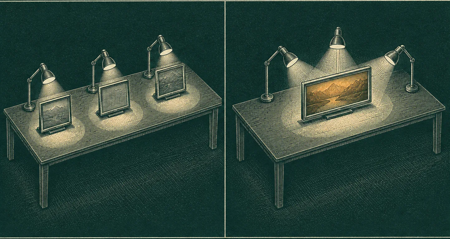
Plate 1. Three places for a task, then one.
Tooling
2 of 6 items
Claude stops asking where a task belongs
Anthropic's post says the frustrating part of running Cowork and Design as separate places was deciding which one a task went to, and that work started in one did not carry into the other. From now the routing is Claude's job: a quick question or a report due at noon goes into the same conversation, with the same context, skills, and connectors, and the bigger jobs keep running after the laptop closes.
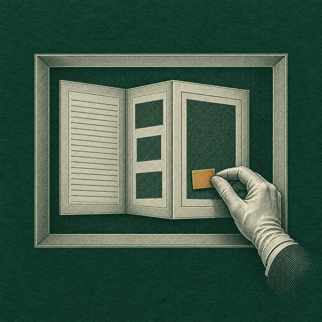
For designers the concrete change is that anything made with Design, Slides, or Docs lives at one shareable link, and on that link you can select an element and move it or tell Claude what to change. Slides present from Claude or download as PowerPoint or PDF. TechCrunch's report pins the launch to yesterday morning and notes that Design first shipped standalone in April.
Figma's Weave node takes a Design frame as input
Today's entry in Figma's release notes adds a node that accepts a copied Design frame, with text and image layers marked as inputs, so a Weave workflow can generate campaign variations or localized assets while keeping the frame's styling. Connected assets update when the source frame changes, which closes the loop that opened when Weave started running from chat.
Technique
2 of 6 items
Unicode 18 gives three currencies a real glyph
Yesterday's Unicode 18.0 release adds 13,007 characters, and the three that touch a pricing page are the currency signs: U+20C2 Rufiyaa, U+20C3 UAE Dirham, and U+20C4 Omani Rial. Each was authorized by its monetary authority over a year ago and waited on an encoding. Until webfonts catch up, a plan table for those markets renders a fallback box, so check glyph coverage before you set prices in them.
Chrome 153 lets a scroll container take diagonal input
The same Chrome release that carried the sticky carousel fix also ships the scroll-axis-lock property, which tells a scroll container whether to lock a gesture to one axis or let it move diagonally. Chrome 153's release notes list it as stable since the 15th; a wide plan table on a phone is exactly where the default lock gets in the way.
Workflow
2 of 6 items
Framer pins projects to the dashboard sidebar
Since the 14th you can right-click a Framer project and pin it to the sidebar, then drag the pins into order. Pins are per account and per workspace, which is the right scope for a freelancer working three client sites at once.
Figma folders show their contents before you open them
Figma's 16 September note gives folders thumbnail previews of the files inside, more distinct folder colours, and the ability to duplicate a whole folder tree. Small, but it is the first time a Figma folder has told you what is in it from the outside.
Design move
Borrow this pattern
The rollout table as the hero object
When a launch is staged by plan, put the plan-by-plan table above the fold in place of a product screenshot. Every cell holds a dated state the announcement actually gives (rolling out, beta, admins choose, not stated), never a checkmark. The table becomes the most honest hero a pricing page can have, because a reader can verify each cell against the source.
Where to use it
Any SaaS pricing or launch page where availability differs by tier or region, and any changelog page where a feature ships to some customers first. It also works as a comparison surface when the columns are your own plans rather than a competitor's.
What keeps it honest
One tinted column at most, and only for the column the announcement actually leads with. A footnote row that explains what a blank or "not stated" cell means. No fake ticks, no greyed-out rows implying a feature exists when the source is silent, and the table scrolls sideways on a phone instead of collapsing cells into vague pills.
Plate 2. Select an element and move it.
Prompt Lab
Works in Beaver Builder AI, Claude Code, Lovable, v0, Bolt, Framer AI
Hand this prompt to a page builder and it rebuilds today's system as a pricing page for your own product.
Build a SaaS pricing and plan-compare landing page in an expressive register borrowed from security engraving and share certificates. Ground: deep desaturated petrol green #0F2D2A, flat, with faint cream-tinted contour lines (topographic curves, 1px, about 15 percent opacity) confined to the left and right gutters and never behind the text column. Panels one step lighter, #163C36, with 1px hairline borders in #2A5C52. No gradients, no glow, no neon, no purple.

Palette: cream text #ECE6D6, softer cream #C9C6B8 for decks, sea-glass muted #93B8B5 for labels, one amber accent #E9A23B for the lead plan column, the meter fills, tags, and link underlines, with a deeper amber #B87616 for borders on the featured card and a pale gold #D8BE86 reserved for italic prose.

Type: Jost (500 and 600) for the headline, plan names, section titles, and accordion questions; Newsreader (opsz, 400 and 500, plus italic) for all body prose at 19.5px with line-height 1.7 and a 68ch measure, never justified; IBM Plex Mono for the table cells, captions, tags, and small uppercase labels at 13 to 14px with 0.06em tracking. The contrast logic: a geometric sans title over a serif of terms, like a certificate.

Masthead: a circular seal stamp, 168px, drawn in SVG in amber: two concentric hairline rings, the publication name set on a textPath along the top arc, and in the centre a small "No.", the issue number large, then the date and reading time in two short mono lines. Set it left of the headline in a 168px + 1fr grid. No boxed metadata cells.

Hero: a mono kicker, a Jost headline at clamp(38px, 5.6vw, 64px) within 15ch, then a 23px serif deck within 52ch. Below the hero, the hero object: a full-width plan-by-plan table (border-collapse, hairlines, a mono caption on top) with the lead plan column tinted #1C4640 and its header in amber, feature names as serif row headers, and a footnote row explaining any blank cell. Every cell states a real availability state; never render checkmarks or ticks.

Under the table, one full-width engraved plate in a hairline frame with a mono figure caption: commission it as a copperplate line engraving in cream ink on petrol paper with one spot of amber, no legible text.

Sections (Tooling, Technique, Workflow) each open with a usage-meter row: a top hairline, the section name in Jost 28px, a six-segment bar with the segments filled in amber for the number of items in the section, and a mono count on the right. Items are stacked articles with a 22px Jost title and one or two serif sentences, separated by hairlines. No cards.

Art direction callout: a hairline panel on #163C36 with a mono label, the style name, one italic line in pale gold, a short paragraph, and small mono outline tags with 3px radius.

Design move: a real accordion of three native details elements (question in Jost 20px, a plus sign that becomes a dash when open, the first open by default) beside a 300px column holding a square engraved plate. Prompt Lab: the featured plan card, a panel with a deeper amber border and the page's only shadow (0 18px 40px -24px black at 70 percent), a mono header row, and the prompt in a pre at 15px mono.

Interaction: link underlines thicken from 1px to 2.5px over 140ms, nav links gain an amber underline, accordion summaries turn amber on hover, all focus states visible in amber. Include a prefers-reduced-motion guard that removes transitions. Radii: 0 on panels and tables, 3px on tags only, no pills. No accent left borders, no emoji, no three-up feature cards, no logo bar, no fake toggles or search fields. Body text never below 18px, small labels at WCAG AA against the panel they sit on. On phones the plan table scrolls horizontally with a 640px minimum width rather than collapsing.
Field note
Closing
The design decision in yesterday's Claude post is a routing one: the product stopped asking people to classify their task before starting it. Every builder tool with a mode switcher in its header should read that as a note about its own first screen.