Paste it into Beaver Builder AI, v0, Claude Design, Bolt, or Lovable.
Build a direct-to-consumer product page for one product sold in two variants; call the style The Hang Tag. Semantic HTML and CSS only, no JavaScript beyond a font loader. The page is a lookbook spread, not a gallery-and-buy-box split: everything runs full width in one column on a warm apricot ground (#F5D3AE), colour-blocked by section with a paler peach (#FAE4CC), no texture, no gradient, no grain. Deep violet (#2A1541) is the ink for all text and rules; a brighter violet (#5A2DB4) is the accent for links, the one button, and a hover shadow; burnt umber (#7E4A25) is the tone for small labels, captions, and italic emphasis.

Type: Instrument Serif (a sharp, high-contrast display serif) at 5.4rem on desktop and 2.4rem on mobile for the product title, and for section titles and variant names; Schibsted Grotesk (a plain grotesque) for all body copy at 19px with line-height 1.7 and a measure of about 66 characters; Sometype Mono, uppercase with 0.06em tracking, for every label, caption, and spec key. Never italicize paragraphs.

Masthead: a hang tag, not a table. A 232px peach card with a 1.5px violet border, a punched hole drawn as a small ring near its top edge, and a thin string rising from the hole to the nav, rotated minus 4 degrees, carrying the brand in mono, a large serif issue number, the date, and the reading time. It rotates to level on hover over 220ms.

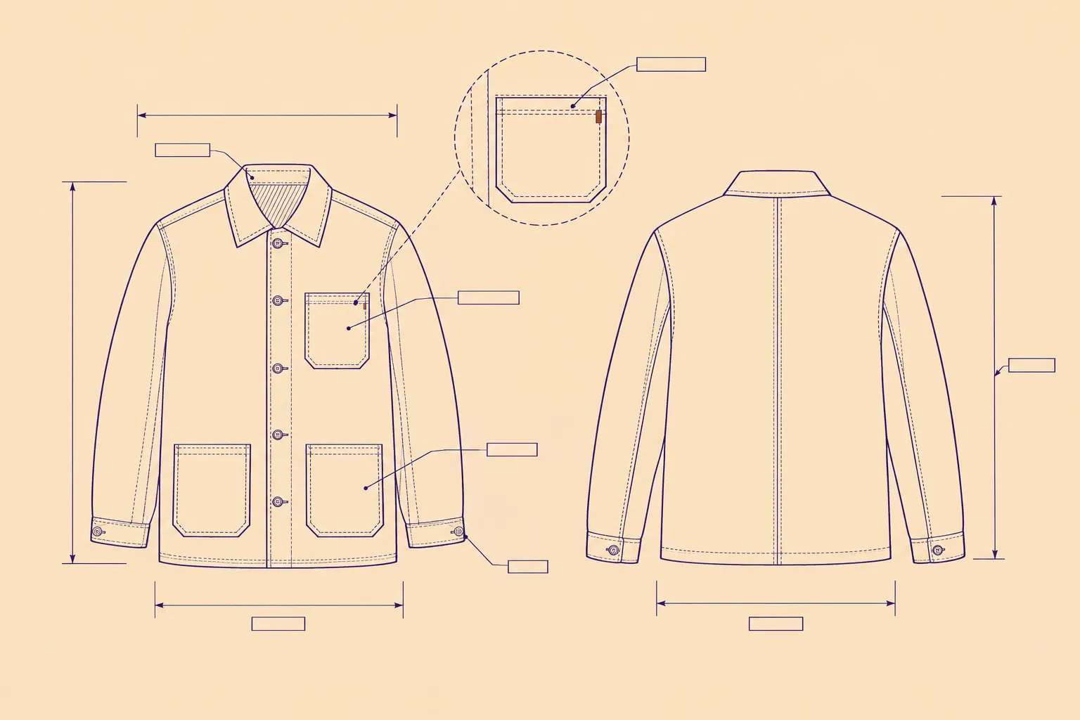
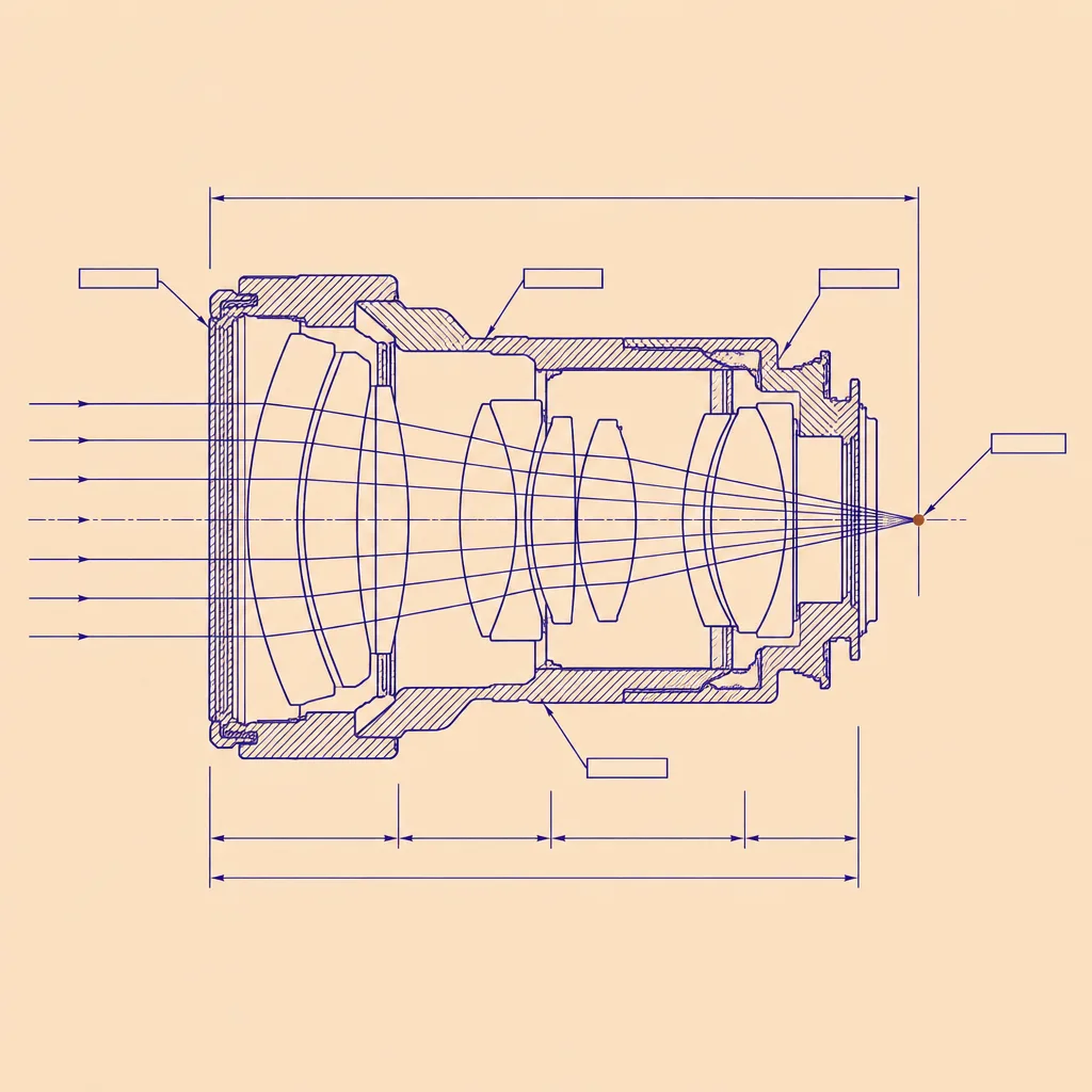
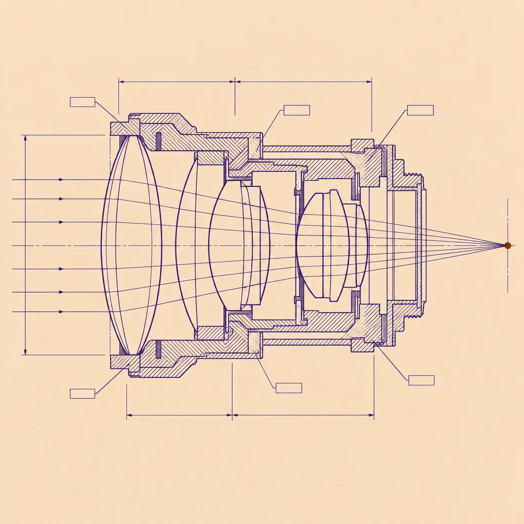
Above the fold, in order: a mono top nav (brand left, three links right); the hang tag; the product title full width in the display serif, max 18 characters per line; a one-paragraph deck at 1.28rem; a full-width framed plate (a 3:2 technical drawing with a 1.5px violet border and a mono caption); then the variant row: a serif heading, and two equal cards side by side (stacked on mobile), each with a serif variant name, a mono variant number, a square plate made by that variant from the same brief, and a definition list of spec rows (built for, speed, price, quality, this plate) separated by hairlines at 28% violet, the last row naming the measured time in bold. Under the cards, one real button in the bright violet linking to the source, with a plain sentence beside it.

Sections open with a care label: an inline box with a 1.5px violet border and an inner 1px dashed stitch line inset 5px, holding a mono index, the section title in the serif, and a mono item count. Items are separated by hairlines and carry a mono date line, a bold grotesque title, and one or two sentences. The design move section is a 7/5 grid: prose left, and on the right a framed receipt panel listing every plate on the page with its model, size, quality, seconds, and the first line of its prompt in umber italic. The prompt section is a deep violet garment bag with peach text and a bordered pre block. End with a prev/index/next rail between two violet rules and a short umber colophon.

Guardrails: body never under 18px, line-height never under 1.6, no justified text, small labels at WCAG AA against the surface they sit on, no fake screenshots with readable text, no pill radius, card radius 4 to 6px, hover states on links, the button, the tag, and the cards only (150 to 220ms), and a prefers-reduced-motion guard. Images: technical drawings in fine violet line on flat apricot paper with dimension lines, blank label tags, and one umber mark, no legible text in them.