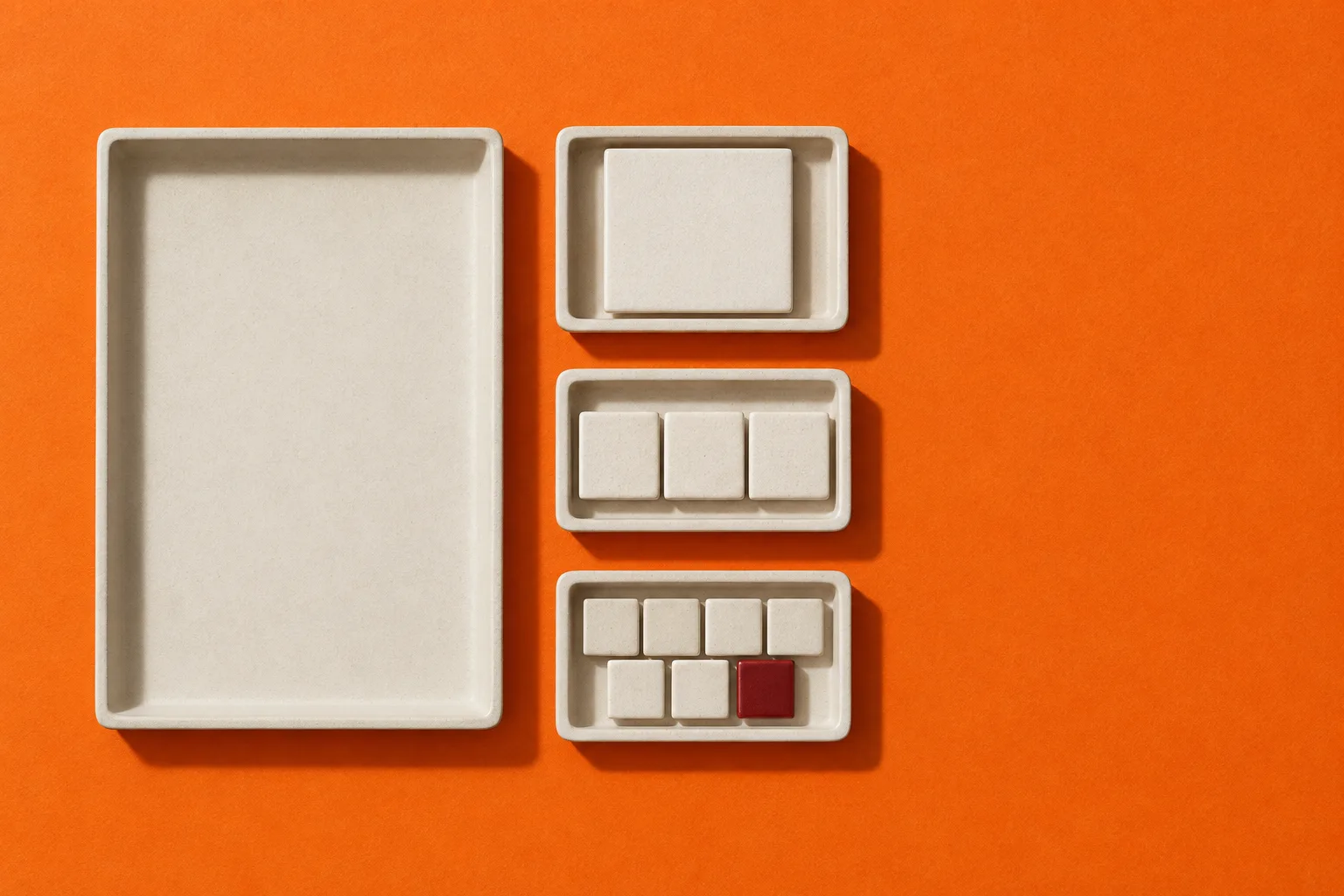
One card, three, or seven: now a container query can count them
Safari's preview lets sibling-index() and sibling-count() sit inside a container query's condition. The rule that picks a layout can now do arithmetic with how many items share a parent.
A component states page on tangerine paper, where every section shows its own count.
A states page is the part of a design system that documents one component through its conditions: empty, one item, a few, many, error. Here each section of the news is a state. Its entry count sits in a rail beside it, and a small tray of tiles under the number is laid out by the same CSS rule the lead story is about.
The release notes list support for sibling-index() and sibling-count() inside container query conditions. Until now the functions worked in property values; in this preview the condition that switches a layout can use them too.
The function returns how many children the parent has, counting the element itself, and MDN marks it newly available across browsers since August 2026. Safari shipped both functions first, in Safari 26.2 last December.
Absolutely and fixed positioned boxes with safe alignment now keep inside the viewport, large picker dropdowns get the same treatment, and inner corners drawn with corner-shape render correctly where they intersect.
Live demo: one rule, three trays
1 tile
3 tiles
7 tiles
.tiles { display: flex; flex-wrap: wrap; gap: 8px; }
.tiles > li {
  /* one tile fills, a few share a row, many wrap at four */
  --per: min(sibling-count(), 4);
  flex-basis: calc((100% - (var(--per) - 1) * 8px) / var(--per));
}
These trays use the Baseline function in a property value, so they work in current browsers. If container queries are new to you, issue 130 starts with a card that answers its container.
Projects gain a chat mode for discussion that does not edit code, workspaces get their own chats, and Free, Pro, and Business plans get a daily chat allowance for thinking and planning.
Fable 5.1, Opus 5.5, Opus 5, Sonnet 5, and Haiku 4.5 are now available for the AI features inside the apps you build, alongside five new cloud connectors including Looker.
A list of one and a list of seven are different designs. The stylesheet can see which one it is holding.
Both image models can now generate transparent PNG or WebP files inside Lovable, so a product cutout or an icon can sit on any section background without a trip to a separate tool to remove its backdrop.
Borrow this pattern
Let the count choose the layout
Design every collection at four counts before you design it once: empty, one, a few, many. Then let one rule carry the middle three. A width built from min(sibling-count(), 4) makes a single item fill its row, lets two or three share it, and wraps anything larger at four across, with no class names and no script counting children.
Use it on card grids, logo walls, pricing tiers, and team pages, anywhere a client adds or removes items after launch. Keep it honest in two places: the count needs at least one child, so the empty state still needs its own markup, and a cap on the columns keeps a long list from shrinking into slivers.
Nothing yet
Empty
One
A few
Full row
Many
Prompt Lab
Build a states page
Build a component states page: a one-page reference that documents a single collection component (a card grid) in each of its states, empty, one, a few, many, and error, as a landing page a design-system team would publish.

Hero: a full-bleed overhead studio photograph on saturated tangerine paper (#E85A09) showing one large empty tray beside small trays of 1, 3, and 7 tiles. Place the kicker and headline inside the photographed empty tray, centered like an empty-state message; put the deck and one dark button in the open paper to the right. The top nav floats on the photo. On screens under 1100px, crop the photo square on the trays and stack the text below it.

Ground and palette: sample the page ground from the photo's paper so the image bleeds into the page. Ink #1F130C for text on orange, cream #F2ECE3 panels shaped like ceramic trays (14px radius, a 3px lip at the bottom edge), a darker ceramic #DBD2C5 for inset tile trays, oxblood #711614 as the only accent and only on cream.

Type: Brygada 1918 for display and body (19px body, line height 1.68), Spline Sans Mono for counts, labels, dates, and code.

Masthead: a cream folder tab rising out of the first panel, holding issue, date, and reading time as labelled rows.

Sections: a 3fr/1fr grid. Left, a cream tray of entries separated by hairlines. Right, a sticky state rail: a 104px mono numeral for the number of entries, the state name in italic, and a small tray of tiles laid out with flex-basis calc((100% - (var(--per) - 1) * 8px) / var(--per)) where --per is min(sibling-count(), 4), inside @supports with a four-across fallback. Set entry type size from the count too, never below 19px. On mobile the rail becomes a row above the entries.

Include a live three-tray demo with its CSS in a dark pre, one italic pullquote, a five-state strip from empty to many, and a copy button on the prompt block.

Guardrails: body at least 18px, line height at least 1.6, WCAG AA contrast for every label on its real background, no text on the orange smaller than 14px, no neon, no glow, no gradients beyond one bottom fade on the hero, no fake UI controls, no readable text inside the photograph, hover and focus states on every link and button, and a reduced-motion guard.
Paste it into Beaver Builder AI, Webflow, Lovable, v0, Framer, or Claude.
Field note
Most card grids are designed at the count in the mockup and shipped to a client who will change it. Design the one-item version this week; it is the state you will see most in the wild and the one nobody drew.