Build the crest index
Build a search results page for an online library of logos and identity marks (crests, monograms, emblems), the page a design studio or template marketplace would pay a freelancer to ship.

Ground and colour: a saturated heraldic azure ground #1C5F9E with a faint dot grid in #F5F1E6 at 17 percent opacity every 24px. Follow the heraldic rule of tincture as the colour system: on the blue ground, only the two metals carry type, argent #F5F1E6 for text and or #E2B23C for large display words and focus rings. Result cards, panels, and tabs are argent #F5F1E6 with sable #141B24 text; gules red #B8322A appears only on argent (buttons, hover states, one small label). Links inside cards are deep azure #16487A.

Type: Zilla Slab 600 for the headline, tab titles, and result titles; Hanken Grotesk at 19px with line height 1.68 for body; IBM Plex Mono for labels, dates, and source lines. The contrast logic: a sturdy slab for anything you scan, a neutral grotesque for anything you read.

Masthead: no boxed meta cells. A breadcrumb rail under the top nav, between two hairlines, with small gold CSS chevrons between the crumbs: site, section, issue number, date, reading time.

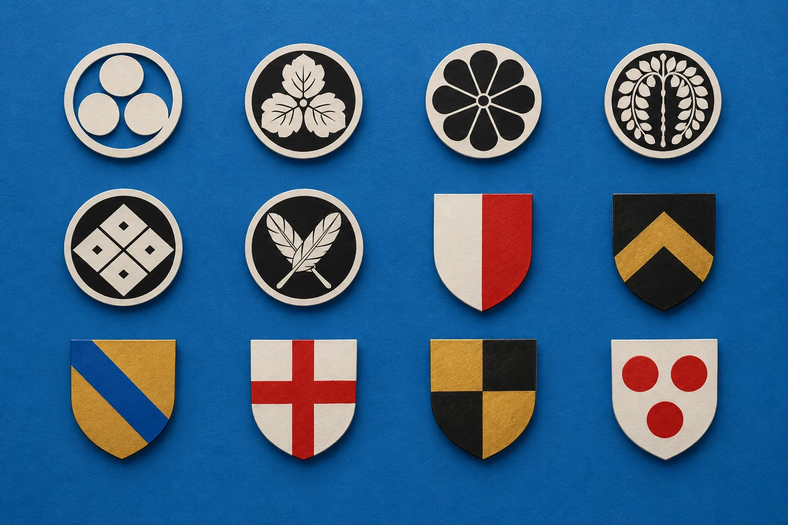
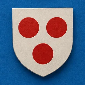
Layout: a two-column page, results column on the left and a sticky 336px knowledge panel on the right. Above the results, the query card: an argent card with one soft shadow that writes the active filters back as a single sentence in 30px Zilla Slab, each filter value bold with a gold highlighter underline, and a mono result count under a hairline. Under it, results grouped by type. Each group opens with a tab strip: its own tab is a raised argent tab holding the h2 and a count, attached to the argent results card below; the other tabs are real anchor links to the other groups. Each result card has a mono source line with the date right-aligned, a 27px slab title link, and one or two sentences of snippet. The first result carries an image pack: one overhead photograph shown whole plus two cropped details, each with a mono caption. The right panel holds the style name, an italic one-line summary, a short explanation, and small vocabulary chips, then two small SVG glyphs explaining the two grammars.

Also: one italic pullquote on the blue between groups; a "Borrow this pattern" card with a working demo of three native selects that rewrite the sentence in an output element; the prompt as a featured snippet card with a gold header band and a red copy button; field note, numbered sources, pagination, and a colophon on the blue.

Guardrails: body at least 18px and line height at least 1.6; WCAG AA contrast for every label against its real surface (gold never for small text on the blue); no fake search field, no fake filter pills, no decorative toggles; no readable text inside images; no neon, glow, or gradients; radius 12px on cards, 6 to 10px on small parts, no pill shapes; hover and focus states on every link, tab, select, and button with 150ms easing; a reduced-motion guard. On mobile, stack the knowledge panel under the query card and let the tabs wrap.
Paste it into Claude, v0, Framer, Beaver Builder AI, Lovable, or Webflow.