Answer sheet
Paste this into an AI page builder to reproduce The Rubric as a course or assessment landing page. Swap the course, the scores, and the plates for your own.
Build a course landing page for a design-school assessment course, called The Rubric. One page, semantic HTML and CSS only, no JavaScript.

Ground: the whole page is poster red (#A61D2B) with a drafting grid drawn in CSS, 32px squares, 1px lines of cream at 8 percent opacity. No gradients, no glow, no shadows except one soft shadow under the framed plate.

Masthead: a breadcrumb rail, a ruled single row across the top with small uppercase monospace crumbs separated by a thin chevron: Issues, Course library, then the course number in a filled cream chip, then the date and reading time pushed to the right edge. No boxed metadata cells.

Hero: the headline runs full width in an extended grotesque (Syne 800), 6vw, line height 0.98, cream. Below it a 12-column grid: a two-line mono unit label in the left five columns, the deck in EB Garamond 23px in the right six columns. Then a grade strip: an ordered list of three tiles inside one cream keyline, each with a small run label, a very large tabular number (Syne 800, 80px) with a small percent sign, a two-line mono note on the right, and a thin cream bar whose fill width equals the score. Then a framed plate: a cream frame with 14px padding holding a 3:2 image, with a mono caption in pale rose below.

Section markers: every section opens with a criterion bar, a three-column grid ruled with a 1px cream line above and a 34 percent cream line below: mono unit number on the left, the section name in Syne 800 at 30px in the middle, and on the right a meter of six 22px blocks with 1px cream borders, filled cream for the units already passed. Sections: Tooling, Technique, Workflow, Design move, Prompt Lab, Field note, then Sources.

Items: a Syne 700 subhead at 26px, a mono source line in pale rose, then one or two paragraphs of EB Garamond at 20px with line height 1.7 and a 66 character measure, cream on red, never justified. One pullquote only, EB Garamond italic at 34px between thin rules.

Course card: a cream (#F3E7CF) card in two columns with dark ink text, a cobalt (#1F3FBF) mono kicker, the course name in Syne 800 at 44px, an italic one-line summary in cobalt, one paragraph, a row of keyline chips with 3px corners, and on the right a definition list of course details with a cobalt rule above and thin cobalt rules between rows. Cobalt appears only on cream surfaces, never on the red ground.

Design move: two columns, text left and a square framed plate right, with a small demo of three criterion bars used as a five-block rating scale.

Prompt block: a cream answer sheet with a cobalt kicker, one line of instructions, and the prompt in a monospace pre at 15.5px that wraps.

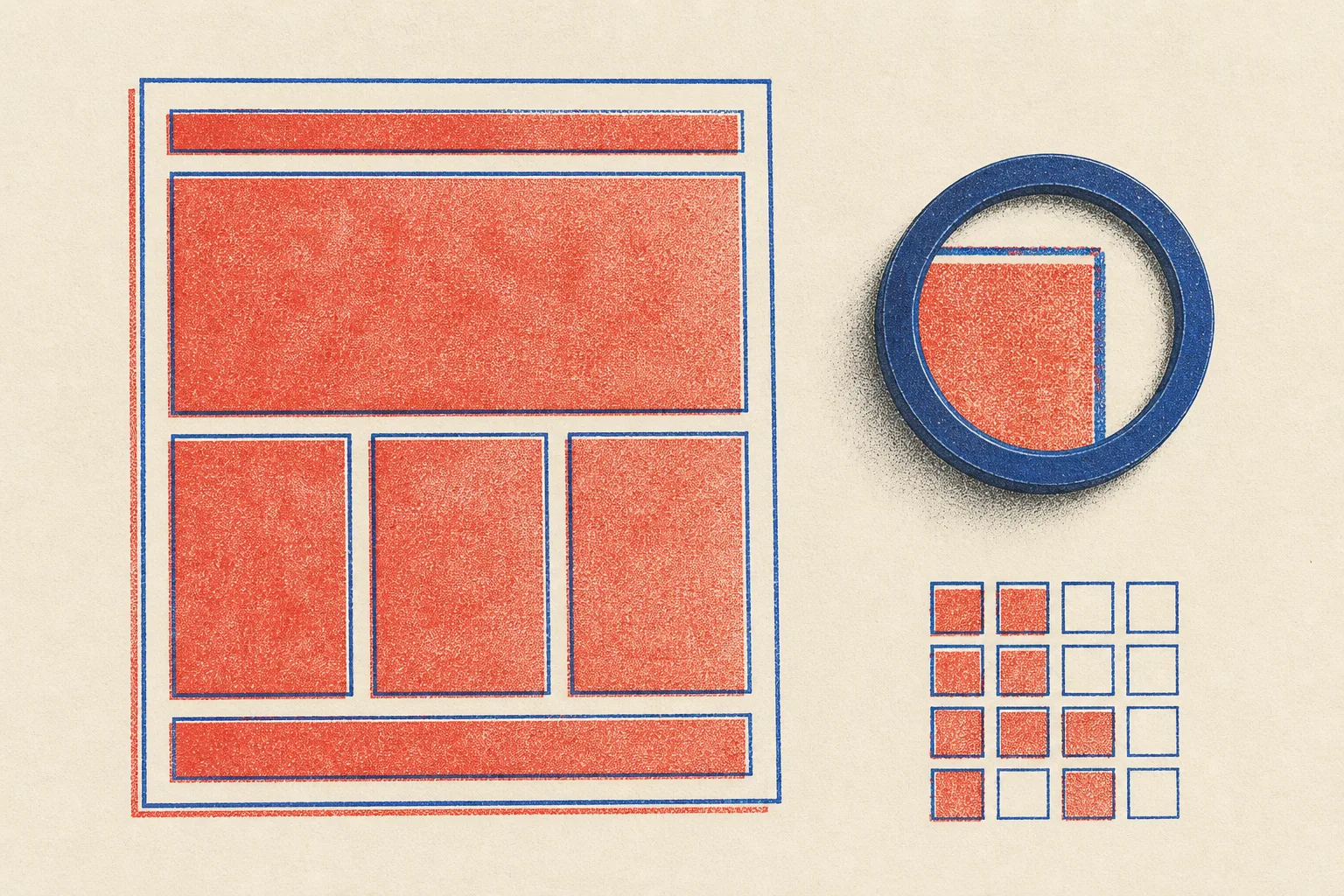
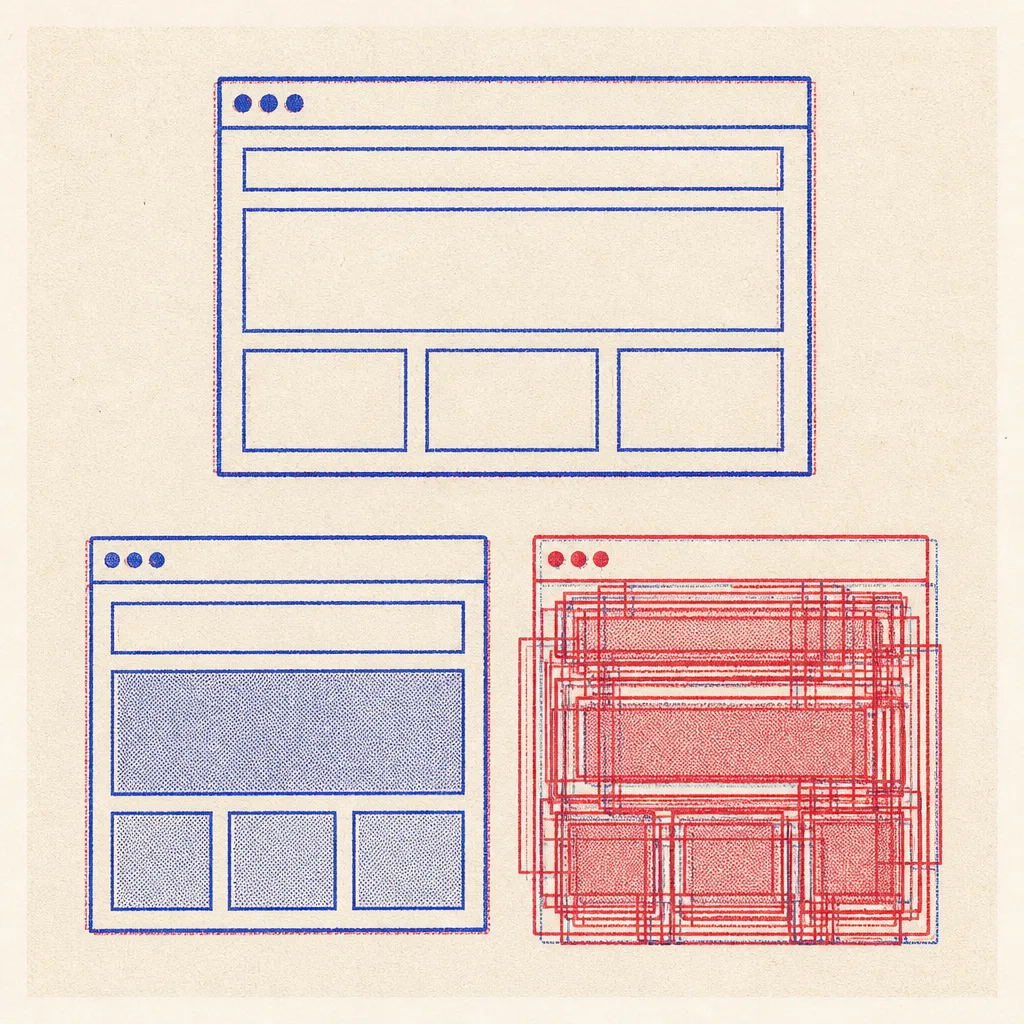
Images: risograph prints, two-colour overprint of poster red and cobalt on cream uncoated paper, diagrams of web page blocks with visible misregistration and ink grain, no legible text.

Guardrails: body text at least 18px with line height 1.6 or more; small labels at least 13.5px and WCAG AA against their real surface; no accent left border stripes; no pill radii except none; hover and focus states on every link with a 150ms transition; a prefers-reduced-motion guard; no em dashes; no fake search fields, toggles, or filter pills; the meter is aria-hidden with its value written for screen readers.
Runs in v0, Lovable, Bolt, Framer AI, Claude Code, and Beaver Builder AI. Swap the fonts for any wide grotesque paired with a Garamond-style serif.