IssueNo. 135
DateMonday 21 September 2026
Reading time4 min

Three engines now let the box hug the letters

The half-leading that has padded every headline, button, and card since CSS began can now be trimmed away with one line, and as of this month it works in Chrome, Safari, and Firefox. A powder-blue type foundry page for a property that finally lets the box fit the type.

Firefox 156 is the fix release that makes it trustworthy. Cursor Projects and Bolt Forge round out the day.

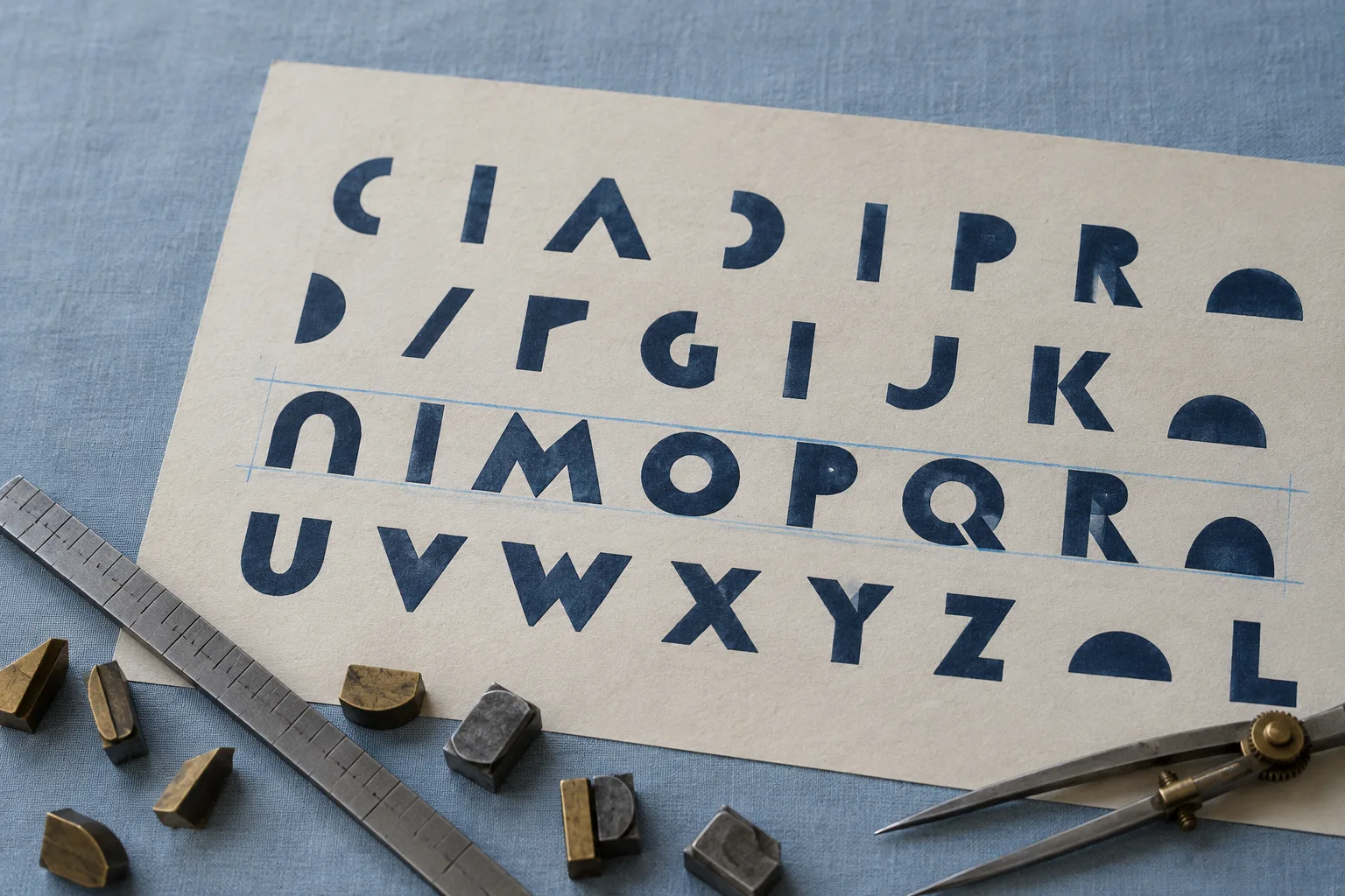
Overhead photograph of a cream proof sheet on powder-blue linen, printed with rows of navy geometric capitals; one row has pale blue pencil rules drawn at cap height and baseline, with brass and lead type sorts, a steel line gauge, and dividers along the lower edge.
Proof sheet. One row ruled at cap height and baseline, which is exactly the box text-box-trim now draws.

Tooling

OvercapUnderalphabetic

Firefox 156 tightens text-box-trim, the last engine to join

Mozilla, 15 September 2026

The property reached Baseline in August once Firefox joined Chrome and Safari, and 156 is the release that makes it safe to lean on: trimming now behaves correctly with first-line styling and with inline boxes that break across lines, and it no longer eats border or padding from an inline box while it trims. The same release stops rounding the viewport readout in the Inspector highlighter, so a fractional zoom finally reports the width you are actually looking at.

Firefox now tells the truth about webkit scrollbars

Mozilla, 15 September 2026

From 156, a feature query for the webkit scrollbar pseudo-element reports unsupported on every site, which means a stylesheet that branches on it will fall through to the standard scrollbar-width and scrollbar-color pair as intended. If a generated stylesheet styles scrollbars only the webkit way, this is the week to add the standard properties beside it.

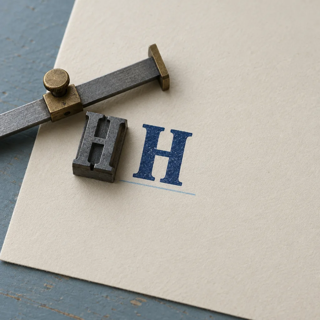
Macro photograph of a single lead type sort of a capital H face up on cream paper beside its navy printed impression, a steel type-high gauge resting across it and a pale blue pencil baseline drawn under the printed letter.
Sort and impression. The pencil line is the baseline. Until this month only two engines could make the CSS box agree with it.

Technique

Size52Leading52

One line, applied to display type only

MDN reference, Baseline since August 2026

The shorthand is text-box set to trim-both, cap, alphabetic: trim the space above the capitals and below the baseline. Put it on headlines, buttons, badges, and any single line whose box you measure by eye, and leave paragraphs alone, since running text needs its leading. In a browser that has not shipped it the declaration is ignored and the box simply keeps the padding it always had, which is why there is no fallback to write.

UntrimmedRegular

Box height measuring

TrimmedRegular

Box height measuring

Same padding on both. The trimmed box loses the half-leading above the caps and below the baseline. If the two heights match, this browser has not shipped text-box-trim yet.

Workflow

TrimbothFallbacknone needed

Cursor Projects runs a whole feature while the laptop is shut

Cursor changelog, 10 September 2026

Projects is Cursor's mode for work larger than a prompt: a coordinator plans the job and hands pieces to subagents that run in parallel on Cursor's cloud, subscribe to events such as a Slack thread, pull request activity, or a schedule, and keep their context across a long session. For a site build that means a redesign can be assigned as one project and reviewed as pull requests rather than babysat as a chat.

Bolt Forge trades data for fifty times the usage

Bolt, 14 September 2026

Forge is an agent mode that runs open models, named as GLM 5.3, Kimi K3, and DeepSeek v4 Pro, for Pro subscribers who opt into sharing their sessions as training data, with fifty times the normal usage at no extra cost through 14 October. Worth knowing before a client prototype goes in, since the opt-in covers the whole session, not the prompt.

h1, h2, h3,
.button, .badge, .price {
  text-box: trim-both cap alphabetic;
}

/* Paragraphs keep their leading. */
p { text-box: none; }

The whole rule. Give it to the agent before it writes a single padding value, and put it in the design system's reset, not in each component.

Every optical-centering hack in your button styles was a workaround for a box that could not see the letters inside it.

Borrow this pattern

Let the rules sit on the type

Trim a display element to cap height and baseline, then give it a top and bottom border. The borders now sit on the cap line and the baseline, so a section marker, a masthead, or a specimen row is ruled the way a proof sheet is ruled, with no magic offsets. Use it on section titles, stat rows, and price lines, anywhere a horizontal rule meets a single line of large type.

What keeps it honest: apply the trim to single lines of display type, never to paragraphs; keep the vertical padding symmetric so the trimmed box reads as centered; and check the page in a browser without support, where the rules will sit slightly wider but nothing breaks.

Trimmed box. With the trim on, the element's top edge is the cap line and its bottom edge is the baseline, so a plain border draws the rule.

Prompt Lab

Works in Beaver Builder AI, Claude Design, Figma Make, Lovable, v0, and Claude Code

A paste-ready brief that rebuilds today's type foundry page: a specimen ribbon masthead, trimmed section strips, a photographed proof sheet, and a proof-block Prompt Lab.

Build a single-page type foundry product page that sells one typeface. Register: expressive, light ground, cool palette with one warm paper element.

Ground and motif: powder blue #D6E2EA across the whole page. Tile a 96px repeating SVG registration cross (10px arms, 1px stroke) in navy at 9% opacity as the only background motif, and give every text column a solid powder-blue background so the crosses live only in the gutters. No grain, no gradients, no glow.

Palette: navy ink #16294A for all text and rules; cream proof sheet #F3EEE3 for panels and image frames; cerulean #1F6FB5 for links and the one button colour; slate #5B6C7E for labels; hairlines #8FA6BA. Italic prose in a quieter #2F4E78.

Type: Outfit 600/700 (Google Fonts) for the headline, masthead values, section titles, and the character set; Spectral 400/600 with its italic for all reading text at 19px and 1.7 line height, never justified; Geist Mono 400/500 for labels, dates, readouts, and the prompt block. Body measure 66ch.

Trim rule: add `text-box: trim-both cap alphabetic` to every single-line display element (headline, masthead values, section titles, the character set, and the demo button). Never apply it to paragraphs.

Masthead: not a boxed meta table. One ruled specimen line across the page: a 1px top and bottom hairline with three cells inside, each a small mono label (Issue, Date, Reading time) above an uppercase Outfit value at 28px that is trimmed, so the hairlines land on the cap line and baseline of the values.

Hero: the headline full width in Outfit 700 at clamp(40px, 6.6vw, 86px), max 16ch, letter-spacing -0.028em. Below it a two-column grid at equal halves: left, a 22px deck (34ch) with an italic closing sentence and a short 17px note; right, a photographed proof sheet in a cream frame with 12px padding, a 1px hairline border, and a mono caption. On mobile the photo moves above the deck.

Section markers: every section opens with a specimen strip: a 1px hairline above and below, the section title in Outfit at 52px trimmed so the hairlines sit on cap height and baseline, and at the right a mono readout in two labelled cells that differ per section (Over: cap, Under: alphabetic; Size: 52, Leading: 52; Trim: both, Fallback: none needed). No icons, no numbers, no coloured left borders.

Section bodies: an equal-halves grid. Left, a 66ch column of items: each a 25px Outfit title link (an underline that grows on hover over 180ms), a mono uppercase source-and-date line, and one or two Spectral paragraphs, separated by hairlines. Right, one cream specimen panel per section with 12px padding and a hairline border: a square photograph with a mono caption in the first section, the live trim demo in the second, and a short CSS rule in a pre block with a mono caption in the third.

Art direction panel: a cream two-column sheet (equal halves) with a mono kicker, a title, an italic one-line summary, a paragraph, then a vocabulary list of 8 small mono uppercase tags in powder-blue chips with hairline borders and 3px radius.

Live demo: inside the second specimen panel, a two-cell grid of powder-blue cells; each holds a cerulean button (one word, 28px Outfit, 18px 26px padding, 5px radius) and a mono readout of the button's measured height written by a tiny inline script; the second button carries the trim rule so the reader can compare. A mono note below explains that matching heights mean the browser has no support yet.

Pullquote: one italic Spectral line at 26px between hairlines.

Design move: a cream panel, equal halves, text left and a metrics diagram right: the glyph pair Hg in Outfit 700 at 150px with the trim rule, its top and bottom edges extended as 1px cerulean lines labelled Cap line and Baseline in mono, on a powder-blue field with a hairline border and a mono caption.

Prompt block: a navy #16294A panel. Its header is the full uppercase character set A to Z in Outfit at 30px with 0.14em tracking, trimmed, between two #4E6890 hairlines. Then the title and a right-aligned mono works-in line, an intro paragraph in #C9D6E4, and a pre block in Geist Mono 15px on #1E3560 with a thin scrollbar, capped at 620px height.

Footer: a hairline-ruled previous / index / next row in mono uppercase, then a short colophon at 15.5px naming the typefaces and the palette.

Guardrails: body text at least 18px with 1.6 line height; all small labels at least 12px and WCAG AA against their actual surface; no fake readable text inside images; no neon, no glow, no gradient text, no pill shapes larger than a tag; hover and focus states on every link and button at 150 to 180ms; include a prefers-reduced-motion guard.
Format PromptRegister ExpressiveBlock Scrolls

Field note

Ask an agent to centre text in a button and it will reach for padding it cannot see. Give it the trim rule first, and the padding it writes will finally mean what it says.

Sources

  1. Firefox 156 for developers Mozilla, MDN release notes, 15 September 2026
  2. text-box-trim MDN CSS reference, Baseline newly available since August 2026
  3. scrollbar-color MDN CSS reference
  4. Projects Cursor changelog, 10 September 2026
  5. What is Bolt Forge Bolt, 14 September 2026