Toolcraft hands an agent the parts to build your own design app

Pixel Point's open-source Toolcraft is a starter kit and UI library for building a small design app with a coding agent: canvas, layers, timeline, controls, export, and a harness so Codex, Claude Code, or Cursor can assemble the rest.

Open the repository

What comes in the box, in cut paper

Three of the kit's parts, drawn as collage. Scroll the rail.

Cut-paper collage of a design tool window: a cream artboard holding a marigold circle, an indigo rounded rectangle, and a cobalt leaf, a layers panel of stacked paper strips on the left, and a cobalt toolbar of blank squares along the top.
Fig. 1. The canvasPan and zoom the way a design tool does, with a layers panel the agent turns on only when the app needs one.
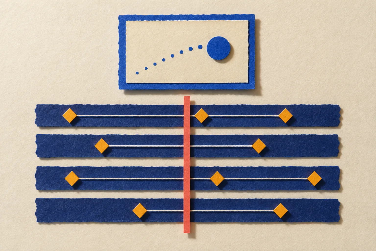
Cut-paper collage of an animation timeline: four indigo tracks carrying marigold diamond keyframes joined by string, a coral playhead crossing them, and a small cream preview frame above with a cobalt circle and a dotted trail.
Fig. 2. The timelineKeyframes and tracks are built in, which is what separates a video-effect tool from an image filter.
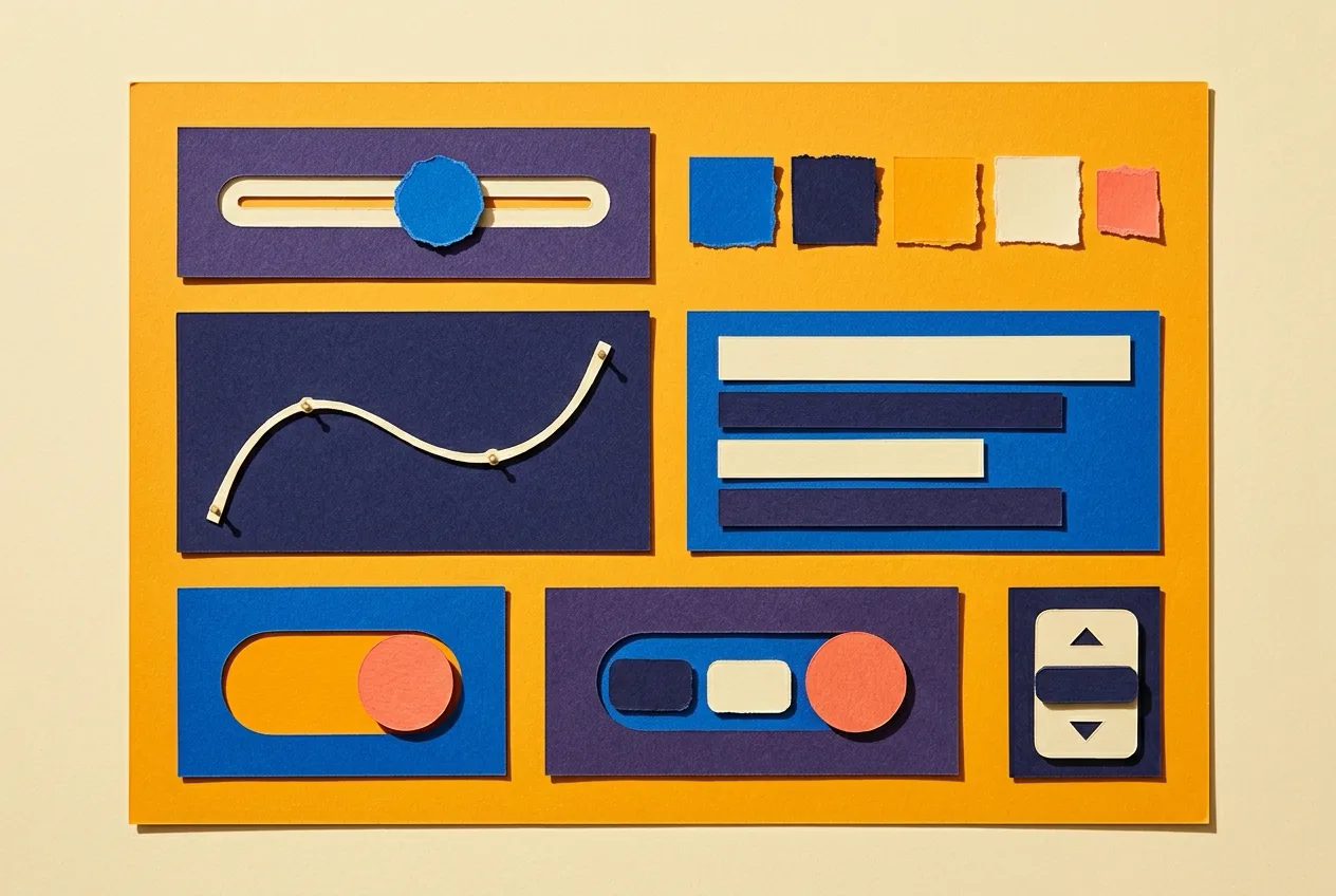
Cut-paper collage of interface controls in a grid: a slider with a cobalt knob, a row of torn paper colour chips, a curve editor with a string curve, a font picker of blank bars, a toggle with a coral disc, and a stepper of stacked buttons.
Fig. 3. The controlsSliders, colour palettes, curve editors, font pickers, and uploaders, so the agent wires parameters instead of drawing widgets.

Today's art direction

Idiom
The Community Listing
Summary
A marigold store listing: an app icon lockup as the masthead, a scroll-snap rail of cut-paper plates, shelf headers opening every section, and developer notes for the Prompt Lab.
In plain words
A marketplace presents a single app with a fixed set of parts, and this page borrows all of them: an icon, a title, a developer line, and one real action at the top, a rail of screenshots under it, then an information table and shelves of hairline-separated entries. The news item is the kit being listed. The ground is a saturated marigold instead of store white, so the cream panels read as cards set on a shelf, and cobalt is the only cool colour, reserved for the action and the links.
Vocabulary
icon lockupversion tagscreenshot railscroll snapinformation tableshelf headerdeveloper notescut-paper plates

Tooling

A starter kit for the tool you could not buy

See sources

Toolcraft: canvas, layers, timeline, controls, and a harness for the agent

Pixel Point, Show HN 11 September, commits through 19 September
Licence
MIT
Stack
TanStack Router, React, TypeScript, Tailwind, Base UI
Works with
Codex, Claude Code, Cursor
Stars
about 800

Pixel Point, the studio behind a run of developer-tool marketing sites, has open-sourced the scaffolding it uses to build small design apps for itself and its clients. Toolcraft is an MIT-licensed starter and UI library on TanStack Router, React, TypeScript, Tailwind, and Base UI. It ships a canvas with pan and zoom, a component library of buttons, dropdowns, sliders, font pickers, colour palettes, curve editors, and image uploaders, layers and animation timelines with keyframes that the agent switches on when an app needs them, and image and video export.

The part that makes it a 2026 project is the harness: skills, instructions, and unit, browser, acceptance, and performance checks that teach Codex, Claude Code, or Cursor to build on the kit's design system. The README's getting-started step is a prompt, not a command: open an empty folder in your agent, paste one paragraph, and describe the tool. Pixel Point says a first working result usually lands in thirty to sixty minutes and that a finished tool takes them one to three days. Around eight hundred people have starred the repo since it went public in July, and it took a Show HN on 11 September with a weekend of commits since.

The FAQ answers the obvious question honestly. Use it only when a custom app beats Figma or the tool you already have, and it names the case: a brand language built on procedural graphics, where hundreds of small layers and repeated effects get slow in a general tool and a client could be handed the app to make new assets alone. Figma's own answer to the same appetite is the Weave tool, the small prompt-built workflow that opened to Community publishing on Tuesday. One is a shelf of finished tools inside a product; the other is lumber for a single-purpose tool that stays yours.

Why it mattersFor a web designer the interesting output is the small generator: a blog cover maker, a halftone or ASCII effect, a branded asset batcher, the kind of thing a client asks for once a quarter and no plugin quite does. Toolcraft turns that from a product decision into a weekend with an agent, and the guardrails come in the box.

Technique

Treat every agent report as evidence

See sources

The Chief of Staff pattern for long Claude Code builds

Mithushan Jalangan, asyncdot, 19 September
Shape
Orchestrator and workers
State
A durable board outside any session
Rule
Exit codes are authoritative, summaries are intent

A long build with a coding agent degrades after an hour for reasons Jalangan lists plainly: context gets compacted, self-reports drift from reality, and a session dies with its state inside it. The pattern separates one coordinating session that writes briefs, reads diffs, and verifies from short-lived sessions that implement, with a durable board outside any context holding the state.

Two rules travel well to a designer running a multi-page site build. Re-run the commands: exit codes are authoritative, summaries are intent. And write to durable channels, a committed file or a board card, because a message between sessions can be delayed or expire while a commit always arrives.

Workflow

The repo brings its own AI setup

See sources

Autopoiesis: a repository that ships a preconfigured AI platform

Jakob Breu, 20 September
Overhead
About 20 KB in the repo
Setup
Clone, prepare the config, one Docker command
Hooks
Bug tracker and CI through MCP

Breu manages engineers with very different working habits and wanted a way to hand every project a working AI harness without asking anyone to install or configure one. His concept puts the configuration, container setup, and project-specific tool hooks inside the repo itself, about twenty kilobytes in total. Clone, prepare the config, run one Docker command, and the AI frontend opens in the browser already pointed at that codebase, its bug tracker, and its CI.

For a studio that hands a client site to a rotating team, the project stops depending on who set up their agent and starts carrying its own.

Borrow this pattern

The screenshot rail

A horizontal row of tall plates that scrolls sideways and snaps plate by plate, with a real caption under each one. It is the store's screenshot carousel done without a carousel: a flex row with overflow set to scroll, scroll-snap-type on the x axis, snap alignment on each figure, and a scroll padding that matches the page margin so the first plate lands flush with the text above it. The rail bleeds past the container edge so a sliver of the next plate shows and tells the reader there is more.

Use it on any listing, product, or portfolio page where three to six images explain the thing better than prose. Keep it honest: leave the scrollbar visible and thin rather than hidden, give the rail a keyboard focus stop and a label, size plates with an aspect ratio so nothing jumps while images load, and let the captions carry content the page needs instead of restating the image. No autoplay, no dots, no arrows.

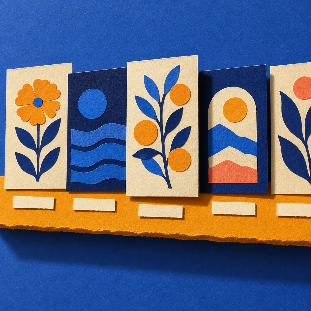
Cut-paper collage of five tall cream and indigo cards standing in a row on a marigold paper ledge, the third pulled forward, the fifth cut off by the frame edge.
Fig. 4. The shelf as an object: the last card leaves the frame on purpose.

Prompt Lab

Developer notes

Give this to the builder you use and it returns today's store listing as a page you can ship for a plugin, an app, a template, or any single product that lives in a marketplace. Swap the product and the screenshots for your own.

Build a one-page website for a single tool sold or shared through a marketplace (a plugin, an app, a template, a workflow). Page archetype: a web-native app store listing, laid out the way a marketplace presents one product: header lockup, screenshot rail, information table, shelves of entries, developer notes, footer. Do not build a generic template; follow this structure exactly.

Ground: a saturated marigold, #F4A927, flat, with no texture except a fine diagonal hairline hatch (1px lines of the ink colour at 9 percent, repeating every 9px at 45 degrees) confined to the header band. Cards and panels are warm cream #FFF3DC with a 1px hairline border at 14 percent ink and 16px radius; a second cream #FBE9C8 for inset notes and tags. Ink is deep indigo #1B1A2F, secondary text #3A3850, small labels dark ochre #5A3C0E. The one cool colour is cobalt #1531A6, used only for the primary button, links, and link hover (#0E2382); italic prose uses a softer #3C4E8C. One coral dot #E4573D inside the app icon. No gradients, no glow, no white.

Type: Zilla Slab 700 for the headline (62px desktop, line-height 1.04, tracking -0.012em), section titles, and entry titles; Public Sans 400 for all body prose at 19px with line-height 1.7 in a 68ch measure; IBM Plex Mono 400 and 500 for the version tag, dates, labels, captions' small heads, and the notes block. The logic: a sturdy slab for the product name and shelf titles against a plain humanist sans for reading, the way a store sets its titles heavy and its descriptions quiet.

Top bar: brand left, three text links right with a 2px underline on hover. Hairline below.

Header band (full width, hatched): a three-column grid of a 128px app icon (ink rounded square, 28px radius, one drawn mark inside, the page's only shadow), a title block, and a primary button. Title block: a filled ink version tag in mono uppercase (for example No. 134) beside a one-line developer sentence in 15.5px, then the headline at 20ch max width, then a 21px deck at 62ch. The button is one real link in cobalt with white text, 9px radius, a small arrow icon. Nothing else in the header.

Screenshot rail: a heading row (24px slab title left, a short 15px instruction right), then a flex row of three to five figures at 560px wide (84vw on phones) in a horizontally scrolling container with scroll-snap-type x mandatory, scroll-snap-align start on each figure, scroll-padding-inline equal to the page margin, a thin visible scrollbar, a focus stop with a label, and the row bleeding past the container edge. Each figure: a cream frame with 10px padding and 14px radius around a 3:2 image with aspect-ratio set, and a caption below with a mono uppercase small head and one sentence of real content. Images must be real or generated art with no readable text.

Information table: a cream panel with a heading row (title left, mono label Information right), then a definition list in a 180px plus 1fr grid where each row is a mono uppercase label and a value separated by hairlines: the idiom name in 28px slab, an italic one-line summary, a short paragraph, and a row of mono tags on the second cream.

Shelves: each section opens with a shelf header: a mono kicker over a 32px slab title on the left, a small See sources link on the right, and a 2px ink rule under both. Below it a cream panel with no top border holding one or more entries separated by hairlines. Each entry: a 23px slab title, a mono date line, one to three paragraphs, and optionally a Why it matters note on the second cream with a mono head.

Design note: a cream panel in a 1fr plus 320px grid, text left with a mono kicker and 30px title, a square image right with a caption.

Developer notes (prompt or code block): a full-width ink panel with cream text, a heading row with the title and a mono label, an intro paragraph, the pre block at 14.5px mono on a slightly lighter ink #25243B, and a Works in line of links.

Footer: a three-cell previous, index, next row between hairlines, then a short colophon in 15.5px.

Guardrails: body text never below 18px; line-height at least 1.6; small labels at least 12.5px and WCAG AA against their actual surface; no justified text; radius 5 to 16px, nothing pill-shaped; one shadow only, on the icon; no accent left-border stripes; no fake toggles, ratings, search fields, or carousel dots; hover and focus states on every link at about 150ms; a prefers-reduced-motion guard; semantic landmarks and no skipped heading levels.

Field note

Stores are the most tested layout on the web, and almost nobody borrows from them for anything but apps. A plugin page, a template page, a course page all want the same six-second read. Lift the lockup and the rail, leave the star ratings behind.

Sources

  1. Toolcraft: open-source starter kit and UI library for building design apps with AI Pixel Point, GitHub, public since July 2026, Show HN 11 September 2026
  2. How to craft personal design tools with Toolcraft Pixel Point blog
  3. Orchestrating Claude Code Agents: The Chief of Staff Pattern Mithushan Jalangan, asyncdot, 19 September 2026
  4. Autopoiesis: Concept for Repos bringing their own preconfigured AI platform Jakob Breu, 20 September 2026
  5. Issue 130: Figma opens Weave tools to the community Art Direction Daily, 16 September 2026