Prompt Lab
Composer
Drop this prompt into your page-building tool of choice to rebuild today's editor shell as a shippable page for an integrations or developer product. Swap the tool names and the page under construction for your own.
Build a one-page website for a browser-based developer tool that lets AI agents operate a sandboxed site. Page archetype: a web-native editor shell, laid out like the product's own workspace, with a hero, three feature sections, a design note, and a footer. Do not build a generic template; follow this structure exactly.

Ground: a deep warm umber, #221A16, with a faint dot grid across the whole page (1px dots of the text colour at 7 percent opacity on a 24px spacing). Panels sit one step lighter at #2C2320; recessed surfaces one step darker at #1C1512. Text is warm off-white #EFE6DC, secondary text #D6CBC0, labels #A8988C. The single accent is lavender #B9A6E6, used for the kicker, tool names, filled count labels, link hover, and one button; italic prose uses a paler lavender #C9BAEC. No cyan, no neon, no glow, no gradients.

Type: Familjen Grotesk 700 for the headline (72px desktop, line-height 1.0, tracking -0.02em), section titles, and item titles; Source Serif 4 for all body prose at 19px with line-height 1.7 in a 66ch measure; JetBrains Mono for the byline, tool names, labels, captions, and the prompt block. The logic: a tight grotesque for the product chrome against a book serif for the reading, the way a docs page sets its interface in sans and its prose in serif.

App bar: brand on the left, three text links, and an inline byline on the right in mono (issue or version number, date, read time) instead of a boxed metadata table. Hairline below.

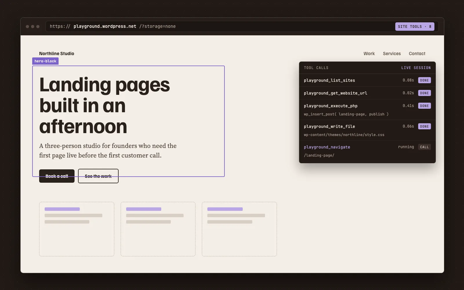
Hero: a mono kicker in lavender, then a two-column row with the headline at 15ch max width on the left and a 420px deck at 19.5px in the secondary text colour aligned to the baseline on the right, then a full-width canvas figure: a recessed panel with a denser dot grid holding a screenshot of the product's window, with a two-part mono caption (figure description left, dimensions right). The screenshot must be real or rendered from real HTML; no fake blurred text.

Workspace: a two-column grid, main column flexible with a 66ch measure, plus a 400px sticky inspector on the right that also holds a field-note panel and a sources panel. On screens under 980px the inspector drops below the main column.

Section opener: a tool-call row, a three-column hairline-bounded line in 13.5px mono with a small triangle then a lavender machine-style name on the left (for example playground.site_tools), the plain section name in uppercase muted mono in the middle, and a filled panel-coloured label on the right stating the item count. Each section then has a 31px grotesque title and one or more items, each with a 22px item title, a mono date line, and one to three serif paragraphs. Items are separated by hairlines, never cards.

Inspector: one bordered panel titled with a mono label, a 24px name, an italic one-line summary, a short paragraph, then a definition list of property rows (Ground, Accent, Display, Body, Mono, Motif) and a row of small mono tags on recessed chips.

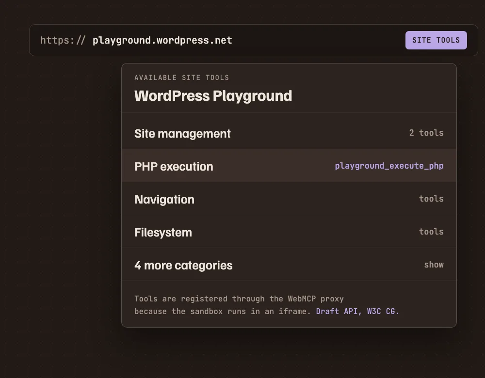
Design note: a two-column block, text left with its own tool-call row and a 31px title, and a 460px screenshot right with a mono caption.

Prompt or code block: a full-width bordered panel styled as the product's composer: a header row with the title and a mono label, an intro paragraph, the pre block in 14.5px mono, and a recessed footer row of attachment-style links.

Footer: a hairline-bounded previous/index/next row in mono, then a short colophon in 15.5px muted text.

Guardrails: body text never below 18px; line-height at least 1.6; small mono labels at least 12px and WCAG AA against their actual surface; no justified text; radius 4 to 12px, nothing pill-shaped; one shadow at most; no accent left-border stripes; no fake toggles, search fields, or spinners; hover and focus states on every link at about 150ms; a prefers-reduced-motion guard; semantic landmarks and no skipped heading levels.