Recent mission · Nebula Sans
A streaming service just shipped your next UI typeface
Nebula rebuilt its brand face on Source Sans, matched the metrics to Whitney SSm, and released the whole family free under the SIL Open Font License. Payload deployed; anyone can catch it.
Get the typefaceThe specimen constellation
RA 04H 32M · DEC +16° 30′Today's Art Direction
The Launch Provider
A rocket company's mission page for a typeface launch: a real starfield, a telemetry strip, and a specimen charted as constellations.
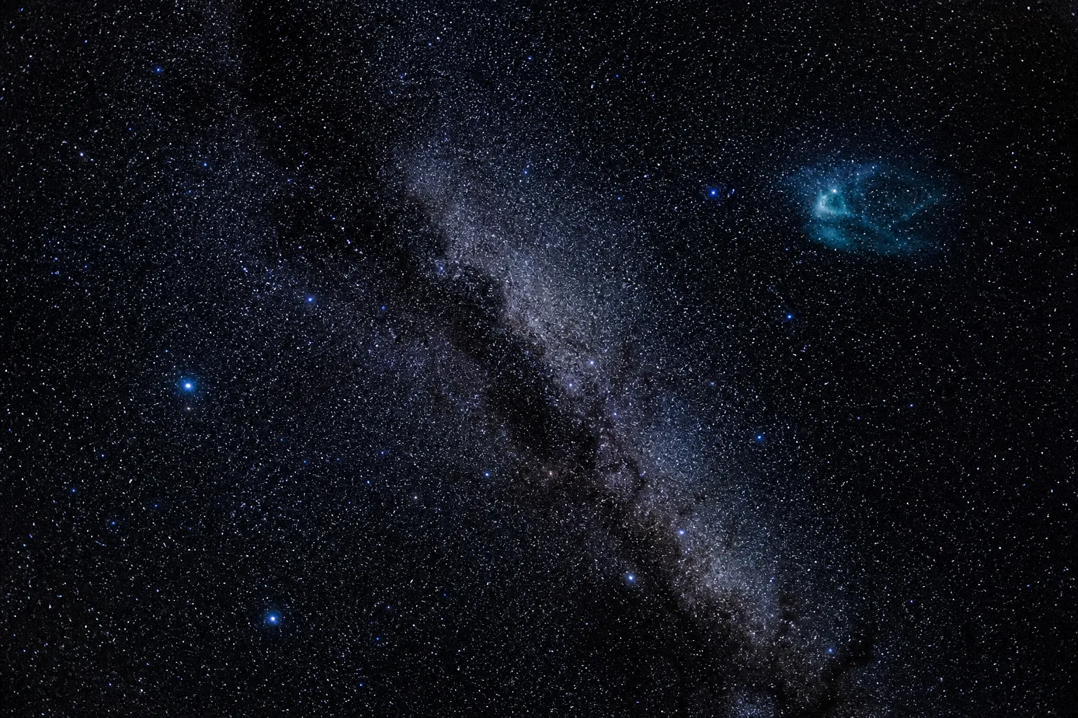
The archetype is a modern launch provider's mission page in the SpaceX register: a full-bleed night-sky hero under a scrim, giant uppercase headline, one outlined call to action, and engineering numbers doing the persuading. The day's payload is Nebula Sans, so the launch stats are the type spec, the star chart draws the specimen, and the whole page is honestly set in Source Sans 3, the foundation face Nebula Sans is built on. One muted nebula teal is the only color the night allows.
- Mission Clock
- Starfield Hero
- Telemetry Strip
- Specimen Constellation
- Phase Markers
- Nebula Teal
- Foundation Face
Nebula releases its brand typeface under an open license
Nebula, the streaming service owned by its creators, built its new brand face on Paul D. Hunt's Source Sans, adjusted the metrics to sit as a drop-in replacement for Whitney SSm, and published the result free under the SIL Open Font License. Two styles, six weights, stylistic alternates, and a short documentary about why they bothered.
The reasons they give are the story: owning the face means they can customize it, wire in the typography features they actually use, and stop watching license costs climb with their audience. A working brand asset, open-sourced on the way past. If your client is paying yearly for a humanist UI face, this is the day to run the comparison.
CSS learns to hold an animation until something happens
The experimental animation-trigger property, currently Chrome-only, keeps a CSS animation parked until a condition fires, then plays, pauses, or resets it. The new almanac entry draws the line against scroll-driven animation neatly: progress tracks scroll, but a trigger is binary, and it fires an action once.
Dashboards that exist to decide something
Smashing Magazine's new piece on dashboard UX organizes the screen around the decision it must support rather than the metrics it can show. A useful lens for the reporting surfaces every AI product keeps sprouting.
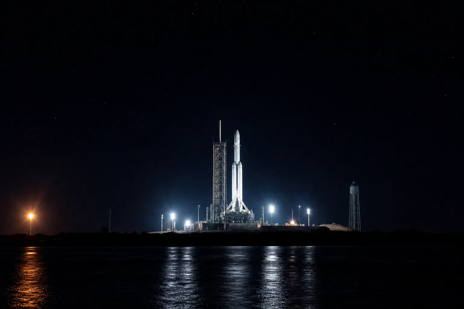
Vercel's Run SDK holds agent code on the pad until a human signs
Agents now hand back whole TypeScript programs, and Vercel's new Run SDK executes them in a hardened QuickJS context with no route to Node, the filesystem, or the network. When generated code reaches a sensitive call, the run stops, a signed token holds the state while a person approves, and work resumes without repeating what already settled. It is the lightweight sibling of the sandbox Vercel put a million dollars on, and it landed alongside Vercel Connect going GA with short-lived, task-scoped agent credentials.
Focus is the main feature
Alex Kras argues the old single-minded Claude Code beat the multitasking version for real work, because an assistant that does one thing at a time keeps the human's attention in one place too. Mission control seats one controller per console for the same reason.
Borrow this pattern
The telemetry strip
When the product is credible on its numbers, put four of them in a full-width strip under the hero, set huge, with small uppercase labels: launches flown, weights shipped, uptime held, dollars charged. Rocket companies sell nine-figure contracts this way because engineering numbers read as evidence while adjectives read as marketing.
What keeps it honest: numbers a customer could verify, no more than four, no decimals doing false precision, and at least one that costs you something to print, like $0 or a real limit. If a stat needs a footnote to survive, it does not belong in the strip.
Prompt Lab
The flight plan
File this with your build tool to reproduce today's system, then swap the payload for whatever your client launches.
Build a one-page mission-style landing page for a product launch,
in the visual register of a modern rocket company's website.

Page archetype: SaaS/product launch page with one download or
signup goal. Structure, in order: a minimal caps top nav; a thin
mission-clock strip (mono, uppercase, number/date/read-time
separated across the row, hairline rules above and below); a
full-bleed night-sky photographic hero with a dark gradient scrim,
bottom-left aligned content (small teal mono kicker, giant 900-
weight uppercase headline, two-sentence deck, one outlined
uppercase CTA button that inverts on hover); a four-cell telemetry
strip of giant stats with small mono labels and hairline dividers;
a dark panel holding an inline SVG star chart that draws the
product's initial as a constellation (stars as small circles,
thin steel-blue connecting lines, a faint coordinate grid); phase-
labeled content sections (mono PHASE 01 labels centered between
hairlines with small + crosshairs); one contained night photograph
plate; and a bordered prompt/spec card.

Art direction: near-black void (#0A0D12), slightly lifted panels
(#10151C), starlight text (#EAF2F8), dimmed body (#A8B6C2), and
exactly one muted nebula teal accent (#6FB4BD) for kickers, link
underlines, and chart marks. No other hue. No glow, no gradient
text, no neon: the only light is the photography and the type.
Photography is real night imagery (star fields, floodlit
structures), never 3D renders.

Type: one family doing both jobs, a humanist sans (Source Sans 3)
at 900 uppercase for display and 400 for body at 19px or larger,
with a monospace (JetBrains Mono) for clocks, labels, and stats.
Letter-spacing is wide on mono labels, tight on display caps.

Guardrails: verify WCAG AA for every text block against the
actual photo region beneath it (strengthen the scrim, not the
font); body line height at least 1.6; hover and focus states on
every real link; square corners throughout; no fake countdowns or
dead UI chrome; and a prefers-reduced-motion guard on any motion.
Flies in Lovable, Figma Make, or v0; Beaver Builder AI executes it as filed.
The best brand investment Nebula made this year is the one it gave away. Generosity, it turns out, is also a distribution strategy.
Sources
- Nebula Sansnebulasans.com
- animation-triggerCSS-Tricks Almanac
- Rethinking Data Visualisation: A UX Approach to DashboardsSmashing Magazine
- Introducing Run SDK: secure eval for your agentsVercel blog
- vercel-labs/runGitHub
- The end of credential sprawl for agentsVercel blog
- Focus Is the Main Feature: Why I Miss the Old Claude Codealexkras.com