The AI builder just handed you the knobs
Figma Make grew a properties panel and canvas annotations this week. Select an element, drag its spacing, stage the edit before it spends a credit. Pointing gives the model a precise target.
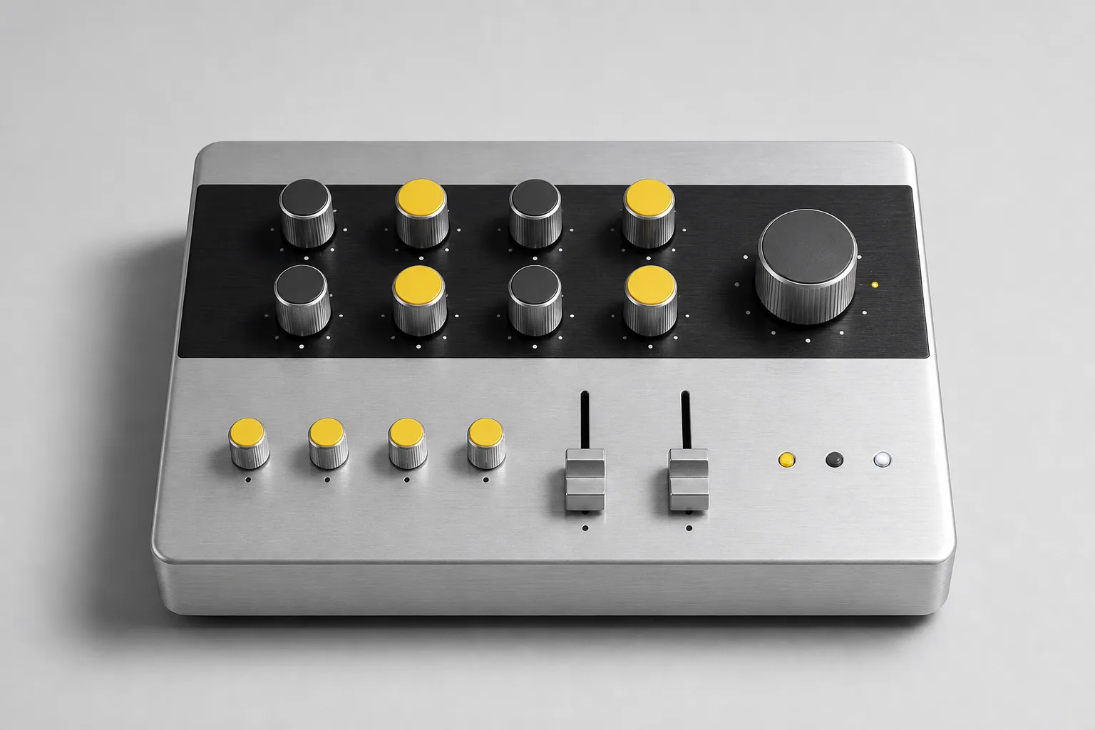
Figma shipped a properties panel and annotations in Figma Make on Wednesday. The panel brings the familiar Figma Design controls into the AI builder: spacing, typography, layout, opacity, border style. Select an element and adjust it directly instead of writing a paragraph about it. Annotations cover the rest, pinning a note to a spot on the canvas for the changes a slider cannot express, like hover behavior and animation.
The telling detail is the pricing. Figma says direct manipulation burns far fewer credits than prompting, because a selected element is a precise target while a described one is a search problem. Edits stage for free and only cost when you apply them. After two years of the prompt box as the whole interface, the inspector is back, and it came back cheaper.
The Control Surface
A brushed-aluminum product page that hands every section its own knob.
Industrial hardware design translated to a storefront: a keyline product stage on a cool silver field, black anodized faceplate bands doing the structural work, and one signal-yellow accent doing all the talking. Type is a compressed poster grotesque over an engineering-grade sans, with a Helvetica-flavored mono for the etched labels. The whole page borrows the grammar of a spec sheet: numbered callouts on the product photograph key the contents card, the channel headers, and the sections they lead to.
Shopify and Vercel are rebuilding Hydrogen
The headless storefront framework goes open source and runtime agnostic, with support for Next.js, Nuxt, and Svelte, typed API clients, unified cart state, and a set of Standard Actions aimed squarely at agentic commerce. If you build storefronts for clients, the framework lock-in question just got simpler.
One sandbox, several agents, real Unix walls
Vercel's Sandbox SDK now supports multiple Linux users inside a single sandbox. Each agent runs as its own user with a private home directory; groups create shared workspaces where collaboration is deliberate. Agent isolation built from plain Unix permissions, no second VM required.
Chrome fixed 1,072 security bugs in two releases, and credits AI for the spike
Google says Chrome milestones 149 and 150 closed more security bugs than the previous 23 combined. The finds come from Big Sleep and a newer vulnerability agent that carries a CVE knowledge base and a critic agent to vet its own reports before humans see them. One catch was a sandbox escape that had been sitting in the codebase for thirteen years.
The critic-agent detail is the one to copy: the fix for noisy machine-found reports was a second machine whose only job is doubt.
Stacked pull requests go live on GitHub
Now in public preview: install the gh-stack CLI extension, split a large change into ordered, independently reviewable layers, read each diff against a stack map, and land one layer or the whole stack in a single action. Copilot gets a matching skill for agents, which fits: layered stacks are a natural shape for reviewing machine-written changes one honest slice at a time.
The session you cannot take with you
Earendil Engineering argues that AI coding sessions are becoming non-portable: encrypted reasoning blobs, hidden search results, and opaque compaction mean a session cannot be exported, replayed, or audited outside the provider that produced it. The essay proposes five portability tests worth running against whatever tool holds your work today.
The keyed product map
Put one honest product photograph at the top of the page, overlay numbered markers on the features it actually shows, and let those numbers double as the table of contents. The same index then appears three times: in the contents card, on the photograph, and in the section headers, so every scroll position carries its own coordinates.
Use it on any page where the thing being sold has real anatomy: a device, a floor plan, a dish, a garment, a service package. What keeps it honest: markers sit on real features, every number resolves to a real section, and the map works as plain anchor links with no script. If the photo has nothing worth pointing at, fix the photo first.
Today's prompt rebuilds this page's system: an industrial product page where a keyed photograph runs the navigation.
Build a one-page product detail page (PDP) for a desktop hardware
controller, art directed like a boutique industrial brand.

Canvas: cool brushed-aluminum gray (#D8DAD9) with near-black ink
(#17181A), white spec panels (#F4F5F4), steel-gray labels (#5F656B),
and a single signal-yellow accent (#EFB40E). No gradients, no glow,
no neon, no purple.

Type: a compressed poster grotesque for display (Anton, uppercase),
an engineering sans for body (IBM Plex Sans, 19px minimum, 1.65 line
height, never justified), and a plain Helvetica-flavored mono
(Fragment Mono) for etched labels and spec rows in uppercase with
wide tracking.

Structure: a thin black faceplate band as the top nav. Hero grid:
left, a small etched nameplate of three stacked label rows, a large
condensed uppercase headline, a two-sentence deck; right, a white
"in the box" contents card listing six numbered sections. Below,
a full-width keyline product photograph on a seamless silver ground
with numbered circular markers overlaid on real features; each
marker is an anchor link to its matching section. Sections open
with a black channel-strip header: a yellow index square plus an
uppercase mono label. Close with a black colophon band in etched
mono text.

Details that sell it: hairline steel rules, one tight shadow under
the product stage only, 34px yellow circle markers with black mono
numerals, hover states that scale markers slightly at 150ms, and a
prefers-reduced-motion guard. Keep body text at AA contrast on the
silver ground, one inline link per paragraph, no fake toggles or
search fields, and no readable text inside the photograph.
WORKS IN FIGMA MAKE, V0, LOVABLE, BOLT, AND BEAVER BUILDER AI.
Twenty years of inspector panels looked obsolete the week the prompt box arrived. Figma just priced them back in.
- Properties panel and annotations, now in Figma MakeFigma
- Stacked pull requests are now in public previewGitHub
- Shopify and Vercel are rebuilding Hydrogen for faster storefrontsVercel
- Run multiple isolated agents in a single SandboxVercel
- Chrome: stronger with every updateGoogle
- The session you cannot take with youEarendil Engineering