Art Direction Daily

New formula  ·  Shipped this morning

Kimi K3 can't stop thinking

Moonshot's 2.8-trillion-parameter flagship went live this morning: a million-token window, native video input, and a reasoning mode with no off switch.

  • 1M-token context
  • Native vision
  • Thinking always on
Cutout photo of an athletic woman in matte black and neon-green training gear drinking from a black sports bottle, sweat gleaming, mid-training.

Issue No. 070

Date Thursday, July 16, 2026

Read time ≈ 5 min

Today's art direction

The Electrolyte Launch

A sports-drink product page: one athlete, one bottle, one loud shelf color.

Beverage launch pages sell a feeling of performance before they sell a liquid. A saturated brand color owns the whole viewport, a cutout athlete crosses the section seam so the page feels in motion, and the densest typography on the page is the nutrition label. The grammar comes from the shelf, where a bottle gets one glance from six feet away, so every band is built to be read at that distance first and up close second. Today that grammar sells a model launch: the benefit deck, the facts panel, and the field test below are all real news wearing retail chrome.

  • Cutout hero
  • Benefit deck
  • Buy-box
  • Nutrition label
  • Stat strip
  • Shelf color
  • Radial spotlight

01 · The lineup

What shipped this week

The headliner

Kimi K3 is live

Moonshot shipped its new flagship this morning: 2.8 trillion parameters, thinking enabled on every request, and native understanding of images and video. It landed on Vercel's AI Gateway the same day, pitched at long-horizon software engineering and, notably for this readership, frontend work.

The open rival

Inkling opens its weights

Thinking Machines released Inkling on Wednesday: an open-weights mixture-of-experts model, 975 billion parameters with 41 billion active, trained across text, images, audio, and video. The launch post leans on web work, citing one-shot web app generation and a high placement on Design Arena's agentic web dev leaderboard.

The supply line

Vercel's plugin reaches Copilot

Vercel's plugin now installs in VS Code and GitHub Copilot CLI, giving Copilot skills for Next.js, AI SDK, and Vercel Functions plus current platform APIs and patterns. Two more places where the agent arrives already briefed on the stack.

02 · Formula facts

Read the label

Formula Facts

Per one request  ·  Kimi K3

Total parameters2.8T
Context window1,000,000 tokens
Inputstext, image, video
AttentionDelta Attention
Tool usecustom + dynamic
Thinkingalways on

Reasoning effort is configurable per request. Values from Moonshot's K3 quickstart, July 16, 2026.

The numbers above come straight from Moonshot's quickstart, which credits the million-token window to Delta Attention, a hybrid linear attention design paired with attention residuals. Thinking cannot be turned off, only tuned: you set the reasoning effort per request and the model spends accordingly.

Pricing splits cache hits from cache misses on input tokens. That split is worth reading closely if you run agent loops, because a workflow that keeps re-reading the same project context pays the cheap rate for most of its window.

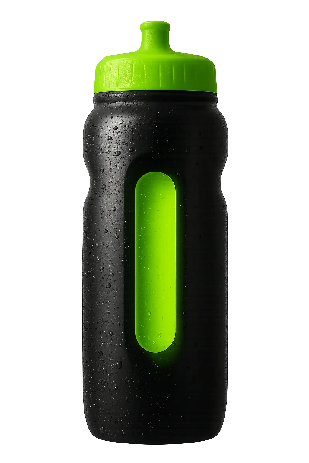
Cutout studio photo of a matte black sports squeeze bottle with a neon-green cap and a glowing neon-green liquid window, beaded with condensation.
The product shot

03 · Field test

One athlete's results

“LLMs today do not understand the last 20% of any project.” Migrating off Webflow, sisyphus.bar

A post published today walks through moving a company site off Webflow onto Next.js and Sanity, with Claude Code doing the rebuild. Scaffolding, routing, and backend wiring went fast. Iterative visual refinement did not: matching exact type sizes, weights, and border radii by prompt ran slower than writing the CSS by hand, with roughly half the attempts landing.

It is a useful counterweight on a day two vendors shipped frontier models aimed at frontend work. The finishing pass is still yours.

04 · Training plan

Borrow this pattern: the facts panel

One move for a real project this week

Set any dense spec block, pricing sheet, or plan comparison in the nutrition label's typographic grammar: a heavy top rule, a bold uppercase title, hairline rules between rows, labels on the left in a medium weight, values on the right in bold, and one thicker rule before the row that matters most. It was engineered for at-a-glance reading on a crowded shelf, which is exactly the job a spec table does on a product page.

The pattern stays honest when three things hold: each row is a fact a reader could verify, hierarchy comes from rule weight and type weight rather than color, and nothing in the panel is decoration. If a row would not survive a fact-check, it does not belong on the label.

05 · Mix your own

Prompt Lab

This prompt recreates today's system: a beverage-brand launch page whose loudest ingredient is one shelf color.

Build a single-page product launch site for a fictional electrolyte
sports drink. Ground the whole page in near-black (#0C0F0A) with a soft
neon-green spotlight behind the hero athlete, and use charcoal (#13180E),
off-white (#EEF3E6), and one neon-green accent (#57FF33).

Hero: a heavy condensed uppercase headline (Anton or similar) in white
with one phrase in tangerine, a two-sentence benefit deck, three
outlined spec chips, and two buttons: solid neon-green with near-black
text, and a white outlined ghost button. Place a cutout photo of an athlete
mid-drink on the right, overlapping the hero's bottom edge into a navy
stat strip that carries three labeled stats (label in small mono caps,
value in the display face).

Then alternate full-width bands: an ice-white feature band with one
wide callout card and two half-width cards (2px navy borders, 14px
radius); a white band with a nutrition-facts panel styled after the
FDA label (thick top rule, bold uppercase title, hairline row rules,
right-aligned bold values, one heavier rule before the last row) next
to a cutout product bottle; a navy testimonial band with one large
italic display quote; a near-black closing band with a call to action.

Type: Anton for display, Barlow for body at 19px with 1.65 line
height, IBM Plex Mono for labels and stats. Keep long text dark on
light bands, meet WCAG AA contrast for every label, no gradients, no
glow, no drop shadows except under the cutouts, no fake UI controls,
and no readable text inside images.

For Figma Make, Subframe, Beaver Builder AI, Claude artifacts, v0, or Lovable.

06 · Field note

Cool down

Two frontier-scale launches in 48 hours, both pitched at people who build for the web. The benchmark charts will argue about the podium. The better habit is the field test above: judge a model on the last 20 percent of your own project, not the first 80 of someone else's.