Diagnostic imaging for the modern web · Walk-ins welcome
Browsing agents are done squinting at screenshots
Anthropic's new browser use toolset lets Claude read the page itself: the accessibility tree, elements, forms, and tabs, each with a reference it can act on. Semantic markup is now the sharpest film in the jacket.
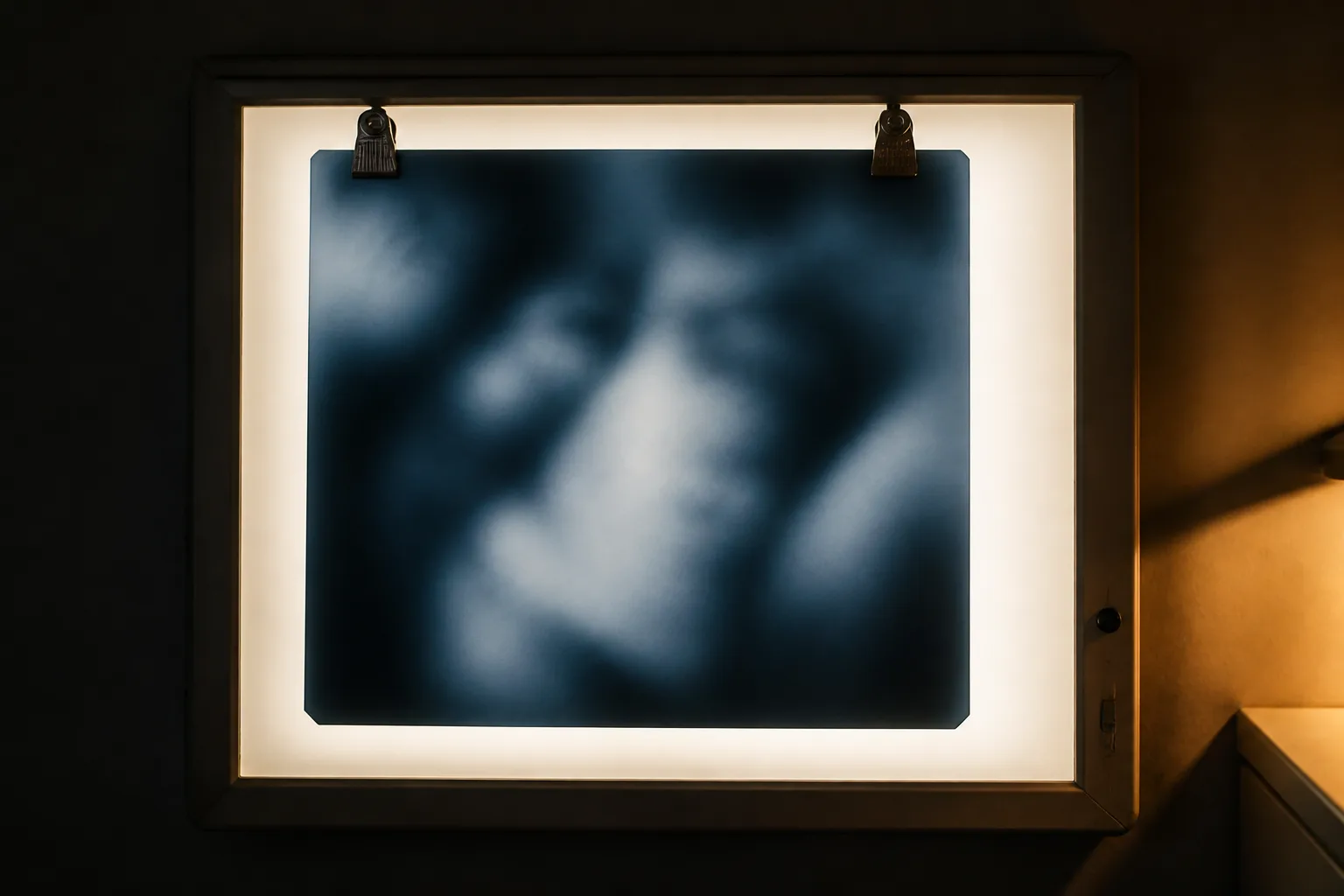
Two films, same page. The new reader takes plate two.
Today's Art Direction
The Reading Room
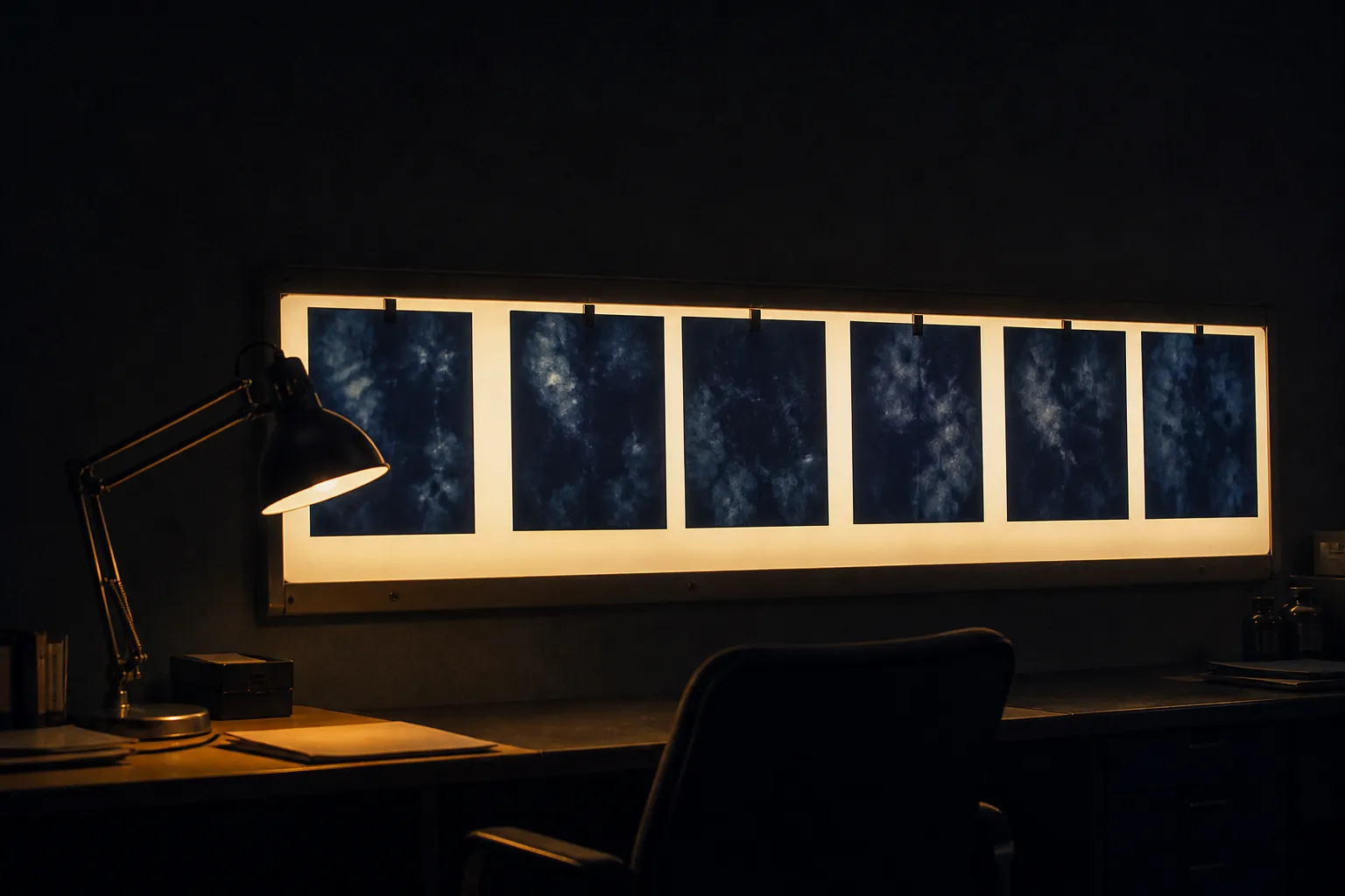
A diagnostic imaging clinic after hours: films clipped to a glowing lightbox in a charcoal room, filed in manila jackets and read by lamplight.
The archetype is a local imaging clinic's landing page, a service business with one booking goal. The metaphor does the arguing: an X-ray sees the structure under the surface, which is exactly what the day's browser tool does to a webpage. The room stays dark so the lightboxes can carry the light, the masthead is a typed film-jacket tab, sections run as numbered film series with red position markers, and the closing argument is typed up as a findings report.
- Lightbox
- Film Plates
- Manila Jacket
- Position Marker
- Findings Report
- Tungsten + Film Blue
- Late Shift
Tooling
Claude's browser use tool reads the accessibility tree
Anthropic launched a browser use toolset on the Claude API: your app hosts the browser, and Claude reads the page itself, its accessibility tree, elements, forms, and tabs, then acts on element references rather than guessing coordinates from a screenshot. The same release moved computer use, the Skills API, and the Files API out of beta, per the platform release notes.
The tool that does not actually run a browser
The New Stack's read on the launch lands on the part designers should care about: the structured view comes from the accessibility tree your markup produces, a story we filed under the accessibility tree is the new sitemap back in May. The cleaner your semantics, the better every visiting model sees.
The new MCP roadmap plans past request-and-response
MCP's lead maintainers published a fresh roadmap: messaging primitives for long-running agent loops, one HTTP-native transport, standardized agent identity for enterprises, and progressive tool discovery for catalogs that outgrew a single listing.
Technique
Kendo UI components now register their own WebMCP tools
Progress shipped a Telerik and Kendo UI release with WebMCP support built in: a grid registers a filter tool, a scheduler registers event creation, a form registers submit, so an existing enterprise app becomes callable without a rewrite. Component libraries doing this by default moves the agent-ready web from proposal to product.
Procedural Three.js templates, built for machine consumption
A new catalog of parameterized Three.js web design templates aimed at coding agents surfaced on Hacker News today: browsable scenes an agent can pull, retune, and ship instead of generating WebGL from scratch.
Workflow
Ora benchmarks whether agents can actually use your site
Vercel profiled Ora, which measures web readiness by sending Claude Code, ChatGPT, Gemini, and friends to sign up for, integrate with, and pay for real products on live sites, then reporting where each one fails. Your funnel now has a second audience, and it takes notes.
Borrow this pattern
The two-plate lightbox
When a page has to sell an improvement, clip the same artifact to the lightbox twice, change exactly one variable, and label the plates like films: as pixels, as structure; before, after. The reader runs the comparison themselves, which persuades harder than any adjective. Use it on feature launches, redesign case studies, and plan pages.
What keeps it honest: both plates get the same scale, crop, and content, plate one is shown at its genuine best, and a caption names the one variable that changed.

Prompt Lab
The imaging order
Give this to an AI site builder and it develops today's system: a clinic landing page lit like a radiology reading room.
Build a one-page landing page for a diagnostic imaging clinic.

Page archetype: local medical service business with one booking
goal. Structure, in order: a thin top nav; a manila film-jacket tab
as the masthead, typed in monospace with a small red position-marker
square; a left-set slab headline with a two-sentence deck; the
signature two-plate lightbox, a luminous off-white panel holding two
films side by side under steel clips, plate 1 a soft-focus indigo
photograph, plate 2 a dark film rendering the same subject as a
labeled skeleton diagram; three content sections opened by numbered
film-series tabs (red marker square, manila SERIES tab, title on one
hairline rule); a findings-report card in manila with typed
TECHNIQUE, FINDINGS, and IMPRESSION rows; and a closing strip with
one booking button.

Art direction: a radiology reading room after hours. Charcoal room
ground (#22262B) with faint horizontal rail lines; luminous lightbox
panels (#F5F3EA); film plates in deep blue-black (#16222E) with film
blue linework (#9FC2DC); manila jackets (#D9C48F) with dark typed
labels; one radiographic red accent (#C24438) reserved for markers.
Photographs are dim tungsten still lifes with indigo film, never
bright product shots. The room stays dark so the lightboxes carry
all the light; no neon, no glow effects on UI surfaces.

Type: a rounded slab (Zilla Slab, 500 and 600) for clinic signage
headings, a plainspoken humanist sans (Karla) at 19px or larger for
body, and a typewriter monospace (Courier Prime) for jacket labels,
series tabs, and report rows.

Guardrails: body line height at least 1.6, WCAG AA contrast for
every label against its actual surface, no readable text inside
images, no fake form fields or dead toggles, hover and focus states
on every real link, small square corners (2 to 6px, no pills), and a
prefers-reduced-motion guard on the single lightbox switch-on fade.
Runs in v0, Figma Make, or Lovable; Beaver Builder AI takes it as written.
Accessibility work used to be filed as a legal checkbox. This week it is the difference between a visitor that converts and one that leaves, and the visitor in question runs on tokens.
Sources
- Browser use tool (Claude Platform docs)
- Claude Platform release notes, August 19, 2026 (Anthropic)
- Anthropic's new browser tool doesn't actually run a browser (The New Stack)
- The new MCP roadmap (Model Context Protocol blog)
- Progress announces new Telerik and Kendo UI release for agent-ready applications (GlobeNewswire)
- Progress adds WebMCP support and agent tools to Telerik and Kendo UI (VKTR)
- How Ora benchmarks every major AI agent on Vercel (Vercel)
- ThreeUI: procedural Three.js web design templates for agents (Show HN)