Webflow MCP, native Interactions
Codex rebuilt three GSAP demos as Webflow animations you can retime
Webflow's MCP server can now build animations as native Interactions, so a scroll effect made by a model arrives as triggers and timelines a designer can open and adjust, with no custom code to paste.
Today's art direction
The Stage Bill
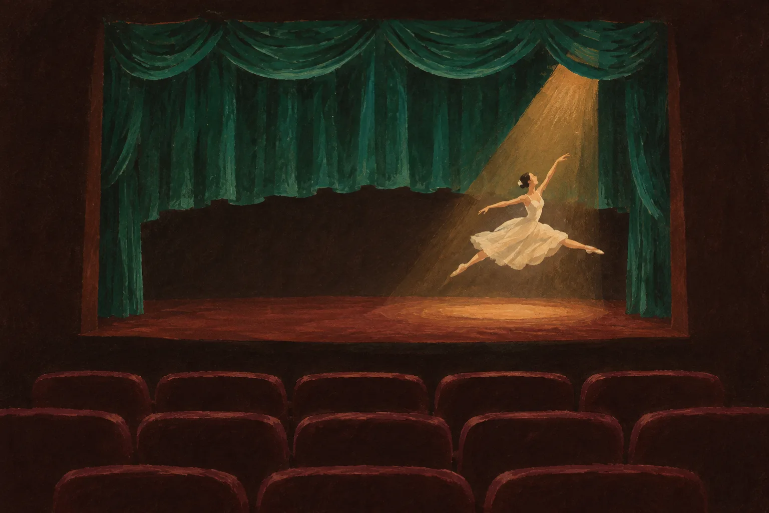
A dance company's event page, painted in gouache: a ticket buy-box up top and a running order that follows you down the page.
An event landing page for a performing arts venue, the kind a theatre or dance company commissions every season. The page sells one evening. A painted plate of the house sits in a proscenium arch, the buy-box holds the date and running time, and a running order rail lists each part of the night as a numbered step and lights the one you are reading.
A fat slab face does the poster's shouting; a humanist sans does the reading.
- 01Ticket buy-box
- 02Proscenium plate
- 03Running order rail
- 04Numbered act head
- 05Cue cards
- 06Interval quote
- 07Ticket stub
- 08House lights flat
Tooling: the animation lands in the panel
Webflow MCP builds native Interactions
The latest Webflow MCP update lets a connected agent create animations as native Webflow Interactions, which are built on GSAP, where before it could build a layout but not move it. Because the result lives in the Interactions panel, a designer can open the trigger, read the timeline, and change the animated properties by hand.
Webflow is plain about the limits. Not every GSAP feature maps to an Interaction property, and custom code is still the right tool when a demo asks for more. The examples were made with OpenAI's GPT-6 Astra through Codex, and the post warns that a cheaper model may land differently.
Firefly widens GPT Image 2 to ten aspect ratios
Adobe's September Firefly update takes GPT Image 2 from three aspect ratios to ten in Image Generation and Boards. It also removes the background across a whole video clip with no frame-by-frame masking, and Kling 3.0 Omni now accepts reference images.
Technique: three cues to a prompt that animates
Every demo in Webflow's post came from one short prompt with the same three parts. The shape is worth copying for any motion work you hand to a model.
- Cue oneContext
Name the site and point at a reference, here the URL of a GSAP demo.
- Cue twoConstraint
Ask for native, editable Webflow Interactions, so the agent does not reach for custom code.
- Cue threeHold
End with a request to report back for review. Models chase their own validation, and whether an animation feels right is the designer's call.
A button that tilts with the cursor
The perspective tilt demo, rebuilt with a mouse move trigger you can inspect.
Lines that build word by word on scroll
The line splits demo across several paragraphs, done in three and a half minutes.
A pinned section with a progress nav
The lateral pin indicator, which came back as more than ten actions in the Interactions panel.
Good animations need taste and judgment calls.
From Webflow's MCP walkthrough
Workflow: house rules and a campaign from a system
Webflow drafts a site's guidelines for its agents
The same update adds tools that read a site's colors, type, components, and copy, then draft brand, asset, CMS, and design system guidelines as MCP skills. They save as drafts for review; once enabled, any agent working on the site picks them up. Agents can also deploy a Webflow Cloud app, wait for the build, and read its logs when it fails.
Figma Weave turns a design system into campaign assets
Figma's latest Workflow Lab follows a product designer making a museum exhibition campaign in Weave from the museum's own design system. The Figma node pastes a frame onto the Weave canvas and stays connected to Figma Design, and the Gen Effect node carries one look across a poster, a billboard, and social posts.
The running order rail
On any event page with more than three parts, list them as numbered steps in a sticky rail beside the content and light the one in view.
- Where to use it
- Conference days, festival line-ups, workshop agendas, course outlines, and long launch pages with named sections.
- How it behaves
- Desktop: a sticky column beside the reading measure. Mobile: a horizontal strip pinned to the top that scrolls sideways.
- What keeps it honest
- Every step is a real anchor to a section that exists, the lit step comes from scroll position and is exposed with aria-current, and the buy-box stays above the fold so the rail never replaces the call to action.
Prompt Lab
Admit one prompt
Recreates this page as a performing arts event landing page.
Build an event landing page for a dance company's one-night performance, styled as a painted theatre bill. It must be a real page a venue could ship, not a poster.

Structure, top to bottom:
1. A slim top bar: wordmark left in a fat slab face, three text links right.
2. The bill: a two-column row. Left: a small uppercase mono kicker, a 19ch slab headline, a 21px deck. Right: a buy-box card in ivory with a 2px rule under its title and issue or event number, a definition list of four labelled rows (Date, Running time, Programme, Headliner), and one full-width green button that books or links to the main action.
3. A contained painted plate inside a proscenium arch: the top corners rounded into a shallow arch with an elliptical border-radius, a 3px amber border thickening to an 8px footlight edge at the bottom, a 21:9 crop on desktop and 4:3 on mobile.
4. An overture block on two columns: the show's name and one italic line left; a short paragraph and an eight-item credits list in two columns, hairlines between, small amber mono numerals.
5. The programme: a 200px sticky running order rail beside a 760px content column. The rail is an ordered list of anchor links, each a slab numeral matching its section's numeral (the interval gets a short amber bar instead) and a label; the link for the section in view gets a solid green fill with dark text and aria-current, set by a small IntersectionObserver. Each section opens with a numeral in a 56px outlined circle, an uppercase mono label, then a slab h2. Items inside a section are an h3 plus one or two paragraphs, separated by hairlines.
6. A cue list: three rounded cards on a slightly lighter ground, a mono label column (Cue one, Cue two, Cue three) beside a bold title and one sentence.
7. An interval: an ivory band (the house lights coming up) holding one large italic pullquote in dark ink whose words darken one by one as it scrolls into view, using CSS animation-timeline: view() inside @supports, fully visible without it.
8. A pattern section: a square painted detail beside a lede and three labelled rows.
9. An encore: a ticket card with a dashed perforation between a stub (title, one line, copy button) and the main body holding a monospace block.
10. A closing note, a numbered sources list, previous and next links, and a colophon.

Palette: house ground #25110F flat, raised panels #331816, ivory text and cards #F3E6D3, viridian button #3FA371 with dark text #1E0D0B, link and outline green #6CC596, amber labels #D9A441, dusty rose captions #C9A69A. Type: Alfa Slab One for display and numerals only, Alegreya Sans for body and italics, IBM Plex Mono for labels and code.

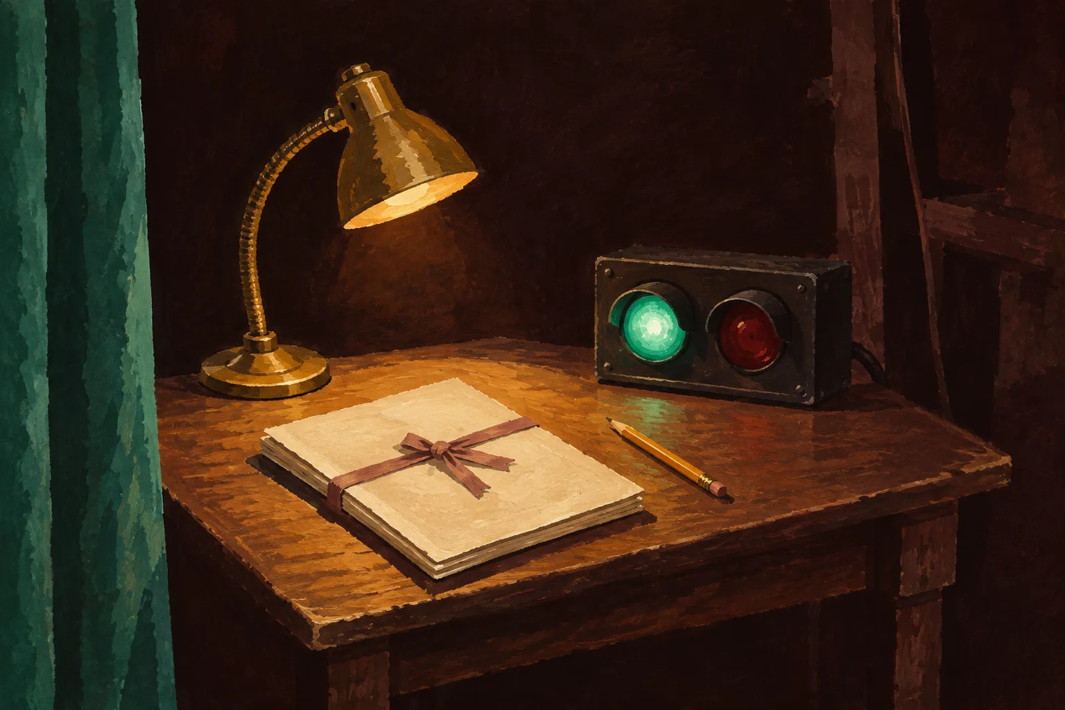
Imagery: gouache paintings on cold-press paper in the same five colors, a theatre from the back of the stalls for the plate and a stage manager's cue desk for the detail. No legible text in images, no logos.

Guardrails: body 19px with 1.7 line height and a 60-75 character measure, never justified; every label at WCAG AA against its real surface; radius 14px on cards, 8px on buttons and rail links, circles only for the act numerals; one shadow, on the buy-box; no neon, glow, or gradients; hover and focus states at 150ms; a prefers-reduced-motion rule that removes the word reveal and smooth scrolling; on mobile the rail becomes a horizontal strip pinned to the top and the buy-box stacks under the headline.
Paste it into Beaver Builder AI, Webflow AI, Claude, v0, Lovable, or Figma Make.
Field Note
The most useful line in Webflow's post closes every prompt: report back and I will verify it. Motion is where a model's output most needs a designer's hands, and native Interactions leave room for them.
Sources
- Interactions, agent instructions, and Cloud deploys in Webflow MCP Webflow Blog, October 2, 2026
- Webflow MCP Webflow
- Cursor-driven perspective tilt GSAP demos
- Responsive line splits on scroll GSAP demos
- Lateral pin indicator GSAP demos
- Workflow lab: From design system to campaign in Figma Weave Figma Blog, October 1, 2026
- What's new in Adobe Firefly, September 2026 Adobe Community, September 18, 2026