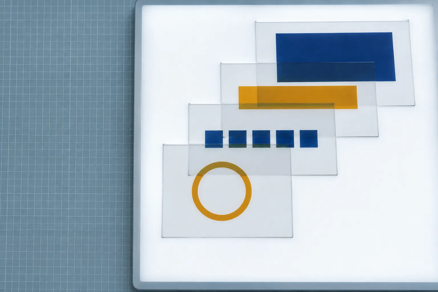
Four layers, one order: the sheet on top is the one you see through first.
#overview
Today's art direction
The Mod Listing
An extension store product page on a drafting grid, with the load order drawn as an exploded stack.
A product detail page is the most sold-to layout on the web: gallery left, buy-box right, specs and changelog below, and a sticky list of anchors so a buyer can jump straight to the part they doubt. This one lists a feature instead of a pair of shoes. The gallery is a light table, the buy-box carries the five facts a developer checks first, and the diagram that matters most shows what runs before what.
Vocabulary
Buy-box
Spec rows
Sticky anchors
Light-table gallery
Exploded stack
Load order
Changelog rows
Install panel
#details
What a mod can change
Anthropic introduced mods on October 1: functions that sit between you and the model and can rewrite a prompt, block or rewrite a tool call, answer a permission request, or redact a secret before it reaches the screen. They run in the terminal and in the desktop app, on every plan, and they travel inside plugins.
The interface is in scope
Mods can add buttons and inputs, and change how tool results and Claude's questions are presented. You can ask Claude Code to write and install one, and it reloads while the session keeps running, so a panel that shows your own build status is one request away.
Built-ins became replaceable
The /diff view now ships as a mod itself. If the stock view does not match how you read a change, you can switch it off and supply your own, the same way a theme swaps a template part.
Order is part of the design
Mods stack. The first one loaded sees each event first and each result last, so two mods that touch the same output behave differently depending on where they sit. On Team and Enterprise plans a security mod always loads first, so nothing beneath it can loosen the permission rules.
Events inResults out
Acts firstLoads 1stSecurity defaultTeam and Enterprise only
Loads 2ndYour modBy you or by Claude Code
Loads 3rd/diff viewBuilt in, now replaceable
BaseClaude CodeTerminal or desktop
28
104
Events enter at the front layer and results leave through it, so the first mod loaded acts first and has the last word.
“A mod can rewrite a prompt, add new UI, replace a built-in feature, or add entirely new functionality.”
Anthropic, Customize Claude Code with mods in TypeScript
#specs
Compatibility: a faster model with an eye for layout
Claude Sonnet 5.5 arrived on September 28 at the same price as Sonnet 5, with output more than 30 percent faster and tasks up to 30 percent cheaper. Anthropic says it has a sharp eye for design, and early testers found that it adds polish to user interfaces and follows slide templates closely enough that the decks need little editing.
For interface work that makes it the tier to test first on a polish pass: tightening spacing, matching a component to a design system, or filling a template. It runs in the Claude apps and on the Claude Platform, and through AWS, Google Cloud, and Azure.
Claude Sonnet 5.5
Released
September 28, 2026
Price per million tokens
$2 input, $10 output, unchanged
Output speed
Over 30% faster than Sonnet 5
Cost per task
Up to 30% lower
Model ID
claude-sonnet-5-5
#changelog
Changelog
Lovable
Apps you build can now hold a spoken conversation
Lovable added live voice through GPT-Live 1. Ask for a voice tutor or a spoken assistant and it wires up the connection and the backend calls, so a caller can book a slot or look up a record by talking, and can interrupt mid-answer. Calls end after two minutes of silence or one hour, with up to 20 running at once on paid plans.
Vercel
Speed Insights stops recording First Input Delay on November 1
Interaction to Next Paint already drives the Real Experience Score, so the change in Vercel's Speed Insights leaves scores alone and old FID data stays visible. If a client report still quotes FID, this is the month to move it to INP.
#design-move
Borrow this pattern: draw the stack
When a product is made of layers that run in order (plugins, filters, theme overrides, middleware), show the order as an exploded stack beside the buy-box. Position does the explaining: the top layer runs first, and a buyer sees where their piece would sit before installing it.
Offset on one diagonal
Use a fixed step, here 28px across and 104px down, and dimension it. A constant step reads as sequence; random offsets read as decoration.
Label each layer in place
Put the position (loads 1st, base) and the role on the visible edge of each layer, never in a legend the eye has to cross the page to find.
Lift, never reorder
A 6px lift on hover helps a reader isolate one layer. If the order cannot change, the diagram should not suggest dragging.
#install
Prompt Lab: install this layout
listing-page.prompt
Build a product detail page for a software extension (a plugin, mod, or add-on) as a production landing page.

Layout: a 208px sticky sidebar of anchor links on the left (Overview, Details, Specs, Changelog, Design move, Install, Notes, Links), each section opened by a mono path label that repeats its anchor name that marks the current section with aria-current and an amber left rule as you scroll; on mobile it becomes a horizontal strip pinned to the top. To its right, a product area: a gallery column (one large photograph in a white light-table frame, square on desktop and 3:2 on mobile with a 1px cool border, three 3:2 thumbnail buttons below that swap or zoom the main image and caption and carry aria-pressed) beside a fixed 420px buy-box. The buy-box holds a small mono kicker, the product name as a 44px grotesk headline, a two-sentence deck, five spec rows as a definition list with hairlines (published, works in, plans, written in, ships through), and one amber button to the real announcement. Put a round rubber-stamp mark over the buy-box corner, tilted -7 degrees, double amber ring, carrying the version or issue number and the date in mono.

Below: sections opened by that mono anchor path label in dark amber above an h2 and a hairline, set on the mat with hairlines rather than boxed. The signature component is an exploded stack diagram: four translucent white layers offset on one diagonal (28px across, 104px down, 150px tall), the first-loaded layer in front, each labelled at its visible bottom edge with load position and role; a dashed navy rail on the left marks events in and results out, and two navy dimension callouts label the step. Hover lifts a layer 6px with a 160ms ease. Add a compatibility spec card with a navy header band, changelog rows with a 150px mono date column and a filled vendor label, a three-step pattern strip under a 2px ink rule, and an install panel with a file tab and a copy button.

Palette: a cool blue-grey ground #E2E9EE with a drafting grid (1px navy lines at 7 percent every 24px, 14 percent every 96px), white panels #FBFCFD, navy-black ink #12233A, print navy #1F4A92 for structure and links, amber #E09A10 for the one button and the stamp ring, dark amber #8A5B00 for small amber text. Type: Host Grotesk for display and body, Red Hat Mono for every label, spec, date, and the stamp.

Guardrails: body text 19px with 1.7 line height and 60 to 75 character lines; every small label at WCAG AA against its real surface; radius 3 to 8px, no pill shapes; one tight shadow on the buy-box only; no gradients, glow, or neon; no fake reviews, star ratings, or download counts; no readable text inside images; hover and focus states on every link and button; a prefers-reduced-motion guard that removes the lift and smooth scrolling.
Works in Lovable, Claude Code, v0, Framer, and Beaver Builder AI.
#notes
Field note
Designers have spent years working inside tools they could not change. A tool whose interface you can sketch and hand back to the model to build turns your own workspace into one more client project, and probably the one you will use most.