Release programme, issue 126

Penpot can finally outline a stroke. It took a new renderer

Penpot 2.18 turns a stroke into an editable path for anyone on the WebGL renderer, adds Line and Arrow tools and a font menu that shows each face, and puts a paid Enterprise layer over the free tool. Also this issue: guides versus grid layouts, and shadcn's cn moving class merging into the build.

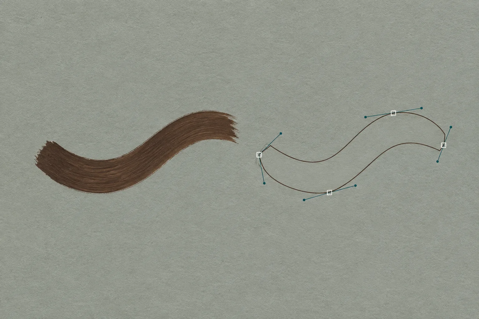
Gouache diagram on cool grey toned paper: a thick brushed espresso stroke on the left, and on the right the same curve redrawn as an outlined path with hollow square anchor points and teal handles
Plate 01A stroke, then the same stroke as a path: anchors, handles, and a contour the boolean tools can read. Gouache on toned paper.

Today's art direction

The Programme

A release-day event page on cool mist paper: a ticker-strip masthead, a slab headline beside a programme card, numbered tracks, and gouache diagrams in espresso and teal.

An event page sells a date. Here the date is a release, so the page is built as a programme: a ticker strip owns the fixed facts, a programme card holds the release details with one real button, and every section is a track with numbered sessions and an honest count. The register is expressive print on a cool ground: a heavy slab over a humanist sans, gouache diagrams on toned paper, and a faint lattice of anchor points as the only ornament.

  • Ticker strip
  • Programme card
  • Track badges
  • Session grid
  • Gouache plate
Track 01

Tooling

3 sessions
1.1

Stroke to paths, on the new renderer only

Penpot 2.18, released on 9 September under the name Born this way, converts a stroke into an editable path, the command Illustrator users know as Outline Stroke. It works for everyone on the new WebGL renderer, so an icon set drawn with strokes can become filled shapes ready for boolean operations without leaving the open-source canvas. Keep the stroked version as the editable master; outline a copy before booleans, before non-uniform scaling, and before handing artwork to any tool that only reads fills.

1.2

Line and Arrow tools, and a font menu that shows its faces

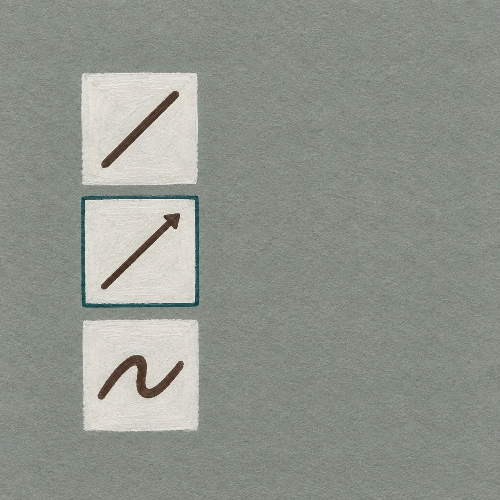
The same release regroups the shape and free-draw tools into flyouts, adds community-built Line and Arrow tools, and renders every family name in the font selector in its own typeface. Small finishing, and the kind that decides whether a designer keeps the open-source canvas open all day. The release notes carry the community fixes as well.

1.3

Penpot Enterprise puts a paid layer over the free tool

Penpot Enterprise is a new paid layer for running the tool at scale: advanced permissions, a choice of identity providers, and an admin panel. The canvas itself stays free and open source, and the paid part is governance, which is how open-source design tools usually earn their keep. Details are in the same 2.18 notes.

Track 02

Technique

1 session
2.1

Guides are for your eye. Grid layouts are for the browser

Laura Kalbag's 3 September post on the Penpot blog separates background grids, the square, column, and row guides you align to by hand, from grid layouts, which place elements from rules you set: named areas, tracks in fr, percent, or auto, and responsive behaviour. A grid layout produces native CSS you can read in the Inspect panel, so the canvas and the shipped page agree by construction. Use guides for a fixed poster or print sheet, and a grid layout for anything that has to reflow.

Track 03

Workflow

2 sessions
3.1

shadcn's cn moves class merging into the build

cn is the utility shadcn shipped on 1 September as one replacement for clsx and tailwind-merge, with the same API and a claim of up to 30 times the speed on standard workloads. Version 0.3.0 on 12 September pulls the scan, subset, compile, and write steps out of the CLI into a build function, with Vite and Next packages, so the merge table is produced as part of the bundle rather than by a separate command.

3.2

Why a designer should care about a class merger

AI builders write Tailwind by default, and every generated component carries a merge call that decides which of two conflicting classes wins. When that logic is a build step configured in one place, with the same extend, override, and prefix structure tailwind-merge uses, a prefix or a custom validator set once applies to every component the model writes. Issue 123 covered where Tailwind itself now lives.

Track 04

Design Move

Borrow this pattern: the programme rail

Build a launch or event page as a programme. A ticker strip carries the fixed facts (number, date, duration) so the hero can spend its whole width on the headline and one card of real details, and each section starts as a numbered track with a session count.

Use it for a product release, a webinar, a conference day, a course cohort. It stays honest while the ticker repeats only real metadata, the counts are real, and the sessions are ordered the way a visitor reads them rather than padded to fill a grid.

Gouache diagram of a vertical tool flyout: three chalk-white tiles holding a straight line, an arrow, and a freehand squiggle in espresso, the middle tile outlined in teal
Plate 02The tool flyout: line, arrow, free draw. Gouache on toned paper.
Track 05

Prompt Lab

Paste this prompt into a builder to reproduce today's page.

Build a one-page release-day event page (a launch programme) for a design tool release; call the style The Programme. Semantic HTML and CSS only, no JavaScript beyond a few lines if needed. Page archetype: event landing page.

Structure, top to bottom:
1. A full-width ticker strip masthead on an espresso band: 13px uppercase monospace in chalk, items separated by 1px vertical rules, duplicated once and scrolling slowly for the loop, stopped under prefers-reduced-motion. It carries only real facts (event or issue number, date, duration).
2. A plain top nav: brand left, three links right in small monospace caps with a 2px underline on hover.
3. A hero on a 7/5 grid. Left: a small monospace kicker in tobacco, then the headline in a heavy slab serif (Alfa Slab One) at 36 to 64px, line-height 1.06, over a 21px humanist sans deck (Fira Sans). Right: a programme card, a chalk panel with hairline rows of monospace label and sans value (release, date, venue, format) and one real call-to-action button in deep teal.
4. A full-width framed illustration plate with a monospace caption rail beneath it, the plate label in tobacco caps.
5. An "about the programme" panel on chalk with a 3px espresso top rule: style name in the slab and a one-line italic summary left, a short paragraph and outlined monospace tags right.
6. Sections as tracks. Each opens with a filled tobacco TRACK 01 badge (chalk 12px monospace, 4px radius), a slab title, and a session count on the right. Inside, sessions sit in a two-column grid with a vertical hairline between the columns and horizontal hairlines between rows, each with a teal monospace number, a 22px bold sans title, and 19px body; a lead session spans both columns with its 28px title in the left five columns and its body in the right seven.
7. A design-move track on a 7/5 grid with a square illustration on the right.
8. A programme-notes or prompt track on an espresso sheet with chalk monospace text.
9. A closing note, a sources list, previous/next navigation, and a colophon on espresso.

Palette: mist grey-green ground #E3E8E5, with a faint repeat tile of 5px hollow squares on a 48px diamond lattice at 8 percent espresso showing only in the page gutters, never behind body text; chalk panels #F6F8F6; espresso ink #2A1D15; tobacco #6E4B2F for badges, kickers, and plate labels; deep teal #0E6B66 for the button, session numbers, and link underlines; stone #5C6964 for captions.

Type: Alfa Slab One for the headline and track titles only; Fira Sans 400, 500, 700 for body and session titles; Fira Mono for the ticker, badges, captions, and code.

Illustrations: gouache diagrams on cool toned paper in espresso, tobacco, and one teal accent, matte with visible brush texture, no legible text, no logos.

Guardrails: body at least 19px with line-height 1.7 and 60 to 72 characters per line, left-aligned, never justified. Captions and labels meet WCAG AA against their actual background. Radius 4px on badges, 6px on the button, 8 to 10px on panels, nothing pill-shaped. No accent left-border stripes, no glows, no gradients, no neon, no fake search or filter controls. Hover states on links and the button at 140ms. Counts, dates, and every fact on the page must be real.

Works in v0, Lovable, Bolt, Cursor, Claude Code, plus Beaver Builder AI.
Track 06

Field Note

A stroke-to-path command and a class merger arrived in the same week, and they are about the same thing: handing a builder a shape it can compute with. Outlined paths take booleans, merged classes take config, and neither needs a model to guess.

Track 07

Sources

4 links
  1. Penpot 2.18 release notes: Born this way
  2. Penpot blog: Background grids vs grid layouts, what's the difference?
  3. shadcn-ui/cn releases: [email protected]
  4. shadcn-ui/cn README