The Proof Sheet · a printmaker's newsletter page

Framer pulls three more heroes out of the one you already built

Framer's Agent now takes the hero section already on your canvas and restacks it into several layout variations, with the headline, the copy, and the styles held still, so you compare arrangements and drop one onto the site. Plus a geometric collection that calls itself the Futura that never existed, a free editorial serif built to sit beside a geometric sans, and four moves for reading a diff you did not write.

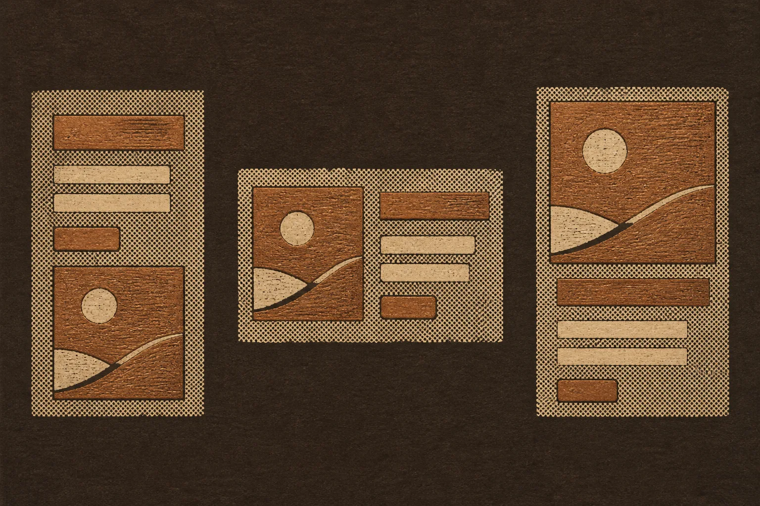
Woodblock print in copper and cream ink on dark umber paper: three proofs of the same abstract hero layout, a headline bar, two text bars, a small button, and a square image with a sun disc, stacked three different ways side by side
Plate IThree proofs pulled from one block. Same bars, same button, same square; only the stacking changes between pulls.

The proof strip

The same hero parts named as grid areas and laid three ways in CSS. This page's own hero is Proof A; the other two are one string swap away.

Today's art direction

The Proof Sheet

A printmaker's newsletter page on dark umber paper: a woodblock proof sheet of one hero pulled three ways, a vertical spine masthead, copper halftone, and cream drawer labels on every shelf.

The page borrows the creator newsletter landing page, the kind a printmaker or illustrator ships to collect readers: a masthead, one strong statement of what arrives and how often, a subscribe row, and an archive below. Here the masthead is a vertical spine running down the left edge, the subscribe row points at the real feed, and the archive is a set of shelves, each opened by a cream drawer label. The ground is umber paper, the ink is copper, and the halftone that a woodblock printer uses to fake a tone sits in two bands, under the hero and at the foot, never behind a paragraph.

  • Spine masthead
  • Proof strip
  • Drawer label
  • Woodblock plate
  • Copper halftone
  • Subscribe row
Shelf 01

Tooling

Framer · September 3

Framer's Agent restacks an existing hero into layout variations, copy and styles intact

In a LinkedIn post on September 3, Framer showed its Agent taking the hero already on the canvas, producing several layout variations in seconds, and letting the builder pick one and place it on the site. The prompt asks for alternatives to the section that exists, and the result is a set of proofs rather than a rewritten page.

The useful part is what stays fixed. Headings, supporting text, and the established styles hold while only the arrangement changes, which turns layout exploration into a contained task you can judge side by side. It lands two days after the 3D transforms release covered in issue 120, and it is the more practical of the two for a landing page.

Shelf 02

Technique

Studio René Bieder · September 2

Neurath X takes Futura's rejected alternates as far as they will go, in 36 styles

René Bieder's Neurath X Collection ships as two companion families, Neurath X and Neurath X Mono, each with nine weights and matching italics. The name honors Otto Neurath of ISOTYPE, a contemporary of Paul Renner who chased clarity through reduction in pictograms rather than letters. Bieder told The Brand Identity that the mono's raised x-height and generous set width are what let the geometry survive at a fixed width.

Neurath X became the Futura that never could have existed.

René Bieder, The Brand Identity, September 2

Just Creative · September 2

JUST Serif is a free seven-weight editorial serif with a variable font, built to sit beside a geometric sans

Russell Bean drew JUST Serif with Jacob Cass as the expressive partner to their geometric JUST Sans: sculpted flared serifs, warm curves, seven weights from Extra Light to Extra Bold, plus a variable font and web formats. Today's pairing on this page follows the same logic from the other direction, a geometric sans for display over a serif for reading.

Shelf 03

Workflow

CrossUI · September 1

Four moves for reading a change you did not write: locate, trace, blast radius, run it

A CrossUI essay that reached Hacker News this morning argues that AI made producing a plausible diff cheap and made reading it expensive, and that the diff view hides the problem because diff size and blast radius are unrelated. Its four teachable moves: find exactly which element on screen the change touches, decide whether it edits a shared definition or one call site, count who else uses it, then render it, including the branch that is not on screen.

A restacked hero is the clean case. The diff is a few lines of grid areas; the blast radius is the first thing every visitor sees. Review the render, not the line count.

Shelf 04

Design move

Borrow this pattern: name the hero's parts as grid areas, so a variation is one string swap

Give every piece of the hero a grid area, headline, lead, button, image, and write the layout as a template string. A second arrangement is a second string on a modifier class, with the markup, the copy, and the styles untouched. That is the same discipline Framer's Agent now applies from the other side: change the stacking, never the content. Where to use it: any hero you expect a client, a test, or an agent to reshuffle. What keeps it honest: the parts keep their order in the DOM, so reading order and focus order survive every proof.

.hero { display: grid; gap: 1rem;
  grid-template-areas: "h" "l" "b" "im"; }        /* Proof A */
.hero.split { grid-template-columns: 1fr 1.2fr;
  grid-template-areas: "im h" "im l" "im b"; }    /* Proof B */
.hero.image-first {
  grid-template-areas: "im" "h" "l" "b"; }        /* Proof C */
.hero h1 { grid-area: h } .hero p { grid-area: l }
.hero a  { grid-area: b } .hero img { grid-area: im }
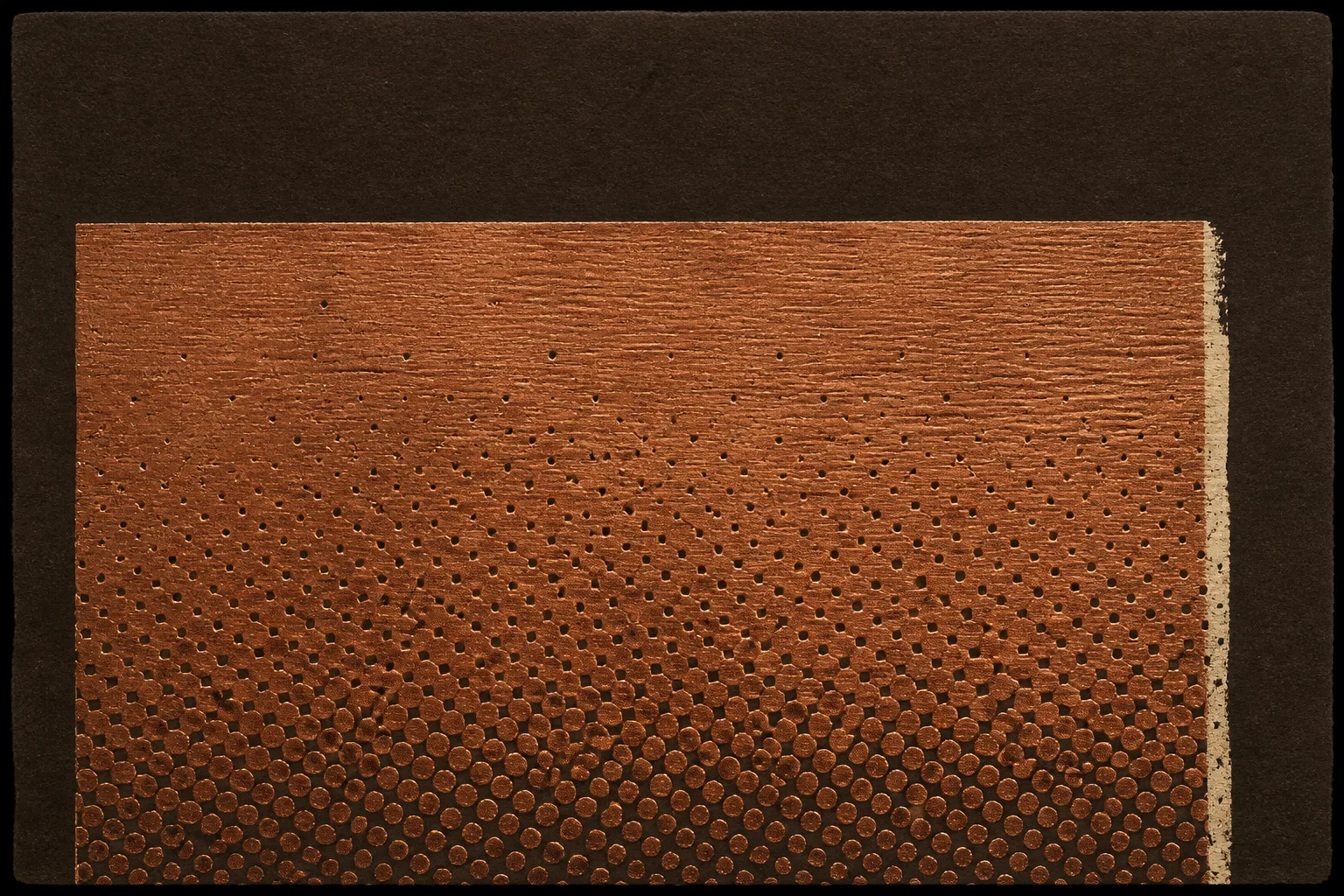
Close woodblock proof in copper ink on dark umber paper: a single flat rectangle showing carved wood grain and a coarse halftone dot field, dense at the bottom and fading toward the top, with a thin cream misregistered edge along the right side
Plate II. One pull from the block, close: the halftone that gives a flat ink a tone. The page reuses it as two bands of CSS dots, never behind live type.

Prompt Lab

Prompt Lab: rebuild The Proof SheetOpen the promptClose the prompt

Runs in Claude Code, Beaver Builder AI, Framer Agent, Lovable, v0, and Figma Make.

Build a creator newsletter landing page called The Proof Sheet, styled as a printmaker's studio letter. One page, semantic HTML and CSS only.

Page archetype: creator newsletter signup page. Above the fold: a fixed vertical spine down the left edge (72px wide) carrying the issue number in a geometric sans, rotated with writing-mode vertical-rl, and the date and reading time in a small monospace. Right of the spine: an inline top nav, a small monospace kicker, a large geometric sans headline (Jost 600, 56 to 66px, max 19 characters per line, balanced), a serif deck (Newsreader, 22px), a subscribe row with one solid copper button and one ghost button linking to a real feed and a real profile, then a wide framed plate image with a monospace caption to its right.

Proof strip: directly under the hero, a three-column row of small CSS wireframes showing the same hero parts (headline bar, two text bars, a button, an image square with a circle) laid out three ways using grid-template-areas: stacked, split with image left, image first. Label them Proof A, B, C in monospace; mark which one the page uses.

Sections as shelves: each section opens with a cream drawer label (a small monospace tab, 12.5px uppercase, cream fill with a double inset hairline like a label holder on an archive drawer) followed by an uppercase copper section title. Items are a monospace source line, a serif-set title in the geometric sans at 25px, and one or two paragraphs. One italic pullquote in the serif at 30px. A Design Move section with a code block for the grid-areas trick and a second plate image. A Prompt Lab on a cream sheet (details/summary) with a monospace pre.

Palette: umber paper #2E221A ground, cream ink #EFE3CC for text, copper #D08A45 for buttons, rules, and section titles, deep copper #A8632E for wireframe fills, cream sheet #E9D8B6 for labels and the prompt sheet, muted tan #AE9679 for captions. Halftone: a CSS radial-gradient dot field in copper, 9px cell, masked as a gradient band under the hero (dense at the bottom, fading up) and at the foot; never behind paragraphs.

Type: Jost 500/600 for display, Newsreader (optical size on) for body at 19.5px with line-height 1.68, DM Mono for labels and code. Body measure 66ch, never justified. Small text at least 12.5px and WCAG AA against its surface.

Images: two woodblock relief prints in copper and cream ink on dark umber paper, no legible text: a wide proof sheet of three abstract hero layouts, and a close halftone proof. Keep each inside a frame with a caption; no full-bleed.

Guardrails: no neon, no glow, no gradients on text, no pill radius except none, cards and inputs at 3 to 6px radius, no accent left borders, no fake forms or toggles (the subscribe row uses real links), hover and focus states on every link and button with 150ms easing, and a prefers-reduced-motion guard. On mobile the spine becomes a horizontal strip under the nav, the proof strip stacks, and the plate spans full width.
Shelf 05

Field note

Framer's release and the CrossUI essay agree from opposite ends: hold the content still, vary one thing, and judge the result on screen rather than in the diff. A proof sheet has always been how printmakers did that.

Shelf 06

Sources

Issue 121, Monday, September 7, 2026. Set in Jost and Newsreader, with DM Mono for labels. Palette: umber paper, copper ink and halftone, cream drawer labels and prompt sheet, tan captions.

Made in Claude Code on Fable 5.1; woodblock plates by gpt-image-2 (OpenAI). Follow @artdirdaily on X.

A field experiment from the team behind Beaver Builder AI.