NO. 122 Tuesday, 8 September 2026 ≈ 5 min

The Paste-Up · a feature launch page on a cut-paper board

Bolt turns ten small edits into one prompt you never type

Bolt.new's Visual Edits puts a toolbar on any element you click: change the copy, the size, the color, stack as many changes as you like, then send the whole batch to the model once, as exact values rather than a description. Plus a detector that scores your landing page against the AI fingerprint, an export that turns a Webflow site into folders an agent can read, and a grotesque that ships with a geometric twin.

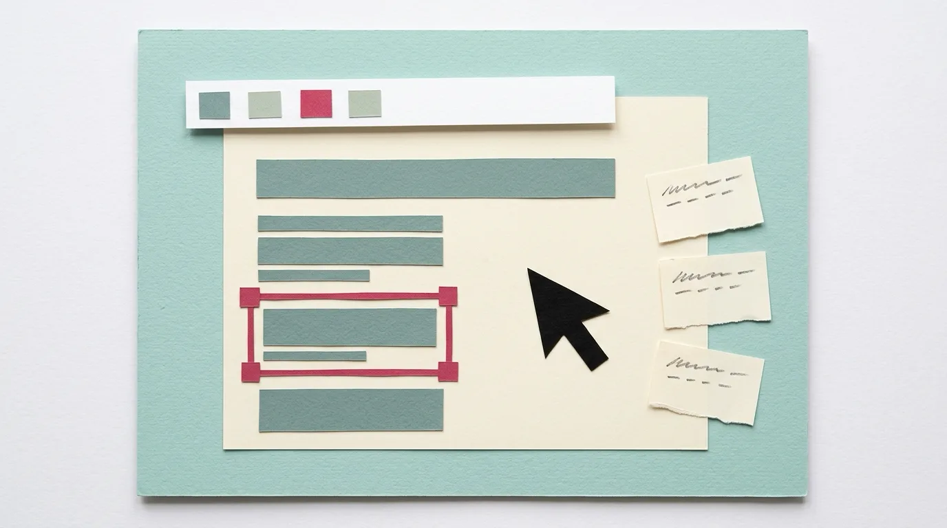
Cut-paper collage on a pale teal board: a cream sheet standing in for a web page with grey paper bars for text, one block framed by a raspberry selection outline, a white paper toolbar strip with colored chips floating above it, a large black paper cursor, and three torn correction slips pasted beside the page
Board IThe page, the selection, the toolbar, and three slips waiting to go to the model together.
Board note

Today's art direction

The Paste-Up

A SaaS feature page pasted up as a cut-paper board: pale teal paper, white sheets with cut edges, index-tab masthead, correction-slip section markers, and one raspberry accent.

The page borrows the product feature launch page, the kind a SaaS team ships when one capability deserves its own URL: a headline that names the change, a deck that says who it is for, one large illustration of the thing in use, and a short run of sections that explain, prove, and hand over. Here the treatment is the paste-up board from print production, where a layout was cut from paper and waxed onto a board before a camera ever saw it. The masthead is three index tabs standing up from the hero sheet, every section is a sheet with real cut edges, and the section markers are correction slips, because Bolt's new feature is exactly that: a stack of small corrections sent in one go. The board carries a paper-fibre grain; the sheets stay clean so the type does.

  • The color picker reads the palette off the rendered page. This is what it would find here.
  • board#CFE3DF
  • sheet#FBFAF4
  • slip#F1ECDD
  • ink#10302E
  • accent#D6336C
  • Paste-up board
  • Index tabs
  • Correction slip
  • Cut sheet
  • Swatch strip
  • Batch stack
  • Paper grain
Change 01

Tooling

Bolt.new · September 3

Visual Edits puts a toolbar on the element you click, then sends the stack to the model once

Bolt.new's Visual Edits lives on the Select button that was already there. Click an element in the running app and it gets a toolbar; elements with text get a bigger one, with font size by the pixel, styling, lists, links, and in-place copy editing. Each approved change stacks into a list, adjusting the same element updates its entry rather than adding a second, and saving sends the whole stack in one round trip. It is on for every user, free and paid, as of September 3.

Two details are worth a designer's attention. The color picker reads the palette off the rendered page, so the colors it offers are the ones the app already uses, and selected elements carry plain-language names rather than div and h1. Bolt is candid about scope: text and styling only, no dragging or rearranging, and the batch still spends tokens on whichever model is selected. Webflow shipped the same instinct for AI code components five days earlier, covered in issue 117. The last mile of an edit is leaving the prompt box on both sides of the fence.

One instruction set, one round trip, and the model gets exact values instead of a description it has to interpret.

Donald Savard, Bolt.new, September 3

Slop Detector · on Hacker News September 6

A deterministic scan scores your landing page against the 27 CSS patterns generated pages share

Slop Detector renders a URL in real Chromium and scores it on four axes: design slop across 27 weighted CSS patterns (the fonts, gradient hero text, and glassmorphism stack), copy slop for the hedging register and the antithesis pivot models default to, drift from the page's own declared DESIGN.md tokens, and whether ChatGPT, Claude, and Perplexity can fetch and cite it. No model, no randomness; the same page returns the same score. The engine is MIT; daily monitoring and a client report are the paid layer.

SiteDownload · Show HN, September 8

Export a Webflow or Framer site as HTML, CSS, and a Markdown CMS an agent can read

SiteDownload pulls a published Webflow or Framer site out as a plain folder: every page as clean HTML and CSS, assets downloaded and relinked, forms as JSON, and each CMS collection as Markdown, MDX, and JSON, the formats Cursor and Claude Code expect. It needs only a read-only API token and a free workspace, and charges a one-time fee per site. The pitch is the gap in Webflow's own export, which is paid and ships the CMS as a spreadsheet.

Change 02

Technique

Takuya Matsuyama, devas.life · September 7

A working designer tries v0, image models, and Claude Design for a landing page, then ships the app itself

Takuya Matsuyama rebuilt the landing page for his note app and wrote up what each tool gave him: v0 prompts that came back mediocre, a one-shot image from GPT Images 2.0 that impressed him, and Claude Design implementations of that image that kept drifting into a look he had started to recognize on other sites. He calls those "taste slops." What he shipped instead is a page that embeds the real editor, self-playing a session until you click into it, because the flashy references he admired kept him from understanding what the product did.

Read it next to Slop Detector above. The convergence he noticed by eye is what the scanner turns into a number, and his fix, show the product instead of a rendering of it, is the one no scanner can suggest.

Formagari · September 3

Metra 2.0 puts a Grotesk and a Geometric stylistic set in one 22-style sans

Formagari's Metra, by Hugo Le Corre, is an extended second version of an earlier release: eleven weights from Hairline to Ultra with italics, a variable font with weight and slant axes, and two stylistic sets that let the same family read as a grotesque or a geometric. Large x-height, a flared capital M, and a character set that reaches Vietnamese and the Pan-Nigerian alphabet. Today's page runs the same argument from a different angle, an extended grotesque for display over an old-style serif for reading.

Change 03

Workflow

alpbahadur on GitHub · on Hacker News September 5

A Claude Code skill that makes one to three fresh reviewers argue with your agent's design before it builds

The interns-review plugin spawns one to three independent reviewer agents, each with a different lens (correctness, edge cases, simplicity), and hands them only a clean context file describing the proposed solution, never the conversation that produced it. The lead agent then verifies their objections against the actual code before implementing. The premise is the one this publication adopted for its own design critic on September 3: a model cannot see past its own rationale, so give the second opinion nothing but the artifact.

Change 04

Design move

Borrow this pattern: cut the sheet on a pseudo-element so the paper tilts and the type stays level

Give each section a rotated, clip-path polygon background on its own pseudo-element, and leave the content box untouched. The reader gets a pasted sheet with a real cut edge and a hair of tilt; the paragraph inside stays perfectly horizontal, so nothing about reading changes. Use it on any editorial, brand, or campaign page that wants a hand-made surface without a texture image. What keeps it honest: a clipped box cannot cast a box shadow, so the edge comes from a hard one-pixel drop-shadow filter instead; vary the polygon and the rotation per sheet by a few tenths of a degree, and never rotate anything that holds body text.

.sheet{position:relative;isolation:isolate;padding:52px 56px}
.sheet::before{
  content:"";position:absolute;inset:0;z-index:-1;
  background:#FBFAF4;
  clip-path:polygon(.5% .6%,38% 0,99.4% .3%,100% 52%,
                    99.6% 99.4%,61% 100%,.2% 99.2%,0 47%);
  transform:rotate(-.35deg);
  filter:drop-shadow(1px 2px 0 rgba(16,48,46,.22));
}
/* the content box never rotates; only the paper does */
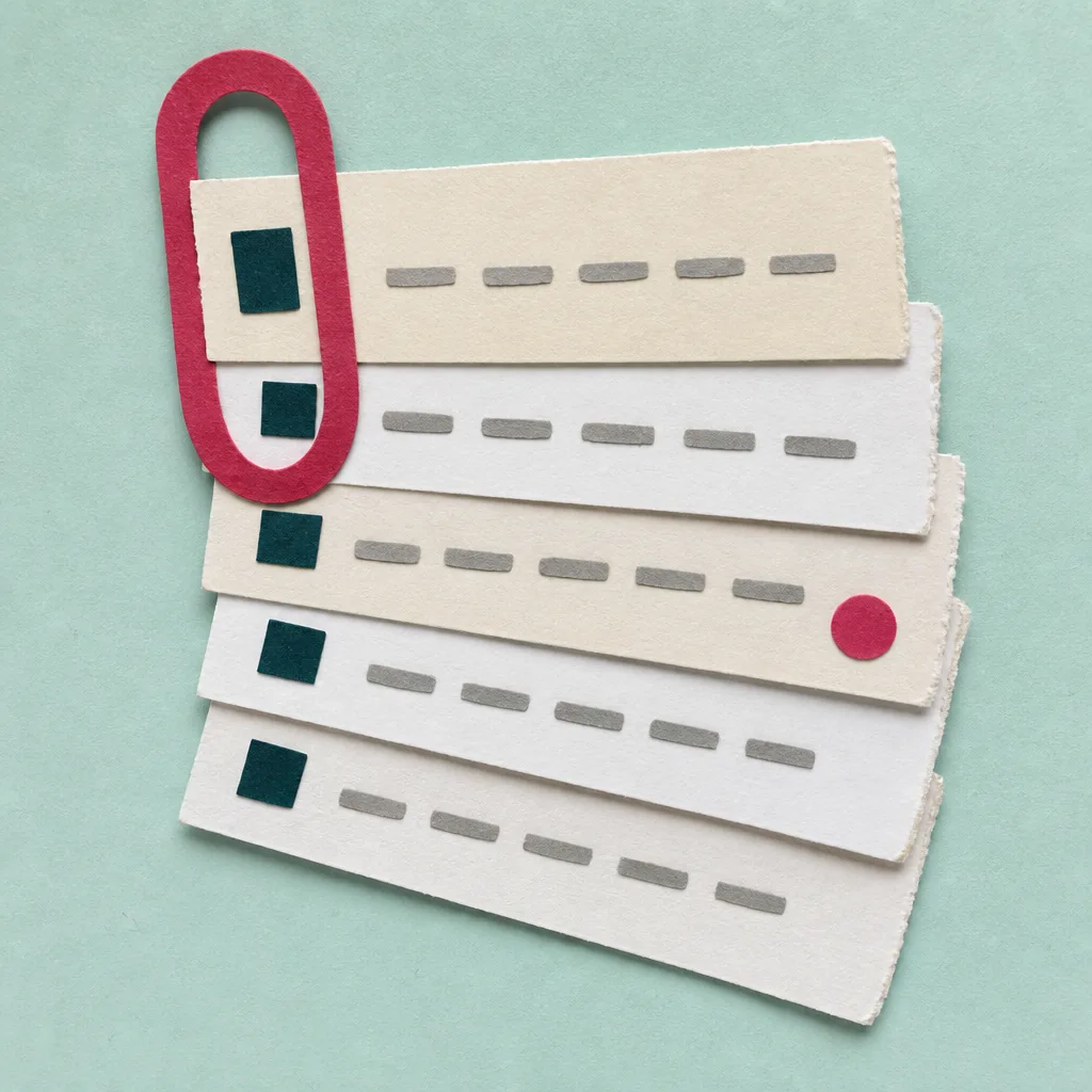
Cut-paper collage on a pale teal board: a fanned stack of six torn cream and white correction slips held by one large raspberry paper clip, each slip carrying a small dark teal square and a row of grey paper dashes
Board IISix slips, one clip. The batch before it goes to the model.
Change 05

Prompt Lab

Prompt Lab: rebuild The Paste-UpOpen the promptClose the prompt

Works in Bolt.new, Beaver Builder AI, Claude Code, v0, Lovable, Figma Make, and Framer Agent.

Build a SaaS product feature launch page called The Paste-Up, styled as a print-production paste-up board with cut-paper sheets. One page, semantic HTML and CSS only.

Page archetype: single-feature launch page for a click-to-edit toolbar in an AI app builder. Above the fold, top to bottom: an inline top nav on the bare board; a masthead made of three small cut-paper index tabs standing up from the hero sheet (issue or version number on a raspberry tab, date on a cream tab, reading time on a cream tab, each rotated about one degree); a full-width white sheet holding a monospace kicker, an extended grotesque headline (Anybody at 125 percent width, 700, 48 to 57px, max 22 characters per line, balanced), and a 24px serif deck; then a wide illustration pasted below the sheet at a 0.6 degree tilt with a small cut-paper caption slip overlapping its bottom-left corner.

Sheets: every section is a sheet on the board. Put the paper on a ::before pseudo-element: an eight-point clip-path polygon with corners a few tenths of a percent off square, a rotation between -0.4 and 0.4 degrees, and a hard 1px drop-shadow filter for the cut edge. The content box itself never rotates. Alternate white and cream sheets, and vary the polygon and rotation per sheet.

Section markers: correction slips. Each section opens with a small cream slip overlapping the sheet's top edge, rotated about 1.4 degrees, carrying a 14px raspberry paper square, a monospace label (Change 01, Change 02) and the section name in the extended grotesque at 17px uppercase. Sections: art direction callout with a swatch strip (five cut-paper chips showing the page's own palette with names and hex values), Tooling, Technique, Workflow, Design Move with a code block and a second illustration, Prompt Lab on a sheet using details/summary, Field Note, Sources.

Palette: board #CFE3DF (pale cool teal), white sheet #FBFAF4, cream slip #F1ECDD, ink #10302E, raspberry accent #D6336C for tabs, squares, and links (deeper #B0285A for link text and #8E2E52 for italic prose), muted teal #4A6864 for monospace labels. Board texture: an inline SVG feTurbulence fractal noise tile at low opacity, multiply blend, fixed behind everything; sheets stay flat.

Type: Anybody (width axis at 125, weights 600 and 700) for the headline, section names, and item titles; Crimson Pro for body at 20px with line-height 1.66, italics for the one-line summary and one pullquote at 30px; IBM Plex Mono for tabs, slips, captions, and code. Body measure 66ch, never justified. Small text at least 12.5px, WCAG AA against its actual surface.

Images: two cut-paper collages in the manner of gouache cut-outs, photographed flat on the same teal board, no legible text: a wide tableau of a paper web page with a selection outline, a floating toolbar strip, a paper cursor, and three correction slips; and a square stack of slips under one paper clip. Each sits inside a figure with a caption slip; nothing full-bleed.

Guardrails: no gradients, no glow, no pill radius anywhere (edges are cut, not rounded), no accent left borders, no fake toolbars or inputs as decoration (the swatch strip is a labelled legend), hover and focus states on every link and on the details summary at 150ms, one restrained motion (the pasted plate settles a few tenths of a degree on hover), and a prefers-reduced-motion guard. On mobile the tabs wrap, sheets shrink their padding to 22px, the design move stacks, and captions stay inside the viewport.
Change 06

Field note

The big move still goes through the prompt. The small one, a shade darker, two points larger, this word not that one, was never a language problem, and this week three builders admitted it with a toolbar. Describe the layout; click the details.

Batch saved

Sources