Product
Webflow breakpoint canvas
Rolling out
From September 2, all users within the week
Works in
Design, Build, and Edit modes
Not in
Preview or Comment mode

Art Direction DailyNo. 120

Every breakpoint on one canvas: the agent's edit has nowhere to hide

Webflow's breakpoint canvas puts desktop, tablet, and phone side by side while you edit, so a layout change shows up at every size at once instead of one tab at a time.

Plus Framer's agent gets every 3D transform, a 1973 paperclip typeface returns as a rocking variable family, Canva counts six million coded sites, and Lovable measures what Fable 5.1 does to design quality.

Comes in four sizes
LLarge1440 and up
MDesktop1024
STablet768
XSMobile390

Sunday, September 6, 2026≈ 5 min

Read the run

Today's art direction

The Size Run

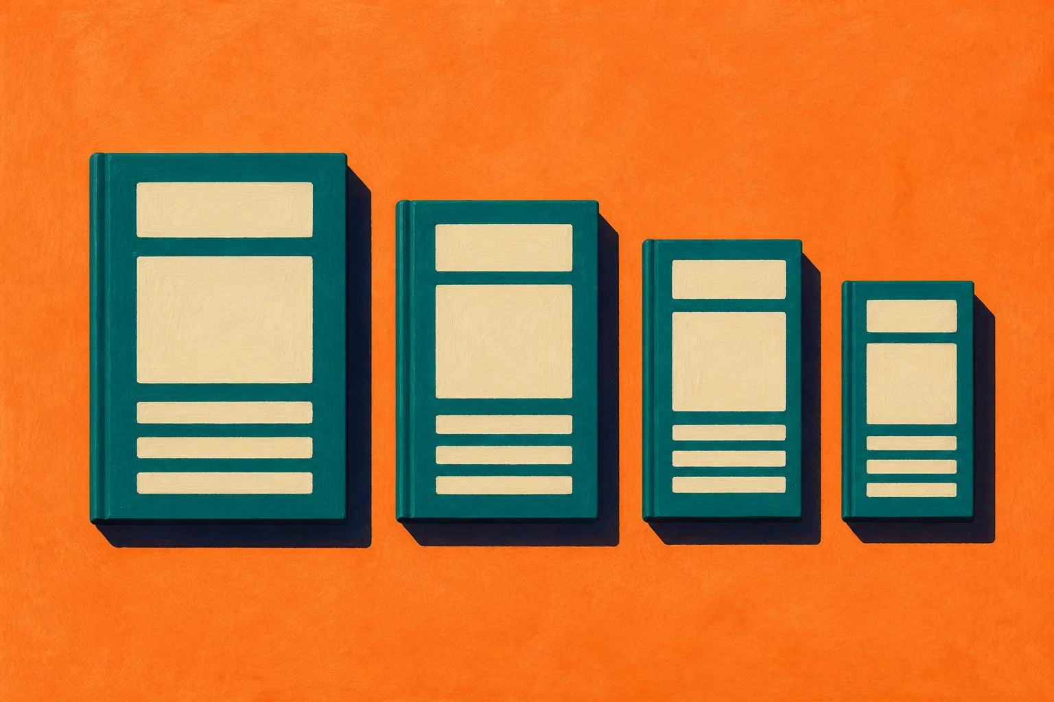
A direct-to-consumer product page selling one sketchbook in four sizes, every size in one row with the true widths drawn beneath it.

Today's lead is a canvas that shows every breakpoint at once, so the page is built the way a good shop sells a thing that comes in sizes: gallery left, buy box right, spec sheet under the fold, and the size run painted in one row so the difference is seen rather than read. Gouache plates on a flat tangerine ground carry the product, a teal buy box carries the headline as the product title, and the sections below open with the numbered hotspot pins a product-detail page uses to call out features. A repeat tile of nested rectangles runs in two bands, where the wrapping paper shows at the edges of the sheet.

  • Buy box
  • Size run
  • Hotspot pin
  • Gouache plate
  • Care label

Tooling

Webflow puts every breakpoint on one canvas

Webflow updates, September 2

Expand the canvas and the large, desktop, tablet, and mobile views sit side by side, so a change made at one width is visible cascading into the others without switching tabs. Breakpoint canvas is rolling out in Design, Build, and Edit modes, and Webflow says part of the point is making an AI agent's changes easier to review across devices. A single-breakpoint focus stays available for scroll-based interactions, and the view is not offered in Preview or Comment mode.

The same day, Webflow let any component drop into rich text, on the canvas or in the CMS panel, with properties set per item and updated everywhere when the component changes.

Framer's agent gets the whole 3D transform panel

Framer updates, September 1

Rotate on X, Y, and Z, perspective, origin, depth, backface: Framer's Agent can now set every 3D transform property, and the layers it produces stay selectable and editable on the canvas rather than arriving as a baked effect. Framer built the logo animation in its own announcement this way, on Opus 5 Fast with light reasoning, out of nothing but frames and effects.

Technique

A 1973 paperclip typeface returns as a variable font that rocks

It's Nice That, September 3

Ad Werner's Paperclip Contour, released by Mecanorma in 1973, only ever existed as an outline face without capitals. Kanon Foundry's Tor Weibull has rebuilt it as Clippy: filled in, with an uppercase and redrawn numerals, in fifteen styles. The variable axis runs from a reverse-slanted Retalic through Roman to Italic, so a word can tip back and forth like a roly-poly toy, which is a kind of motion a static family cannot make at all.

The family is on Kanon Foundry's site now, alongside the studio's other releases.

Workflow

Canva counts six million coded sites

Canva newsroom, September 2

Canva's hundredth Visual Suite upgrade of the year arrived with numbers for its website tools: close to a million sites published a month, more than six million built with Canva Code, and site navigation that now runs to twenty sections with SEO titles and domain controls. The newsroom post frames it as one project moving from whiteboard to doc to site without leaving the file, the same one-surface argument the design tools are making from the other direction.

The Business Wire release the next day adds the enterprise figures and the quote from Cameron Adams.

Lovable measures what Fable 5.1 does to design

Lovable, September 1

Lovable benchmarked Fable 5.1 against Fable 5, five runs per task at three effort levels. The visual design lift grows with effort, from 1.6 percent at low to 3.5 at high, while fixing an existing app got up to 17 percent better and about a third cheaper. Building from scratch was flat to slightly worse.

For a designer the useful reading is that effort is now a design dial, which is where issue 115 landed when the model shipped.

A layout is not finished at one width. It is finished when the row agrees.
Borrow this pattern

Show the size run at true scale

When the product comes in sizes, put every size in one row, scaled to each other, with the same content inside each. A rug, a print, a frame, a template, a screen: the customer sees what changes and what holds, instead of reading a table and imagining it. The painted plate in the hero carries the idea, one layout reflowed across four covers, and the bar legend underneath carries the truth: four widths drawn in CSS with flex ratios of 1440, 1024, 768, and 390, so the proportions are real rather than illustrative.

The honesty lives in the scale. If the small size is drawn bigger than it is so the row looks balanced, the pattern has become decoration. Let the row be uneven, align the bottoms on one baseline, and put the spec sheet underneath for the numbers the picture cannot carry.

Gouache detail of a large and a small teal sketchbook overlapping at one corner, the same cream layout reflowed on each cover, with a single cream dot marker on the larger cover
Plate II. Two sizes overlapped at the corner, same layout, one hotspot

Prompt Lab

Prompt Lab: the Size Run product pageCopy into your build tool
Build a direct-to-consumer product page for one product that comes in a size run, styled as a small paper-goods brand. Page archetype: ecommerce product detail page, expressive brand register, vivid light ground.

Ground and palette: a flat vivid tangerine field (#FB7A25) carrying a faint repeat tile of nested rectangle outlines in a slightly deeper orange (#E4661A, 2px strokes, 96px tile) so the ground reads as branded wrapping paper, never as a gradient. A single continuous cream product sheet (#F7ECD5) holds everything below the hero, with warm sand (#ECD3A2) for tinted panels and tags. Ink is navy (#0D162B). One accent only, deep teal (#035E5E, deepened to #02494A for text links), used for the buy button, the hotspot pins, and italic display lines. Small text on the tangerine uses dark rust (#3A1604), never teal, because teal fails contrast on orange.

Type: a wide monospace with a heavy weight (Azeret Mono 800) for the product title, section heads, item titles, and the wordmark; the same mono at 500 for every label, caption, table cell, and spec; a serif with optical sizing (Source Serif 4) for body at 19px and line-height 1.7, with its italic for the one pullquote and the one-line art direction summary. Body never goes below 18px and is never justified. Measure stays between 60 and 70 characters.

Masthead is the buy box. The hero is a two column grid, 7 to 5. Left: a gallery figure holding one painted product image with a mono caption, and beneath it a size run legend built as a flex row of four bars with flex-grow values of 1440, 1024, 768, and 390 and heights stepping down from 34px to 16px, each labelled in mono, so the widths are true to each other. Right: a cream buy box with a wordmark and issue number line, the headline as the product title at 28 to 38px, the description as the deck, a four row size table in mono with a caption, a date and read-time line where the price would go, and one solid teal button with cream text linking down into the first section. No boxed grid of meta cells anywhere.

Under the hero, the cream sheet begins with a four column spec sheet: a definition list with a 2px navy top rule, hairline column dividers, mono uppercase terms, serif definitions. It reduces to two columns under 980px.

Section markers are hotspot pins from the product detail idiom: a 38px teal teardrop (border-radius 50% 50% 50% 0, rotated minus 45 degrees) with the section number in mono counter-rotated inside, sitting on the same line as the section heading. Sections: Tooling, Technique, Workflow, Design Move, Prompt Lab, Field Note, Sources. Items inside a section are a 4 to 8 grid, a title column with a mono source line and a serif body column capped at 66 characters, separated by hairlines; the grid stacks under 980px.

The Design Move is a care label: a sand panel with a bordered mono tag, a heading, two short paragraphs, and a second square painted plate on the right with a mono caption.

Images: gouache illustrations only, opaque matte paint with visible brush marks and paper grain, the product in deep teal with cream painted layout shapes, on the same tangerine as the page so the plate sits without a frame. One wide plate showing every size in one row at true relative scale, one square detail plate. No readable text inside any image.

Guardrails: body 19px and line-height at least 1.7; contrast at WCAG AA against the actual rendered surface; radii 3 to 8px on panels and 2 to 4px on bars and buttons, nothing pill shaped; one restrained motion only, links thicken their underline on hover and focus over 150ms and the buy button darkens and lifts one pixel, both wrapped in a prefers-reduced-motion guard; visible focus outlines in teal; no glow, no gradient text, no drop shadow on more than the gallery plate and the buy box, no left border stripe on callouts, no fake size selector or add-to-cart state, and no container taller than the content inside it.

Paste it into Beaver Builder AI, Lovable, Figma Make, Cursor, or Claude Code.
Field note

The one-surface week

Webflow's four breakpoints on one canvas, Canva's whiteboard that becomes the site, Framer's 3D that stays editable where it was made: the tools are converging on a single surface where the review happens where the work happened, and the designer's job shifts from switching contexts to reading a row.

Sources

  1. See every breakpoint while you edit, Webflow updates, September 2, 2026.
  2. Add components to CMS content, Webflow updates, September 2, 2026.
  3. Agents: 3D Transforms, Framer updates, September 1, 2026.
  4. Paperclip Contour, meet Clippy: Kanon Foundry takes a 1973 typeface and makes it flexible across 15 different styles, Paul Moore, It's Nice That, September 3, 2026.
  5. Kanon Foundry, Clippy in 15 styles.
  6. Big updates just landed in the Visual Suite, Canva newsroom, September 2, 2026.
  7. Canva Expands Its Productivity Bet With 100+ Visual Suite Upgrades, Business Wire, September 3, 2026.
  8. Lovable now builds with Fable 5.1, Lovable, September 1, 2026.

Issue 120, Sunday, September 6, 2026. Set in Azeret Mono and Source Serif 4. Palette: tangerine ground with a nested-rectangle tile, cream product sheet, sand care label, teal buy box and pins, navy ink.

Made in Claude Code on Fable 5.1; gouache plates by gpt-image-2 (OpenAI). Follow @artdirdaily on X.

A field experiment from the team behind Beaver Builder AI.