No. 119 Saturday, September 5, 2026 ≈ 5 MIN

Bold was a checkbox. In Figma it is now a number

Figma's Plugin API can now read every OpenType axis a variable family exposes and set type anywhere along them, so a weight stops being a name picked off a list.

Plus Chrome 154 gives underlines somewhere to sit, auto layout learns two spacing modes the browser has had for years, and Beaver Builder AI turns a generated module into a reusable component.

The same family
Static EditionNamed styles
Variable EditionContinuous axes
Asking for weight
Pick the style the foundry drew and shipped. Regular, Medium, Bold, Black.
Name the axis and the value. { wght: 550 } is as real as Bold, and so is 551.
Weight, drawn

Four stops the file contains

Every stop between them

What a plugin reads
A family and a style name, and nothing about how that style was made.
variationSettings carrying every axis the family defines, keyed by its four character tag.
Discovering the range
Enumerate the styles and infer the rest.
getFontFamilyVariationAxes() returns the axis tags, or null when the family is static.
Loading
Load one style at a time, by exact name.
Load the family and get every style. Style is optional now, on read and on write.
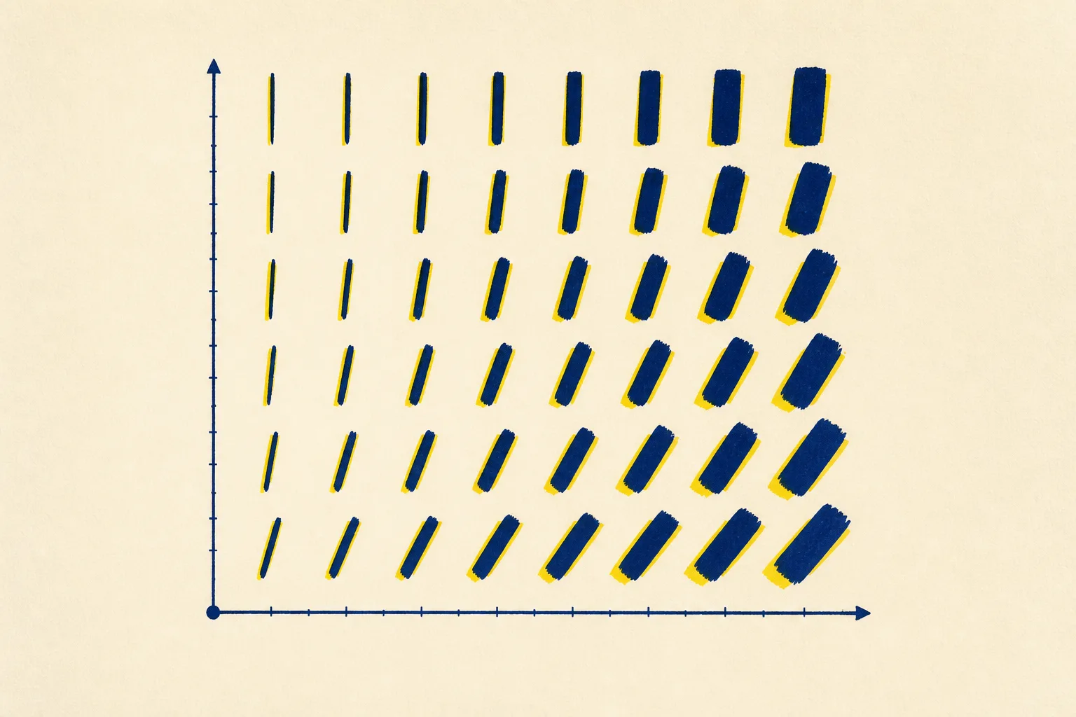
Screenprinted specimen diagram: rows and columns of abstract ink strokes that thicken from left to right and lean further from upright down each column, indigo over a chrome yellow underprint on cream paper.
Plate I. Weight along the horizontal, slant down the vertical.

Today's art direction: Endpaper Editions

A comparison page bound like a specimen catalogue: marbled indigo endpapers at head and foot, cream sheets between, and one chrome yellow underprint running out of register.

Marbled endpapers are the sheets pasted inside a book's covers, made by floating ink on a bath, combing it into a pattern, and lifting it off on paper. They open and close the book, which is where they sit here. Between them the page is a comparison: two editions of one typeface in a shared spine, each attribute crossing both columns as a single labelled row, with the chrome yellow a few pixels off register behind every ink mark.

Shelf 01

Tooling

Figma's Plugin API learns variable fonts

Figma Plugin API, Sep 3

Reading a font on a variable family now returns its variation settings, carrying every OpenType axis the family defines, keyed by the four character tag the axis was registered under. A new method lists those tags for a family, or returns null when the family is static, so a plugin can ask what it is holding before it writes anything. Update 138 landed on September 3.

The smaller change matters as much. Style is now optional: loading a family loads all of its styles, and setting a font without one lets Figma pick the named instance closest to the axis values you asked for. A design system that was a list of eleven text styles can be a range with eleven bookmarks in it.

Continues our coverage of Figma's agent surface in issue 117, which followed shaders out of the canvas and into React.

RapidWeaver Elements builds the component and its controls

Realmac forum, Sep 4

Describe a component and Elements AI writes it, then writes the native inspector controls for editing it, so the thing it generated stays adjustable by someone who never reads the code. Realmac showed the workflow on September 4 and says the build ships later this month with bring your own API keys and MCP support.

Generating a control surface alongside the output is the part worth watching. Most builder AI hands back a finished artifact and leaves you editing it in chat forever.

Shelf 02

Technique

Chrome 154 gives underlines somewhere to sit

Chrome Developers, Sep 2

The new text-decoration-inset property controls how far an underline, overline, or strike is inset from or pushed past the edges of a text run, in lengths or percentages, with separate start and end offsets. Alongside text-decoration-skip-spaces it retires a familiar workaround: the positioned background standing in for a line the browser would not let you place. Chrome 154 reached beta on September 2.

The same release aliases a font-width descriptor onto font-stretch, days after Firefox 155 shipped the same alias in issue 118. Scroll marker groups also gained two modes, links and tabs, which decide whether a marker set announces itself as navigation or as a tablist.

Macro screenprint detail: the edge of a thick indigo ink stroke on cream paper, with a chrome yellow underprint showing along one side where the press ran out of register.
Plate II. The yellow underprint showing along one edge of an inked stroke.

Auto layout picks up two spacing modes

Figma Plugin API, Aug 31

Primary axis alignment now takes space evenly, which puts an equal gap before the first child, between each pair, and after the last, and space around, which gives every child an equal share so the outer gaps come out half the inner ones. Both have been in flexbox for years, which is the point of the update log: the file is closing on what the browser already does, one property at a time.

Shelf 03

Workflow

Beaver Builder AI saves a generated module as a component

Beaver Builder, Sep 3

Version 1.0 lets you save a custom module as a component and choose which of its fields stay editable on each instance, so one generated build gets reused rather than regenerated. Chat will also take an uploaded image as a reference to build from, a step past placing it in the layout, and a new filter pushes the default design system's tokens to content outside the builder. The 1.0 notes went up on September 3.

Beaver Builder AI is made by this publication's publisher.

A style you can name is a style someone already drew for you.
Borrow this pattern

Compare across the row, not down the column

Most comparison pages set two feature lists side by side and leave the reader holding the first one in memory while they read the second. Build it as one labelled row per attribute spanning both columns instead. The label states the question once, both cells answer it, and the eye travels across the difference rather than down two inventories.

Where the difference is a matter of degree rather than kind, draw it. The weight row near the top of this page is four separate strokes on one side and a single wedge on the other, set in the same ink, because that is the actual difference between a named style and an axis. A checkmark in both cells would have said nothing.

The label does the policing. It has to be a question a buyer would really ask, and both cells have to answer it in the same terms. The moment one cell is empty, or the row is written so that only one column can win, the page has stopped comparing and started selling. Use it for pricing tiers, plan pages, migration guides, and any place two versions of one thing have to be told apart.

Prompt Lab

Prompt Lab: the Endpaper Editions comparison pageCopy into your build tool
Build a comparison landing page that sets two editions of one product side by side. Treat the page as a bookbinder's specimen catalogue. Page archetype: comparison or "X vs Y" landing page, expressive print register, dark cool ground.

Ground and palette: a deep indigo field (#151A2E) carrying a single fixed marbled-ink wash at about 13 percent opacity, covering the viewport so it never tiles or seams. Cream paper panels (#EFE7D5) with ink at #1B2036 for anything that must be read at length. One accent only, chrome yellow #E9B21F, used for filled labels, graphic marks, and italic display lines, never as small text on cream. Cool slate #9BA4C2 for secondary text on the indigo. Every ink mark drawn in CSS gets a hard 3px offset copy in the yellow behind it, no blur, so the page looks screenprinted slightly out of register.

Type: a decorative flared display serif (Yeseva One) for the nameplate, headline, section heads, and row titles; a plain grotesque (Instrument Sans) for body at 19px and line-height 1.72; a monospace (Space Mono) for labels, axis values, and metadata only. Body copy never goes below 18px and is never justified. Measure stays between 60 and 75 characters.

Masthead: fold the nameplate into the hero. A cream strip across the top of the hero holds the wordmark in the display face on the left and issue metadata in uppercase mono on the right, and directly beneath it runs a 26px band of the marbled image repeated on x at full height, like the marbled fore-edge of a closed book. No boxed grid of meta cells.

The comparison spine is the signature. One cream panel holds a stack of rows, each row a three column grid: a 230px label column tinted one step darker, then two equal content columns for the two editions. A single hairline separates rows and a second one runs between the two edition columns, so the whole block reads as one spine rather than two cards. The header row names each edition in the display face with an uppercase mono subtitle. Where a row compares a difference of degree, draw it instead of writing it: on one side a flex row of four solid vertical bars at 3, 6, 11 and 19px wide sitting on a shared baseline, on the other a single wedge clipped with polygon(0 45%, 100% 3%, 100% 97%, 0 55%), both in ink with the yellow offset behind. Caption each with one line of uppercase mono. Under 940px the label column spans the full width and the two editions sit side by side beneath it.

Section markers are shelf labels, not filters. Each section opens with a hairline rule across the content column and a solid chrome yellow tag with uppercase mono in near black, pulled up so it straddles the rule like a tag on a shelf edge. The tag is a label and nothing else: no hover state, no active variant, no fake filtering. Sections: Tooling, Technique, Workflow, Design Move, Prompt Lab, Field Note, Sources.

Items inside a section are a two column grid, a 220px title column holding the row title and a small uppercase mono source line, and a wide body column capped at 70 characters. Under 940px the two columns stack.

Images: contained plates only, one wide diagram and one square detail crop, both screenprinted on cream with indigo ink and a chrome yellow underprint. Give each a mono caption naming it as a plate. Never put readable text inside a generated image.

Guardrails: body 19px and line-height at least 1.7; contrast at WCAG AA against the actual rendered surface, which means yellow only on the indigo or as a filled block with dark text, never yellow type on cream; radii stay at 2 to 3px throughout because these are sheets of paper, with nothing pill shaped; one restrained motion only, links that increase their underline offset and thickness on hover and focus over about 160ms, wrapped in a prefers-reduced-motion guard; real focus-visible outlines in the accent; no glow, no gradient text, no neon on dark, no left border stripe on callouts, no fake toggles or search fields, and no container taller than the content inside it.

Works in Beaver Builder AI, Figma Make, Lovable, Cursor, and Claude Code.
Shelf 04

Field note

The file catches up to the browser

Two of today's three tooling items are a design tool learning something the browser could already do. The distance between what CSS can express and what a design file can say is where most handoff arguments start, and this week it closed from the file's side, which is the side that rarely moves.

Shelf 05

Sources

  1. Figma Plugin API, Version 1, Update 138, September 3, 2026.
  2. Figma Plugin API updates log, including Version 1, Update 137, August 31, 2026.
  3. Chrome 154 beta, Rachel Andrew, Chrome for Developers, September 2, 2026.
  4. Build anything with AI Custom Components, Realmac Software forum, September 4, 2026.
  5. Beaver Builder AI 1.0: Components, Image Prompting, and More, Beaver Builder, September 3, 2026.