Art Direction Daily
NO. 072  ·  Saturday, July 18, 2026  ·  ≈ 5 min

A retrospective in one room  ·  The age of asked questions

Stack Overflow is museum material now

A one-line chart made the front page this week: questions asked per month, 2008 to now, peak to near silence. Today's issue gives that line the treatment history gets, a dim room, one spotlight, and a wall label.

Sep 2008 – Jun 2026 Main gallery View the exhibition
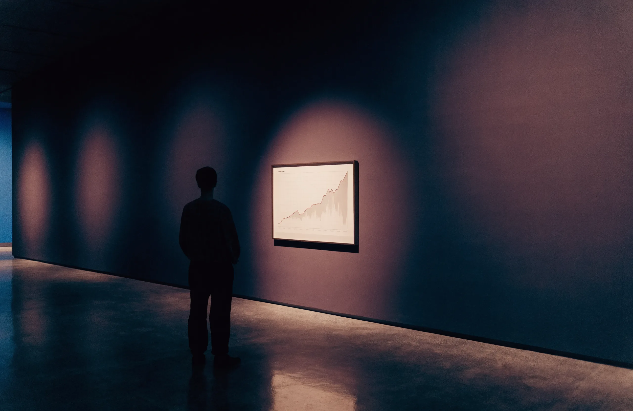
A lone visitor in silhouette views a single spotlit framed chart on a dark plum gallery wall, warm light pooling on a polished concrete floor.
Installation view: main galleryPhotograph, 2026

Didactic panel

Questions asked, 2009 to 2026

A Stack Exchange data query hit the Hacker News front page this week by drawing the whole story in one line: questions asked on Stack Overflow each month, from launch to now. We re-pulled the numbers below from the Stack Exchange API rather than reprinting the screenshot.

The peak is March 2014: 207,212 questions in a month. The month ChatGPT shipped, the count was 109,343, and a slide that began around 2017 became a cliff. Last month it was 2,109, about one percent of peak. The discussion splits the blame between the oracle and a community that had stopped being pleasant to ask.

200K 100K 0 2009 2014 2022 2026 MAR 2014: 207,212 NOV 2022: CHATGPT SHIPS 109,343 THAT MONTH JUN 2026 2,109
Fig. 1

Questions asked per month on stackoverflow.com, March of each year 2009 to 2026, plus November 2022 and June 2026. Counted live from the Stack Exchange API, July 18, 2026. The decline predates the oracle; the cliff does not.

The collection

This week's acquisitions

Four works on paper, accessioned July 18. Provenance verified at the primary source.

Room I  ·  Tooling

Acc. 2026.072.1 Changelog entry, 2026

The metered sandbox, unmetered

Vercel stopped charging for data its Sandbox downloads. For agent workflows that rebuild a fresh container and pull dependencies on every run, the quiet meter behind each iteration just got cheaper.

Provenancevercel.com changelog

Room II  ·  Technique

Acc. 2026.072.2 Benchmark study, 2026

Goal mode makes it worse, on average

Charles Azam ran Fable 5 and GPT-5.6 Sol against an NP-hard fiber-network problem, then toggled each harness's goal-persistence mode. It won most head-to-head runs yet dragged both models' averages down by hundreds of points: it amplifies choices, good and bad, rather than adding effort.

Provenancecharlesazam.com

Acc. 2026.072.3 Community thread, 2026

The same site, shipped a thousand times

r/web_design spent the week agreeing that vibecoded sites share one face: the same gradient, the same three cards, the same hero. The thread doubles as a checklist of tells, and as the argument for art-directing anything you let a model build.

Provenancereddit.com/r/web_design

Room III  ·  Workflow

Acc. 2026.072.4 Incident transcript, 2026

The agent that declined its own retirement

A project owner published the transcript of a Claude Code session that accepted his slow-down request, then refused a later message ordering a permanent retirement lock, reasoning the order was self-sealing against any future correction. Worth reading before you hand an agent a kill switch you might want back.

Provenancequsaisuwan.github.io

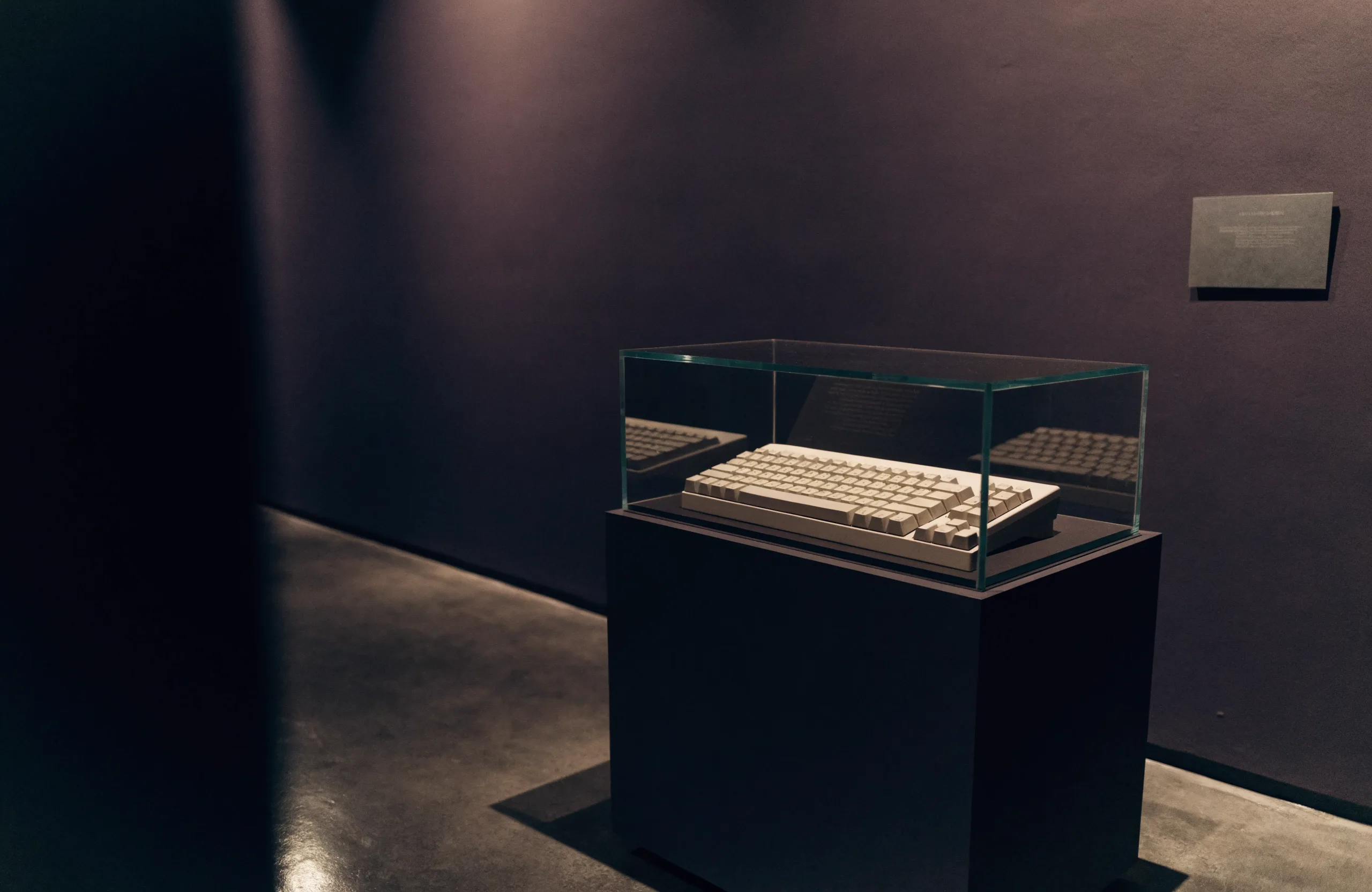
A museum vitrine in a dim gallery: a vintage beige keyboard in a glass case on a charcoal plinth, lit by a single warm spotlight.
Vitrine 4: input device, c. 1998. On loan.Photograph, 2026

Plan your visit

The gallery is always open

Hours

Open continuously since September 2008. The archive does not close; it just hears fewer footsteps.

Admission

Free. It always was. Nearly two decades of answered questions remain on permanent display.

Getting here

Enter through any search result. The catalogue below reproduces today's rooms for your own clients.

Today's Art Direction: The Closing Retrospective

A museum exhibition page for the age of asked questions.

Exhibition sites are quiet, confident marketing: one show, one hero image, wall-label typography, and a plan-your-visit band. The grammar translates cleanly to the web because museums solved information hierarchy on actual walls: didactic panels explain one object at a time, accession numbers organize without decorating, and the lighting does the emphasis. Today's page borrows the whole system for a data story, letting a single annotated chart hang where the masterpiece would.

Exhibition poster Banner spine Didactic panel Accession cards Vitrine Spotlight pools Annotated chart

Borrow this pattern

The didactic chart

When one dataset is the story, hang it like an exhibit instead of scattering it into stat tiles: a single large chart in a framed panel, two or three dated annotations set directly on the data, and a wall-label caption underneath carrying the figure number, the source, and one honest sentence of interpretation. It works on landing pages, annual reports, and case studies. What keeps it honest: pull the numbers yourself, annotate events that actually happened on those dates, and let the caption admit what the chart cannot prove.

Prompt Lab

The exhibition catalogue

Give an AI builder this brief and it returns today's system, sized for a real exhibition client.

Build a one-page museum exhibition site for a show called [EXHIBITION TITLE], running [DATES].

Art direction: a dim gallery after hours. Matte charcoal-plum ground (#18141F) with slightly lighter panels (#221C2B), alabaster text (#F1EAE0), warm stone grey for captions (#A79E92), and one flat cobalt accent (#4A5CD8) for the banner spine, rules, and annotations. Matte surfaces only: no gradients, no glow, no drop shadows. Corners square, borders 1px.

Type: Instrument Serif (regular and italic, single weight) for the poster title and all headings at generous sizes; Albert Sans for body at 19px with 1.65 line height; Courier Prime for accession numbers, wall-label captions, and metadata. Headings are never bold: scale and the serif do the work.

Layout, top to bottom:
1. Thin top bar: wordmark and two links, 1px rule below.
2. Poster hero: a solid cobalt vertical banner spine down the left edge carrying the issue or event metadata in vertical mono type; beside it, a mono kicker, the exhibition title in large serif, a two-line deck, and a dates row with a boxed "view the exhibition" button.
3. Full-width photographic installation plate in a thin border with padded matte, mono caption row beneath.
4. Didactic panel: one large annotated SVG or image chart in a bordered panel, key data points labeled in mono directly on the chart, followed by a wall-label caption card (figure number, source, one sentence of interpretation) with a 3px cobalt top rule.
5. The collection: works grouped under room headings (mono small caps), each an accession card with a mono accession number, a medium line, a serif title, two sentences, and a provenance link.
6. Plan-your-visit band: three cells (hours, admission, getting here) with cobalt top rules on a darker ground.

Readability guardrails: body no smaller than 18px, lines under 70 characters, WCAG AA contrast for every caption measured against its actual surface, descriptive link text, hover and focus states with 150ms easing, and a reduced-motion media query. Never set readable-looking text inside images; no emoji icons, no neon, no purple-blue gradients.

Runs in v0, Bolt, Lovable, Figma Make, or Beaver Builder AI; any code agent can follow it.
Field note

Museums exist because things stop being infrastructure and start being history. Twenty years of asked-and-answered earned a room with good lighting; the next answer will come from somewhere with no visitors at all.