Webflow now retranslates only the words you changed
Agents in Webflow Localize can now keep every locale in step with the primary page, skip any field you mark as off limits, and reuse a translation whenever its source text has not moved.
Issue No. 144, Wednesday 30 September 2026, set by Art Direction Daily as a rate card you can actually run. About a 4 minute read.
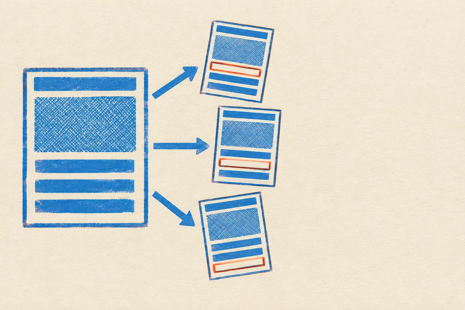
One primary page, three locales. The orange-red block on each copy is the field the agents never see.
01 Tooling
Two plans for handing a locale to the agents
Webflow added agentic translation to Localize on September 29. Until now a new locale meant someone clicking through the site to find what needed translating. Turn the feature on in a target language's settings and pick one of two modes.
The two agentic translation modes in Webflow Localize, and the features they share
Feature
One-time translationHands-on review
Continuous translationHands-off sync
What the agents do
One pass over your content, for your team to review.
A first pass, then every later change is translated and applied to the locale.
When the primary page changes
Nothing. The translation stays as reviewed.
The target locale updates to match, using the site's tone, formality, and glossary settings.
Exclusions
BothMark pages, components, CMS fields, or component props to keep out. Excluded content is filtered out and never passed to a model.
Translation memory
BothIf the source text, language, and settings are unchanged, the existing translation is reused instead of running through AI again.
Availability
BothRolling out now on every Localize plan. Translated words count toward word limits pooled across locales, and AI credits can cover the overflow.
The design consequence is in the exclusions row. Because a component prop can be marked off limits, deciding which props hold copy and which hold codes becomes part of building the component, not a cleanup job after launch.
Excluded content is filtered out entirely and never passed to a model for translation.
Webflow, on the new exclusion rules
02 Technique
Gutenberg evens out its design tools
Release
Gutenberg 24.1
Date
30 September 2026
Backgrounds and colour controls reach almost every block
Gutenberg 24.1, out today, spends about 140 pull requests on design tool consistency. Background image, size, and gradient, plus shadow, borders, typography, and link, heading, and button colours now reach nearly every core block, Accordion and Tabs included.
For anyone styling WordPress by prompt or by hand, it means fewer blocks where a style request has nothing to attach to.
Release
Gutenberg 24.1
Area
Global Styles
Text shadow gets its own panel
The text shadow support added in Gutenberg 23.5 now has a panel in Global Styles and works on Paragraph and Heading blocks. Cover and Media & Text pick up the media picker the Image block already uses.
One small honesty fix too: a wide or full alignment a theme cannot offer now shows as unavailable instead of silently disappearing from the toolbar.
03 Workflow
Set the rules before the first pass
Applies to
Webflow Localize
When
Before enabling
Mark exclusions, then switch on continuous mode
Continuous translation starts with a full first pass, and exclusions decide what that pass can see. Tag SKUs, reference codes, and internal CMS fields first, and set tone and formality per language, so the first run is also the one you would ship.
Release
Figma Weave
Date
16 September 2026
Weave tools can now be published to the Community
Custom tools built in Figma Weave can be published to the Figma Community for anyone to use. Publishing works for any output type, video and 3D included, but only image and vector tools run inside Figma Design.
It pairs with the node that pulls a Design frame into a Weave workflow, which we covered in issue 131.
04 Design move
Borrow this: bill the delta, and draw it
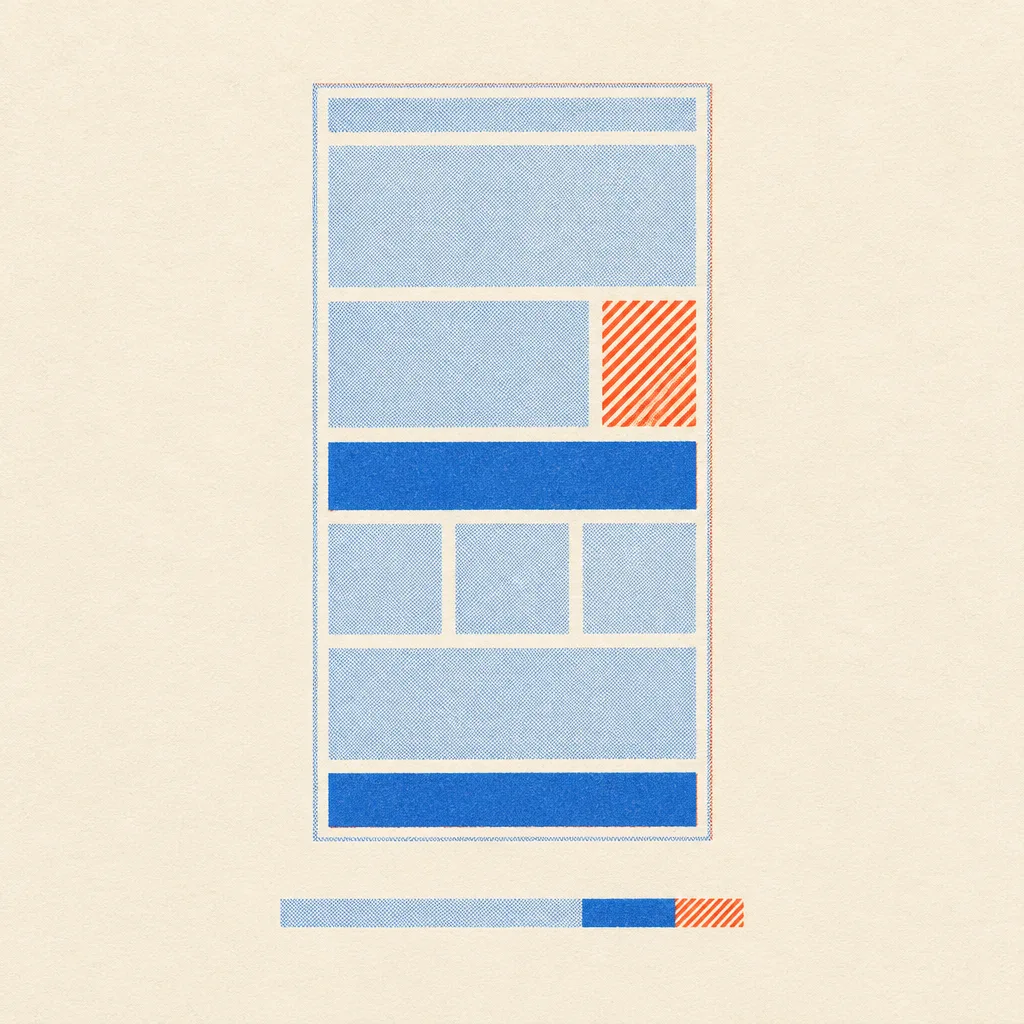
Pale tint is reused, solid blue is billed, hatching is held back.
When a price depends on what changed, put one stacked bar under the total and split it into what is reused, what is excluded, and what is charged.
What it is
A single bar whose segments come from the same inputs as the headline number, with a legend of labelled rows instead of coloured dots.
Where to use it
Usage-priced plans, quote calculators, upgrade screens, and any page where a client asks why this month cost more.
What keeps it honest
The segments always add up to the whole, nothing moves unless an input moves, and the fine print says what the number is not.
05 Prompt Lab
Prompt Lab
Can I build this page for a client?
Yes. Paste this into your builder of choice and swap in the client's product and numbers.
Works in Beaver Builder AI, Claude Design, Claude Code, Framer AI, v0, Lovable.
Build a pricing calculator page for a usage-billed product, the kind a freelancer ships for a SaaS or agency client. It is a real pricing page, dressed as a two-ink risograph rate card.

Layout: a slim top nav; a full-width hero with a monospace headline (Chivo Mono 800, 56-76px, tight tracking), a one-sentence deck in Rethink Sans, and the byline written as one sentence instead of a box of metadata cells. Under it, a 5fr/4fr row pairs a risograph diagram print with a live calculator card: three or four labelled range inputs with their values in mono, one large result number, and one stacked bar split into three segments (reused or included, excluded, charged) with a legend of labelled rows. Below: a two-plan compare table whose shared features span both columns on a slightly darker cream; line items with a mono label column (release, date) beside a heading and two short paragraphs; one italic pullquote; a "borrow this" block of labelled rows; an FAQ built from native details elements; sources and a plain footer.

Palette: warm dark ground #1C1612 with a halftone dot ramp behind the hero only; cards in riso-paper cream #EFE4CF with warm dark ink #221B16; riso blue #2F6BC9 for fills, #2458AE for text on cream, #7EA2E6 for labels and italics on the dark ground; fluorescent orange-red #E4572E only for the excluded segment and held-back marks. Type: Chivo Mono for headings, figures, and labels; Rethink Sans for reading.

Section markers: open each section with a row of section links styled as filter segments, the current one filled blue with aria-current.

Images: two-colour risograph diagrams (blue and orange-red on cream stock, coarse halftone, slight misregistration) of simple page wireframes. No legible text in any image.

Guardrails: body at least 18px with 1.65 line height and 60-75 character lines, never justified; WCAG AA for every small label on its real surface; radius 12px on cards, 6px on inputs and segments, no pill shapes; one shadow, on the calculator only; the calculator must compute from its inputs and its segments must add up to the total; hover and focus states at 150ms with a prefers-reduced-motion guard; no gradient surfaces, neon, glow, or fake controls; on mobile stack every row and turn the compare table into labelled blocks.
Where do the calculator's numbers come from?
Only from the sliders. Words that are excluded never count, unchanged words are reused, and the changed share of the rest is what gets sent, once per locale. It shows the shape of Webflow's rules, not its prices.
Field note
A translated page used to be a copy that aged from the day it shipped. Billed by the changed word, it starts to behave like a build step, and the component is where you decide what it is allowed to touch.