Art Direction Daily presents

No. 101 · Tuesday, August 18, 2026 · ≈ 5 min read · One night only

The main event · Ten rounds, one framework

Would 42 million visitors notice if you swapped the framework?

Lovable rewrote its entire site onto TanStack Start, route by route, while 42 million monthly visitors kept browsing. Tonight's card prints the tape.

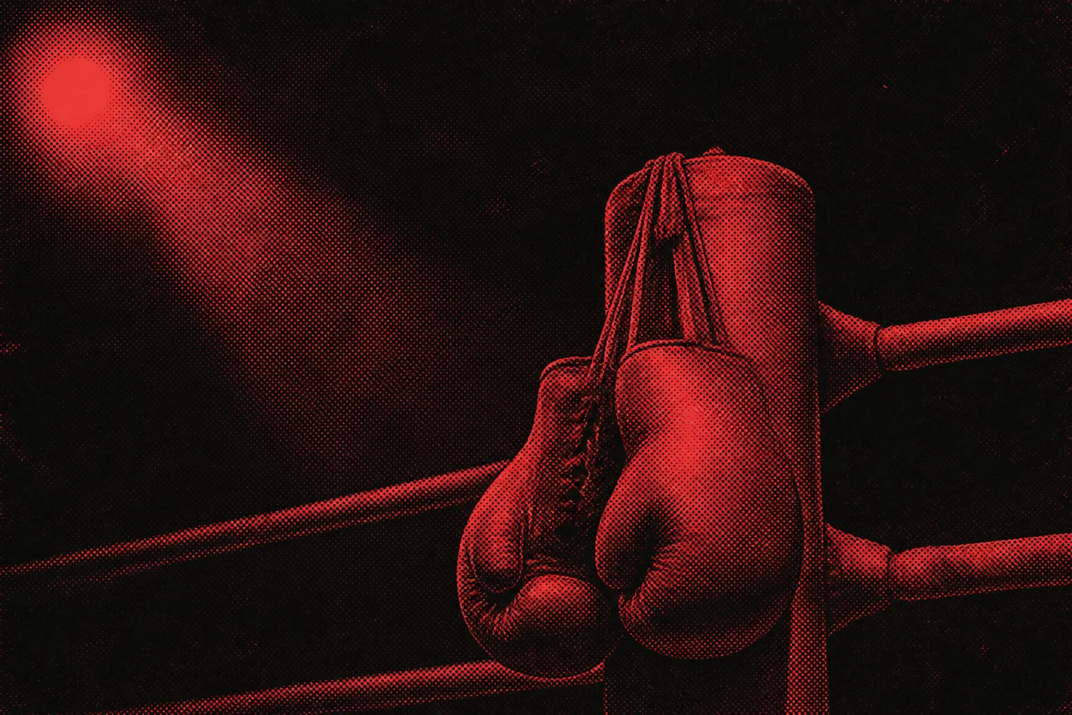
Duotone halftone photograph in crimson red of worn leather boxing gloves hanging by their laces from a ring corner post, a single spotlight glowing in the dark upper left
Plate 1 · The incumbent's corner, afterHalftone duotone, crimson ink

The incumbent

Next.js

Five years in residence
Built and deployed on Vercel

The challenger

TanStack Start

Router-first full stack
Runs on your own iron

Tale of the tape

12 minutes and up Production build 6 to 9 minutes
The baseline Median server response 49% faster
Vercel's platform Home arena Lovable's own infrastructure
910,000 lines · 400+ routes · six months · 3% framework-specific at the final bell

How the bout was won

Lovable published the full account of moving lovable.dev off Next.js and onto TanStack Start: 910,000 lines and more than 400 routes migrated in five groups over six months, with both frameworks live at once behind a single proxy.

Coding agents did most of the mechanical rewriting and its verification, while feature flags walked each route group from 1 percent of traffic to full rollout. The one knockdown came at 20 percent, when an out-of-memory crash caught server bundles hauling code the client never used. The team lazy-loaded the heavy objects, got back up, and finished the fight.

Today's art direction

The Fight Card

A comparison landing page printed as a fight-night bill: two color-blocked corners, a tale of the tape, and an undercard.

The oldest comparison layout in print is the fight bill: two names in fat wood type, a tale of the tape down the middle, and a card of undercard bouts below. Today's page borrows that grammar for the X-versus-Y landing page a freelancer actually ships. The corners carry the two frameworks in crimson and navy, the tape table judges them in numbers with units, and the rest of the day's news files in as scheduled bouts. Two duotone halftone photographs, one crimson and one navy, keep the whole bill on newsprint.

Bout no. 2 Tooling

Claude Code steps into the ring with artboards

Anthropic's developer account announced a /design skill in research preview: Claude Design's artboard workflow, running inside the Claude Code CLI and desktop app. Run it, get editable artboards for your interface, pick one, and have Claude implement it.

The getting-started guide pairs it with a design-sync command that pulls in your existing design system, plus an MCP server for staying in the terminal. Claude Design opened in May as a canvas-only preview; the canvas now comes to the keyboard.

Chat SDK takes the bout to Instagram

Vercel's Chat SDK added an Instagram adapter: bots that hold DM conversations with media, quick replies, and story replies, inside Meta's 24-hour reply window. The surfaces a client means by "our website" keep multiplying.

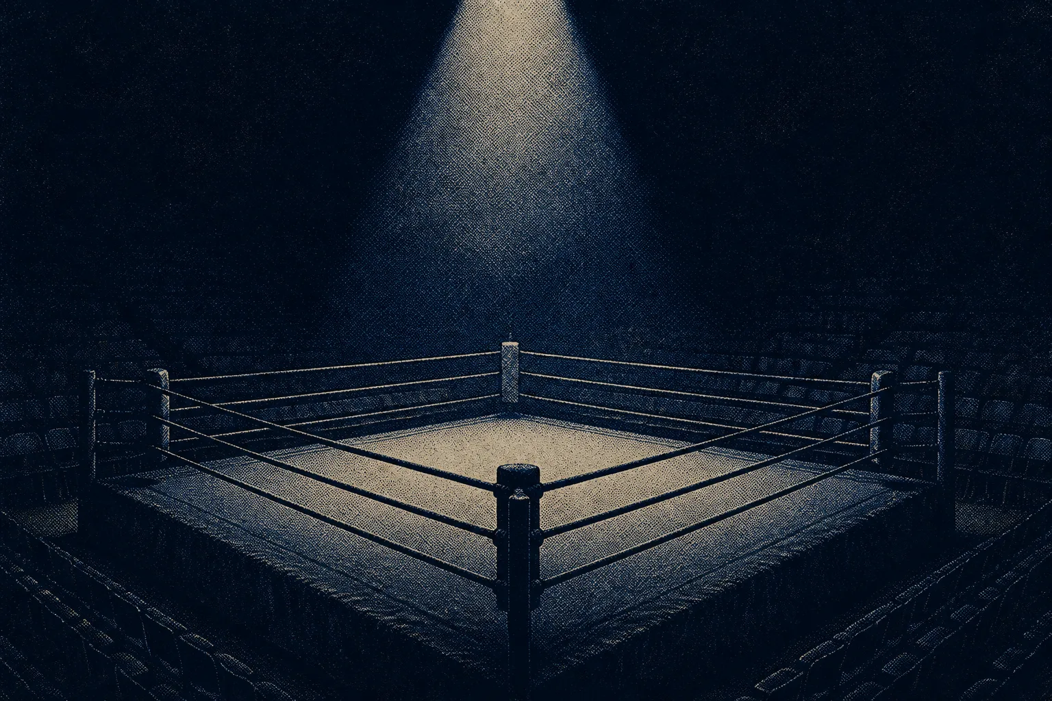
Duotone halftone photograph in midnight navy of an empty boxing ring under a single cone of spotlight, rows of empty seats fading into darkness
Plate 2 · The arena, doors at sevenHalftone duotone, navy ink
Bout no. 3 Technique

The winner's technique: adapters at every seam

The move to take from the main event is architectural. Lovable finished with 90 to 95 percent of its code framework-agnostic and only 3 percent framework-specific, using TypeScript aliases and adapter modules as plain dependency injection. The framework becomes a peripheral you can unplug, which is what made the next swap cheap enough to bet the site on. TanStack Start itself is the router-first full-stack framework from the TanStack team, and this post is the most detailed public case for it yet.

Bout no. 4 Workflow

Judging a five-agent card

The Stack Overflow blog asked practitioners what an agentic software lifecycle actually looks like. The concrete answer: a five-agent pipeline, a specification-enrichment stage placed right after design so quality moves upstream, and models judging models with Cohen's kappa keeping score.

Borrow this pattern

The tale of the tape

A three-column comparison table for any X-versus-Y page: the attribute runs down a quiet center spine, and the two contenders' values face each other across it. The reader's eye never travels back to a column header, because every row is a complete matchup on its own line.

What keeps it honest: numbers with units in every cell, the incumbent's best rows printed at the same size as the challenger's, and no adjectives anywhere in the grid. Verdicts go in a caption below the table, cited to evidence. It fits framework pages, hosting pages, plan tiers, and every "alternatives to" brief in your inbox.

Admit one · Ringside

Prompt Lab: print this bill

Feed it to the builder in your corner and stage the same bill for your own two contenders.

Build a one-page comparison landing page (X versus Y) art directed as a
vintage fight-night bill. Ground: deep warm ink (#1A1720) with a faint
CSS halftone dot screen; bill cream (#F2E8D5) for text, spotlight cream
(#FFF4DE) for display lines; corner crimson (#8E2434) and corner navy
(#22355C) as the two contenders' zone colors. Type: Ultra for the title
and bout names, Libre Caslon Text for body (19px minimum, 1.65 line
height), Oswald in caps for labels and stat rows, Courier Prime for
meta. Masthead is a centered promoter's line between double rules, not
a boxed metadata table. Hero: fat-face title, then a mirrored two-panel
split, navy incumbent left and crimson challenger right, each with a
role label, a big name, and two short spec lines, joined by a small
circular VS seal at the seam. Directly below, a tale-of-the-tape table:
attribute names down a quiet center spine, the contenders' values
facing each other, numbers with units only, winner cells in bold cream,
and a mono footer strip of overall stats. Remaining content files in as
numbered undercard bouts with double-rule dividers. Photographs are
high-contrast halftone duotones, one per zone color, in thin
double-bordered plates with mono captions. Square corners except the VS
seal, no gradients, no glow, no neon; hover states on links, one
punch-in animation on the seal, and a reduced-motion guard.

Books in Beaver Builder AI, Figma Make, Claude Code, Lovable, or v0.
Field note

The best comparison pages read like tape, not talk: units in every cell, and the loser's best round printed at full size. Lovable's post earns its verdict the same way, by publishing its own knockdown.

Sources