Divide 100vw by 1px and Firefox 158 hands back a number

Firefox 158 now does typed arithmetic in calc(): divide one length by another and you get a plain ratio you can feed to opacity, an angle, or a font's width axis.

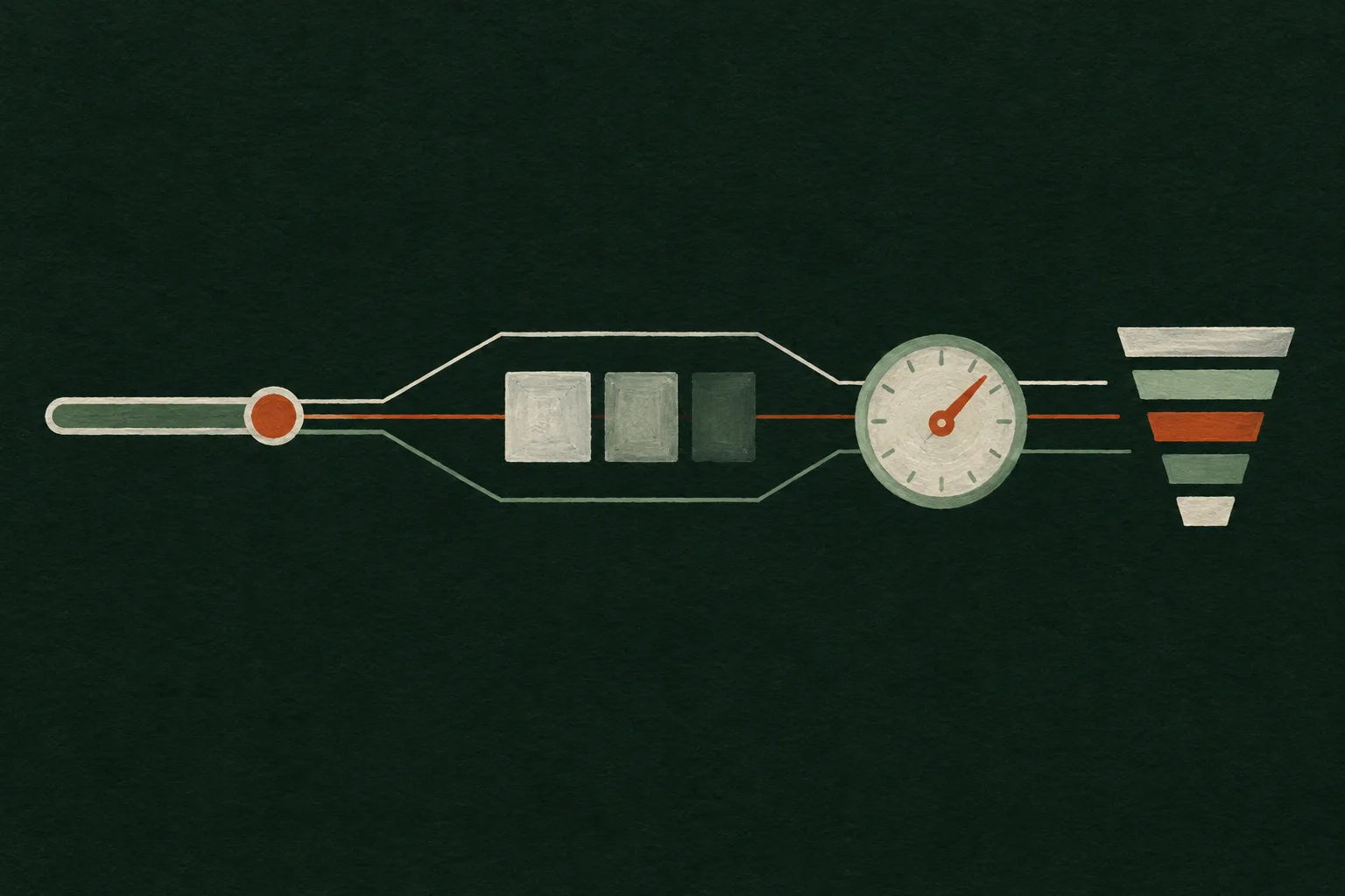
Gouache diagram on a dark spruce ground: one slider knob wired by painted lines to a fading square, a turned dial, and a stack of bars narrowing in width.
DriverOne measured width, divided by 1px Output 1Opacity, a plain number Output 2Angle, the ratio times deg Output 3Font width, the ratio times %

Today's art direction

The Rig Reel

A motion studio's portfolio where one measured width drives everything else on the page.

Motion designers build rigs: one control wired to many properties, so a single slider moves a whole character. This page borrows that for a studio site. The headline's width axis follows the viewport, sections open on a scrubber with a timecode and a playhead, and the reel index sizes each clip by its running time.

The ground is a spruce contour field, set in Archivo stretched wide against Hanken Grotesk held at normal width, with rust kept for the playhead and the controls.

  • Rig
  • Driver value
  • Scrubber
  • Timecode
  • Reel index
  • Width axis
  • Contour field

Firefox 158 lets calc() divide a unit by a unit

Firefox 158 reached the release channel on October 13, and its release notes list typed arithmetic in CSS calc(), "allowing units to be multiplied and divided within math functions." Until now the spec only let you divide a length by a plain number, so 1000px / 2 worked and 1000px / 2px did not.

With the restriction relaxed, a length divided by a length cancels its units. The MDN guide uses calc(100vw / 1px), which returns the unitless 1000 in a 1000px viewport and 500 in a 500px one. Divide by 1em instead and the same viewport gives 62.5 at the default 16px.

That number is the useful part. Store it once in a custom property and opacity, rotation, and a variable font's width axis can all read from the same measurement, so they move together as a container grows or shrinks.

One width goes in, and CSS can now hand back a ratio it reuses everywhere.

The same release stops rounding scroll positions

Further down the same notes, Firefox no longer rounds scroll positions to whole screen pixels, which Mozilla says makes scrolling smoother and more precise on high-resolution displays and zoomed pages. Scroll-linked effects that read a position should land on fractional values now, so check any that assumed integers.

Webflow's MCP server can now read how a page performs

A Webflow post from October 15 says its MCP server now reads three data sources: Analyze for site and page traffic, goal completions, and filtered queries; Optimize for experiment results, including the winning variation; and AEO Analytics for AI crawler requests per page and how answer engines responded to tracked prompts.

It is read access for now. Webflow says creating and editing Optimize experiments through agents is still in development, and access follows existing Analyze, Optimize, or AEO permissions at no extra cost. It extends the MCP work issue 136 covered, when the same server learned to build GSAP interactions.

Measure once, then multiply back into any unit

The pattern has two steps. Divide a measured length by a reference length to get a ratio, then multiply the ratio by a unit to turn it into an angle, a percentage, or a different length. Container query units make the measurement local, so a card can scale its own details without knowing the page.

/* the card is the container that gets measured */
.card { container-type: inline-size; }

/* 0 at nothing, 1 at 640px wide */
.card .badge {
  opacity: clamp(.15, calc(100cqi / 640px), 1);
  rotate: calc(100cqi / 1px * .5deg);
  font-stretch: clamp(62%, calc(100cqi / 520px * 125%), 125%);
}

/* keep a sane value where division is not supported */
@supports not (opacity: calc(2px / 1px)) {
  .card .badge { opacity: .6; rotate: 0deg; font-stretch: 100%; }
}

Wrap the ratio in clamp() every time. A divided measurement has no ceiling, and a badge that hits opacity 3 or a 900 degree spin at a wide breakpoint is the bug you will see first.

A studio slips the page between two canvases

OFF+BRAND's write-up of the Dialed site, published October 15 on Webflow's blog, walks through a homepage carousel where each flavour changes the interface colours, typography, and graphics around a floating 3D can.

The move worth taking is the layering. One WebGL renderer draws the scene, and the second frame goes to a second canvas through drawImage(), so ordinary DOM elements can sit between the two. Three depth layers and a dual Kawase blur give the flying paper its depth of field.

For a portfolio, that means the type and buttons stay real, selectable HTML while the motion runs above and below them.

Gouache diagram of three floating panes: blurred shapes at the back, a cream paper can silhouette in the middle, clear glass with bright flecks in front.
Back canvas, DOM in the middle, front canvas.

Borrow this pattern: one driver, many outputs

Pick one measurement per component, turn it into a ratio, and let every responsive detail read from that ratio instead of from its own breakpoints. Use it on portfolio cards, pricing tiles, and hero type, anywhere several properties should change together.

Driver
The container's inline size divided by a reference width
Outputs
Opacity, rotation, font width, gap, all multiplied from one ratio
Honesty
clamp() every output, and ship an @supports fallback that still reads well
Ratio

This browser does not divide units yet, so the outputs hold their fallback values.

Render this studio page

Archetype
Motion studio portfolio
Palette
Spruce, bone, rust, sage
Type
Archivo wide, Hanken Grotesk
Build a portfolio landing page for a small motion design studio. Treat it as a rig: one measured value drives many properties, and the layout shows that idea.

Structure:
- Top nav: studio name set in Archivo at font-stretch 125%, then Work, Studio, Contact.
- Masthead as one inline byline sentence (studio name, city, what they make). No boxed meta cells.
- Hero: a very wide Archivo headline (weight 850, about 15ch) on a dark spruce field with faint topographic contour lines in sage at about 15% opacity. Make the headline a container-query child and set font-stretch: clamp(75%, calc(100cqi / 1180px * 125%), 125%) so it widens with its container. Below it, a 7/5 row: a 22px deck left, a rust primary button and a sage outline button right.
- A full-width 16:9 hand-painted diagram (gouache style, no text in the image) with an HTML caption row naming the driver and three outputs.
- A reel index: a horizontal row of anchor links to each section, each showing a mono timecode and a title, with flex-grow set by the section's length so the row reads like clips on a timeline.
- Case study sections in a 760px column. Open each with a scrubber bar: mono timecode left, a 2px track whose filled part and 3px rust playhead sit at that section's position on the page, and an uppercase label right. Then a wide Archivo h2, body text, and a facts list in a two-column label/value grid.
- A design-move panel with a live demo: a range input sets the width of a resizable frame (container-type: inline-size); inside, a square's opacity, a dial's rotation, and a word's font-stretch all come from calc(100cqi / Npx), each wrapped in clamp(), with an @supports not (opacity: calc(2px / 1px)) fallback.
- Contact block, footer.

Palette: ground #0F1F1A, panels #16302A, text #EAE5D8, secondary text #C9C6B8, rust #D2582A for buttons and playheads (#E57B4E for small rust text), sage #8FA89B for labels and contours, pale rust #EDB896 for italics.
Type: Archivo (variable width axis, 600 to 900) for display, Hanken Grotesk 400/600 and its italic for body, JetBrains Mono 500 for timecodes and labels.

Guardrails: body at least 18px with line-height 1.65 or more and 60 to 75 character lines; WCAG AA contrast for every small label against its real background; no neon, glow, cyan on black, or purple-blue gradients; no gradient text; radius 6 to 14px, never pills on cards; one restrained motion (the playhead) with hover and focus states at 150ms and a prefers-reduced-motion guard; no fake controls, every control works; no readable text inside images.

Works in Claude Code, Beaver Builder AI, Webflow, Framer, Lovable, and v0.

Field note

Responsive design has mostly meant picking a breakpoint and swapping values. A ratio a stylesheet can compute on its own lets the page move continuously instead, the way an animator's rig does.

Sources

  1. Firefox 158.0 release notesMozilla, October 13, 2026
  2. Using CSS typed arithmeticMDN Web Docs
  3. Webflow MCP server reads Analyze, Optimize, and AEO AnalyticsWebflow, October 15, 2026
  4. Behind the can: Designing and building DialedOFF+BRAND on the Webflow blog, October 15, 2026