Cloudflare's x402 gateway turns payment into part of the request, while Vercel and GolemUI keep turning agent work into reviewable web surfaces. The page pattern is a box office: show the pass, the price, the gate, and the human stamp.
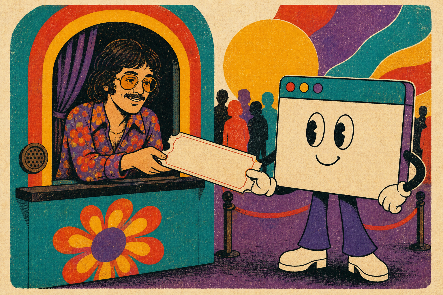
Ticket booth handoff, no readable text
Box Office
Concert Ticket Box Office
A saturated ticket-booth issue with stacked stubs, perforated review cards, cartoon handoff imagery, and model-name gig billing.
Old concert tickets make access physical: a venue, a date, a price, a torn edge, and a stamp at the door. That maps cleanly to agentic web work because payments, approvals, and generated forms all need visible state. The transferable pattern is the perforated review stub: a compact component where source, permission, and action are readable before anything passes through the gate.
Cloudflare announced a Monetization Gateway that can charge for any resource behind Cloudflare through the x402 protocol. The pitch is direct for agentic browsing: an agent can hit a protected route, receive a payment requirement, pay, and continue without a custom checkout flow on every site.
For designers, the shift is a new kind of state to expose. Access, price, machine request, and human policy need a visible component, not a buried error page.
Vercel expanded Vercel Agent into public beta with chat, production investigations, and approved actions. The Ship recap describes an agent that monitors deployments, investigates alerts and anomalies, then opens fixes in pull requests for review.
The important interface pattern is permission in batches. Vercel frames approvals around a plan and scoped permissions, which gives teams a clearer review surface than a stream of one-off yes buttons.
GolemUI presents itself as a declarative form engine for React, Angular, Lit, Vue, and vanilla JavaScript, with schema serialization and accessibility built into the pitch. Its homepage also points agents to machine-readable docs for the programmatic GUI API.
That detail matters for agent-built sites: forms are where generated UI usually breaks trust. A form system that documents how agents should compose fields, validation, and branches gives the model fewer chances to invent a brittle pattern.
A good agent surface should feel like a ticket window: the route is visible, the fare is named, and the stamp waits in the open.
Prompt Lab
Design a single editorial web page as a 1970s concert ticket box office for agentic web design news. The visual lesson is how to turn checkout, permission, and review states into playful but legible ticket components.

Palette: deep plum stage wall (#2F1F40) as the page ground, aged ticket ivory (#FFF4CD) for reading surfaces, saturated teal (#1B9A91), tomato red (#DA4636), sunflower yellow (#F1B737), and dusty purple accents. Avoid beige minimalism, generic dashboards, purple-blue gradients, glass, glow, stock people, and fake readable text inside images.

Type: use a hand-painted or carnival display face such as Barrio for the hero and box-office labels; Atkinson Hyperlegible or a similarly readable sans for 19px body text at 1.68 line-height; Libre Baskerville Italic for one editorial note; and Roboto Mono for ticket numbers, source stamps, and the prompt block.

Layout: above the fold is a ticket booth, not a split SaaS hero. Use a dark stage background, one large irregular headline, a stack of overlapping vintage ticket stubs for the issue metadata, and a large bitmap illustration of a human box-office clerk handing an oversized blank ticket to a browser-shaped agent. Below, make Today's Art Direction a wide perforated stub. Run Tooling, Workflow, and Technique as stacked concert tickets with torn edges, source stamps, and one short caption each. Do not use a wide left margin with giant numbered section markers.

Imagery: create one integral bitmap in the first viewport. It should feel hand-inked and cartoony: a ticket booth, a human handoff, a friendly computer or browser agent, stacked old concert tickets, abstract band-name bars, admission stamps, and payment tokens. No readable text, logos, or watermarks. It must still compose well in a 1200x630 crop and a 600x800 cover crop.

Components and guardrails: box-office nav, metadata ticket stack, perforated stubs, source stamps, gig-bill labels, a real copy button, numbered source ledger, visible focus and hover states, and a prefers-reduced-motion guard. No dot-chip legends, fake toggles, fake search boxes, emoji, pill-shaped everything, accent left-border stripes, 3D blobs, or identical feature cards.
Works in: Beaver Builder AI, v0, Lovable, Cursor, Figma Make.
Field note
The agentic web is gaining counters and ledgers. That is good news for interface design: every hidden protocol still needs a clear page state when money, permission, or review enters the flow.