Lovable edits images in the Files tab
Lovable's October 12 changelog adds image editing to the Files tab. You can draw strokes over an image, pin comments to spots on it, erase areas, and remove the background.
The part worth noticing is the save. An edited image is written out as a new file, and the original stays where it was. For a builder whose assets get swapped by prompt all day, that gives you a fallback with no version history to dig through.
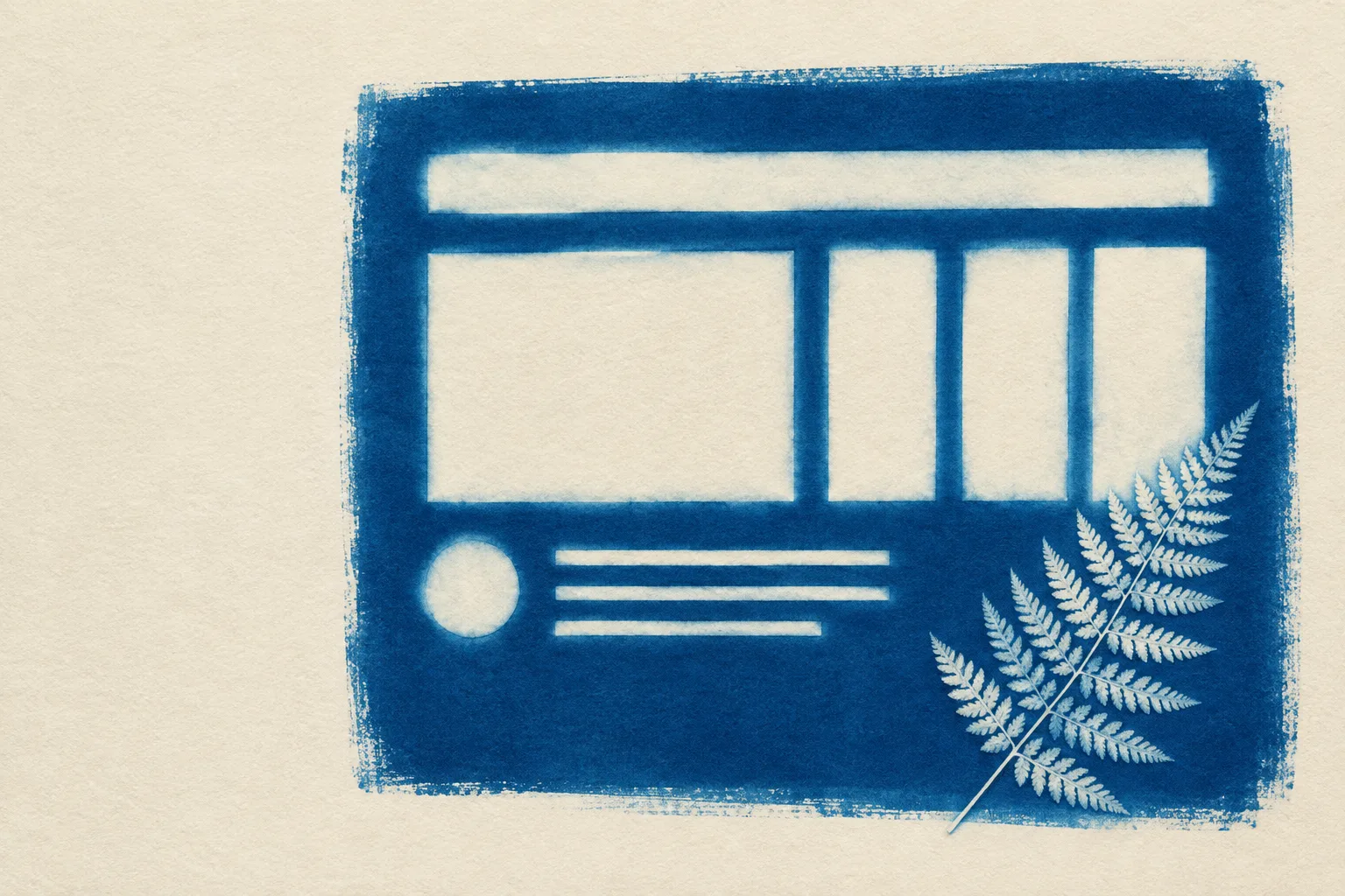
It follows yesterday's change, where Lovable removed the design picker before the first build and started reading the art direction from the prompt. Both changes keep you in the builder for small design calls that used to mean a trip out to another app.
Light asset fixes no longer need a round trip to another editor.
A model that reads the brand PDF too
Vercel added Gemini 4 Argon to AI Gateway on October 13. It takes text, images, PDFs, and video in one request, holds a 1M-token context, and supports tool calling.
For a build pipeline, that means a brand guideline PDF and a stack of reference screenshots can go into the same call as the instructions, instead of being summarized first.
- Model id
- google/gemini-4-argon on AI Gateway
- Input
- Text, image, PDF, and video
- Context
- 1M tokens
- Thinking
- Low, medium, or high, set with reasoning or reasoning_effort
- Pricing
- No gateway markup, including with your own key
Feedback lands on the pixel it means
Pinned comments change the shape of an image review. A note like "the fern crowds the third card" is vague in a chat thread and exact when it sits on the fern.
Try it on the next client round. Pin every note to the image, number the pins, and keep one list beside the image that reads in the same order. The client can scan the list, you can work down it, and nothing gets lost between the screenshot and the message.
Draw on a layer, never on the file
Put annotations in an SVG layer over the image, in the image's own coordinate space, and make every pin a real link. The image file never changes, the marks scale with it at every width, and the pins work as navigation for keyboards and screen readers.
Use it for case studies, feature tours, and design reviews. What keeps it honest: every pin needs a matching item in a visible list, so the marks never carry meaning on their own.
.board { position: relative; aspect-ratio: 3 / 2; }
.board svg { position: absolute; inset: 0; }   /* viewBox = image px */
.pin { position: absolute; left: 62%; top: 16%; }
Rebuild this page from one prompt
Build a SaaS feature launch page for an image editing tool, laid out as the editor itself.

Ground: flat dark graphite (#141A1C) with a faint fractal noise texture at about 7 percent opacity, like a darkroom wall. Panels #1A2329 with 1px #33403F borders, 14px radius on the editor shell, 12px on cards, 6px on small labels. One accent, a marker yellow (#E8D84E) with near-black text on it, reserved for marks and pins a reviewer added. Prussian blue (#2C5C9E) from the print carries interface state: the active tool and the active file tab. Text is bone #ECEDE6, secondary text #A3B0AD, italics in a pale yellow #DCD3A0. No neon glow, no gradients, no purple.

Type: Sofia Sans Extra Condensed 800 uppercase for the hero and section titles; Alegreya Sans for body at 20px with line-height 1.7 and 60 to 72 character lines; IBM Plex Mono 500 for labels, tabs, and code only.

Above the fold: a small top nav. Then a two-column head: an issue nameplate label and a 17ch condensed headline on the left with one word underlined by a hand-drawn yellow marker stroke (an inline SVG background, same yellow as the canvas marks); a deck and a plain byline sentence on the right. Under it, a full-width editor shell: a file tab bar across the top that is a real two-option radio toggle (the edited copy, checked by default, and the untouched original; choosing the original hides the marks and pins with :has(), no script), a 76px left tool rail of icon-plus-label links (Draw, Pin, Erase, Cut out, Save as) that are anchor links to the page sections, a center canvas holding one 3:2 image, and a 300px right pin thread listing numbered comments that also link to the sections.

The canvas: put an absolutely positioned SVG over the image with viewBox set to the image's pixel size, and draw yellow marker strokes in it (a loose loop, an underline, an arrow, a dashed selection marquee). Strokes draw in once on load, guarded by prefers-reduced-motion. Numbered teardrop pins sit over the image as real links with aria-labels.

Below: an art direction block (title, italic one-liner, paragraph, mono vocabulary labels). Then sections in one 720px column, each opened by a small numbered yellow pin and a mono label above a condensed h2. Components: a Files list card with thumbnail rows and state labels (Original kept, New file); a dt/dd facts list; a single italic pullquote under a 2px yellow rule; a design move with a cropped figure beside prose and a short CSS snippet; the prompt in a panel with a copy button. End with numbered sources and previous and next links.

Mobile at 390px: the tool rail becomes a horizontal strip above the canvas, the pin thread drops below it, every two-column split stacks.

Guardrails: body never under 18px, WCAG AA contrast for every label on its real surface, no fake readable text inside the image, hover and focus states on every link and button at about 150ms, radius used with purpose instead of pills everywhere.
Save as new
The safest edit is one that leaves the source alone. Lovable put that rule in its image editor this week, and it is a good one to build into your own tools.
Sources
- Lovable changelog: Edit images directly in the Files tabLovable, October 12, 2026
- Gemini 4 Argon now available on AI GatewayVercel, October 13, 2026
- Issue 153: Lovable removes its design pickerArt Direction Daily, October 12, 2026