
The Layered Listing
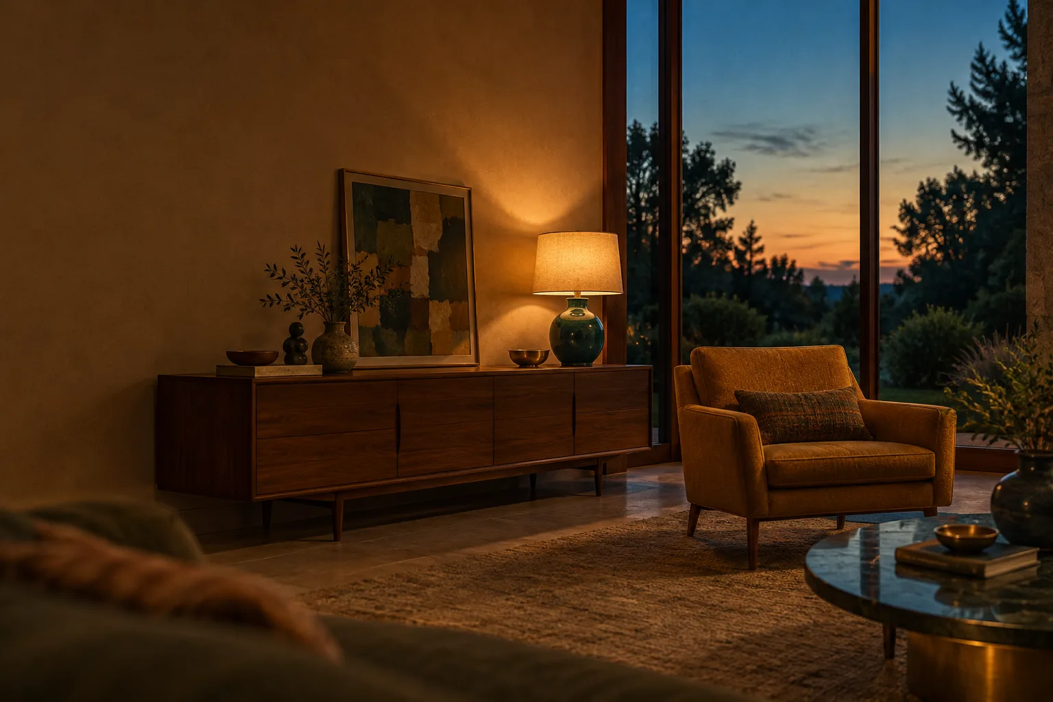
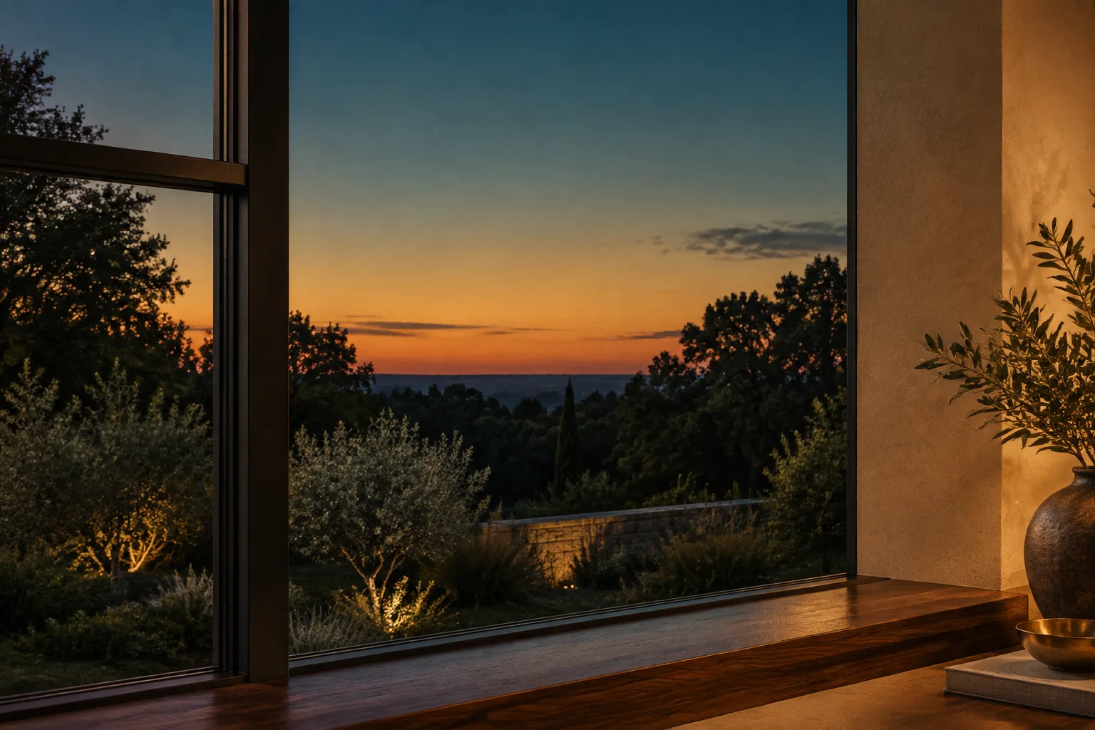
A dusk property listing in umber, brass and teal, where the lead photo carries its own layers panel.
This is a real estate listing page, the kind a freelancer builds for an agency or a developer: a breadcrumb rail, a title beside its key facts, a photo mosaic, then numbered tabs down the page. The gallery is the move. Its lead photo has a working layers panel, so every light and grade over the original can be switched off, the way a layered retouch should behave. Bodoni Moda carries the titles with the hush of a property brochure, and Hanken Grotesk does the reading.
Features
- Photo mosaic
- Layers panel
- Key facts strip
- Breadcrumb rail
- Numbered tabs
- Adjustment layer
- Locked base
- Diamond lattice
Editmamei changelog, 11 November 2026
Editmamei adds a relight that keeps the original underneath
Editmamei is a desktop MCP server that lets Claude, or any other MCP client, work inside Photoshop or GIMP with the apps' own tools. Its 1.10.0 release adds a relight command that places up to three lights with the Relight panel's own sliders and renders them as a new layer above the photo.
The original pixels stay where they were. If the client likes the lamp but not the window glow, you hide one layer instead of asking for a new picture, and the retouch stays as editable as one you made by hand.
A flattened retouch asks for trust. A layered one can be checked.
The cost is spelled out. Relight needs Photoshop 2027 (version 28.0 or later), signed in and online, and each render spends Adobe Firefly generative credits, 30 a render in Photoshop 28.0. The client asks before every render, and a new setting that allows those credits is on by default, so check it before you hand an agent a client's account.
One more setting worth a look: since 1.9.7 on 9 November, new installs send daily counts of which features and options were used, with no paths, layer names or text. It can be switched off in the config.
Klad on GitHub, active this week
Klad keeps a painting as strokes you can point to
Klad is a 2D paint and animation app with no image model inside. An agent paints from the command line with a named brush along a path, reads the strokes back as JSON, and changes a single mark by its address, so a revision touches one stroke instead of repainting the frame.
It is the same principle as the relight above, and as the strokes Figma's agent began drawing last week: keep the agent's output in the medium's own editable units.
- Kind
- 2D paint and animation app
- Driven by
- Command line, so any agent with a shell
- Edits by
- Stroke address, one mark at a time
- Reads back
- Strokes as JSON
- Saves as
- Folders of plain files with stroke data
- Image model
- None
Google's A2UI reaches 1.0, so the agent draws with your components
What shipped today
A2UI 1.0 is a stable protocol for an agent to describe a view that each app then renders with its own native components. Version 1.0 adds two-way function calls and accessibility support.
What it changes for a design system
The agent describes the view, and your renderer decides what it looks like. That puts the component library and its tokens back in charge of generated interfaces, instead of a sandboxed block of HTML styled by the model.
If your team keeps a component library, the work is a mapping: which A2UI parts resolve to which of your components, and what the agent may not draw at all.
| Renderer | Runs on | Version |
|---|---|---|
| React | Web | 1.0 |
| Angular | Web | 1.0 |
| Lit | Web | 1.0 |
| Flutter | Mobile, web, desktop | 1.0 |
| SwiftUI | iOS | 1.0 |
| Jetpack Compose | Android | 0.9.1 |
Show the retouch as layers a visitor can switch off
Put each adjustment over the original photo as its own named layer, and give each one a switch. A listing hero, a product shot or a portfolio case gains the same thing: the viewer sees exactly what the edit did and can take any part of it away.
- The base is the untouched photo, and it is labelled locked.
- One layer, one job, named for where it comes from in the room: lamp light, window fill, grade.
- Layers adjust what is in the frame. They never add a view, a room or furniture that is not there; in a property listing that is where buyers stop trusting the photos.
- Checkboxes and :has() are enough. No script, and it still works with keyboard and screen reader.
/* one layer per adjustment, over a locked base */
.photo .lyr { position:absolute; inset:0; pointer-events:none; transition:opacity .18s ease; }
.l-lamp { mix-blend-mode:screen;
  background:radial-gradient(circle at 55% 38%, rgb(255 206 140 / .5), transparent 36%); }

/* the switch hides its own layer */
.photo:has(#ly-lamp:not(:checked)) .l-lamp { opacity:0; }

@media (prefers-reduced-motion:reduce){ .lyr { transition:none; } }
Build this listing page with your own tool
Works in Claude, v0, Lovable, Framer AI and Beaver Builder AI.
Build a single-property real estate listing landing page with a layered photo gallery. Art direction: The Layered Listing, a dusk property brochure in deep umber, brass and teal.

Page structure, top to bottom:
1. Slim top bar on the ground: wordmark left, three text links right.
2. Breadcrumb rail as the masthead: a slightly lighter band holding breadcrumbs (Home, area, property type, listing number) separated by a brass chevron, and on the right two labelled pairs, Listed (date) and Read or Viewings (value). No boxed meta cells.
3. Title block: a full-width high-contrast serif headline on two lines, its last phrase in brass italic kept on one line. Below it, a one-sentence deck on the left beside a 620px key facts strip on the right: four facts in one row between hairline brass rules (label in small mono caps, value in the display serif), then a solid teal button and a text link. On mobile the order becomes headline, deck, photos, then facts.
4. Photo mosaic: one large 3:2 photo on the left spanning two rows, two detail photos stacked on the right, 10px gaps, 4px radius, a small "Photo 1 of 3" caption chip on each. Over the lead photo, a floating layers panel in the upper left, over empty wall (262px, dark translucent panel, 8px radius, one tight shadow): a header "Layers" with a count, then four real checkbox rows (Lamp light, Window fill, Dusk grade, Vignette) each with a square check and a small tag (relight or adjust), and a last row "Original photo, locked" with a dashed check. Each checkbox hides its own overlay layer via :has(). Overlays are CSS only: a screen-blend radial glow at the lamp, a screen-blend linear glow from the window side, a soft-light amber fill, a radial vignette.
5. A sticky numbered tab rail: 01 Overview, 02 The listing, 03 Details, 04 Nearby, 05 Floor plan, 06 Brochure, 07 Notes. Number in brass mono, label in body face, a 3px teal underline on the active tab set by IntersectionObserver.
6. Sections opened by a brass tab chip (number in a 6px top-rounded tab) and a mono label. The overview pairs a reading column with a two-column ticked features list. The main listing sits on a limestone card with a 300px aside of a portrait detail photo and a ruled facts list. Details and Nearby sit directly on the ground: Details pairs its reading column with a ruled spec list, Nearby pairs prose with a ruled table. The floor plan card holds an intro, then numbered rules beside a line-drawn SVG plan of the photographed room marking where each light layer comes from, then a full-width dark code block. Close with a two-column notes block (one large serif line beside a ruled sources list) under a 2px brass rule, three bordered pager tiles and a colophon.

Palette: ground #2A2213 (dark warm umber) with a 36px diamond lattice of brass hairlines at 9 percent opacity; band #33291A; text #EFE6D2; soft text #C9B994; limestone card #EFE7D6 with ink #1F1A10; brass #C8A45C for labels and rules; teal #1F6F68 for buttons with white text; light teal #8CC7BC only for the active tab and checked boxes.
Type: Bodoni Moda for headline, section titles, facts values and one italic pullquote; Hanken Grotesk for body and UI; DM Mono for labels, breadcrumbs, tabs and code.
Photography: one commission, blue-hour interior real estate photographs in umber, ochre, brass and muted teal, film grain, no people, no legible text.

Guardrails: body text at least 18px with line height at least 1.6 and lines of 60 to 75 characters; all small labels at WCAG AA against the surface they sit on; hover and focus states of 120 to 180ms on every link, button and checkbox; a prefers-reduced-motion guard; no fake UI that does nothing, every switch must work; layers only adjust what is in the photo and never add objects; no neon, no glow on text, no purple-blue gradients, no gradient text, no pill-shaped everything, no accent left-border stripes. On mobile the mosaic becomes one large photo over two detail tiles, the layers panel moves under the photos as a full-width list, and every two-column block stacks.
Field note
When an agent edits a client's photo, ask for the layers along with the picture. A retouch you can take apart is one you can defend.
Sources
- Editmamei changelog: 1.10.0 relight, 1.9.7 telemetrygithub.com, 11 November 2026
- Editmamei repository and READMEgithub.com
- A2UI 1.0: build fast, reliable agentic experiencesGoogle for Developers blog, 11 November 2026
- Klad repository and READMEgithub.com, November 2026
- Figma's agent now draws in strokesArt Direction Daily, issue 176