- Issue
- NO. 189
- Date
- Read
- 5 min
Design write-up, 17 Nov
The in-app assistant that gives up its corner to a toast
Frigade's assistant rises over a stack of toasts, slides ahead of a drawer and holds still for a dimming dialog. Developers write no selectors to get it.
Today's art direction
The Front Desk
A boutique hotel landing page that hands you the key first.
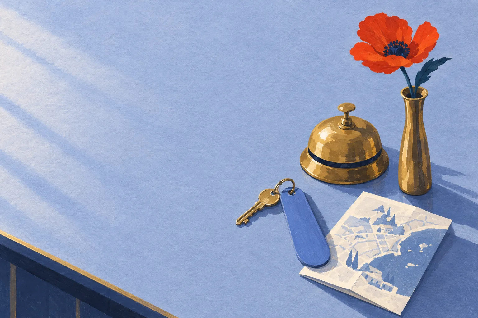
A hotel page built the way a good small hotel runs: the masthead hangs like a room key, the hero image sits in an arched window, and each section starts at a lit floor plate, the way a lift panel tells you where you are. A directory board under the hero does the work of a table of contents.
The ground is periwinkle with a paired wallpaper pinstripe. Bodoni Moda carries the display at hotel-sign contrast against Instrument Sans for reading, with DM Mono for room numbers and labels.
- Lobby periwinkle
#9DAEF2 - Linen white
#F5F6FC - Night porter navy
#141B3D - Bellhop vermilion
#C2341F - Lift brass
#F0B44A
The lead: an assistant with manners
Frigade wrote down where its assistant should stand
Frigade's in-app AI assistant docks in a corner of the host product, which is also where toast messages and side drawers like to appear. In a design write-up published 17 November, engineer Elton Lai-Rego sets out the placement rules the team settled on.
When a toast lands, the assistant rises above it, and a stack of three toasts counts as one move rather than three. When a drawer slides in from the right, the assistant slides left ahead of it. A small dialog gets cleared the same way a toast does.
A dimming dialog already says where the attention belongs, so the assistant stays exactly where it is.
The exceptions are the interesting part. Full-page dialogs that dim the screen get no move at all. During a guided tour the tour decides where the assistant sits, so it stops dodging toasts until the guide is done. A visitor can drag it anywhere, and once dragged it stays put; if no clear spot exists, it holds still rather than hunting for one.
Frigade says the assistant works from what is rendered on the page, and that host teams list no selectors and fire no events to get this behaviour. The team checked final placement with browser tests.
- Source
- Frigade blog, design write-up
- Published
- 17 November 2026
- Author
- Elton Lai-Rego, senior engineer
- Setup
- None for the host product
- On mobile
- Sits above the bottom navigation bar
- Home
- Returns to its corner when the obstruction closes
| Layer that appears | Assistant does | Why |
|---|---|---|
| A toast | rises above it | The toast is brief and needs the corner. |
| Three stacked toasts | rises once, over the stack | One motion reads calmer than three. |
| A drawer from the right | slides left ahead of it | The drawer is where the work moved. |
| A small dialog | clears it like a toast | It covers part of the page, not all of it. |
| A full-page dimming dialog | stays | The dim already holds the attention. |
| A guided tour | defers to the guide | The tour owns placement until it ends. |
Rooms: tooling, technique, workflow
-
301Tooling
Figma's image tools now return two, four or six options
In Figma's Make image and Edit image, the model picker can ask one model for two, four or six results, and a plus button adds other models for one image each. Place all on canvas lays the options out side by side, so picking an image becomes a comparison on the board.
- Shipped
- 18 November, release notes
- Plans
- All plans; edit access needed
- Starter
- Image tools in Figma Design only
-
302Technique
A ten-step accessible scale grown from one brand colour
A method post from taisho.design builds an OKLCH scale from 100 to 1000 where each step aims at a fixed contrast ratio on white, from 1.08 up to 19. The brand colour keeps its own step untouched, the other steps are solved for lightness with the hue held, and dark mode gets its own targets.
- Published
- 20 November 2026
- Space
- OKLCH, hue held fixed
- Bonus
- Each step picks its own text colour
-
303Workflow
Lovable keeps building while your answers wait
Lovable now asks its questions as cards above the chat input, one card per question, each with options and a marked Lovable's pick. Per its chat docs, it builds whatever does not depend on the answer and reworks it if you choose differently. It still stops for steps that are hard to undo, such as deleting data, spending money or contacting people.
- Changelog
- 19 November 2026
- Still pauses
- No pick offered, or Plan mode
- For designers
- Review mid-build, not after
House rule: the docked button yields
Borrow this pattern
Hotel and booking sites dock a Book button in the bottom corner, then a cookie notice or a chat widget lands on top of it. Give the docked button a home and a short list of layers it steps aside for, and drive the move from the page state with :has() rather than from each widget.
- Write the yield list down: toasts and drawers move it; a full-page dialog does not.
- Move it the shortest distance, once, even for a stack.
- Send it home when the layer closes, unless the visitor moved it.
- Keep the motion under 200ms and drop it for reduced motion.
.page:has(.toast[open]) .book { --dy: -66px; }
.page:has(.drawer[open]) .book {
  right: calc(var(--drawer-w) + 16px);
}
.book {
  translate: 0 var(--dy, 0);
  transition: translate .18s ease, right .18s ease;
}
Try it on a booking page
Both layers on at once: the button clears the drawer and rises over the toast in the same move.
Prompt Lab
Reservation 189Builds a boutique hotel landing page with a room key masthead, an arched hero plate and floor-plate sections. Paste it into Claude, Lovable, v0, Figma Make or Beaver Builder AI.
Build a landing page for a small boutique hotel. It should feel like the hotel's own printed brochure translated into a real booking page, not a template.

Layout:
1. Top bar: hotel name left in the display face, three plain text links right (Rooms, Dining, Contact).
2. Hero as three columns on desktop (about 132px, flexible, 400px):
   - Left: a hanging room key tag as the masthead. A thin brass line drops from the top of the hero to a dark navy (#141B3D) tag 132px wide with radius 14px at the top and 60px at the bottom, a punched round hole ringed in brass (#F0B44A), a large brass room number in the display face, and three small labelled rows in monospace (Check-in, Check-out, Guests or similar). Use a dl, not a table.
   - Middle: a small solid navy kicker label, a large display headline (about 76px, line-height 1, max 13ch) with one italic word in deep vermilion, a two-sentence deck, then a filled vermilion (#C2341F) Book button with white text and a plain text link.
   - Right: the hero image inside an arched frame: border-radius 200px 200px 14px 14px, a 6px white border, and one flat navy offset (a hard 10px shadow, no blur). Caption it in monospace underneath.
3. Under the hero, a dark navy directory board, like the floor list beside a lift: a small uppercase label, then six real anchor links in a row, each with a large brass numeral and a section name.
4. Every section opens on a floor plate: a 64px navy square with a brass display numeral, then a small monospace "Floor N" label above a display h2. The numbers match the directory.
5. Rooms section: one white card holding room listing rows, not three identical cards. Each row has three columns: a large vermilion room number with a monospace room type under it, the room name and two sentences in the middle, and a ruled list of facts on the right (Sleeps, View, From).
6. Include one real policy table on a white card (columns: Situation, What we do, Why) with a small solid label in each middle cell.
7. A house rules section: a navy card with prose and a numbered list in brass markers beside a white card with a live demo, where two real checkboxes ("Show a notice", "Open the menu drawer") move a docked Book button out of the way using :has() and CSS custom properties.
8. A reservation card for the enquiry form: 2px navy border, a header row with a label and a vermilion button, real labelled inputs below.
9. Close with a two-column row of a short note from the front desk and contact details under a 2px navy rule.

Ground: vivid periwinkle (#9DAEF2) with a wallpaper pinstripe: pairs of 1px navy lines at about 7 percent opacity, 5px apart, repeating every 30px, as a repeating-linear-gradient. No gradients between colours, no glow.
Type: Bodoni Moda (500, 700, italic 500) for display; Instrument Sans (400, 600) for body; DM Mono (400, 500) for room numbers, labels and the policy column.
Palette: periwinkle #9DAEF2, linen white #F5F6FC for every reading surface, navy #141B3D for text and dark panels, vermilion #C2341F for buttons and room numbers only, brass #F0B44A only on navy.

Images: gouache illustrations with flat opaque brushwork and paper tooth, in periwinkle, navy, vermilion, brass and off-white. Hotel objects (a service bell, keys on long tags, a folded map), no people, no readable text in the images.

Guardrails: body text at least 18px with line-height 1.65 or more; reading columns about 680px; long prose sits on linen white, never directly on periwinkle; every small label meets WCAG AA on its real background; brass is never used as text on white or periwinkle. Radius 14px for cards, 8px for buttons and labels, no pill shapes, no accent stripe borders, one hard offset shadow on the page and no soft glows. Hover and focus states on every link, button and checkbox at about 150ms, with a prefers-reduced-motion guard. On mobile the key tag turns sideways into a horizontal tag above the headline, the arched image goes under the copy at full width, the directory becomes two columns, room rows stack, and the policy table becomes labelled stacked rows.
From the front desk
Anything docked in a corner shares that corner with whatever the product throws up next. Decide what it steps aside for before a second widget arrives and decides for you.