Safari can now repaint your light site dark, unless you say no
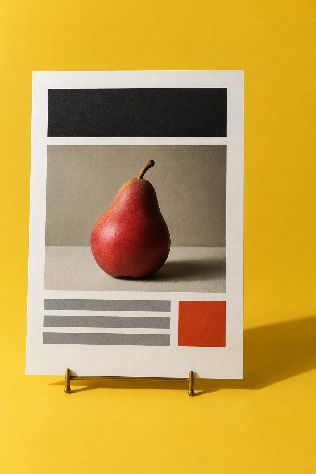
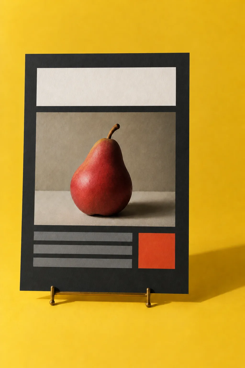
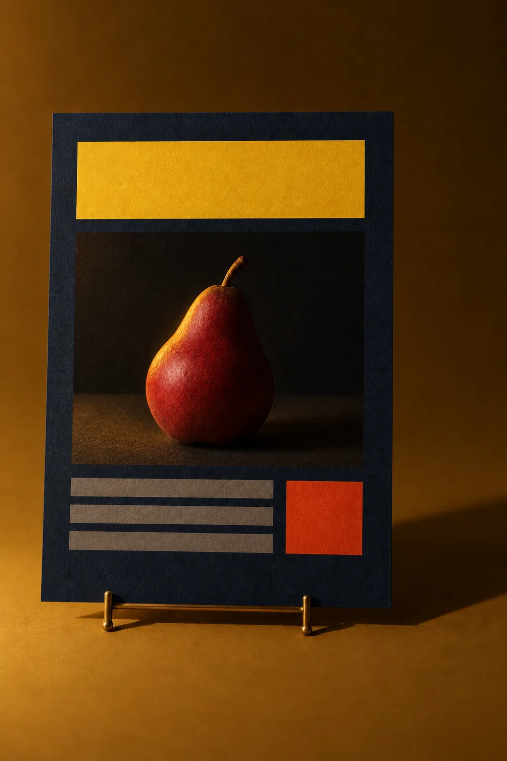
Safari 27.3 beta adds Adaptive Dark Mode, an opt-in setting for readers that recolors light websites on the fly. Sites that declare their own dark support are left alone, so the choice now sits in one line of your page's head.
- Today's Art Direction
- Studio portfolio
The Thumb Index Portfolio
A photographer's bound book on cadmium yellow, with one proof shot three ways.
A thumb index is the stepped row of tabs cut into the fore edge of a dictionary or a bound portfolio, so a hand can find a section without reading a contents page. On the web it becomes sticky section navigation that sits outside the content sheet, with the active tab taking the sheet's color and merging into it. Studio portfolios suit it because a visitor jumps between jobs far more often than they read in order.
- Tooling
- WebKit
- Shipped
- November 3
- Status
- Safari 27.3 beta
What the browser inverts, and what it leaves alone
When a reader turns on Adaptive Dark Mode, Safari estimates whether a page is mostly light and, if it is, inverts the luminosity of its colors while keeping their hue. Text is aimed at a 4.5:1 contrast ratio. The setting has to be enabled by the reader, with the system appearance set to dark, and pages that already declare dark support are never touched.
Your site cannot see it happen. Safari blocks detection for privacy, and JavaScript reading a CSS color still gets the authored value, so a screenshot from a beta device is the only honest proof of what a client's page becomes.
For readers who turn it on, every undeclared site gains a second art director.
| Element | Treatment | Worth knowing |
|---|---|---|
| Backgrounds and text | Inverted | Light surfaces go dark, dark text goes light, hue held. |
| CSS gradients | Inverted | Light gradients are transformed to dark. |
| SVG icons and logos | Inspected | Colors change only when contrast needs it. |
| Bitmap logos | Inspected | Simple black-and-white marks can invert, judged from the pixel histogram. |
| Most images | Left alone | A white background baked into a photo stays white. |
| Canvas | Left alone | Left as drawn, since canvas content is hard to predict. |
| Masks, mix-blend-mode | Sometimes switched off | Effects on a transformed element can disappear. |
- Technique
- color-scheme
- Works
- Widely available today
Three declarations settle who gets the dark state
Declare in the head rather than injecting it later with script, so the first paint is right. The property also scopes to a single element, which means one designed panel or one pinned brand plate can sit inside a page the browser adapts.
- Swap bitmap logos and icons for SVG.
- Export images with transparent backgrounds, not the page color.
- Use CSS colors in place of tiled background images.
- Replace image sprites with CSS corners, shadows and states.
- Add padding so inverted containers do not crowd.
<!-- We built dark. Hands off. -->
<meta name="color-scheme"
      content="light dark">

/* Dark built for this panel only */
.case-study {
  color-scheme: light dark;
  background: light-dark(#fff, #141c33);
}

/* This color is the brand */
.client-plate {
  color-scheme: light only;
}
The only keyword is not supported yet in Safari 27.3 beta 1, so test the opt-out again as the beta moves.
- Workflow
- Figma, Lovable
- Shipped
- November 3 and 4
Two tools got better at reading what you already decided
Figma code layers now read your prototype wiring
Create a code layer from design frames and the agent reads the prototype connections and interactions between them, so the flow arrives without being re-explained in a prompt. Code layers are still in open beta, and we last looked at them on October 24.
Lovable's project rules now nest by folder, and tidy themselves
Lovable now follows AGENTS.md and CLAUDE.md files in subfolders, reading the file's own folder and every folder above it. A new background pass called Dreaming, on paid plans, rewrites or removes memory and rules that no longer match the code, leaving rules you asked for as written and logging its edits in version history.
- Borrow this pattern
- Dark as a declared state
Decide dark element by element, before the browser does
Treat dark as a state you sign off per element, the way you sign off a hover. Use it on any light marketing site or portfolio, and start with the three things automatic recoloring handles worst: brand color, photography and charts.
- Pin the surfaces where the color is the identity.
- Give photography a dark alternative with a picture source, or transparent edges.
- Declare light dark only once you have looked at every page in it.
<picture>
  <source srcset="pear-night.webp"
    media="(prefers-color-scheme: dark)">
  <img src="pear-day.webp" alt="Red pear">
</picture>
Fruit, shot on location since last Tuesday.
Studio portfolio, job 04The page as your file describes it.A plain CSS simulation, since Safari's own matrix will differ: surfaces flip, the brand yellow turns to mud unless pinned, and the photo stays bright.Your own dark palette and a second photo. Nothing here was guessed.
- Prompt Lab
- Take the page home
Build the bound portfolio
Paste this into your build tool, then swap in a real studio's work.
Build a one-page studio portfolio for [studio name], a photographer or small art direction studio. It is a real page a client would pay for, and it should feel like a bound portfolio book without imitating paper.

Layout:
- Ground: saturated cadmium yellow #F2C31B with hairline concentric circles radiating from the top right corner at 13 percent ink, like a light falloff diagram. Use a repeating radial gradient. No other pattern.
- Top: a plain nav, then a full-width headline in League Gothic, uppercase, about 11vw, line height .9. Under it a one-sentence inline byline. No boxed metadata cells.
- Below the headline, a three-photo proof set of one project in a grid of 2.4fr 3fr 5fr, all 4:5 crops, bottom aligned so the frames step up to the strongest shot. The short intro and a single ink button sit in the space above the two smaller frames. Give each photo a 1px ink keyline.
- Then one warm white sheet #FBF8EE that runs off the right side into a column of sticky thumb index tabs: ink tabs with yellow condensed labels stacked down the sheet's right edge with 10px gaps. The tab for the section in view takes the color of the surface it touches and merges with it, set by IntersectionObserver. On mobile the tabs become a sticky horizontal strip above the sheet.
- Each case on the sheet opens with a row of labelled credits (client, discipline, date) above a condensed uppercase heading, then a 680px reading column. Separate cases with a 1px rule.
- Two panels invert to deep ink blue #141C33 with yellow headings: the studio statement and one featured case.

Type: League Gothic for display only, Alegreya Sans for body, DM Mono for small labels. Palette: yellow #F2C31B, ink #1B1710, sheet #FBF8EE, night #141C33, one vermilion accent #D23A17 for rules and key numbers.

Dark mode: declare it on purpose. Put a color-scheme meta tag in the head. Pin the yellow brand surfaces with color-scheme: light only, and give each hero photo a dark alternative through a picture source with prefers-color-scheme. Export images with no baked-in page color and logos as SVG.

Guardrails: body at least 19px with line height at least 1.6, text at WCAG AA on its real surface, hover and focus states on every link and tab, a prefers-reduced-motion guard, no fake text inside images, no neon, no glow, no gradient text, no pill-shaped cards, no three identical feature cards.
Works in Beaver Builder AI, Lovable, Figma code layers, v0 and Claude Code.
Field note
This page declares light only, because the yellow is the whole idea.
Sources
- Introducing Adaptive Dark ModeWebKit, November 3, 2026
- Your prototype connections, now context for code layersFigma release notes, November 3, 2026
- Dreaming, and AGENTS.md files in subfoldersLovable changelog, November 3 and 4, 2026