Three browser teams now coach the agent writing your CSS
Modern Web Guidance went stable on November 10 as a skill a coding agent reads before it writes HTML and CSS, and Firefox and Edge now co-own it with Chrome.
Today's art direction
The Campaign Spine
A nonprofit campaign page on warm oxblood, with a spine that fills as you read.
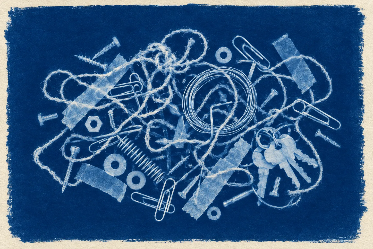
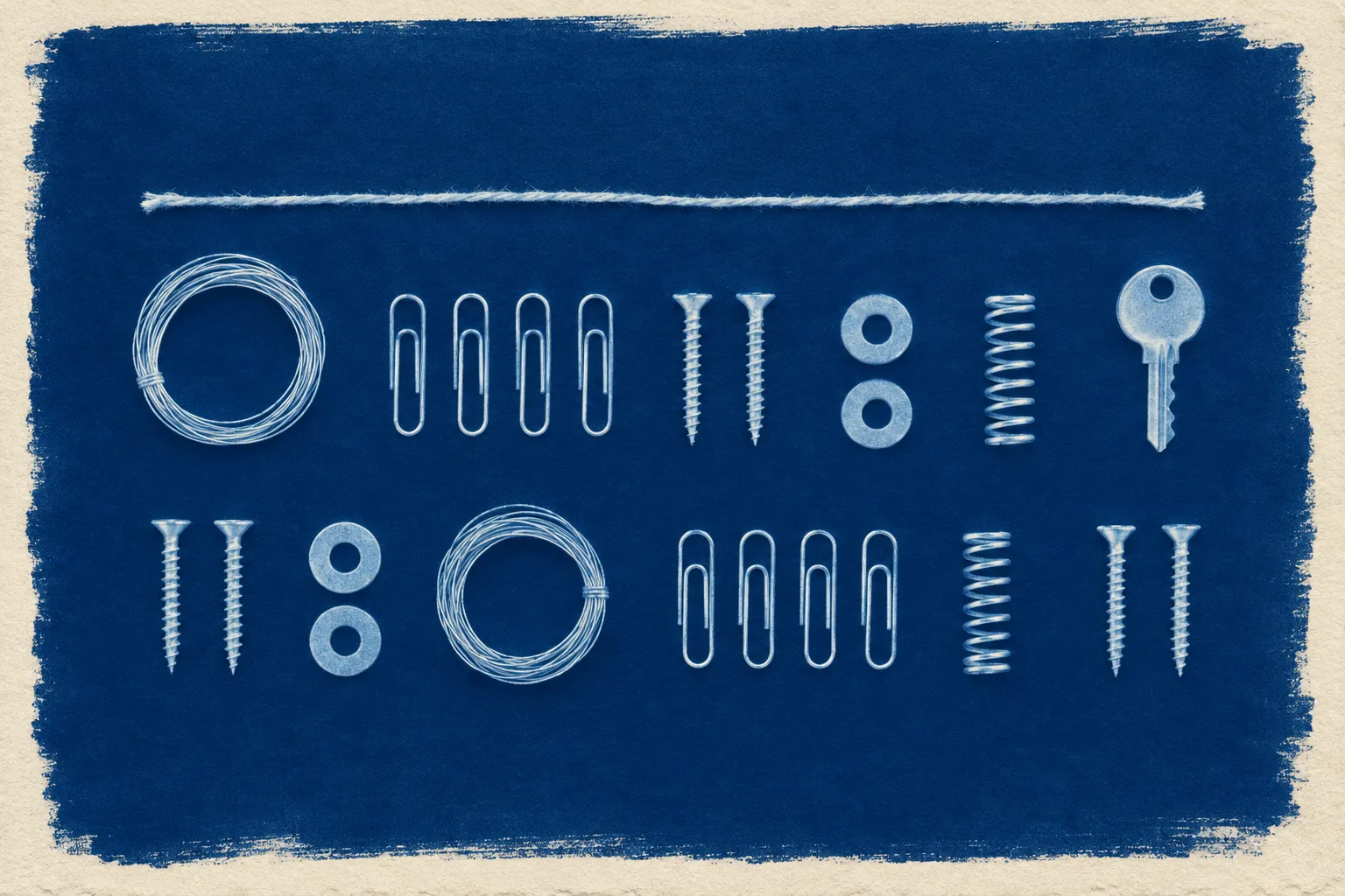
A campaign page for an open project, built the way a nonprofit asks for support: the cause up top, an impact report, the program areas, then one clear ask. The masthead runs down the left edge like a book spine and doubles as a reading thermometer with a notch for each milestone. The images are cyanotypes, the sun print process that turns objects into pale silhouettes on Prussian blue, used here as a before and after.
- Oxblood ground
#2A1517 - Cream card
#FAF5EC - Cyanotype blue
#2456A6 - Sun blue
#9DBBEA - Rose clay
#D9A493 - Ink
#22140F
Modern Web Guidance 1.0 is stable, with three browsers as owners
Modern Web Guidance 1.0 shipped on November 10. It is a set of agent skills from the Chrome team that puts web platform best practices and browser compatibility data in front of a coding agent before it writes code, and Firefox and Edge have now joined Chrome as project owners.
Version 1.0 adds a modernization workflow that scans existing HTML, CSS, JavaScript and package.json for safe upgrades, then walks the agent through them. Chrome says this first release uses static analysis on a narrow set of patterns, with agent-led audits planned later. Install it, then point it at a folder:
npx modern-web-guidance@latest install
/modern-web-guidance Modernize the code in this directory
“Mistakes like bad ARIA can make a page less accessible than no ARIA at all.”
Chrome for Developers, on why the user-facing guides got an accessibility review
The guides carry Baseline data, so advice follows the browser support targets you set. For designers the useful part is the default it pushes: native HTML and CSS for popovers, dialogs and scroll effects before custom JavaScript, with a public eval dashboard comparing agents with and without it.
- Released
- 10 November 2026, version 1.0
- Owners
- Chrome, Firefox and Edge, per the project's governance file
- Works with
- Any model or agent harness, per Chrome
Impact report
Customer figures from Chrome's announcement. They are vendor-reported, not independent tests.
- 61 to 94%
Pass rate on modern web checks across 180 runs on note inc.'s production Next.js codebase, steering agents toward native scroll animations, tooltips and accordions.
note inc., case study - 4 days to hours
Turnaround on new Pensionbazaar pages after pairing the guidance with DevTools for agents, with UI bugs on new screens down by over 90 percent.
Paisabazaar, via Chrome - 87%
Less debugging time at WeTV, where a CI agent now diagnoses and fixes 90 percent of failed performance checks.
Tencent WeTV, via Chrome
Technique: the ten things the guidance corrects most
A day later Chrome published the ten things AI gets wrong in web development, grouped under four program areas. More than half of the list is interface work a designer signs off on.
Accessibility
- Keyboard focus and inert management
- Reduced-motion support
- Form validation, format hints and autofill states
User experience
- Swipe and touch gestures
- Dialogs, popovers and top-layer transitions
- Dark mode and theme-adaptive controls
Performance
- Runtime responsiveness and smoothness
- Layout shifts and visual flicker
Security
- DOM XSS defenses and HTML sanitization
- Passkey sign-in, reauthentication and credential lifecycle
Workflow: write with the guidance, check in a real browser
Chrome recommends pairing the skill with Chrome DevTools for agents, which gives the agent a running page to test what it just wrote.
Animations
The agent records a dialog or popover as it opens, studies the clip against the rest of the site, then reruns with reduced motion switched on to confirm the fallback holds.
Responsiveness
A trace on a simulated low-end CPU shows whether long tasks block the main thread. Chrome's target is under 50 milliseconds a task, so input stays quick.
Cached views
When the agent keeps views in memory for instant transitions, the memory tools confirm old views are cleaned up instead of piling up over a long visit.
Tooling: Google Flow adds five tools for visual work
Google Labs added five tools to Flow on November 12, a separate batch from the creator-built set covered in September. The post does not list plans, models or export formats yet.
- Pixel MachineConverts an image to bitmap, ASCII, CRT, pixel art or glitch styles.
- Lucid GlassGenerates prisms, halos, refractions and optical blooms.
- Character PosterTurns a story concept into a poster-format visual.
- Character ArcRenders one character across ages while keeping the core look.
- Pocket StudioTurns one phone take into several camera angles and keeps the performance.
Borrow this pattern: the honest before and after
Renovation, retouching and redesign pages all lean on a compare slider, and most are built on custom drag handlers that ignore the keyboard. Build it on one native range input instead. Its value sets a custom property, and the second image is clipped with clip-path inset from that value.
- Use a real range input with a label, so arrow keys and screen readers work with no extra code.
- Label each state on the image edge with the measurement that changed, beyond a bare before and after.
- Without script, show the two images side by side, so nothing is hidden.
- Keep the divider thin and give the handle a visible focus ring.
The cyanotype pair at the top of this page is built this way. Tab to it and press the arrow keys.
.compare { --p: .5; }
.stage { display: grid; }
.stage img { grid-area: 1 / 1; }
.stage .after {
  clip-path: inset(0 0 0
    calc(22px + (100% - 44px) * var(--p)));
}
.stage input {
  position: absolute; inset: 0;
  appearance: none; background: none;
}

input.oninput = () =>
  box.style.setProperty('--p',
    input.value / 100);
Prompt Lab
Written for Claude Code, Lovable, v0, Beaver Builder AI, Framer and Figma Make.
Build a nonprofit campaign landing page for an open-source project as plain HTML and CSS, with a tiny inline script only for a compare slider, a reading meter and a copy button.

Structure:
1. A vertical spine masthead fixed to the left edge, 84px wide, on a darker band of the ground: the issue or campaign number, the organisation name set vertically in the display face, the date and read time, and a thin vertical reading meter with one notch per section. The notches are real anchor links and light up as their section is reached; the meter fills as the reader scrolls. Under 820px the spine becomes a sticky strip across the top with a horizontal meter.
2. Hero: a solid label naming the campaign, a heavy serif headline no wider than 15 characters per line, a one or two sentence appeal, one filled button and one text link.
3. A full-width before and after figure: two images stacked in one grid cell, the second clipped with clip-path inset driven by a native range input. Label each state on the image edge with the figure that changed. Without script, show the two images side by side.
4. Sections opened by milestone markers: a solid label reading "Milestone 2 of 7" beside a seven-segment bar with the finished segments filled. No numbered circles, no section symbols.
5. An impact report as a ruled ledger: one large figure per row, a plain sentence, and its source. Say plainly when a figure is reported by the organisation itself.
6. Program areas as a two by two ruled grid, each area a short numbered list that continues its numbering across areas.
7. A pledge card for the main call to action: cream card, a blue header band holding the title and one copy button, the steps below.
8. Close with a short note beside a ruled source list, then previous and next tiles.

Visual system:
Ground: warm oxblood #2A1517 with a halftone field in rose clay #D9A493 at 14 percent opacity, dots large at the top of the page and shrinking to nothing by the first section. Cards: cream #FAF5EC with ink #22140F. Accent: cyanotype blue #2456A6 on cream; sun blue #9DBBEA for marks and links on the dark ground; rose clay for labels on dark.
Type: one superfamily. Merriweather at 900 weight and its narrowest width for display, its italic for a single pullquote; Merriweather Sans for body and interface; IBM Plex Mono only for commands and code.
Images: cyanotype photograms, pale silhouettes on Prussian blue with a cream paper border, the same treatment on every image, no legible text in any image.

Guardrails: body text at least 19px with line-height 1.7 and lines of 60 to 75 characters; every label meets WCAG AA against the surface it actually sits on; no neon, no glow, no gradient text, no purple-blue gradients; card radius 12px at most and small labels 4px; hover and focus states eased over about 150ms; one signature motion only (the meter fill), and a prefers-reduced-motion block that removes transitions.
Field note
When every agent reads the same guide, the native dialog becomes the default dialog. That frees the design budget for how it looks and moves, so spend it there.
Sources
- Modern Web Guidance 1.0: The web platform expertise your coding agent is missing Chrome for Developers, 10 Nov 2026
- Top 10 things AI gets wrong in web development Chrome for Developers, 11 Nov 2026
- Modern Web Guidance documentation Chrome for Developers
- Modern Web Guidance governance and owners GitHub
- Modern Web Guidance eval dashboard Chrome
- note inc. case study Chrome for Developers
- Chrome DevTools for agents Chrome for Developers
- New Google Flow tools Google, 12 Nov 2026